
A B-Side BY Armin
Air Lituanica

About: (Est. 2013) “The vision of Air Lituanica is to become a regional base airline providing air transportation services for travellers flying to and from major European destinations. The mission of the company is to facilitate Lithuania’s accessibility by air, therefore Air Lituanica will not only carry passengers on highly demanded direct routes, but also ensure that passengers are capable of using a wider range and more convenient connecting flight network.”
Design by: Lukrecija BBDO.
Ed.’s Notes: It’s alright. Bigger view of the logo and livery shot below (or after the jump).
Relevant links: Lukrecija BBDO case study. World Airline News.
Select quote: “The company’s logo features an old-style Lithuanian cross with two transepts, a symbol which was often used in Lithuanian aviation in the inter-war period. In the Air Lituanica logo this cross is modernised and it becomes stylised aircraft propeller blades. Air Lituanica company symbols also make use of the ducal seal of Vytautas Magnus, Grand Duke of Lithuania, to symbolise the Lithuanian origin of the airline. The company symbol is presented on a rich red background. Historically, red was the most important colour for symbols of nationhood of the Grand Duchy of Lithuania, representing energy and vitality.”
Continue reading this entry

DATE: Jun.24.2013 POSTED BY: Armin
 CATEGORY: The B-Side Aviation
  COMMENTS:


Opinion BY Armin
Flight of the Condor

In 2009, two of the largest and oldest airline carries in Latin America — TACA (est. 1931) and Avianca (est. 1918) — announced their merger and in 2012 they indicated that the Avianca name would take over both airlines. This week, TACA is no more and Avianca has taken over the 160-airplane fleet to serve the 5,100 weekly flights for 100 destinations in 25 countries across America and Europe. The merger and launch strategy and the new identity were designed by New York, NY-based Lippincott.
Continue reading this entry

DATE: May.30.2013 POSTED BY: Armin
 CATEGORY: Aviation
  COMMENTS:

TAGS: airline, animal, lippincott, livery, red,

A B-Side BY Armin
BlackJet

About: (Est. 2013) Co-founded by Uber founder Garrett Camp and with high-profile investors including Ashton Kutcher, Will Smith and Jay-Z, BlackJet launched in 2013. The service allows a wider market of luxury travelers to book individual seats on private planes instantly, at the touch of an iPhone.
Design by: Moving Brands.
Ed.’s Notes: This looks expensive.
Relevant links: Moving Brands case study.
Select quote: “The visual identity Moving Brands developed for BlackJet is bold, confident and elegant. The ‘B’ is abstracted, drawing directly from the design direction’s concept of the fast, frictionless journey. It takes the subtle shape of wings, both in the positive space created by the curves of the ‘B’ and the negative space, which reveals the sleek nose and wings of a jet. A moody, sexy, monochromatic color palette and contrasting, geometric font further advance the personality of the brand and differentiate its identity from its competitors.”
Continue reading this entry

DATE: Mar.07.2013 POSTED BY: Armin
 CATEGORY: Aviation The B-Side
  COMMENTS:

TAGS: black, icon, monogram, moving brands,

Opinion BY Armin
Hawaiian Airlines Exteeeends its Service

Announced this month by Hawaiian Airlines, Ohana by Hawaiian will be a new über regional airline between the islands of Moloka‘i and Lana‘i flying in adorable-looking, 48-passenger ATR42 turboprop aircrafts. The new name — the Hawaiian word for “family” — logo, and livery have been designed by renown textile and apparel designer Sig Zane (and son). Before we get to the rest of the post: my apologies for the crappy logo image above; there is no clean image anywhere of it.
Continue reading this entry

DATE: Feb.19.2013 POSTED BY: Armin
 CATEGORY: Aviation
  COMMENTS:


A B-Side BY Armin
HOP!

About: (Est. 2013) “HOP stems from the alliance between 3 regional airline companies (Airlinair, Brit Air and Regional) within the Air France group. Thanks to its powerful network combined with the efficiency of its over 3,000-employee staff, the company is THE new transport solution for inter-regional flights, in France and Europe.”
Design by: Brandimage.
Ed.’s Notes: Between Joe on the main side and this, the French are stealing all our words. Nice, simple logo. Tail fin is kind of crazy and hard to read. Bigger view of the logo and livery sample below (or after the jump).
Relevant links: HOP press release. HOP press images (more liveries and ads). HOP media kit (PDF).
Select quote (from media kit): “The name “HOP!” evokes rapidity and the ease with which travellers can get from point A to B. Synonymous with agility, HOP! illustrates its capacity to bounce back and adapt to customers’ needs. The simple typography and red colouring featured in the HOP! logo illustrates the Company’s flexibility in a creative and playful manner. Positioned alongside a slanted exclamation mark, symbolizing an aircraft’s take-off, HOP! illustrates an ambition for reactivity and mobility.”
Continue reading this entry

DATE: Jan.30.2013 POSTED BY: Armin
 CATEGORY: Aviation The B-Side
  COMMENTS:


Opinion BY Armin
American Airlines, a Second Opinion
Due to popular demand — flattered, thanks folks — and to the reality that it’s very hard to hold back my opinion on such a significant redesign I feel both the need and urge to provide a second opinion to Mark Kingsley’s refreshingly optimistic view of the American Airlines identity. Although by no means I share his same enthusiasm or praise for the work I will preemptively state that I do not feel this is the design crime deserving of capital punishment that many designers were either expecting or have made it out to be. In few words: it could have been worse. In far more words: read on.
Continue reading this entry

DATE: Jan.18.2013 POSTED BY: Armin
 CATEGORY: Aviation
  COMMENTS:

TAGS:

Opinion by Mark Kingsley Posted BY Brand New
My Kind of American Exceptionalism
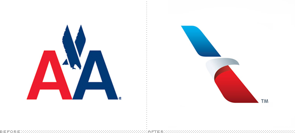
Flying used to mean something.
And before People Express Airlines remade air travel into the equivalent of a bus ride, before the mediascape overinformed us about every possible destination, before the security theater of X-rayed shoes, and before the global financial crisis, the experience of flying actually delivered on that promise.
But now, air travel can be a miserable experience. Especially if you fly coach. And especially if you fly American Airlines.
[Ed.’s Note: This is the first time I hand over a “large” review to anyone. Mark Kingsley, a good friend and annoyingly astute observer, asked if he could do it, saying he was “totally excited” about the work. His point of view on this is likely the last thing you expected to hear from Brand New. Enjoy. — Armin Vit]
Continue reading this entry

DATE: Jan.18.2013 POSTED BY: Brand New
 CATEGORY: Aviation
  COMMENTS:


A B-Side BY Armin
Air Canada Rouge

About: (Est. 2012) Rouge is “Air Canada’s new leisure airline with stylishly affordable service to holiday spots in Europe and the Caribbean. Benefit from Air Canada’s extensive network for smooth connections to flights departing daily from Toronto and Montreal. Service begins July 1, 2013. It’s time to go more. “
Design by: N/A.
Ed.’s Notes: Wow. That is bad. I would excuse how bad it was if at least they would have actually taken the time to hand-letter it instead of just using a font — or if they did hand-letter it (because I really have no idea what font that is, I’m just assuming) then they should have made different letterforms for the repeating characters in “Rouge” and “go more”. Terrible. Livery and logo-on-balloons images below (or after the jump).
Relevant links: Meet Air Canada Rouge.
Select quote: “Air Canada rouge embodies the best of Air Canada including reliability, trustworthiness, top safety standards and a name and iconic brand that represents ‘Canada. The name was tested in major Canadian cities. Canadians said the name and colors spoke to the color Canada is known for: red, a color they link to warmth, fun and excitement. Air Canada rouge also represents Canada’s two official languages.”
Continue reading this entry

DATE: Dec.20.2012 POSTED BY: Armin
 CATEGORY: Aviation The B-Side
  COMMENTS:

TAGS: canada, hand-drawn, livery, red,

A B-Side BY Armin
Brno Airport
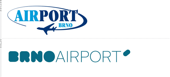
About: “Brno Airport is the second largest international airport in the Czech Republic and it is an important junction of the region and remote destinations. It handles over 500,000 passengers and more than 25,000 aircrafts annually.” (Provided by design firm).
Design by: Studio Kutululu.
Ed.’s Notes: A couple of application images below (or after the jump) and plenty more at Kutululu’s link below.
Relevant links: Kutululu case study.
Provided quote: “The corpulent word BRNO bears characteristics of the exterior shape of the terminal building and aircrafts. Broad in appearance and causing respect by their size. In contrast to monolithic, compactness and organicity was put the word AIRPORT, of which design draws inspiration from very rugged interior of the building and also represents airiness and technicality. The graphic symbol brings an element of the airport to the logo itself — a take-off and landing of aircraft on runway.” (Provided description).
Continue reading this entry

DATE: Dec.18.2012 POSTED BY: Armin
 CATEGORY: Aviation The B-Side
  COMMENTS:

TAGS: czech republic, sans serif, teal,

A B-Side BY Armin
Germanwings
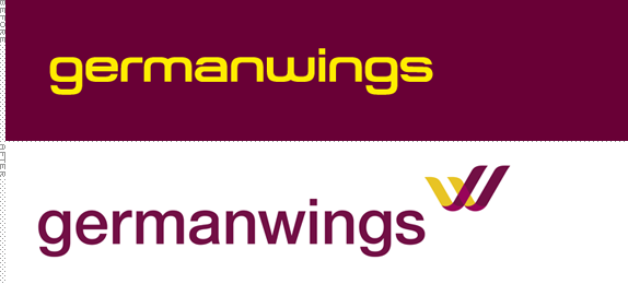
About: (Est. 2002) Germanwings is a low-cost airline based in Cologne, Germany, and is wholly owned by Lufthansa. Its fleet includes 32 Airbus A 319 that flies over 7.5 million passengers a year to over 90 destinations.
Design by: N/A.
Ed.’s Notes: Livery shot and video below (or after the jump).
Relevant links: Press release.
Select quote: “The key element will be a stylised burgundy and yellow ‘W’, transforming the wings in Germanwings into a succinct icon.”
Continue reading this entry

DATE: Dec.10.2012 POSTED BY: Armin
 CATEGORY: Aviation The B-Side
  COMMENTS:


