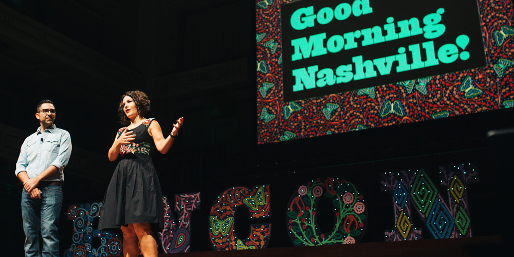
Announced Sep. 22, 2016 by Armin No Comments on 2016 Brand New Conference: Photos, Tweets, and Videos
Here is this year’s breakdown of the 16 sessions of the 2016 Brand New Conference that took place this past September 15 – 16 in Nashville, TN, and which was awesome. (If you are looking at this in an RSS reader head on over to the real thing, too much heavy formatting). This is a very long post with a photo of each speaker, very brief summaries from me and my partner Bryony, collected tweets from the audience, and a preview of their video/session, so give it a good time to load. A few other things worth bullet-pointing:
• Videos for purchase are now available.
• A lot more photos from the event have been posted in this Flickr album.
• Additional videos from the conference not included in this post: Day one opening remarks and BNConf identity presentation / Day one closing summary / Day two Brand New summary / Day two closing summary.
• Registration is now open for the 2017 Brand New Conference in New York, NY, on September 14 – 15.
• Next I will post this year’s identity materials. Just have to photograph them once we receive our own shipments from the venue.
That’s it. Enjoy the post. There is a lot of great content from all the speakers.
Photos by Nicola Harger.
Kickoff
Armin & Bryony’s summary
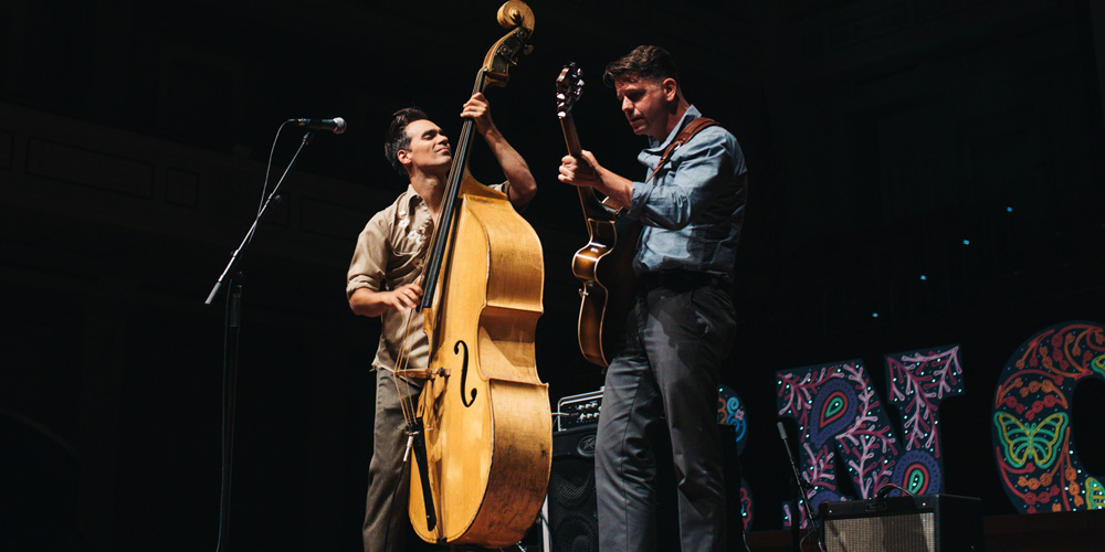
We kicked off the conference with a 3-song performance from local bass master Slick Joe Fick and his guitar sidekick Lain Christian. From there, we let all the prep work leading up to the event take its course and hoped for the best!
Tweets
Charles S. Anderson / CSA Design / Minneapolis, MN
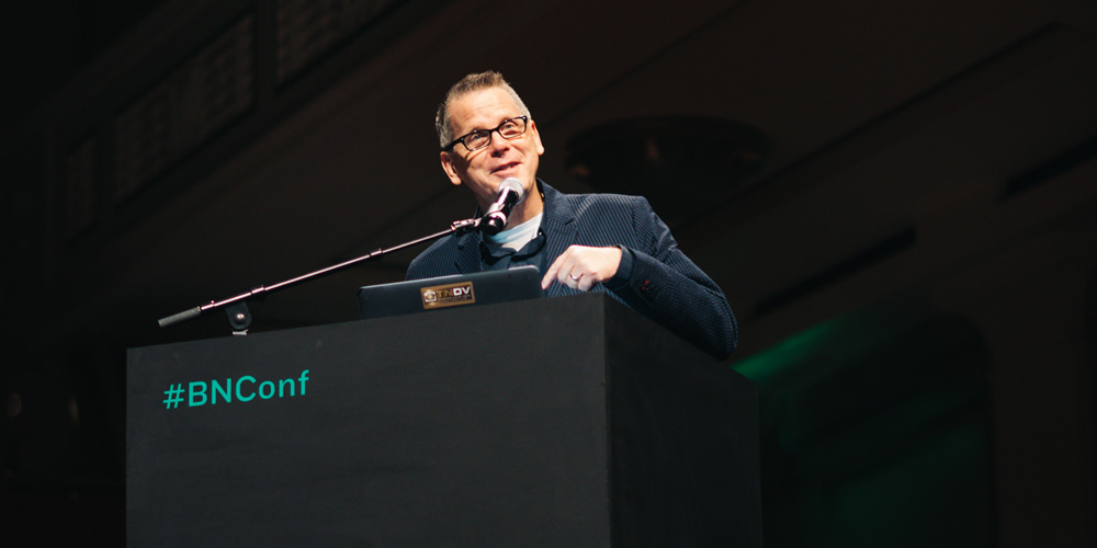
Armin’s summary
A rare look at the process behind 30-plus years of logo and identity projects plus examples of the long-standing relationship with French Paper.
Bryony’s summary
We started the day with a look back over the decades of work focused on reviving the past and giving it a second chance, or third, fourth, and so on. This done through creating clients and building identities that start with truth–great puns and humor go a long way too, as does a love and passion that drive the need to create. And remember, you should love your client’s products.
Tweets
Charles from CSA Design 30 years of logo design in 45 minutes #bnconf only 44 minutes left
— Tanja Pohl (@IndyTanja) September 15, 2016
"Our process starts decades ago, we're just huge fans of the entire history of graphic design." @CSAimages @bnconf #bnconf #CharlesAnderson
— ariannaorland (@ariannaorland) September 15, 2016
Corporate clients are like baklava, the layers get flakier as you get to the top. #ChuckAnderson #bnconf
— Brand New Conference (@bnconf) September 15, 2016
Charles S. Anderson is killing it with the puns… And y'know, all the amazing @FrenchPaperCo work. #bnconf @CSAimages
— Rusty (@rustyccook) September 15, 2016
"Always try to build an identity from the truth or something real." – Charles Anderson #bnconf
— Grace Bolzman (@gracegdesign) September 15, 2016
“The best clients are made, not found” ~Charles S. Anderson #BNConf #Design #Branding
— Jason Clark (@clarkster) September 15, 2016
Getting approval from the client… That's the true art form in graphic design — Charles S Anderson #bnconf
— Brand New Conference (@bnconf) September 15, 2016
Video Preview
BUY VIDEO
Clara Mulligan / Sid Lee / Amsterdam
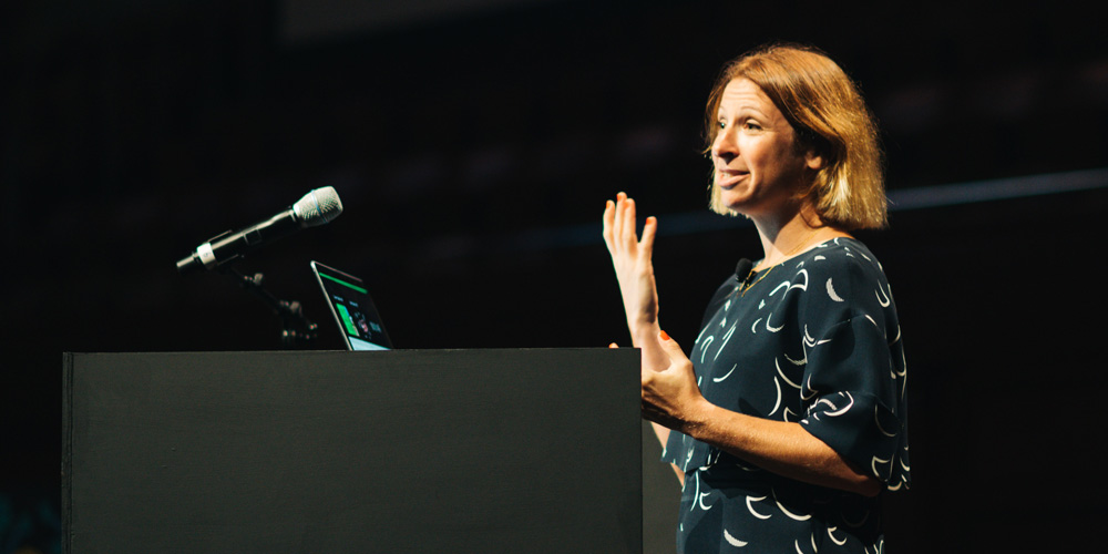
Armin’s summary
A convincing and charming case for seeking variety, diversity, and maximalism in identity projects… and life.
Bryony’s summary
More is more, and less is a bore. When you create energy around a project, you are going to get that energy back from the client. Seek out variety around each project. Avoid a processed process. Create a lot so that you can spot what fails. Use every project as an opportunity to improve yourself. Make; evaluate. Make; evaluate. Rinse; repeat.
Tweets
More is more, less is a bore. — Clara Mulligan #bnconf
— Brand New Conference (@bnconf) September 15, 2016
Make, and then evaluate. Make, evaluate. Don't do them both at the same time, it'll drive you crazy. – Clara Mulligan #bnconf
— Beth Voigt (@twenty3eighty4) September 15, 2016
The more you make, the more of an opportunity you have to solve the problem. @claramulligan1 #bnconf
— Cesar Rivera (@ecesarrivera) September 15, 2016
"Design isn't about how it looks, it's about how it works." -Clara Mulligan #bnconf
— ariannaorland (@ariannaorland) September 15, 2016
Variety is the spice of life. As is of design. -Clara Mulligan #bnconf #brandnew
— Helena Jakoube (@helenajakoube) September 15, 2016
"If you don't care about your work, how can you expect anyone else to?" Clara Mulligan #bnconf @bnconf pic.twitter.com/pktX5qTwjy
— ariannaorland (@ariannaorland) September 15, 2016
When you create an energy around a project, you're most likely gonna get that energy back from your client. – Clara Mulligan #bnconf
— Grace Bolzman (@gracegdesign) September 15, 2016
Yes yes yes, Clara Mulligan. Always have a personal agenda, use every project as an opportunity to improve yourself. #bnconf
— Rusty (@rustyccook) September 15, 2016
A brand is evolving and complex over time. @claramulligan1 #bnconf
— Cesar Rivera (@ecesarrivera) September 15, 2016
"Hyper consistency results in boring work a lot of the time." -Clara Mulligan #bnconf @bnconf
— ariannaorland (@ariannaorland) September 15, 2016
Clara Mulligan – It's ok to treat design like art #bnconf
— Tanja Pohl (@IndyTanja) September 15, 2016
Video Preview
BUY VIDEO
Manuel / Manuel American Designs / Nashville, TN
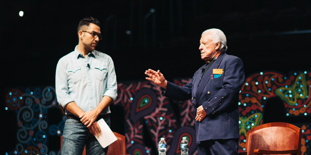
Armin’s summary
A conversation spanning over 60 years, covering Manuel’s multiple jobs and signature line while musing on fame, fortune, style, and rhinestones.
Bryony’s summary
There was so much to the conversation between Manuel and his now-BFF Armin that I am opting for reminding you of a few rhinestones… “I’m as simple as oatmeal. My next suit will be my best one. Worry about legacy? I don’t even worry about tomorrow.” Manuel is focused on today, the project on hand, the friend by his side, and, of course, good food and extraordinary projects.
Tweets
"I want to stand up so I can look at these people."
— Kelsey Greer (@kelseyraegreer) September 15, 2016
—@ManuelCouture #quote#bnconf @bnconf
"I teach them everything I know. The one thing I don't know is if they learn everything I teach them."
— Kelsey Greer (@kelseyraegreer) September 15, 2016
—@ManuelCouture#bnconf @bnconf
"Why do I need to worry about legacy? I don't even worry about tomorrow." @ManuelCouture #BNconf pic.twitter.com/zYvSeD691J
— Stephanie Haworth (@steph_haworth) September 15, 2016
"Yes of course I dress like this all the time. I even have a special suit to mow the lawn!" All hail Manuel ??? #bnconf
— Alli Elster (@TimesNewAlli) September 15, 2016
I never met a challenge that was just about quality. #manuel #bnconf
— Cesar Rivera (@ecesarrivera) September 15, 2016
"I am simple as oatmeal" Manuel #bnconf
— Sara Coffey (@SaraLeeCoffey) September 15, 2016
"I made my lunch, just in case he gave me a job."
— Kelsey Greer (@kelseyraegreer) September 15, 2016
—@ManuelCouture #quote#bnconf @bnconf
Video Preview
BUY VIDEO
Mackey Saturday / Chermayeff & Geismar & Haviv / New York, NY
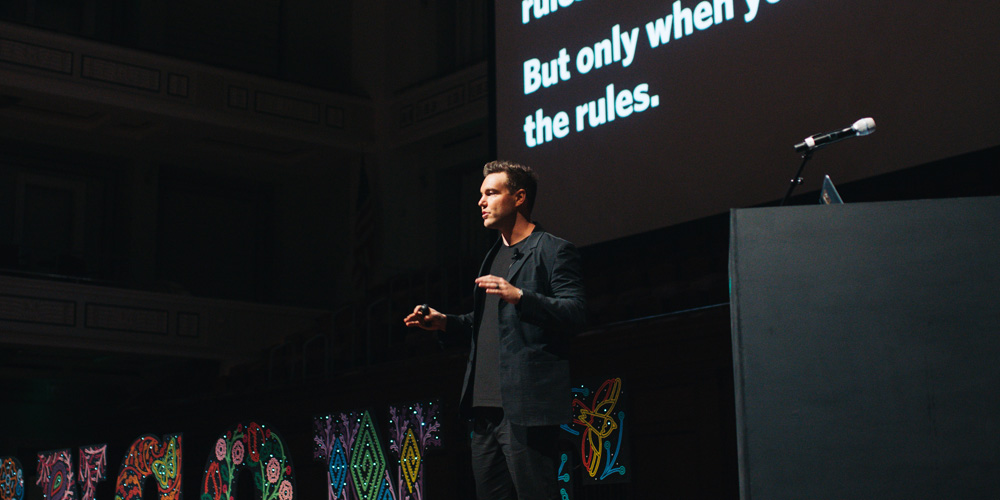
Armin’s summary
A glimpse at what it means to be the new guy on the block in a storied firm while showing that the quest to design simple logos is multi-generational.
Bryony’s summary
From solo design to joining a staple of our industry Mackey walked us through some of the lessons he has learned: A logo gains meaning and power overtime. You should break the rules — but only when you make the rules. Gray is the worst color for a logo — it’s like it can’t make up its mind. Clients think they know what they want, until you show them. If you mis-diagnose or let your clients self-diagnose, that’s when you get poor work. Your first idea is your best idea but your last idea is your best idea. Consider everything. — worry about nothing.
Tweets
Clients think they know what they want, until you show it to them. @MackeySaturday #bnconf
— Cesar Rivera (@ecesarrivera) September 15, 2016
"Oh, really? You already know what you want. Okay, here it is."
— Beth Voigt (@twenty3eighty4) September 15, 2016
*LOOK OF HORROR*
"Now can we talk for real?"#bnconf pic.twitter.com/zRooTU1w8X
"Any good logo gains meaning and power over time." @Saturday @CGHNYC #bnconf
— ariannaorland (@ariannaorland) September 15, 2016
Take care to honor your work. Spend time on the presentation. (472 slides!) @saturday #BNConf
— Jason Clark (@clarkster) September 15, 2016
Awesome work method of @CGHNYC …all 4 together, no lead or division, pure collaboration #bnconf pic.twitter.com/mimNSbjIm5
— Maria Ramirez (@marytlicue) September 15, 2016
Consider everything. But worry about nothing. – Mackey Saturday #bnconf
— Grace Bolzman (@gracegdesign) September 15, 2016
Video Preview
BUY VIDEO
Dirk Barnett / Nike / Portland, OR
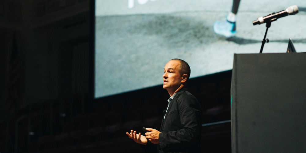
Armin’s summary
An honest recap of changing industries and landing inside a well-oiled machine where performance and innovation are the leading qualities of the product and the expectations of its design team.
Bryony’s summary
Dirk told us to Shut up. Listen. And learn. Embrace your fear and don’t let anyone talk you out of greatness. Dig deeper, find out why they are saying what they are saying–communicate your ideas. Learn the art of faking it, and Don’t fuck up.
Tweets
Don’t F@#% it up!@DirkBarnett at #BNConf.
— Bobby C. Martin Jr. (@bobbycmartin) September 15, 2016
I learned the Art of Totally Faking it really quick — upon moving from the editorial world to Nike. #dirkbarnett #bnconf
— Brand New Conference (@bnconf) September 15, 2016
You, Listen to the voice in the back of your mind… the one that, with each slide, is saying “I can do that.” Believe it. Just do it. #bnconf
— LWSDCo. (@lwsdco) September 15, 2016
Product innovation is the North Star. @DirkBarnett #bnconf
— Cesar Rivera (@ecesarrivera) September 15, 2016
OKAY, I can't just screenshot this entire presentation from @DirkBarnett. No. Shan't.
— Beth Voigt (@twenty3eighty4) September 15, 2016
HOWEVER! #bnconf pic.twitter.com/Ka5YQ7dkUD
This presentation is either career suicide or really inspiring. #timewilltell #bnconf #dickbarnett
— LWSDCo. (@lwsdco) September 15, 2016
Beautiful presentation @DirkBarnett That last video was inspiring. I'm ready for war. #niketraining #bnconf
— Daniel Roman (@RomanEmpir3) September 15, 2016
Video Preview
BUY VIDEO
Beth Sachan / Goo Goo Cluster / Nashville, TN
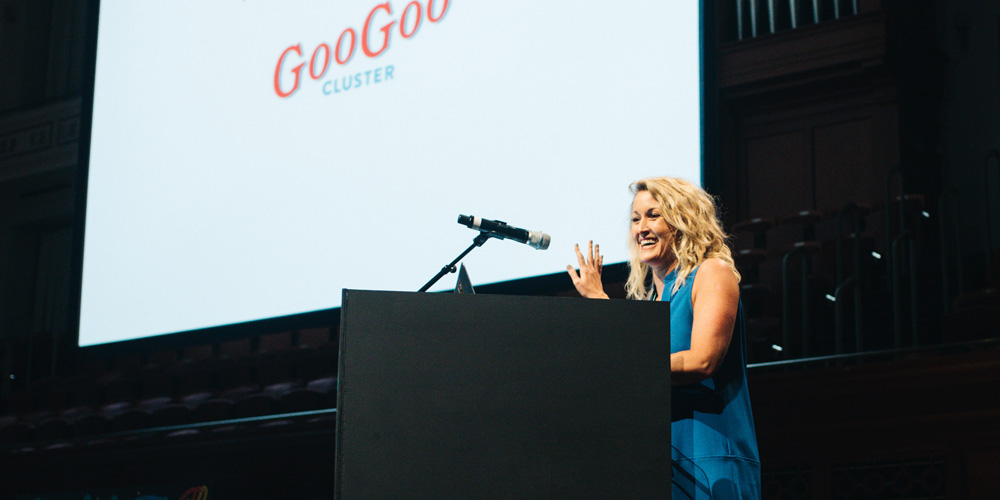
Armin’s summary
A quick historical introduction to the first known candy bar in the U.S. followed by its revival in 2010.
Bryony’s summary
Challenged with finding a fresh voice for a company that had been around for 100 years, Beth showed us that with a good origin story, passionate customers, and a delicious project you can get locals and non-locals to love your brand no matter where they are.
Video Preview
BUY VIDEO
Austin Gray / Entire World / Nashville, TN
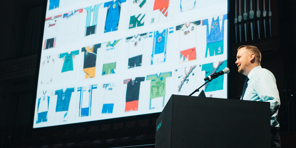
Armin’s summary
An endearing look at a life-long admiration for logos (and sports uniforms) and how that informed the start of his own business.
Bryony’s summary
The computer is where ideas are executed, not where they are born. Own it: You have the expertise, not them. Guide them and find better outcomes together. Get fired — it’s just the cost of doing good business sometimes. Learn from it and own it too. And finally, don’t be lazy.
Video Preview
BUY VIDEO
Bryce McCloud / Isle of Printing / Nashville, TN
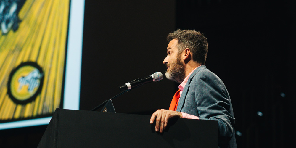
Armin’s summary
An optimistic presentation on the potential of design and ideas to influence community and society positively with humor, smarts, and craft.
Bryony’s summary
Work with civic and public sector groups to get things because we have the ability to shape the way people interact with the world, perhaps you should use it for good? And as long as we are here, let’s make it better!
Video Preview
BUY VIDEO
Combined Tweets of 15-minute Presentations
Loved hearing @betheats talk about @GooGooClusters weathering 100+ years of change. #bnconf pic.twitter.com/tUMd5fRYpx
— Stephanie Haworth (@steph_haworth) September 15, 2016
YUP. Sometimes the best thing to do is part ways. And that's okay. #bnconf pic.twitter.com/emYvBo3ken
— Stephanie Haworth (@steph_haworth) September 15, 2016
"As long as we're here, let's make it better!" @isleofprinting #bnconf pic.twitter.com/r1Ews53dQn
— Beth Voigt (@twenty3eighty4) September 15, 2016
Kristine Arth / fuseproject / San Francisco, CA
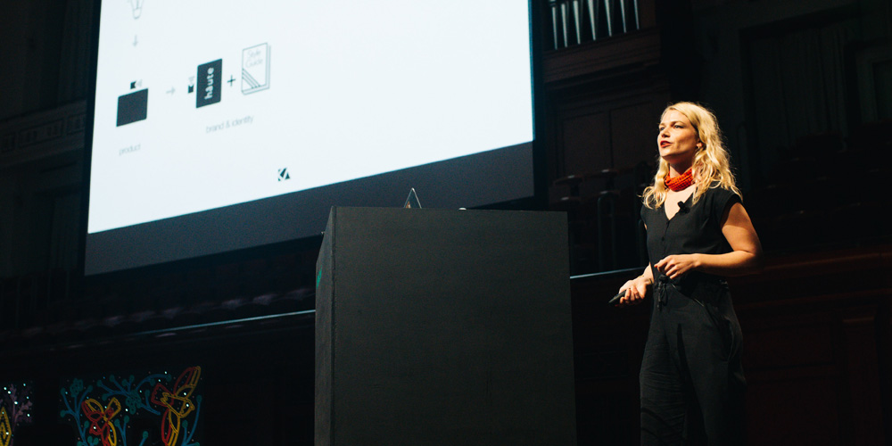
Armin’s summary
A non-jargon-y nor pretentious promotion of holistic design and how bridging and unifying the worlds of product and brand design generate stronger results.
Bryony’s summary
The design food chain is broken. We need to question this process and influence the collaboration that should exist with the many parts. Holistic design is an experience that creates a unified emotional, physical, and social connection and when you see the behind the scenes you can grasp the effect of what you can do. So know where your designs are going. And please remember: Collaborate! Be brave enough to critique – and be critiqued. Work with empathy, not sympathy — big difference. “Holistic design, it’s the future!”
Tweets
"I don't think anyone in our profession is just there to be a dick." – Kristine Arth #bnconf
— Beth Voigt (@twenty3eighty4) September 15, 2016
Be brave enough to critique and be critiqued. @kristinearth #bnconf
— Cesar Rivera (@ecesarrivera) September 15, 2016
“align before design.” @kristinearth from @fuseproject at #bnconf #design #truthbetold pic.twitter.com/5XV3uOV2b2
— Think Carmen (@thinkCARMEN) September 15, 2016
"Holistic design is an experience that creates a unified emotional, physical and social connection." @kristinearth #bnconf
— ariannaorland (@ariannaorland) September 15, 2016
"The design food chain is broken." — Kristine Arth @fuseproject #bnconf pic.twitter.com/KCdt8gpHE4
— Nicky Quinn (@nickymquinn) September 15, 2016
Collaborate!
— Brand New Conference (@bnconf) September 15, 2016
Group perspectives can be cool.
Grab a beer and talk. — @arthkris #BNConf
Video Preview
BUY VIDEO
Matías Duarte / Google / San Francisco, CA
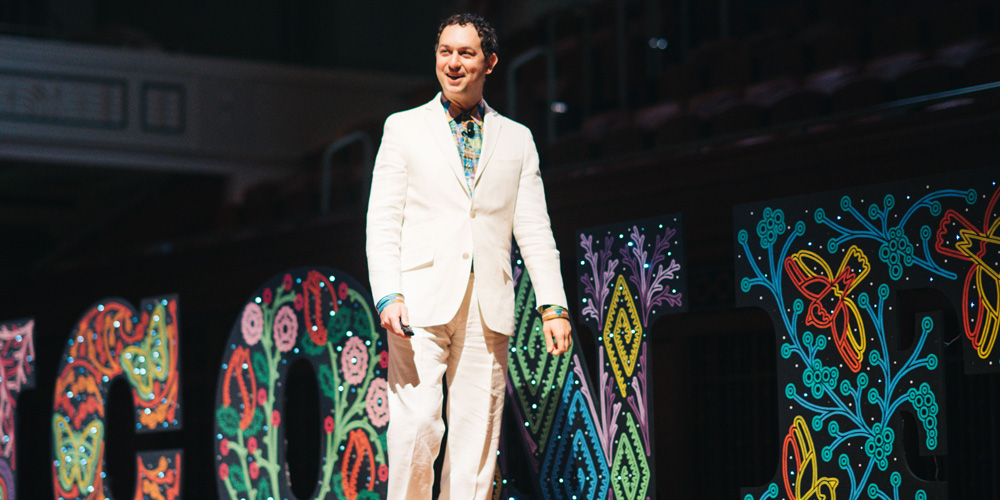
Armin’s summary
An in-depth look at the arduous process behind the redesign of the Google logo and the challenges of deploying it across the platform and its myriad offshoots.
Bryony’s summary
From Matias we heard that one of the greatest lessons in getting people to help you is to tell them about your troubles. The long shadow makes everything good — sometimes. Mix up teams so that they don’t work with each other as usual and help break the typical working relationships. This was a great example of not waiting for the executive team to give the command to redesign but taking on the project from the belief that it’s needed and that if the work is good it will stand up to scrutiny at the highest levels.
Tweets
Hearing about the change in Google's logo, a talk to die for. #bnconf
— Morgan♡ (@omgmorgan) September 15, 2016
Listening to @MatiasDuarte go deep on process and concepts that informed the final @google logo. Swoon! #bnconf pic.twitter.com/BhVo7nQ1Bw
— ariannaorland (@ariannaorland) September 15, 2016
"I don't even notice, because it's become the new normal." @MatiasDuarte on Google rebrand & material design; beautifully invisible! #bnconf
— Beth Voigt (@twenty3eighty4) September 15, 2016
Listening to @MatiasDuarte go deep on process and concepts that informed the final @google logo. Swoon! #bnconf pic.twitter.com/BhVo7nQ1Bw
— ariannaorland (@ariannaorland) September 15, 2016
Loving the theme of designers as doctors and the slippery slope of self-diagnostics by clients #bnconf
— Alex Flamini (@alexflamini) September 15, 2016
Loving the theme of designers as doctors and the slippery slope of self-diagnostics by clients #bnconf
— Alex Flamini (@alexflamini) September 15, 2016
"Produce all the things" @MatiasDuarte #bnconf
— ariannaorland (@ariannaorland) September 15, 2016
Video Preview
BUY VIDEO
Michael Johnson & Tim Murray / johnson banks & Mozilla / London, UK & San Francisco, CA
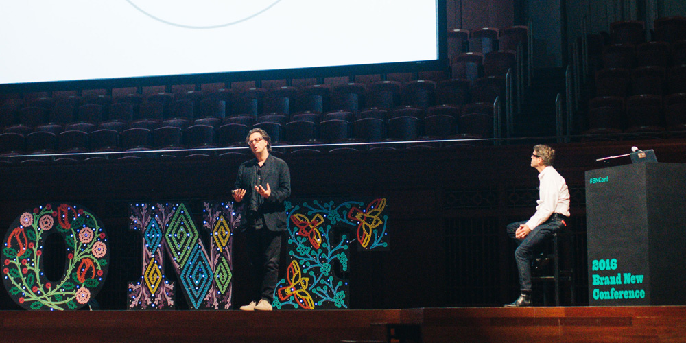
Armin’s summary
An introduction to the Mozilla Open Design project and step-by-step peek at the second round of exploratory identity work by johnson banks.
Tweets
Tim Murray of @mozilla at #bnconf sharing work in progress of their open identity design with @johnsonbanks. asks who will be open with us?
— ariannaorland (@ariannaorland) September 15, 2016
@johnsonbanks @mozilla Heard Tim & Michael @ #bnconf tonight. Brave to open source design. I'm loving Protocol, distinct, original, flexible
— Kenny Isidoro (@MUDEO) September 16, 2016
Feeling a bit naked at @johnsonbanks showing initial designs… #bnconf pic.twitter.com/jj2Tf3IBeE
— Beth Voigt (@twenty3eighty4) September 15, 2016
@johnsonbanks don't let the haters get you down! #bnconf
— Matías Duarte (@MatiasDuarte) September 16, 2016
#bnconf is the first to see @mozilla's latest concepts in their open design process. pic.twitter.com/R4QhEqIzkD
— Tori Tasch (@toritasch) September 16, 2016
Live comments section breaking out at the #bnconf pic.twitter.com/vRCETVOYuZ
— Fanbrandz (@Fanbrandz) September 16, 2016
Video Preview
FREE VIDEO!
Tony Brook / Spin and Unit Editions / London
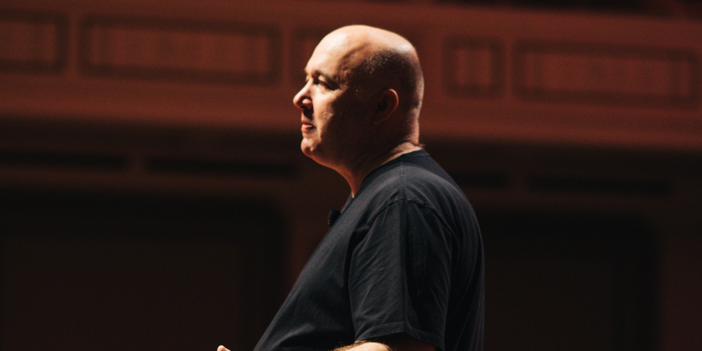
Armin’s summary
An overview of how SPIN works, the influences in Tony’s work, his collections, a sampling of two projects, and a preview of upcoming Unit Editions titles.
Bryony’s summary
Think. Make. Next. Design is social. Come together. Collect. Be weird. Look. Research. Try to explain it. Keep looking, there is more than just one good idea. When in need, Will-Burtin-it, and find a better alternative. Don’t just brand the back end of a cow.
Tweets
There isn't just one good idea, you've got to keep pushing it – Tony Brook #bnconf via @dougransdell pic.twitter.com/X6eZWcCypK
— Smashing Boxes (@smashingboxes) September 16, 2016
"My name is Tony Brook and I'm a collector" #bnconf @Spin_TonyBrook
— Brand New Conference (@bnconf) September 16, 2016
"I know what I know now & I can see that they're all idiots but can't EXPLAIN it… there's such potential for art" @Spin_TonyBrook #bnconf
— Beth Voigt ? (@twenty3eighty4) September 16, 2016
@Spin_TonyBrook killing it early on Day 2 of #bnconf in Nashville! Lots of great identity case studies. pic.twitter.com/nnIAEsmLB3
— APSU Graphic Design (@APSUdesign) September 16, 2016
"I'm not comfortable with 'brand' because that's something you do on the back end of a cow." @Spin_TonyBrook #bnconf pic.twitter.com/5wVGllJoPt
— Beth Voigt ? (@twenty3eighty4) September 16, 2016
Tony Brook takes the stage and nothing else matters #bnconf pic.twitter.com/8kGKu5CghK
— Fanbrandz (@Fanbrandz) September 16, 2016
Logos are the seed of a visual identity. #BNConf @Spin_TonyBrook
— Christina (@cmbittinger) September 16, 2016
Video Preview
BUY VIDEO
Luke Stockdale / Sideshow Sign Co / Nashville, TN
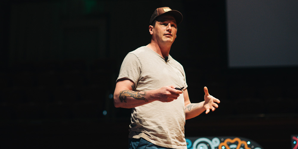
Armin’s summary
An informative talk on the challenges of making signs and the considerations designers should have when designing logos that will end up as signs.
Bryony’s summary
Luke Stockdale’s parents owned a magic and novelty store in rural Victoria. When their home was lost in bush fires he helped build a new home and could not go back to sitting in front of a computer again. What did he do? Something we should all do. Get people to teach you what you want to learn. If you have something to teach, do so. Be it in a classroom, a boardroom, or your very own church. There is beauty and value to be found in that which is difficult. Don’t take the easy way out just because it is faster.
Tweets
There is a reason designers don't make signs… because it's bloody difficult. — Luke Stockdale @SideshowSignCo #bnconf
— Brand New Conference (@bnconf) September 16, 2016
@SideshowSignCo – love Luke's approach to interconnected relationships between all of us who create & make things. #bnconf
— Mark Vanderbrook (@MVanderbrook) September 16, 2016
Materials dictate design. -Luke Stockdale #bnconf #brandnew
— Helena Jakoube (@helenajakoube) September 16, 2016
The most forgotten, and often the most important, application of a brand: the sign. @SideshowSignCo #bnconf
— Tori Tasch (@toritasch) September 16, 2016
"Signs are the largest application of a brand. Designers have to be involved." @SideshowSignCo #bnconf
— Bullhorn (@wearebullhorn) September 16, 2016
"Sign industry has reduced materials down to 6…shut designer out…we must put power back in hands of designers." @SideshowSignCo #bnconf
— Nicky Quinn (@nickymquinn) September 16, 2016
Video Preview
BUY VIDEO
Min Lew / Base / New York, NY
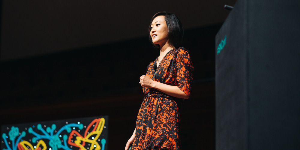
Armin’s summary
A breakdown, smartly framed through basic human skills, of the approach Base Design takes in their work while showcasing some of their work.
Bryony’s summary
Min Lew showed us that great design = design skills + people skills. To use basic, inherent human skills to create great design. Trust your gut, and listen. Before you walk into a meeting ask yourself: What is my energy today? What are my expectations? What is my contribution? And listen 80% of the time. Talk only when you have something to say. Don’t design for designers, or yourself, design for people. Help define who companies are. Don’t be afraid of words, they make great visuals. Be together, it’s not us vs them. Think beyond your title, flex your creative muscles, your mind, your design and don’t forget there is no glory… in bad work.
Tweets
5-minute poster with damn fine advice. @mintylew #bnconf pic.twitter.com/3HvsvRCSig
— Beth Voigt ? (@twenty3eighty4) September 16, 2016
Designers help define, design, decide who companies are. #bnconf
— Grace Bolzman (@gracegdesign) September 16, 2016
Love the Inclusion method they use at Base for internal meetings. By Min Lew. #bnconf #brandnew
— Helena Jakoube (@helenajakoube) September 16, 2016
You guys.. Min Lew.. She's absolutely inspiring! #bnconf
— Andrea (@iathomas77) September 16, 2016
Great design = Design skills + Human skills – Min Lew @bnconf #design #bnconf
— Grace Bolzman (@gracegdesign) September 16, 2016
The best meetings are 20% talking & 80% listening ~Min Lew of @Base_Design #BNConf
— Jason Clark (@clarkster) September 16, 2016
Video Preview
BUY VIDEO
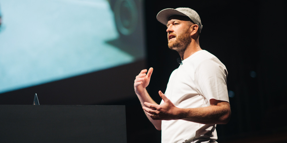
Mike Alderson / Man vs. Machine / Los Angeles, CA and London
Armin’s summary
A behind-the-scenes, no-holds-barred look at the clever and surprising design, motion, and live-action work of ManVsMachine.
Bryony’s summary
Mike tolds us to design by doing. Throw shapes. Mess around with stuff. Don’t just point at things. Find a motif and build from it. Be a little more ridiculous than everyone else. Own your path, do what you must to do what you are interested in doing — create awesome digital lies. Don’t design for designers, design for your nana, for everyone else. The computer is rad, but the real world is rad-er. If something breaks, let it be broken. Imperfection is great.
Tweets
We have to convince our clients to introduce a little imperfection. @Man_vs_Machine #bnconf
— Christina (@cmbittinger) September 16, 2016
We take the world as it is and tweak it. @Man_vs_Machine #bnconf
— Christina (@cmbittinger) September 16, 2016
My notes don't all look like this, but it's fun when I can do it. #bnconf talk from @m_alderson of @Man_vs_Machine pic.twitter.com/sRH9R0i4sN
— Beth Voigt ? (@twenty3eighty4) September 16, 2016
Love it. "It's all lies, digital lies." @Man_vs_Machine #bnconf
— Kristine Arth (@kristinearth) September 16, 2016
"I don't want to just design for my peers… I want to design things my Auntie Debbie will see and think it's good." @m_alderson #bnconf
— Beth Voigt ? (@twenty3eighty4) September 16, 2016
Mess around with stuff. Don’t just point at things. @Man_vs_Machine #bnconf
— Brand New Conference (@bnconf) September 16, 2016
Design by doing. – Mike Alderson @bnconf #design #bnconf
— Grace Bolzman (@gracegdesign) September 16, 2016
The computer is rad but the real world is rad-er. — Mike Alderson @Man_vs_Machine #bnconf
— Brand New Conference (@bnconf) September 16, 2016
“Do it right. Imperfections bc the charm comes out through that.” Mike Anderson @Man_vs_Machine #bnconf #design pic.twitter.com/Sct6I9uBbX
— Think Carmen (@thinkCARMEN) September 16, 2016
Favorite quote of the day: "Bullshit harmony" ?? #bnconf
— Sarai Nunez (@sarainunez) September 16, 2016
Video Preview
BUY VIDEO
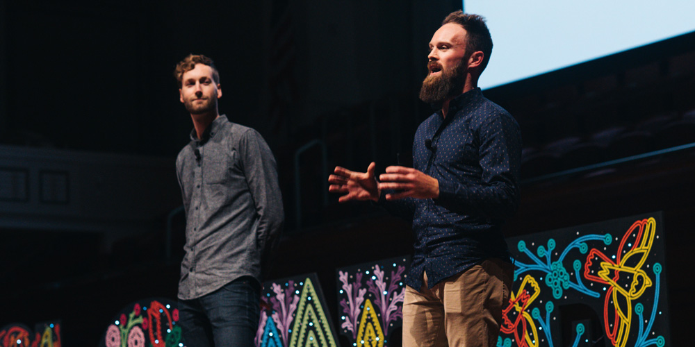
Ben Hulse and Greg Durrell / Hulse & Durrell / Vancouver, BC
Armin’s summary
An illuminating glimpse into the research and restoration of dozens of Olympic emblems, mascots, and identities carried out with evident love and exemplary craft.
Bryony’s summary
Ben and Greg had a unique opportunity to review, recreate, and redefine the work of hundreds of designers. What I find the most striking, and something that I would like to remind myself of, is the need to find a balance between what has been established with what can be, while respecting the existing without constraining your exploration by what you have seen. Their process and experience can be applied to any rebrand that the rest of us are exposed to at work on any given day. And it is up to us to balance the past, with our personal desires, the needs of the clients, the expectations from their customers, and the common ground of all of the above.
Tweets
"The Olympics can have the power of redefining a country." Using design to craft a national image. @hulsedurrell #bnconf
— Bullhorn (@wearebullhorn) September 16, 2016
@hulsedurrell "México '68 The Beatles of The Olympic design" #bnconf
— jon orta (@j_orta) September 16, 2016
Now hearing @hulsedurrell talk about the incredible amount of work that goes into branding the #Olympics. #BNConf pic.twitter.com/0df2Kwrc74
— Empower MM (@EmpowerMM) September 16, 2016
"Carry through a single vision" @hulsedurrell #BNConf
— Kristine Arth (@kristinearth) September 16, 2016
"Design has the biggest impact when creative vision is in place from start to finish." @hulsedurrell #bnconf
— Beth Voigt ? (@twenty3eighty4) September 16, 2016
“Logo competition is like a beauty pageant: w/out thinking of all applications–meaningless" @hulsedurrell #bnconf pic.twitter.com/mfwx2FFZNd
— Think Carmen (@thinkCARMEN) September 16, 2016
Video Preview
BUY VIDEO
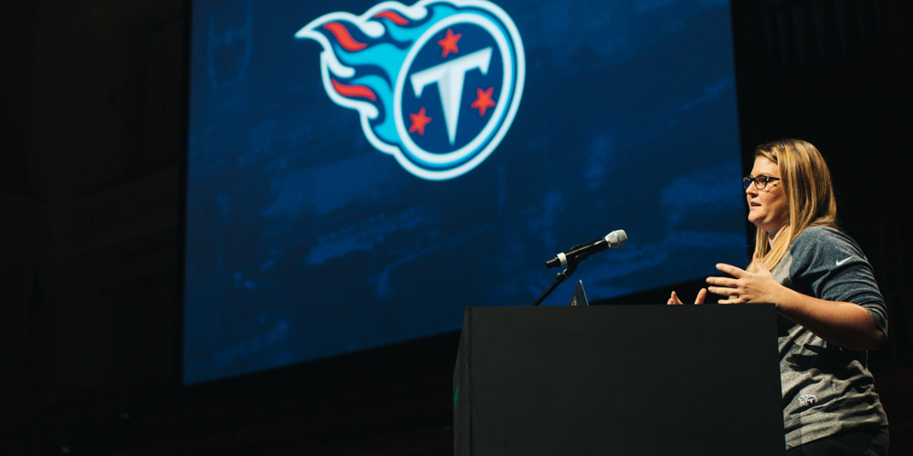
Ashley Strauss / Tennessee Titans / Nashville, TN
Armin’s summary
A great story of the team’s first designer creating a logo steeped in research and meaning and bringing to life an identity.
Bryony’s summary
How do you create something out of nothing? By piecing bits and pieces together one step at a time. A conversation, a typeface, a photo shoot, some stories, references and research, and personal investment in the future success of the project, and day by day you can see it all come to life. If you are as determined as Ashley was to create something out of nada, then you have nothing to worry about when you next find yourself in her situation.
Video Preview
BUY VIDEO
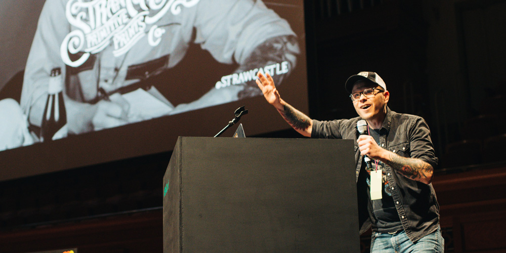
Derrick Castle / Straw Castle / Nashville, TN
Armin’s summary
A charming rags-to-creative-riches story of establishing a unique illustration style and build a thriving side business and creative outlet.
Bryony’s summary
Finding fame and fortune needs to be done through a project of the heart. But if you think you have found it, and after a bit you realize it ain’t working no more, then it is time to walk away, and invest in yourself as you seek a new goal — without ever losing your soul. Like Derrick. You never know how it will all turn out, but the journey, the growth, and the process sure make it worth your while. And yes, it is ok to negotiate for yourself. And reconsider. Fucking reconsider.
Video Preview
BUY VIDEO
Benji Peck / Peck & Company / Nashville, TN
Armin’s summary
A thoughtful case for being more open and accepting of clients and building strong relationships that lead to more meaningful work.
Bryony’s summary
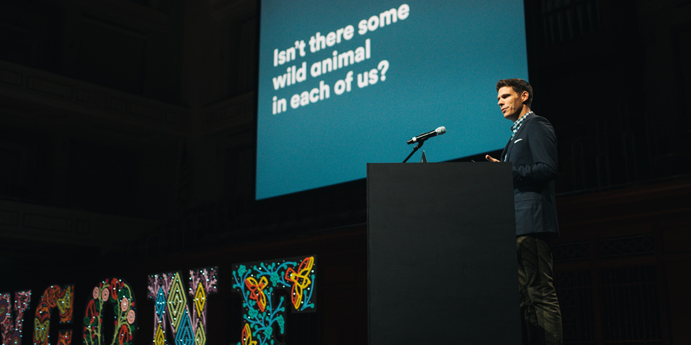
Benji Talked about designing relationships. Nashville is a town of wild animals and lovely people. Who knew?! Isn’t there some wild animal in each of us? We should strive to see people for who they are without confirmation bias. Value relationships over transactions. Understanding people makes us create better work.
Video Preview
BUY VIDEO
Combined Tweets for 15-minute Presentations
Loved hearing @AshleyStrauss talk about bringing design in-house for the @Titans!! #bnconf
— Alex Flamini (@alexflamini) September 16, 2016
@ashleystrauss Great job showing us the brand work you’ve done for the @Titans. Love seeing how brands develop from the inside! #bnconf
— Mike Jones (@remarkamike) September 16, 2016
Amazing story. "Please reconsider.” When @strawcastle turned down Miller High Life. Thank goodness he did. #bnconf pic.twitter.com/ZN9i1rrISb
— Think Carmen (@thinkCARMEN) September 16, 2016
Theresa Fitzgerald / Sesame Workshop / New York, NY
Armin’s summary
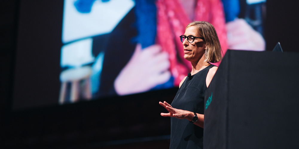
An invigorating look at the challenges and successes of a show that influenced many of us while showcasing the creative output needed to keep the brand on track.
Bryony’s summary
Kids deserve good design; simple typefaces that are clean and real — they can tell the difference. Theresa shared that Sesame Street’s brand attributes are: real, heartfelt, simple, furry, funny. Which is something we could strive for in our daily lives. The focus for the next season is kindness and, again, something we should all focus on. A hint of muppet works just fine. And when in doubt, wear Elmo shoes!
Tweets
I'm crying at the @sesamestreet presentation #bnconf
— That's So Sharp (@thatssosharp) September 16, 2016
In @sesamestreet each character gets its own guideline, since they are not cartoons. Theresa Fitzgerald. #bnconf pic.twitter.com/hmhleFjZ5g
— Think Carmen (@thinkCARMEN) September 16, 2016
"The creative adult is the child who survived." #SesameWorkshop #bnconf #Nashville
— Duncan Robertson (@darwerk) September 16, 2016
The Sesame Street brand; consistent and woven into the hearts of ages 5-95. It is not happenstance. #bnconf pic.twitter.com/6nVnMTj6be
— Hollinden (@hollinden) September 16, 2016
Fur is very difficult to animate on a tight budget. — Theresa Fitzgerald #BNConf
— Brand New Conference (@bnconf) September 16, 2016
There are VERY GOOD REASONS for the standards for eyes, textures, materials, placement and colors. #bnconf pic.twitter.com/XawMjc84Gm
— Beth Voigt ? (@twenty3eighty4) September 16, 2016
"It taught me that it's okay to look like me."
— Beth Voigt ? (@twenty3eighty4) September 16, 2016
Loving these videos from Theresa Fitzgerald's presentation on @sesamestreet at #bnconf
Sesame Street logo for every language! #bnconf pic.twitter.com/A3jKoYUn2q
— Fanbrandz (@Fanbrandz) September 16, 2016
Video Preview
BUY VIDEO
Jim Sherraden / Hatch Show Print / Nashville, TN
Armin’s summary
A fast-paced history of Hatch Show Print and its 137-year legacy plus a passing of the torch as Jim steps away from being The Hatch Guy.
Bryony’s summary
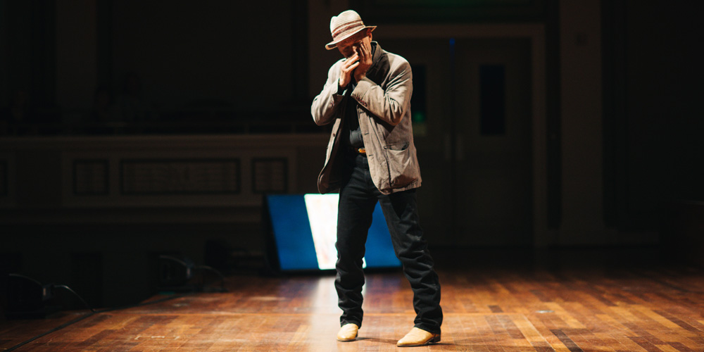
Jim serenaded us with his harmonica. The Hatch Guy. The Hatch Guy talked fast! What a treat. He told us about a time when a poster was meant to tell you something, not sell you something. How world wars changed the poster. How computers saved Hatch. How mainstream clients infused Hatch Show with cash and visibility. How new musicians revived its services. How the Hatch Guy himself spread the gospel of Hatch. What a story. What a future. Thank you Jim for that. Celene, good luck! And, everyone, go on and get that money.
Tweets
What an amazing entrance by Jim Sherraden from @HatchShowPrint #bnconf not your normal hatch talk. pic.twitter.com/qkpgbtCogO
— Think Carmen (@thinkCARMEN) September 16, 2016
Whether you're in your 20th year or your 1st, make sure you get paid what you're worth. @HatchShowPrint #bnconf
— Beth Voigt ? (@twenty3eighty4) September 16, 2016
"Your soul is all you own. Don't pawn your soul, keep your shoulders high." @HatchShowPrint #bnconf pic.twitter.com/i6PSXtdCWh
— Beth Voigt ? (@twenty3eighty4) September 16, 2016
Thanks to Jim Sherraden from @HatchShowPrint Thanks for keeping letterpress alive! #bnconf
— That's So Sharp (@thatssosharp) September 16, 2016
Gah! Totally freaking out to see @HatchShowPrint to close #bnconf For years, that was the reason why I wanted to come to #Nashville
— Sarai Nunez (@sarainunez) September 16, 2016
When @HatchShowPrint started 137 years ago, a poster was meant to tell you something, not sell you something. — Jim Sherraden #BNConf
— Brand New Conference (@bnconf) September 16, 2016
@HatchShowPrint is the perfect example of truth in branding. Never follow trends. #bnconf pic.twitter.com/ZxOStxWIWu
— Tim Littlefield (@timcreativecom) September 16, 2016
Jim Sherraden of #hatchshowprint "a little more personal, a little more honest" #bnconf
— Kristine Arth (@kristinearth) September 16, 2016
“Presentation through production.” Jim @HatchShowPrint #bnconf #designthinking pic.twitter.com/wDGosKNy8k
— Think Carmen (@thinkCARMEN) September 16, 2016
A standing ovation for Jim Sherraden of @HatchShowPrint. Thank YOU for your 32 years of American type legacy #bnconf
— Alex Flamini (@alexflamini) September 16, 2016
Video Preview
BUY VIDEO
Nashville, you Rocked!
Armin & Bryony’s summary
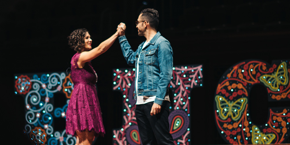
Now in our seventh year and eighth conference overall we were surprised at how much this particular conference kicked our ass in the last month. It was a lot of work and we got very ambitious with the hand-made elements, particularly those stage letters that Bryony painted by hand and I drove across state lines from Texas to Tennessee. As if that weren’t enough our grand idea to place rhinestones of the program covers — photos to come — was unbelievably slower than we ever expected but our volunteers stuck to it, literally, and went the extra hours to get it done. The speakers were great, the venue was great, the audience was great. It was great. I’m sorry, we are beaming about it! Now, we have the challenge of coming back to New York and trying to deliver another great 2-day experience. Hopefully you will be there.
Tweets
Awesome speakers at the Brand New Conference in #Nashville ! #bnconf
— Kacy (@KacyBelew) September 16, 2016
Loving the content.
THANK YOU @ArminVit and @Bryonygp for another amazing #bnconf! (especially thank you for the webcast!) pic.twitter.com/k3dYNHDwxy
— Beth Voigt ? (@twenty3eighty4) September 16, 2016
Streaming live from Waunakee, WI; Our #designers are feeling inspired! Thanks #BNConf speakers! @bnconf pic.twitter.com/VyEdBFLYbc
— Suttle-Straus, Inc. (@SuttleStraus) September 16, 2016
There is a common thread among speakers at #bnconf this year: make something and *own it* – both for yourself and for your clients.
— Stephanie Haworth (@steph_haworth) September 16, 2016
Looking at all the #BNconf feed makes me want to take a trip to Nashville.
— theresa dela cruz (@theresadelacruz) September 17, 2016
I left #bnconf convinced that choosing to design is the best choice I've ever made. Thx @ucllc for truly moving me. pic.twitter.com/OWwZS8icZw
— Charleey.indd (@HeyCharleey) September 18, 2016
Our team was so inspired by #BNConf in Nashville last week. Check out our trip photos on FB: https://t.co/5JbTMayN7u pic.twitter.com/Pt5OidHVyE
— Son&Sons (@sonandsons) September 19, 2016
What a great conference! Thank you to the organizers and volunteers! Bravo! #bnconf
— Chris Hyatt (@hyatt_chris) September 16, 2016
Nothing as affirming as coming away from something as lovely as #bnconf feeling proud/excited to be part of this kind of design community
— Annie Maynard (@eamayn) September 17, 2016
Another #BNConf in the books. Mind buzzing with new ideas and strategies. Look out, #GRMI.
— Chelsie Wyse (@chelsiewyse) September 17, 2016

Comments