

|

|
BY
Holly Tillman
IN
|
ON
November 18, 2009
COMMENTS
CLICK ON WORD IT FOR AUTHOR’S LINK, IF PROVIDED
|


|
Jump to Most Recent Comment NeblGenocide’s comment is:
amazing, the colors are great! On Nov.18.2009 at 10:54 AM

smeebob’s comment is:
i like how the perspective is kinda slanted. On Nov.18.2009 at 11:24 AM

Lilshadow’s comment is:
Looks cool, The work text reminds me of how a 3d movie looks without the glasses. Nice colors On Nov.18.2009 at 11:27 AM

AyumiNazu’s comment is:
Flashy colors, it really stands out! On Nov.18.2009 at 06:19 PM

kriselt’s comment is:
Great! Looks like front of CD! Nice concept! :) On Nov.19.2009 at 08:33 AM

Edleen’s comment is:
To me, this design is too much colour in some ways or others. I cannot quite describe it. I think the idea is good, but the design comes up a little messy and somewhat distracting in my honest opinion. But then again, I am more of a simplicity kind of guy ;) On Nov.19.2009 at 08:42 AM

lola’s comment is:
great use of colors! On Nov.20.2009 at 08:29 AM

Swiss’s comment is:
It looks like Holly is "All the Rage" On Nov.20.2009 at 11:58 AM

Alicia’s comment is:
Wow visually stunning. On Nov.20.2009 at 02:00 PM

yajiko’s comment is:
makes me feel all happy to see colors making a come back in the world. On Nov.20.2009 at 02:17 PM

Yazzie’s comment is:
i really like this one! especially the background! :D On Nov.20.2009 at 02:23 PM

Ferreson’s comment is:
Haha. thats cool. This psychedelic image comes off with a hint of irony. I like it. On Nov.20.2009 at 05:35 PM

|


 Discussing, and looking for, what is relevant in, and the relevance of, graphic design.  Displaying opinions, and focusing solely, on corporate and brand identity work.  Corralling the most relevant and creative on- and off-line bits that pertain to the design community – and said community is openly invited and encouraged to add their hard-earned links.  Celebrating the reality that print is not dead by showcasing the most compelling printed projects.  Describing, tracking and explaining culture, commerce, politics, media, sports, brands — everything possible, really — through design.  Designing corporate and brand identities and full development of printed and digital matter for clients and us. |

+ Word It, is a division of UnderConsideration LLC, encouraging creative diversity in the community through monthly, one-word challenges.
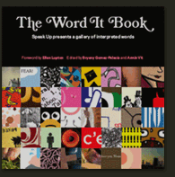
+ Word It is run with Six Apart’s MovableType 4.2 + In 2007, with F+W Media we published The Word It Book, an edited selection from the first 30 words 
Syndicate RSS Feed Disclaimers + All comments, ideas and thoughts on Word It are property of their authors; reproduction without the author’s or Word It’s permission is strictly prohibited + Word It reserves the right to delete any comment deemed offensive or unnecessary + All artwork is sole property of its author. Reproduction without the author’s or Word It’s permission is prohibited. + Word It is not responsible for the views expressed by each individual entry and its author. Nor does it represent Word It’s or UnderConsideration’s own opinions. We have zero censorship (unless deemed completely unpublishable material). If you have a problem with somebody’s entry we ask you to contact the author. Contact By all means, please |

|


