Dangling Listicles
That great bane of contemporary media, the Listicle, made another appearance last week. This time, it was in answer to that nagging question: what were the 40 greatest magazine covers of the last 40 years?
Lucky for us, the American Society of Magazine Editors (ASME) were on the case. From this year's American Magazine Conference at the Wyndham El Conquistador Hotel in Puerto Rico, they issued two press releases. One announced new Guidelines for Editors and Publishers — a reaction to a recent issue of the New Yorker in which Target bought every single ad, the other was the list of the 40 "greatest" magazine covers of the last 40 years — presented in honor of the 40th anniversary of the National Magazine Awards.
52 editors, design directors, art directors and photography editors (what, not 40?) whittled down from 444 entries. Only magazines published in the United States were eligible; which explains the absence of other 'great' magazines like The Face or Vogue Italia.
Lists like these make for easy news copy. They're usually free of controversy, have multiple entry points (even ESPN Hollywood did a story on the sports-related covers), and don't require much editorial framing. And if you consider the design press, they also generate money (by the way, why is it that design magazines charge more for their annuals?).
That said, in perusing the ASME list, perhaps one can discern some general themes. While many of the covers reflect specific events, there are general archetypes in use. (ASME listings are under the selected covers, in bold)
From the Venus of Willendorf; through Aphrodite, the Greek goddess of life, beauty, and coitus; Suadela, the Roman goddess of persuasion in romance (and a follower of Venus); to today — the pretty girl is the first refuge of editors. The particulars (Jennifer Love Hewitt, Paris Hilton, Pamela Anderson) may be interchangeable but the universal ideal remains constant.
Every naked woman incarnates prakriti. Hence she is to be looked upon with the same adoration and the same detachment that one exercises in pondering the unfathomable secret of nature, an intrinsic mystical value: in, in the presence of the naked woman, one does not find in one's inmost being the same terrifying emotion that one feels before the revelation of the cosmic mystery, there is no rite, there is only a secular act, with all the familiar consequences ... — Mircea Eliade, Yoga: Immortality and Freedom
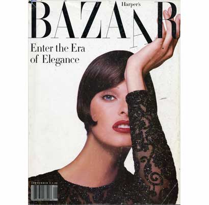
#9 — Here's where most of us first heard of Fabien Baron, the art director who launched a thousand Bodonis. This issue of Bazaar (from 1992) was the first to reflect editor-in-chief Liz Tilberis' renovation of the magazine into what was then the most elegant and cutting-edge fashion publication. The cover layout echoes everything that we loved about mid-century magazines — before the age of multiple call-outs and celebrity portraits…
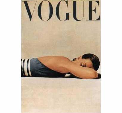
…like this 1947 Vogue with an equally oblique John Rawlings image.
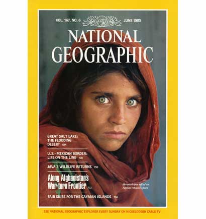
#10 — There's sadness in the realization that Sharbat Gula's compelling gaze couldn't protect her from a painful life. I can't count how many times I've seen this cover reproduced. It obviously did better for the National Geographic than Gula, and the world continued to ignore Afghanistan — with painful results. So the cynic in me wonders: does that still make it a great cover?
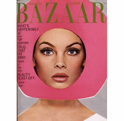
#15 — Perhaps it's the crazy 1960's headgear; but I can't quite figure out what makes this worthy of the list. If it is the fashion…
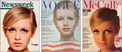
…then shouldn't it have something more representative of that era, like Twiggy?
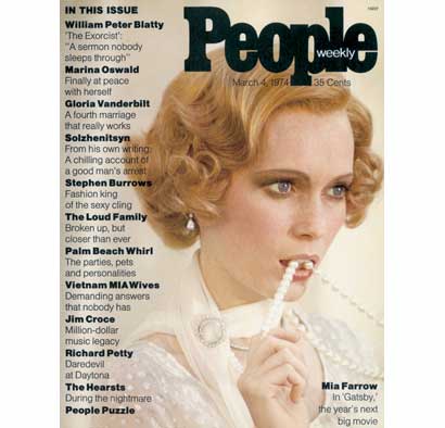
#26 — Mia Farrow was the cover model for the first issue of People. The design and call-out text is sedate…
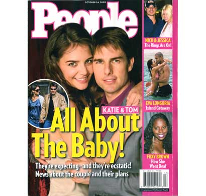
…when compared with a recent issue.
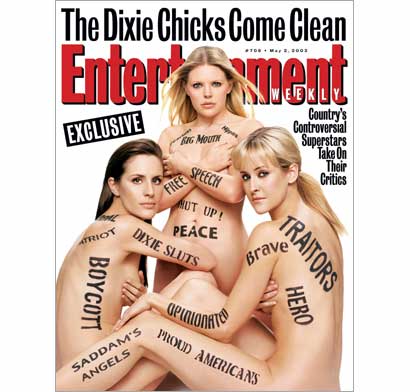
#27 — This one is just an abomination. The styling is awful and the oversell of the body painting defuses the intended confrontation. And when I think of girls covering their breasts on magazine covers…
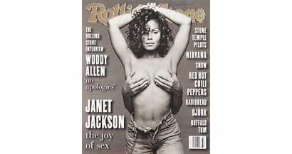
…my mind immediately goes to this 1993 Rolling Stone cover with Janet Jackson — named their "most popular cover ever," by the way.
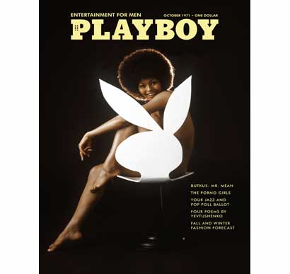
#29 (tie) — Not only was this the first Playboy to feature an African-American model (Darine Stern), it is also one of the more memorable of all Playboy covers; at least in my pre-teen experience.
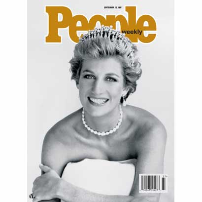
#36 — You can now have a copy of this Patrick Demarchelier photograph in "handcrafted, full-bodied porcelain … that displays Diana's sweetness and serenity."
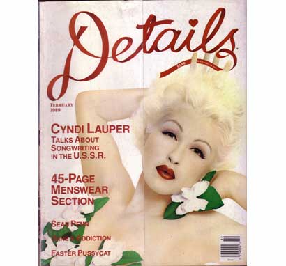
#37 (tie) — I have no idea why this was included.
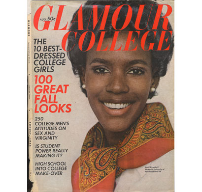
#37 (tie) — This was selected only because it was the first American women's consumer magazine with an African-American woman (Katiti Kironde II) on its cover. The generic safety of the image turns a potentially controversial subject into an everyday occurrence…
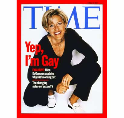
#37 (tie) — …as did this cover.
The hero gets into trouble. The hero gets out of trouble. — attributed to Kurt Vonnegut
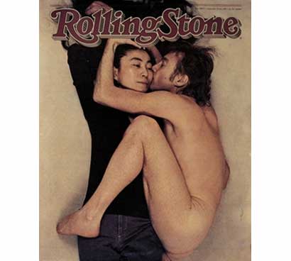
#1 — In his death, John Lennon assumed the role of the Hero described by Joseph Campbell: an everyman leaves his everyday life to begin an adventure, which leads into a dark world of trials and challenges; he overcomes a "supreme ordeal" and becomes transformed by the experience; he thus gains new ability or insight; then re-enters and transforms society. This image by Annie Leibovitz shows an older, wiser Lennon in a reference to his and Yoko's Unfinished Music No. 1: Two Virgins album package.

#19 — I guess you could say something similar about Bill Clinton. He certainly looks different than when first elected.
Invention in painting does not imply the invention of the subject; for that is commonly supplied by the Poet or Historian. With respect to the choice, no subject can be proper that is not generally interesting. It ought to be either some eminent instance of heroick action or heroick suffering. There must be something either in the action, or in the object, in which men are universally concerned, and which powerfully strikes upon the publick sympathy.
Strictly speaking, indeed, no subject can be of universal, hardly can it be of general, concern; but there are events and characters so popularly known in those countries where our art is in request, that they may be considered as sufficiently general for our purposes. Such are the great events of Greek and Roman fable and history, which early education, and the usual course of reading, have made familiar and interesting to all Europe, without being degraded by the vulgarism of ordinary life in any country. Such too are the capital subjects of scripture history, which, beside their general notoriety, become venerable by their connection with our religion. — Sir Joshua Reynolds, Seven Discourses on Art (December 10, 1771)
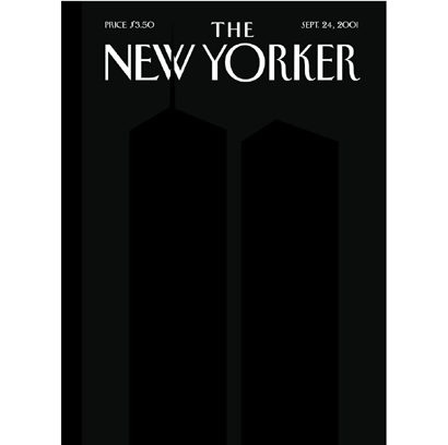
#6 — History painting's subjects are often more than a depiction of grand events. There is often a mythological or allegorical theme which conveys some sort of morality. This black-on-black silhouette of the World Trade Center has greater power and says more than any of the other 9/11 covers in the top 40.
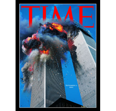
#25 — A phenomena first recognized in Andy Warhol's work, the countless repetition of a violent image deadens the initial shock. But look… they made their red frame black.

#29 (tie) — A genre scene masquerading as history painting. In this case, there's a disconnect between the subject and its depiction. Now, there was a great deal of disassociation in Manhattan after 9/11; because for several days, people were walking and driving as if on automatic, and I saw much more drinking in restaurants and bars.
So maybe this cover, with its somewhat inappropriate copy (too much, too soon; while under a deadline) conveys that sense of disassociation.

#13 — Buzz Aldrin's reflective face shield makes what could have been a portrait of an individual hero anonymous, and historical.

#21 — In 1968, CBS news anchor Walter Cronkite, "the most trusted man in America", called for an end to the Vietnam War. President Johnson was quoted as saying to press secretary Bill Moyers, "if I've lost Cronkite, we've lost America".
This image, along with…
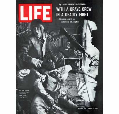
#28 — …this picture of a wounded soldier appeared three years before Cronkite's editorial.
There's probably a lesson in there somewhere about the relative power of television and print in shaping public opinion.
Genre painting depicts everyday subject matter, and could portray average people engaged in typical activity, still lifes, or variations like vanitas paintings. There are only a couple genre-type images in the ASME list; most likely chosen because they have something to do with modern art.
In order to encourage you to imitation, to the utmost extent, let me add, that very finished artists in the inferior branches of the art will contribute to furnish the mind and give hints of which a skilful painter, who is sensible of what he wants, and is in no danger of being infected by the contact of vicious models, will know how to avail himself. He will pick up from dunghills what by a nice chemistry, passing through his own mind, shall be converted into pure gold; and, under the rudeness of Gothic essays, he will find original, rational, and even sublime inventions. — Sir Joshua Reynolds, Seven Discourses on Art (December 10, 1774)
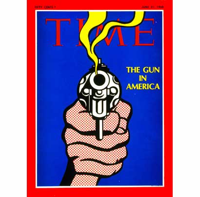
#21 — A gun by Roy Lichtenstein.
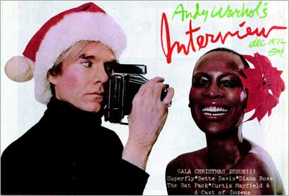
#24 — Andy Warhol photographing an Andy Warhol model for Andy Warhol's Interview.
In this case, I'm admittedly extending the definition of transvestism to the inhabitation of alternate personae.
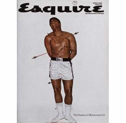
#3 — Muhammad Ali playing the role of St. Sebastian. Ali refused to be inducted into the Army for religious reasons, Sebastian was martyred for his Christianity.
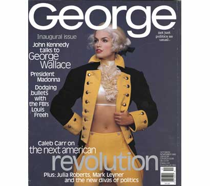
#3 — The powdered-wig-on-a-celebrity device quickly became a hackneyed trope for John F. Kennedy's George, but not as icky (or Oedipal) as the time Drew Barrymore appeared as Marilyn Monroe.
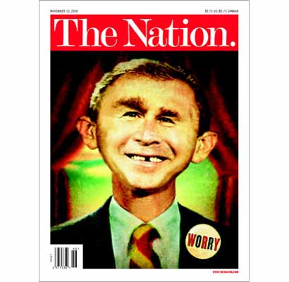
#22 — George W. Bush as Alfred E. Neuman — which is usually a Mad Magazine-ism.
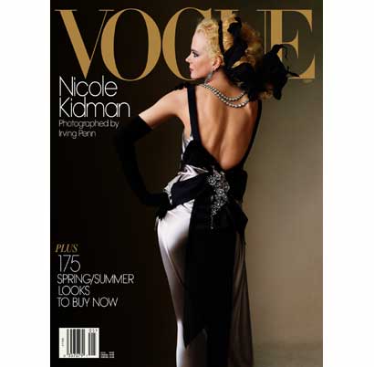
#32 — The important thing about this image isn't that it's Nicole Kidman, but that Irving Penn took the picture. It is elegant not because of the dress nor the pretty girl, but because the editorial staff invested so much desire in the myth of Irving Penn.
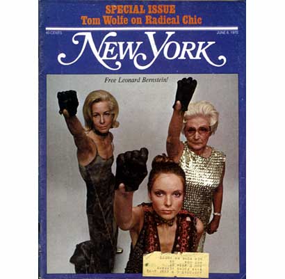
#35 — Here's a bad pastiche of George Lois' work. Frankly, it would have been better to select…
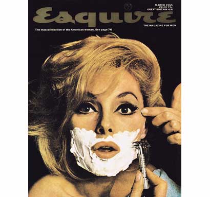
…the real thing. This cover appeared in the very early days of the women's movement and I faintly remember it being copied by a shaving cream ad.
At its best, Surrealism unearths the unconscious with a threatening sexuality; and with its continued presence, one can paraphrase Theodore Sturgeon with confidence: "90% of all Surrealism is crud".
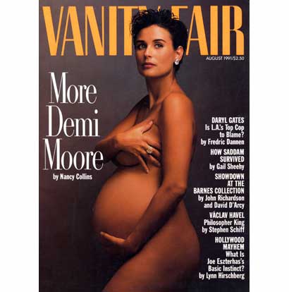
#2 — Granted, this Annie Leibovitz image of a pregnant Demi Moore derails what could have been a mundane erotic photograph into something slightly more shocking. But there still remains a bit of modesty.
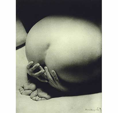
Here's Man Ray's La Priére (Prayer) from 1930 — more sacrilegious, more dangerous…
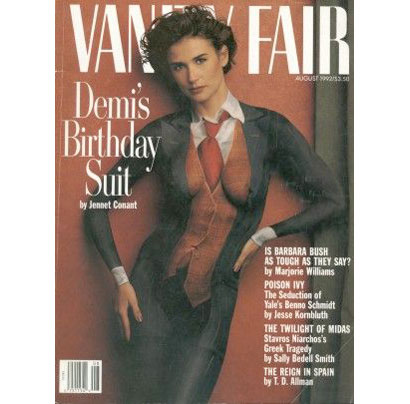
And here's the follow-up image — which appeared after the birth of Moore's daughter. This time, its a direct copy of an earlier series by ex-supermodel Verushka in which her skin was painted in a similar trompe l'oeil fashion.
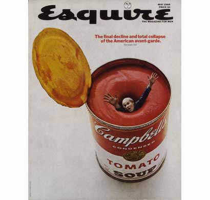
#5 — Andy Warhol drowning in an Andy Warhol soup can.

#11 — Revealing the unseen.
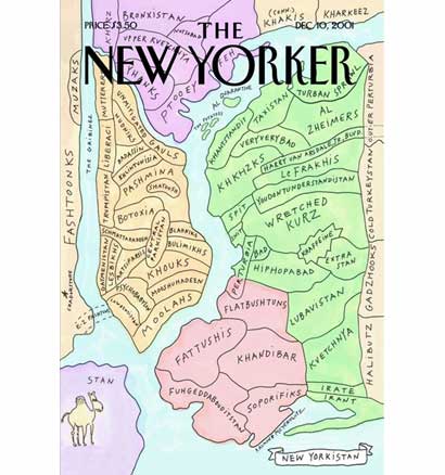
#14 — Unveiling New Yorkers' true feelings about the other boroughs.
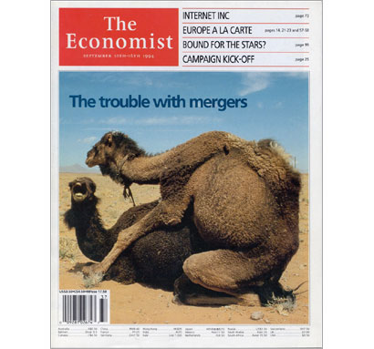
#16 — A surreal image by itself; made petty with the caption.
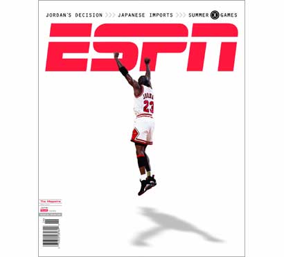
#18 — Michael Jordon removed from the basketball court and transformed into an idealized crucifixion scene. No, I don't get it either. But in a way, it reminds me of Dali.
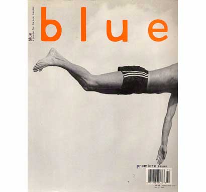
#20 — David Carson's oblique cropping is in the surrealist photographic tradition…

…but he does this kind of thing a lot.
Also, one could make the argument that this issue of Beach Culture had more of an impact in magazine publishing than Blue.

#31 — Proof that there is an inverse relationship between the success of a surreal image and the magazine's circulation. Atrocious.
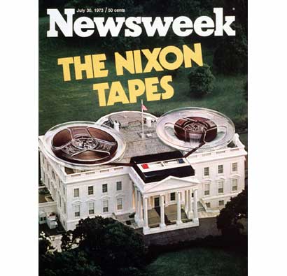
#33 — Equally awful.
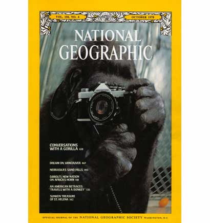
#37 (tie) — And more surrealism which falls short.
Freud stated there are three views into the unconscious: dreams, slips of the tongue (aka parapraxes) and jokes. Dreams and parapraxes lie outside our conscious control; but jokes (or wit) are a conscious method of sublimating the source of fear and anxiety (often originating in aggression or obscenity). Through wit, we diffuse anxiety.
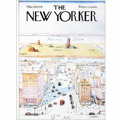
#4 — Saul Steinberg's classic cover for the New Yorker.
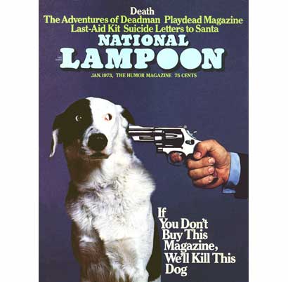
#7
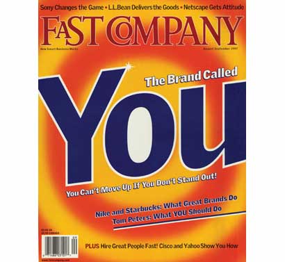
#37 (tie) — There's a lot of nervous laughter to this cover as the subtext whispers "you're disposable… you're a commodity… just like detergent…"
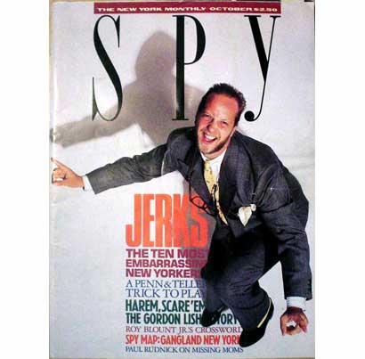
I was surprised that Spy didn't make the cut because…
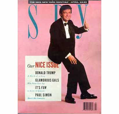
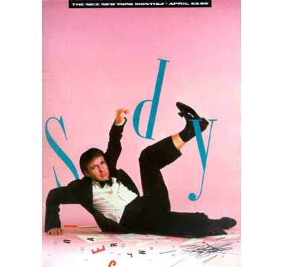
…there certainly was enough to chose from.
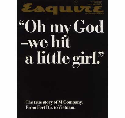
#8 — When restraint is called for, just set some nice type…
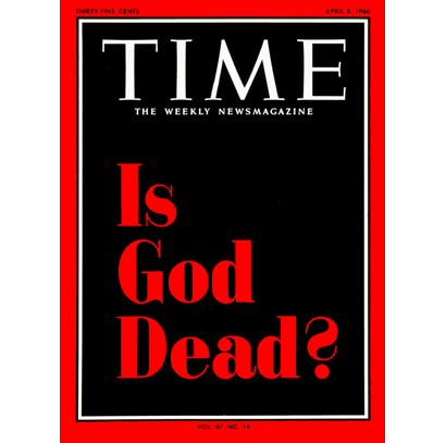
#12 …and when in doubt, do the same.
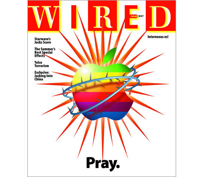
#33 — The theme may be the passion of Apple, but the illustration is more about the rendering than the subject.
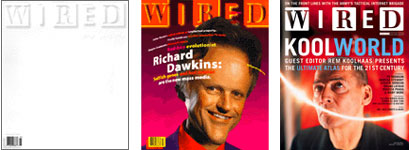
And this is another missed opportunity. Wired certainly played an important role in the promotion of computer-based business and culture, and their covers were often idiosyncratically 'computery'. Here are three, from left: January 1995's white on white issue, an early Photoshop-filtered image from July 1995, and a typical groovy/semi-obscure celebrity from June 2003.
As the ASME list made its way through the media's intestinal tract, it shared the spotlight with a few others:
1. Bernard Goldberg's been plugging his 100 People Who Are Screwing Up America (and Al Franken is #37) from The Daily Show to C-Span's Book TV.
2. The Parents [sic] Television Council released their Top Ten Best and Worst Shows for family viewing on prime time broadcast television — and for lack of "safe" programs, their list of the ten best contained only nine.
3. Jakob Nielson's Alertbox listed the Top Ten Web Design Mistakes of 2005; of which, I've made several in this post. Sorry!
4. Time magazine selected the All-Time 100 Novels.
5. C/Net introduced their Blog 100.
…and so on…
All are basically random, all are self-promotion devices, and all will be forgotten in a couple weeks; because as we all know: fame is fleeting, and getting cheaper every day.
Comments
Excellent tearing-apart Mark. Your alternate choices reveal how easy it is for lists to seem official, final and unbreakable while many great covers are overlooked under the surface for some reason or another which we will never know.
Posted by: Armin | October 26, 2005 09:12 AM
Thanks for this, Mark. I love your quote from Yoga: Immortality and Freedom.
I looked briefly at the list a few days back and was dumbstruck by how the collection of them looked a lot like the average magazine rack. Very few seemed compelling.
It's striking also that there is so very little social commentary or critique in the lot, and so much celebrity clutter.
This whole breast-covering thing ... I find it incredibly weird. If you're going to be photographed naked, be fuckin naked. It's such a bizarre mix of fake-risqué puritanism to expose so much skin while clutching your breasts in terror. Now that really is social commentary.
Just a petty note re ASME: You note that ASME listings are in bold
A pretty girl is like a melody, that haunts you night and day
I really don't think that comma should be there.
Posted by: marian bantjes | October 26, 2005 12:46 PM
> Just a petty note re ASME: You note that ASME listings are in bold
…and they are; as are the archetype categories like this one:
A pretty girl is like a melody, that haunts you night and day
> I really don't think that comma should be there.
That's because you don't recognize the lyric from Irving Berlin.
Posted by: m. kingsley | October 26, 2005 12:56 PM
Ah.
Posted by: marian bantjes | October 26, 2005 01:14 PM
nice work, marky.
you were a little harsh on
those surreal Newsweek covers
but .. love that camel merger
good stuff
Posted by: feelicks sockwl jr | October 26, 2005 05:10 PM
And to bring it together, this lament of magazine covers, by Andrew O'Hagan, via Bill Drentell over at DO.
O'Hagan writes, in part:
Covers used to be the province of art directors, people with talent and wit and a sense of style, but have now become the domain of the moneymen. I think that's a terrible shame. Most covers are not only ugly nowadays, but ugly in exactly the same way.
Indeed.
Posted by: marian bantjes | October 26, 2005 09:16 PM
I think the white-on-white Wired cover was the last magazine cover that, by itself, got me to purchase the issue.
Posted by: Darrel | October 27, 2005 01:17 PM
everybody agrees these lists are arbitrary and more than a little lame. any list of "great magazine covers" that i would produce would probably only include a rare few of the ones selected for this particular list. but then, i tend to represent another world of graphic design that usually gets dismissed by mainstream 'design culture' folks as 'vernacular' (a mean spirited and dismissive term that in itself creates and elitist positioning). i'm sure that the covers i would select would seldom be the covers of time or newsweek or rolling stone. if nothing else, simply because i pay so little attention to those magazines that i have no idea what their covers ever look like.
so, it boils down to exposure? the bigger the magazine, the more it's covers get blasted into our sightlines, the more money it makes, the more "greatest covers" lists it gets included on. that particlular scenario would certainly NOT be my criteria. we all wear blinders in this business.
Posted by: art chantry | October 27, 2005 01:52 PM
Why haven't they just cut to the chase and created a magazine made up entirely of Lists?
I remember in grade school we'd make personal lists of who we thought the cutest girls were.
Posted by: Jimm | October 27, 2005 02:39 PM
Jimm, such a magazine does exist. It's called "List"
http://www.listmag.com/
Posted by: Dilettante | October 27, 2005 03:32 PM
I just really hate these types of "definitive" lists. It seems like every other issue of Rolling Stone magazine I see on the newstand is another "200 greatest blah blah blah" special edition. I'm not exactly sure what it is about these lists that iritate me — they all just seem like attempts by baby boomers to congratulate each other on how the culture of their generation was the high point in world history. I imagine that the people who like these types of lists all have those horrible drawings of dead rock stars jamming together in heaven hanging on their walls.
Posted by: David E. | October 27, 2005 05:34 PM
It seems like every other issue of Rolling Stone magazine I see on the newstand is another "200 greatest blah blah blah" special edition.
I have read British “Music” “Journal” Q since 1986 and it has, in the last 18 months boarded the slippery slop that is listism, and to be honest, I don’t know of a music mag that doesn’t anymore. (It’s either that or another Kurt Cobain regurgitation piece). I think it was Brian Eno who made the observation that, as nothing new seems to be emerging from our culture, we choose/are forced to simply re-arrange and re-order what has gone before. Culture has become the domain of the curator. He cited Moby as the ultimate proponent of this phenomenon.
Posted by: chris dixon | October 27, 2005 08:56 PM
People have been complaining about this "list" thing since at least the late seventies. As someone who has worked on magazines in the past, I'll give you a clue: It's an easy way to fill an issue. Every time I see "THE 100 BEST..." on the cover of a magazine, I think, there's one issue I won't need to read.
Posted by: Mark Simonson | November 6, 2005 12:07 AM