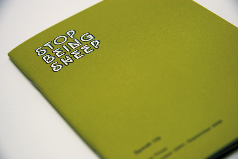
Stop Being Sheep, Volumes 2 & 3
Two years ago we eagerly put Speak Up's first ever publication, Stop Being Sheep, on the "market" celebrating its first year anniversary. Somehow, printing 2,000 of these little buggers made Speak Up very real, permanent and somewhat scary. Broken loose from the confines and ephemerity of the internet — and, well, into the confines and ephemerity of paper — the comments chosen for inclusion in the first Sheepie seemed to have a new air of longevity, sitting in the bookshelves of designers around the world, or in wastebaskets around the world — either way: out there. This fall, it is our pleasure to unleash two volumes of quintessential Speak Up dialog — in all its seriousness, silliness, foolishness and hopefulness — on you.
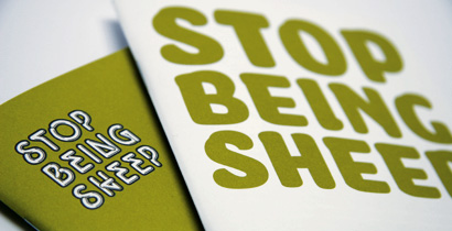
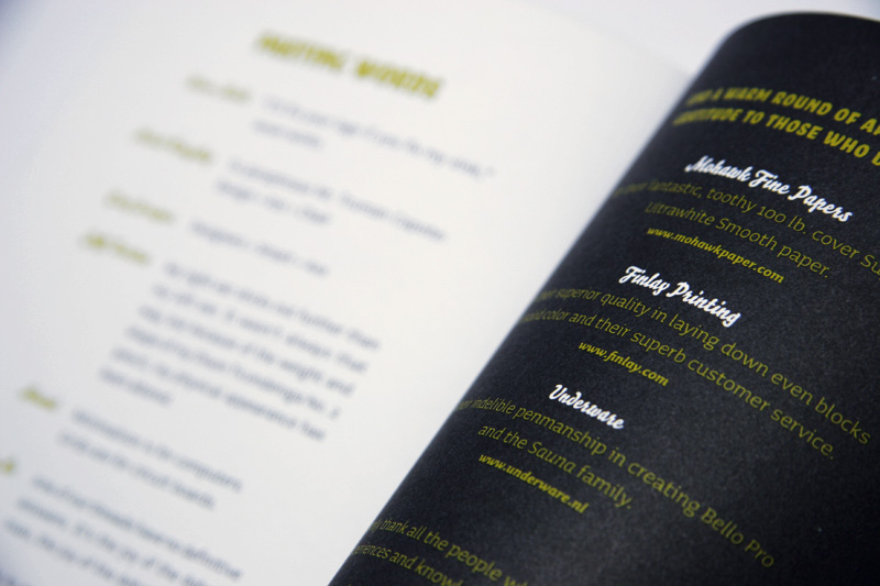
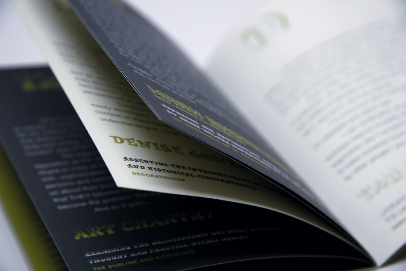
More than six months in the making, Stop Being Sheep — years two (’03-’04) and three (’04-’05) — bring together the best commentary of Speak Up from the last two years. Painfully edited, after scouring over more than 13,000 comments, the results are a couple of twenty-eight page, two-color, 4.5" x 6.5" cuties. Thanks to Mohawk Fine Papers generous contribution, Sheepies are printed on their deliciously white Mohawk Superfine line. And if the paper were not enough to make you want to nurture them, PMSs 612 and 432 have been evenly laid out by Finlay Printing.
Last year, we took donations starting at $1.00 for a copy of Stop Being Sheep. This year, we are selling them for a flat $6.00 or both Sheepies for $10.00 plus $1.00 for shipping and handling ($3.00 for anywhere outside the U.S.). If you would like to own a copy (or copies) of Stop Being Sheep please make a selection from one of the following options:
Buttons for U.S. orders only
Buttons for orders for the rest of the world only
Please allow a few days for delivery as we hand-package and hand-ship (with lots of love) each copy.
Your contributions help support Speak Up and its non-stop delivery of hearty design dialog.
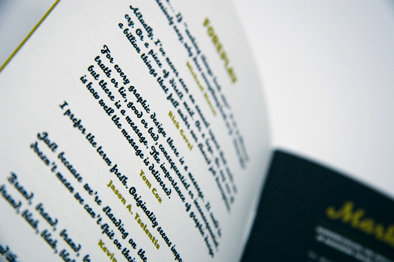
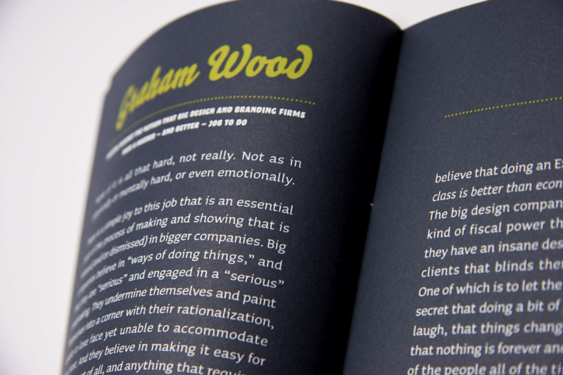
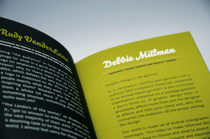
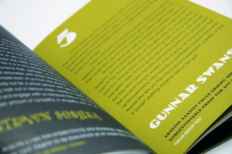
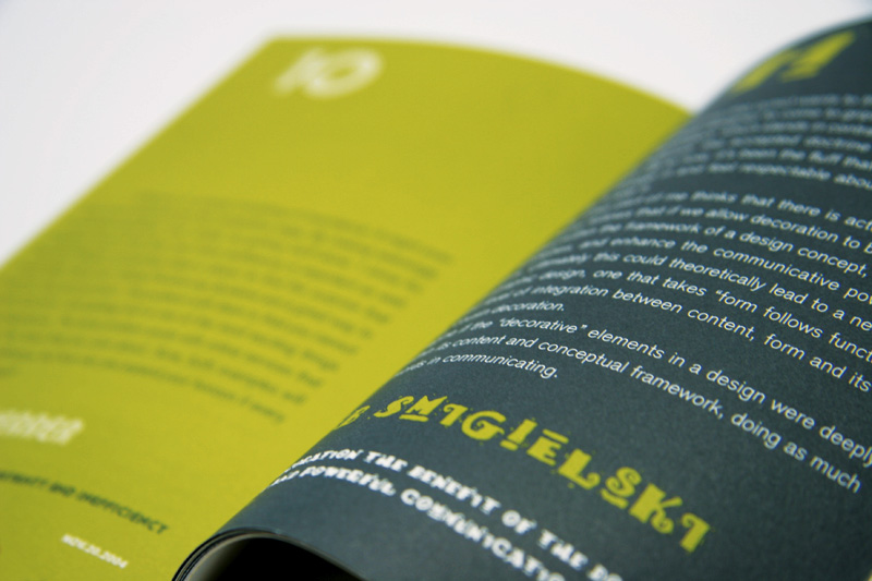
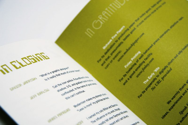
Some pictures to convince you:
(Click on each image for larger view)


Comments
Hellsyeah! I cannot wait to get my hands on these two little ones! Great job and keep it up Armin!
Posted by: Justin Goodlett | September 23, 2005 11:06 AM
How does the song go?
"...gonna buy five copies for my mother!"
Posted by: Daniel Green | September 23, 2005 11:13 AM
Baaaaah.
Oh, I mean, can't wait to get mine!
I love the Letraset frenzy on vo.l 3. Groovy!
Posted by: JonSel | September 23, 2005 11:29 AM
I've got mine right here... They's beautiful.
Now I just need to come up with something witty to say in the next year so I can be included in vol. 4.
Posted by: Alan | September 23, 2005 12:00 PM
They look absolutely stunning. Can't wait to get mine!
Posted by: Neil | September 23, 2005 12:15 PM
Yikes! I thought the use of Image Club's Fajita died out in the late nineties... Let me apologize up front to all the designers who were forced to design a menu or identity for a Mexican restaurant (or similarly Latin American influenced commercial venture) using this typeface. I am truly sorry for ever bringing that font to market. Really, I am.
Posted by: Grant Hutchinson | September 23, 2005 01:09 PM
I am not sorry at all Grant, otherwise you would not have such a beautiful piece on your desk right now that exemplifies the best of the crop.
Posted by: Bryony | September 23, 2005 01:52 PM
Chopstick font.
Armin, you fucker — you had to do it, didn't you?
Other than that one, they are beautiful. Good job.
Posted by: Tan | September 23, 2005 02:11 PM
Pesky wants to know if he's disqualified from getting a copy because his postal address is under water? Again.
Posted by: Paeky Illustrator | September 23, 2005 07:43 PM
The preview snaps look lovely -- can't wait to flip through it!
Posted by: gregor | September 23, 2005 11:50 PM
Classy effort. Thanks.
hhp
Posted by: Hrant | September 26, 2005 12:30 AM
Hey Fam:
Among other things I've got some catching up to do busy weekend.
I received mine Friday; just opened it now.
Beautiful, a Labor of love.
Many thanks for including me among such Heavy Weights and Giants in our Profession.
If I have my way they would be included in AIGA 50 Books.
More importantly, these Gems are Marvels of Typographic Virtuosity.
I haven't seen Sinaloa used in years.
Extremely Appropo. Of course you GUYS are aware the Face was Designed by the World's Greatest Female Designer, Rose Marie Tissi.
You Got to Get Up Eary in the Morning to Pull one over on OLE Mav...
DM
P.S. What's Weinberger GOT UP HIS SLEEVE??? Should be interesting to SAY THE LEAST!!!!
Posted by: DesignMaven | September 26, 2005 01:45 AM
BTW, if anybody would like to sell (or barter - I have some possibly interesting things) a copy of SBSh #1, please let me know.
hrant_thatsymbol_inverselogic_dot_com
hhp
Posted by: Hrant | September 27, 2005 12:14 PM
Rabidly anticipating the arrival of SBS2+3. Excitement is in the air, and I'm eating as much of it as possible.
Posted by: ben... | September 28, 2005 12:46 PM
I must say the penmenship on the address part of the envelope containing my two new sheepies is excellent. If I could write like that I would be a rich man! Anyways, thanks for two more awesome books to add to my collection, and yes, I'm reading them. You guys are awesome!
Posted by: ben... | October 1, 2005 09:35 PM
It's come to our attention that some Sheepies (Vol. 3) are deffective, with bad printing (white type on gray background is unreadable and white pages have gray streaks) on pages 4-5 and 8-9, if you have purchased a Sheepie with this problem, please let us know and we will replace your misprinted Sheepie.
Posted by: Armin | October 3, 2005 10:57 AM
Were those quoted receiving these or should we purchase them ourselves? I'm OK either way...I just didn't need multiple copies...
Posted by: Darrel | October 5, 2005 01:56 PM
Darrel, you should be receiven yours any day (or should of by now). Send me an email with your current address and I will double check that I sent it there.
Posted by: Bryony | October 5, 2005 02:18 PM
I just got mine... thank you so much! These are really neat. I am enjoying reading them. I might get a couple more copies to give to friends!
Posted by: Megan | October 17, 2005 12:36 AM
Beautiful stuff. Good job.
Posted by: Gratis Flirten | February 3, 2006 06:28 PM