To Shop or Not To Shop
The Gap Inc. has been busy. So busy that they have lost millions they could have earned online through The Gap, Old Navy and Banana Republic. How much they are not saying, but the sites have been down for an average of two weeks. They don’t seem to mind, actually they sound pretty excited about it.
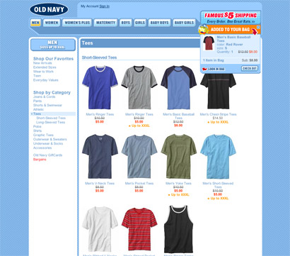
It turns out that they are reinventing the ways of online retail, the customer experience and managing to better replicate the in-store browsing style better than ever before (by anyone). Now, I will let you be the judge of that, and today the only site that is working in this manner is Old Navy, for which I am showing you some examples that “illustrate” the new way:
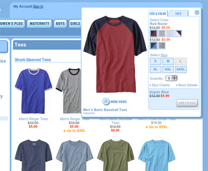
The main thing is the elimination of excess clicks. It is no longer necessary to click on an item to receive all the information - you need just to roll over.
It all starts rather simple and usual. You select the category you wish to browse, as you would in a store. Say, the t-shirt rack.
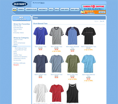
A quick scan and you identify something you like and could potentially purchase. You (roll over it) take a closer look, you touch the fabric.
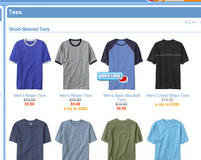
You decide to pick it up (click on it). You like. A quick glance (mousing over) and you can see what sizes, colors and styules are available, without having to pick each one up (or making multiple clicks).
Darn, no aspen blue.
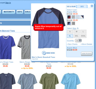
In the end, each item you place in your basket gives you a tiny window with a couple options, and your retail experience is not interrupted by the annoying page showing you how much you are carrying, reminding you that your arm is getting tired, and that you can now check out or continue walking around.
The other interesting part in all of this is that the job was done in house. Writing their own software for all major behind-the-scenes features and systems, while contracting back-office programs. This means that they are the only ones with the information (at least for now). But do they have enough information to handle all of the pending bugs and problems?
I have to admit it is nice to skip the pop-up windows with additional information, color selections, styles, etc. The fact that I am not forced to select between checking out and continue shopping every time I add an item is a plus. Less clicking is indeed more efficient. I am looking forward to the launch of Banana and Gap to see exactly how those are working and if there are any bugs to be uncovered.
Comments
It turns out that they are reinventing the ways of online retail
They haven't reinvented anything other than the ability to convince the NYTimes that this is something special.
I'm all for better user experiences, but the Gap is doing nothing new. They're just borrowing bits and pieces from systems that have been around for years.
That said, the in-house aspect is a new thing, and nice to see some companies finally 'getting' the fact that 'enterprise level web software' from commercial vendors usually is overpriced and, well, sucks.
Posted by: Darrel | September 13, 2005 10:27 AM
I believe Ms. Youngblood (ex Landorian) is over at BR so it will be interesting to follow that branding madness. I just finished working with Old Navy (freelancers) on some internal materials and it was exactly that.
I wish everything - sales transactions/ returns- could be dealt
with online- without the hastle of snaking customer svs lines.
Posted by: feelicks sockwl jr | September 13, 2005 10:28 AM
a couple articles on the subject:
Gap closes online sites for repairs
The New York Times
Posted by: Bryony | September 13, 2005 10:47 AM
To give them some credit, what they've done is implemented AJAX to allow the addition of items to the cart without having to force a page reload. This isn't terribly innovative, but it is nice if you are shopping for several items. Alas, they did it in a obtrusive way, rather than unobtrusive, so one must have javascript to use the site...which certainly seems like a step backwards to me.
Posted by: Darrel | September 13, 2005 10:54 AM
OldNavy.com is down, as is Gap.com. BananaRepublic works for me, but is severely broken in lots of places with OS X - Safari. I'm underwhelmed on so many levels.
Posted by: James Song | September 13, 2005 12:24 PM
Gap.com is actually open to a few in what appears to be a random selection. I visited and was allowed into the new site, with a message telling me that I was one of a limited number of visitors.
Features at gap.com are identical to those described here.
Posted by: Jon | September 13, 2005 01:13 PM
Jon-
mee too! I feel oh so lucky. They have reinvented nothing as far as the UI goes. Took me three clicks to get to a shirt. Hows that different from target.com?
I'm sure though there are some back end goodies that are probably quite innovative but no one is going to see those so I really cant comment on that.
It is good that they are bringing it in house as Darrel had said but something truly innovative would have been to select the clothes for me so I dont have to rack my brain on which delight stripe shirt will cover up my increasing girth the best.
Posted by: fatknuckle | September 13, 2005 02:02 PM
just click enough times on all the links and you'll get in (it's just a random selection).
they've not reinvented anything, but it seem very well crafted, very smooth and the ajax stuff fits without disrupting expectations... that is, if you have javascript enabled.
Posted by: manuel | September 13, 2005 02:27 PM
Thats what a good PR person can do for you. Create buzz about nothing substantial.
Heres an example i would like to see:
I'm munching on a chili dog before the most important client presentation of my life. As murphy's law dictates I spill my urban delicacy on my freshly pressed shirt. Don't have time to run to the office for a fresh shirt, I dial up br.com on my celly, browse for a fancy shirt order it, pay for it all on my phone and then swing in to a store to pick it up they only thing I need to present is a a conf # and id and Im out the door. No need to browse, wait in line or hassle.
That, to me would be the ultimate user experience.
Posted by: fatknuckle | September 13, 2005 02:46 PM
Thats what a good PR person can do for you. Create buzz about nothing substantial.
I have to agree.
And while the sites are still not up and running as they should, sometimes letting you in and other not, from the point of view of someone who does not really know how things work behind-the-scenes-in-online-retail, this is a good thing. I don’t think they are reinventing code/script or programming details, in as much as finding a way to marry the in-store and the online retail experience. Finding ways in which browsing online is very much like browsing in the store.
Posted by: Bryony | September 13, 2005 02:59 PM
Finding ways in which browsing online is very much like browsing in the store.
This is a dated concept that never really turns out as well as it sounds.
People shop in stores because they like shopping in stores. People shop online because they like shopping online. Certainly there are similarities, but there are also differences. Attempting to make both experiences one and the same sounds good, but isn't.
I think the 'make it more like shopping in the store' was a more of a creation of the PR fluff than necessarily a specific goal of the development team.
Posted by: Darrel | September 13, 2005 03:35 PM
Yipes! Many errors in Firefox and IE, preventing me from even seeing the basic layout correctly. It's almost totally non-functional. How'd you even get these screenshots?
Posted by: Andrew | September 13, 2005 06:06 PM
What is very clear here is that, indeed, the technology isn’t new, it’s been brooding in developer and programmers’ hands for some time and, most likely, it has been implemented in some cool web sites that, possibly, Darrel and fatknuckle have seen — hence, the claim that this is old news. However, this is a typical case where a large brand takes something that designers (or programmers in this case) are very familiar with and have seen it in more obscure settings and deploy to the unsuspecting masses — people who will likely have never heard of AJAX, Ruby or PHP and are happily rewarded by a bit of code that makes nice pop ups come up when they roll over a t-shirt. Is this the mainstreafication of code? Isn’t this what we all creatives hope for? That our efforts are appreciated by a larger crowd?
You also have to remember how hard it is for companies like these to embrace the latest technologies. It’s usually a pretty big deal when they manage to get something that is innovative... Or, at least, innovative to the hundreds of thousands of their target audience who have never seen stuff like this.
Posted by: Armin | September 13, 2005 11:04 PM
Maybe its because im browsing this at 12 in the morning but i don't see any significant errors in Firefox.
Plus all the sites work great.
Maybe its not innovative, but lately being a pretty consistent web browser, I have not seen a UI that has blown my mind.
Anything i should look at?
Posted by: Josh | September 14, 2005 01:18 AM
What is very clear here is that, indeed, the technology isn’t new, it’s been brooding in developer and programmers’ hands for some time and, most likely, it has been implemented in some cool web sites that, possibly, Darrel and fatknuckle have seen — hence, the claim that this is old news. However, this is a typical case where a large brand takes something that designers (or programmers in this case) are very familiar with and have seen it in more obscure settings and deploy to the unsuspecting masses — people who will likely have never heard of AJAX, Ruby or PHP and are happily rewarded by a bit of code that makes nice pop ups come up when they roll over a t-shirt. Is this the mainstreafication of code? Isn’t this what we all creatives hope for? That our efforts are appreciated by a larger crowd?
You also have to remember how hard it is for companies like these to embrace the latest technologies. It’s usually a pretty big deal when they manage to get something that is innovative... Or, at least, innovative to the hundreds of thousands of their target audience who have never seen stuff like this.
Posted by: Armin | September 14, 2005 07:06 AM
Sorry to correct you, but it's just "Gap Inc."
"The Gap" is a store, and it's not even technically called "The Gap." Consumers have done that!
Posted by: Rhonda | September 14, 2005 10:21 AM
I didn't realize that designers and programmers were following or interested in the redesign of Gap. Or even that newspapers were actually printing articles about it. I work at Gap, and I have to agree with the New York times article... customers would leave our store angry and agitated because we couldn't order that one perfect pair of jeans for them. Gap definitely didn't minimize customer inconvenience.
Its nice to see that Gap is taking an interest in the online shopping experience, though. I hate Express's website. Its a waste of online space because you can't even order from them.
Posted by: jen | September 14, 2005 08:36 PM
Beyond the redesign issues which can be argued either way (Good? Bad? Boring? Boing Boing) what is truly amazing is how much you guys spent on it when all of the associative costs are figured in.
At $10M a week, 2 weeks seems like a long time to be down and "working out the kinks." That basically makes it >$20M development project, Yowza.
Now I see why you all did it in house. Try cutting that 30% deposit check without fainting.
Posted by: fatknuckle | September 14, 2005 10:49 PM
At $10M a week, 2 weeks seems like a long time to be down and "working out the kinks." That basically makes it >$20M development project, Yowza.
Not really. If they are truly 'reinventing' the experience (which they're not, but I digress) then, in theory, they'd make that money back in a better shopping experience for users when they launch.
Though I have no idea why they had to shut the sites down for two weeks. Maybe they're thinking TOO brick-and-mortar-like and thought that they had to lock the doors to remodel.
Posted by: Darrel | September 15, 2005 09:51 AM
Though I have no idea why they had to shut the sites down for two weeks.
It's called PR.
Posted by: JonSel | September 15, 2005 11:39 AM