Recent Rebrandings 6: Mergers
This installment of Recent Rebrandings covers a few recent mergers.

Glu


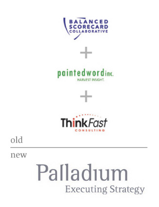
Palladium

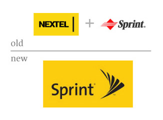
Sprint
I know we kinda covered this, but I dislike this mark so much, I had to see it again. Armin likes it, for whatever that's worth.
« Quipsologies
~ Vol. 19 ~ |
Main
| AIGA LA › Collaboration Series 3 - IDEO »
This installment of Recent Rebrandings covers a few recent mergers.

Glu


Palladium


Sprint
I know we kinda covered this, but I dislike this mark so much, I had to see it again. Armin likes it, for whatever that's worth.

Comments
I'm in an aesthetic mood today, so screw strategy.
1. I have no idea what these people do. But I like the little space alien. I hope they have a fairly young target, because I don't see many lawyers using this. Didn't Geocities try the 'g' character 5+ years ago before they were bought by Yahoo?
2. Rotis? That's still available? I like the idea of the serifs on the top of the l's pointing towards each other, but it's so subtle that nobody (of consequence) will ever notice it. And all the other serifs just distract. I suppose I should at least be thankful that there are no swooshes.
3. What do you dislike about this, David? I think it's a fairly nice representation of movement and direction.
Posted by: JonSel | July 6, 2005 09:53 AM
3. Sprint: I'm not crazy about this one either. There is too much disconnect between the type and the mark, plus it looks very similar to the Amtrak mark.
Posted by: Dan McGorry | July 6, 2005 10:05 AM
What do you dislike about this, David?
A few things.
First is that this mark screams "design recycling" to me. Jon, remember being in crits and pages of random "cool stuff" would go up on the wall? Not locked up with type, just 50 shapes run through KPT Vector Effects. That's what this looks like to me. If I am wrong, I am sorry, but this one looks like it has been used for other projects before.
The second thing is reproduction. I know, I'm the one always arguing against the "Logos have to work in black and white" rule. But, I am a firm believer that major consumer or audience touchpoints should help drive design. If your company's main business is Fax solicitations, your logo better work in black and white. If your main touchpoint is the web, than feel free to use a 20 color logo. So, Sprint. We are looking at this two inches wide and I can't tell if the ends of the shapes are touching or not. Are they supposed to? This logo will need to be reproduced on cell phones at 3/4 of an inch and on screens at the same size. The old Sprint didn't do it well. Nextel seemed like that was part of the design brief. If this was my project, it would be as well.
I also think the name should be bigger in relation to the mark. When your dealing with cell phones, often you have very limited spaces where logos can go. There are overlapping finishes and surfaces and manufacturer logos all fighting for space. The awkward footprint that this mark has will force it to be fairly small and the name is only half of that height.
Posted by: David Weinberger | July 6, 2005 10:23 AM
The second thing is reproduction.
David, you should know that there are logo representations created to be produced at varying sizes. I'm sure there's a version of this that works quite well small and molded out of plastic. If not, well, then they screwed up. But I'll give Lippincott the benefit of the doubt.
As far as on-screen repro goes, nothing looks good on a cell phone screen. Not Verizon's logo, not even Nextel's. Curves and angled lines are simply not handled successfully on low-pixel screens. And while this is a major application, it's also the lowest possible denominator of reproduction, and I'd never have that drive my final logo design.
Posted by: JonSel | July 6, 2005 10:33 AM
> Armin likes it, for whatever that’s worth.
$39.99. Pay up.
> I can't tell if the ends of the shapes are touching or not. Are they supposed to? This logo will need to be reproduced on cell phones at 3/4 of an inch and on screens at the same size.
Dave, I find it incredible that you are arguing for reproduction. Extremely ironic.
There is a huge, HUGE sign stapled on to a building right on the criss-cross of Broadway and 5th for Nextel. I assume Sprint will have applications, like this, of their logo where the space between the end of the shapes will be the size of your head — I'm not implying that you have a big head, just using it as a measurement metaphor. As far as reproduction on cell phone screens, they are very low resolution, it is expected that they will not look perfect. Cingular's logo is one of the most simple shaped logos and it still looks like shit on a cell phone.
Ludicrous, Dave. Ludicrous!!!
And for discussion purposes, I argued in favor of this mark in its solution for merging to extremely different identities and coming up with a somewhat cohesive solution that retains something from each one. So I don't like it-like it, I think it's OK. In other words: It could have been worse.
Posted by: Armin | July 6, 2005 10:45 AM
well, for sure UnBeige do not like new Sprint logo as well.
Posted by: Plamen | July 6, 2005 11:00 AM
Armin,
I'm with you on the Sprint identity. It's definately not my favorite thing in the world, but giving consideration to the two vastly different identities being merged, i think it was an appropriate solution. Even in the case of repoduction on cell phone screens, I think we all know how fast the technology is moving forward, the 'low-res' screen is soon to be a thing of the past -- especially with the advent of the 'camera phone'.
Although, I will agree with David on the symbol signature size relationship. The symbol could easily be 20% smaller -- if not more.
Posted by: Kyle Hildebrant | July 6, 2005 01:01 PM
All i have to say is that anyone who has "Executing Strategy" as part of their name, or as a tagline so big it looks like part of their name, should be dragged out into the street and shot.
What is "executing strategy"? or rather, what isn't executing strategy? I like to think that what they do is strategize executions, in which case I think the logo should be darker; maybe have a little black hood.
Posted by: marian bantjes | July 6, 2005 01:05 PM
The only thing taht bothers me about the Sprint logo is the mark is so much taller than the name. If the Sprint was a little larger (or the mark smaller), not that it has to be even with the mark, just a little closer to the difference between the NEXTEL and the line. Too much height between them.
Posted by: Adrian Repasch | July 6, 2005 01:10 PM
Marian, you always cut right to the chase and I love it. I think a logo with a little black hood would be fantastic. It'd win my rebranding of the year award (were I to give one out).
Posted by: JonSel | July 6, 2005 01:14 PM
Marian,
If you don’t have an Executing Strategy then what happens when the electric chair shorts out or the lethal injection is the guy’s idea of recreational drugs? If you’re going to do capital punishment you have to do it right or the PR problems will be deadly.
Posted by: Gunnar Swanson | July 6, 2005 01:51 PM
The question is, can i hire them to strategize their own execution? .. as my own methods are admittedly a bit barbaric.
Posted by: marian bantjes | July 6, 2005 02:50 PM
I wouldn't care if the "sprint" text and icon were so far apart if they just interacted with each other. At least with the old logo, the italisized font kept up with the motion on the icon... here it's like "Sprint" is just standing there as this swoosh (and it really is just another swoosh) is flying by.
And I agree that the serifs in the Palladium logo are distracting. The "L" serifs were cool for a second but overall, it's not a logo, it's a font. Very boring.
The "Glu" name just doesn't seem to be very well thought out. It's like they were sitting around trying to think of something "cool" and just made the concept fit.
Posted by: Jennifer | July 6, 2005 03:24 PM
About the Sprint mark, from the inside: A good friend of mine works on the Sprint account at Euro RSCG and saw & was playing with the new mark before it was made public. He was fairly shocked at them getting rid of the PMS 485, but when I said it might have been a bad move, he pointed out that Verizon & CellularOne & a couple others all have red identities. Still, a major shock to the eyes. I'm curious to see how they work with the colors, since my friend said the new color guidelines are crazy-strict.
He also said that this mark was supposed to have a lowercase S, but that got changed somewhere very close to the end of the process... I don't know if someone finally saw the strange size relationship and saw that would make it even worse.
And they're already having headaches trying to reduce that thing to small sizes; cell phone screens aside, there are the print applications, e.g. on your monthly bill & collateral. Apparently they didn't make a version that works well small and molded out of plastic. :)
Posted by: Sonyl | July 6, 2005 03:31 PM
re: Sprint, I don't have much of a problem with the mark. My issue is with that damned Nextel yellow. It's always screamed "caution!" to me, and somehow it's been amplified with the new treatment.
Posted by: Alan | July 6, 2005 05:11 PM
I really don't like the � and � symbols on the Sprint logo. Usually the trademark symbol is sufficient. Legal issues, I know, but it sticks out like a sore thumb to me.
I must admit that I saw this a couple weeks ago for the first time and stared at it for a while trying to decide if it was two different marks displayed side-by-side, or if the entire image was the logo. I like the symbol, but think that the type should be a bit bigger and the two marks could be closer. Maybe in the future, the symbol can be used by itself, without the logotype, to identify the brand when it needs to be used at smaller sizes.
Posted by: Danny | July 6, 2005 06:13 PM
I'd say Glu pretty much sums up anyone whose eyes have become radioactive from too much life on their gadgets and falls prey to being, well, kinda ugly-- but it's not the mark's design -- it's the pallete. Change the pallete and it works nicely.
Sprint: take a pice of paper and cover the s and the fanned pin drop and it looks uncomfortably too close to that magazine many of us hold dear.....
What's interesting in these is no single rebranding here calls to mind the companies that mergered, leveraging prior identities or aquired companies.
Posted by: gregor | July 6, 2005 09:46 PM
Glu rocks.
Maybe I'm old fashioned, but I have a problem with "i"s that aren't dotted. (Pallad?um.) It's rather like the all-lower-case thing, too, in that you don't know where to draw the line in applying it: the slogan is in the same face, but it's inconsistent -- the "i" there has kept its dot.
At least it's not as bad as the Securicor logo, where it looks like the dot has been stolen.
Sprint is interesting, it has a bit of a 1950s vibe, with the delta-wing shape, and also a kind of Asian feel, with it's complex geometry. Also a bit of Mareyish "stop-motion", and the suggestion of a beating wing. All that compressed into one clean symbol, must be good.
Posted by: Nick Shinn | July 7, 2005 07:19 AM
NIck: Glu rocks. How so? It rocks in the sense of Little Richard, psychedlic, glam, punk, post-punk, or what?
Come on now and fess up so we can situate just how old fashion you are in relationship to the Palladium brand. (That undotted i doesn't work for me either.)
Personally I think Glu dances to a single drum beat generated from a Roland SRX.
Posted by: gregor | July 7, 2005 09:33 AM
I must agree with Armin on the issue of the Sprint mark. Mergers are soiled with politics, and the fact that a mark so simple came out of this is astounding. While not a mark I am in love with, it doesn't offend me.
I am concerned, however, that it may not be timeless enough. The typography is of a popular genre, similar to that used in the UPS rebranding, all having an extremely European vibe. (competition with T mobile?)
Reproduction and applications.. now thats another can of worms...
Posted by: Eric Janssen Strohl | July 7, 2005 09:50 AM
Like everyone, I like Glu and I'm glad to see that a merger didn't yield another giraffe-with-wings logo.
Palladium... oy vey. Stop it with the Rotis, people. And that grey plus the staggeringly bland tagline? Man, it's like they were going for Helvetica but didn't want to use Helvetica. Trying saying less with that 'logo'. I hope the client is happy with it, but that would assume the client isn't devoid of emotion.
I agree with Eric and Armin that Sprint came out of the deal with a decent and simple logo, but I agree with some of the naysayers: it seems too familar. It evokes a million other companies and industries in my mind, because I swear I've seen it before. But Sprint's huge (even more so now), so in no time we'll all associate it with Sprint. I like the pin-drop concept, but wish it had more unique personality (as much as I wish anything on Sprint's behalf).
Posted by: Chris Rugen | July 7, 2005 10:13 AM
>Glu rocks. How so?
Er, I mean I kinda like it, eh?
The best rockin' recently was the Floyd reunion at Live8. They played music, while everyone else was just performing.
But Glu, more rocks like Squarepusher.
Posted by: Nick Shinn | July 7, 2005 10:39 AM
Er, I mean I kinda like it, eh?
yup, I know that's what it means, just having a bit of fun in the wee hours of my morning...... lol, now we all know you're music tastes :)
Posted by: gregor | July 7, 2005 10:52 AM
That new Sprint mark is freaky, but I love it in a Amsterdam Airport way.
Posted by: Tselentis | July 7, 2005 12:23 PM
My gosh, sprint is no longer a red brand! When they were a client we had too many red brands and one of my designers kept seeing nothing but red...
The new sprint reminds me of an 80s arcade computer game called Qix, which was a risk management game in which you avoided an enemy that flitted around the screen and looked just like the new sprint logo...
Posted by: Kevin Steele | July 7, 2005 03:31 PM
glu is kind of fun. In an '80s video game kind of way, but still fun.
I'm unable to register any strong feelings about Palladium, though. (:
I rather like the new Sprint mark -- well, I'm not too sure about the fan. As has been said, it ought to be closer to the word and maybe smaller, or the word should be bigger.
As for the typeface -- I've been a fan of de Groot's TheSans family for a long time. I was tickled when AOL began using it over the last year (nb: they syndicate our site for much of AOL Autos [and since we had a slew of custom graphics to put together, I got to play with all of the TheSans family]) and GM's using it on all the messaging for their "Employee Discount for Everyone" program.
I'm with Alan on the yellow though; I find myself always pausing, even for a brief second, when I come across any Nextel adverts.
Posted by: .sara | July 7, 2005 06:22 PM
The thing you're looking at (in this case a logo) is not a design, it is the result of design. What was produce is less important that how and why it was produced, facts which few of us are privy to.
With that in mind, conversations like these are essentially useless, aren't they? What are we going to learn from these discussions of form, besides who does and who does not like yellow?
Posted by: CCHS | July 7, 2005 11:16 PM
The thing you're looking at (in this case a logo) is not a design, it is the result of design.
It's a design and the result of the process of designing.
With that in mind, conversations like these are essentially useless, aren't they?
depends on what you want out of it. not liking yellow isn't the point, I would say, but how the pallete conveys the brand in what's the result of the process - the design.
Posted by: gregor | July 8, 2005 12:50 AM
i like sprint+nextel; it means nextel's ugly print advertising might grow some less ham-fisted typography. it also gets rid of that hideous sprint logo. i don't know what it is about mobile companies that breeds hideous marks, but this was one of the worst (and with that said, i'm hoping u.s. cellular is next).
so if nextel and sprint are merging, does anyone have any idea what's going on with boost mobile? their TV ads with the senior citizens are some of my favorites.
Posted by: pk | July 8, 2005 07:07 AM
With that in mind, conversations like these are essentially useless, aren't they? What are we going to learn from these discussions of form, besides who does and who does not like yellow?
Quite the contrary Chris, there is a lot to learn from formal critiques. Conversations around how to lock a symbol up to a logotype and their size relationships are pretty educational. The issues that everyone are pointing out are valuable lessons in graphic design. Wondering why or why not to use a dot on the "I" in a logotype. Reproduction at small sizes. The size of a tagline. How and where a mark will be used. These are all legitimate conversations.
Palladium is a FutureBrand mark. I too dislike Rotis as a face but there are a few smart things happening here to notice. The most important is that this is a new name and although it is always tempting to design a symbol, wordmarks go a long way for educating people to the new name. I also like the subtle arch that is happening between the L's, which is an obvious nod to Palladio, the architect.
Jon, you are right, GeoCities did have a G character, but as Tony Spaeth points out, it wasn't original then, either.
Posted by: David Weinberger | July 8, 2005 09:52 AM
The most important is that this is a new name and although it is always tempting to design a symbol, wordmarks go a long way for educating people to the new name.
I agree that a wordmark can be very effective especially in this case. But it looks like someone just typed it all out -- including the tag line -- in a font and then flipped the "l". There just isn't anything engaging about the type. I think the mistake was in using the same font for the tag line. With it all the same, the wordmark doesn't look special.
Posted by: Jennifer | July 8, 2005 10:30 AM
Yes, David, formal critiques are valuable, no question. Forgive my hyperbole. I just think that the bigger story in these particular examples is the strategy behind them. We are in a thread entitled,"Recent Rebrandings: Mergers" where one would expect the conversation to focus more on issues of brand strategy, design as a tool for managing merging corporate cultures, etc.
Perhaps its time for Logo Smackdown, Part Trois...
Posted by: CCHS | July 8, 2005 11:36 AM
the bigger story in these particular examples is the strategy behind them.
Christopher, you are right about strategy vs. form. I'll take a little of the blame, as I started right off critiquing the actual designs and ignoring the backstories. I guess I felt I didn't really have enough information to judge the marks on strategy. Maybe I should read the press releases again.
But it looks like someone just typed it all out -- including the tag line -- in a font and then flipped the "l".
Exactly. The story you are telling, David, could be interesting, but it's let down by the final execution.
Posted by: JonSel | July 8, 2005 11:59 AM
Am I dating myself if I admit that Glu reminds me just a little too much of this?
Posted by: Rick | July 8, 2005 12:18 PM
Ooops, bad link.
I meant this.
Or possibly that.
Posted by: Rick | July 8, 2005 12:23 PM
Rick, you're right on. Orco and Dig Dug totally look Glu.
Posted by: Tselentis | July 8, 2005 03:07 PM
Yikes. That Sprint logo? One of the younger designers here created a mark like that in the early stages of a project for one of our clients (a credit union.). It didn't last, to say the least.
Weird.
The one for Glu is kinda cute.
Posted by: Bradley | July 8, 2005 04:17 PM
I personally like the path the sprint mark travelled. It just looks half baked. Like maybe with audio they can transition that damn beep of Nextel into something that has more synergy to the whole idea. I guess with multi media in mind it could be anice direction.
Also the yellow definately distinguishes itself, I know Sprint is the grand daddy but Verison is red Cingular is Orange. They just adopted the most visually accute pallette they had. Plus I'm sure politics had moe to do with this than a designer did.
Anywho, I like it for now. It has more possibilities, we'll see if Sprint allows them to fly.
GLUE SUCKS! Thank God retro is oooooooover, thats not design its a freiking gimic! My opinion only counts to me, good chat topic though. Nice job who started this one.
6TON
Posted by: Todd | August 17, 2005 09:13 AM
That Sprint logo after the merger looks frick'n awsome!
Have they merged?
Posted by: Mark | August 18, 2005 01:18 PM