Speak UpA Former Division of UnderConsideration
The Archives, August 2002 – April 2009
advertise @ underconsideration
---Click here for full archive list or browse below
  
A Letter to President-Elect Obama from a Young Designer
Guest Editorial by Nicole Peterson

To President-Elect Obama:

No doubt you’re getting a lot of these letters lately. I’m no Michael Pollan or Tim O’Reilly, but I hope you’ll take the time to read my hopes for the future of the relationship between design and the United States government.

We are coming upon a time of exciting change in America. Watching your transition has given great hope to many, from scientists, to net neutrality advocates, to those just wanting some sanity in this country. Your presidential campaign demonstrated that you understood the power of good design. It inspired confidence not only in artists and designers, but everyday citizens. Thousands found their unique voices in your message, remixing your image and campaign identity to express their hopes for change.

Listed below are design problems I want to see your administration address, which will help to raise understanding and confidence in this country and around the world.

---

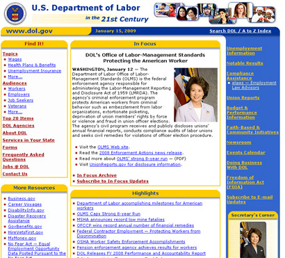
U.S. Department of Labor Web Site

1. Overhauling Government Web Sites and Online Communication
The Obama presidential campaign web site was a masterpiece of politics exploiting fine aesthetics and Web 2.0 applications. With technology such as phone texting, people could literally carry you around in their pockets. Maintaining that level of connection through online communication will be vital during your administration.

Overall, the network of public government web sites is crippled by incomprehensible navigation and bugs, an eye sore with design aesthetics more second-rate IT firm than presidential. A comprehensive, systematic design would ensure visual and conceptual unity, improving organization and access, and dissolve the barrier between government bureau and online user.

Open information in the form of blogs, RSS feeds and online video should be widely applied. Imagine being able to download news feeds from government offices onto your iPhone: food safety alerts from the USDA, hiking conditions from the National Park Service, or employment opportunities from a variety of other agencies. Such information can be passed from person to person, strengthening the bond between citizen and citizen, and government and citizen. Publicly accessible, easy-to-search databases of photos and documents — such as the Library of Congress using Flickr to crowdsource the organization of part of its photo collection — helps people feel connected to national history.

As an “administration of the internet,” embracing new technology and intuitive online design, instead of shunning and censoring it, will demonstrate your presidency’s commitment to transparency and the free exchange of ideas, acknowledging the Internet as an indispensable force driving the future of this nation.

---

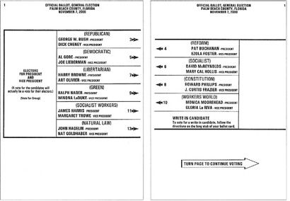
Palm Beach County, Florida 2000 Election Ballot

2. Improving Election Ballot Design
As the 2000 presidential election demonstrated, simple design mistakes on ballots can throw the country into chaos. Cloudy navigation, poor information hierarchy, and confusing ballot instructions can unwittingly determine the outcome of an election. Differences in languages, reading comprehension and abilities only increase the risk for mistakes.

The American Institute of Graphic Arts’ “Design for Democracy” initiative has been addressing ballot design since 2000, working with local jurisdictions to implement improvements, but this effort needs to expand to a national level. Even in the recent presidential election, poorly designed ballots still confused voters.

Nowhere else is the relationship between design and government this critical. Rather than an afterthought, design needs to be considered a vital part of the voting process, ensuring that everyone who votes can do so with confidence.

---

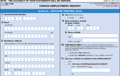
Census Employment Enquiry

3. Redesigning Federal Job Applications
Baby boomers are retiring en masse and will leave behind over 500,000 federal positions. As someone who has slogged her way through it, I know that filling out the application is the most arduous part of applying for a federal job. I’ve talked to friends and family who have been scared off from applying to jobs with the government because of the frustrating forms. With the government expecting to hire hundreds of thousands of people in the coming years, using design to make the application process understandable and accessible to all will be critical.

The application forms — both print and online — in their current form are a confusing mess of incomprehensible jargon and poor structure, easily leading to mistakes, stress and wasted time. Much like with election ballot design discussed above, good design can lessen or eliminate many of these problems, benefitting not only the government but generations of job seekers in this country.

---

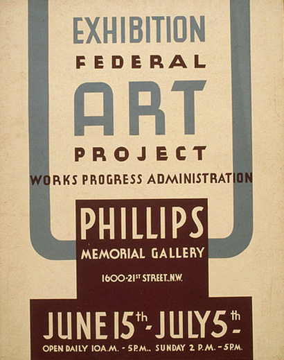
Works Projects Administration

4. Making Design an Integral Player in Economic Recovery
In your December 6, 2008 online video address, you announced plans for a massive economic recovery initiative, like that of the Works Projects Administration during the Great Depression. Along with being an excellent opportunity to carry out the improvements discussed in this letter, the government should work hand-in-hand with designers to promote and implement changes that will affect the future of the United States. After all, designers need jobs, too.

The original WPA knew the of value art and design in civic life. Its sponsorship of the arts lead to the creation of over 200,000 sculptures, murals, posters and other works that have enriched this nation’s history and spirit. The role of designers in your job creation plan should not be underestimated. We are not expendable luxuries, but essential factors to the success of your goals. We are the face and backbone of your American Recovery and Reinvestment Plan, creating posters, television commercials and web sites to advertise programs; designing energy-efficient buildings; and developing information campaigns about education, technology and citizen activism.

Design can express the hope your recovery plan inspires, opening people to its opportunities, its vision for a greater, greener, grander America.…

I graduated from art school into the toughest job market in recent American history. Finding and keeping a job has been perilous and frustrating. With the plunging economy shrinking demand for branding and marketing, I and other young designers need another direction for our talents.

Like many people growing up through the Bush II administration, I became interested in politics, particularly the intersection of artistic expression and government policy. But design’s foray into politics at that time seemed to encompass only graphics of George W. Bush straddling a nuclear missile Slim Pickens-style. I became quickly bored with what passed as protest design. There had to be another way to use design to influence politics and opinion, to change the way things are run. There had to be something that would last longer than a vinyl sticker stuck onto a stop sign.

---

The points discussed above are a start, but many designers want to do something that really matters. During the presidential campaign, we created posters, web sites, t-shirts, a myriad of ways to pass on your message of hope and change. And we were pleased to find on election night our efforts were not in vain. But now we want to do more. We want to help.

If you’ll have us.

Nicole Peterson, a graduate from the Massachusetts College of Art and Design, is a graphic designer in Boston, MA. She runs the blog Design Benign, and has previously contributed writing to Speak Up.

Maintained through our ADV @ UnderConsideration Program
ENTRY DETAILS
ARCHIVE ID 5662 FILED UNDER Discussion
PUBLISHED ON Jan.16.2009 BY Speak Up
WITH COMMENTS
Comments
Travis’s comment is:

Great post! I'd also love to have Obama's administration commission a redesign of the Passport. The cheesy cartoony imagery on the current passports is a disgrace to our great country.

On Jan.16.2009 at 09:48 AM
grit’s comment is:

Excellent thoughts and suggestions. I look forward to growing old and observing your design generation as they see such progressive social movements through.

I "dugg" it in to Politicl Opinions and hope all further readers digg it too.

On Jan.16.2009 at 12:21 PM
Dori Tunstall’s comment is:

Greetings Nicole and others,

You should go look at the U.S. National Design Policy Initiative's Redesigning America's Future: ten design policy proposals for the US's economic competitiveness and democratic governance.

Limited edition hard copies are set to arrive on the desks of all the members of Congress, the President and Vice-President, as well as select Obama administrators on Tuesday's Inauguration Day.

There is also an online advocacy campaign to get people to write their Congress people to endorse the Design policies and the Initiative.

This is a great way to have impact.

Dori Tunstall, U.S. National Design Policy Initiative organizer

On Jan.16.2009 at 01:06 PM
lonelygirl15’s comment is:

Through various points of this past election season... its many ups and downs... the only thing that really made me even pay attention so closely was by the way Obama's brand kept evolving.

Which was a weirdly poignant thing. But probably good, none the less.

On Jan.16.2009 at 02:14 PM
Pesky Illustrator’s comment is:

I'm ready for it. Death to Helvetica! Onward Futura!

On Jan.16.2009 at 07:45 PM
Leslie Yang’s comment is:

Smartly put and much needed! Thanks for lifting up these design needs.

On Jan.16.2009 at 08:32 PM
Andrew klein’s comment is:

Wow!

Prehaps usher in a new wave of design for the common good! Design is understanding, it is information, it interacts with every tangible facet of human existence!...for me, it is life. Design is EVERYTHING!

If Obama reads this: for how influential and powerful design is, there should be a cabinet level position created for a designer!

P.S. Pesky Ill: Futura Sucks, Helvetica is okay, America for Avenir!

On Jan.16.2009 at 08:35 PM
joan cairney’s comment is:

This is great. BUT....
Your opening: A Letter to President-Elect Obama from a Young Designer has a really bad line break. It is jarring and it takes your presentation down a couple pegs before you actually begin. Also an added hit because you are speaking of design.

thought: break after Obama.

j

On Jan.17.2009 at 12:01 AM
J’s comment is:

The web based job application form for ALL federal jobs is a nightmare. Give it a try here: http://www.usajobs.gov/

This site best produces millions of dollars in wasted time. A far better applicant pool would result in a better designed, shorter, and easier to use site. The site, as it is now, takes hours to fill out (if you even get that far), has a pile of coding errors and totally blown user interface with usability issues found more commonly in 1998 not 2008. It is also not very Mac friendly.

We can ultimately blame the outgoing executive administration for letting this important site wither and rot away.

On Jan.17.2009 at 02:18 PM
Nicole’s comment is:

Travis- Ugh, I just looked up photos of the US passport, and you're right. What's with the patterning in the background? I also found some with a cheese-tacular flag 'n' eagle background. The text doesn't stand out well at all. They look like pretend passports you would give to kids. Thanks for pointing it out, I should have included it in the essay.

Dori- Thanks for bringing that up! I've heard of it before. I really hope this new administration does take up the suggestion countless designers have offered to use design to improve the function of the federal government. It's great to see a lot of us up in arms about this issue.

J- Oh, that site is awful. I've had to use it before to find job postings. If we took some money out of fighting a useless war and put it towards improving the design and functionality of government forms and web sites, it would be a blessing to the future of this country.

On Jan.17.2009 at 04:07 PM
Stephen Tiano’s comment is:

Can he fix the economy first? ;)

On Jan.18.2009 at 11:08 PM
David Hisaya Asari’s comment is:

Please check out the Obama-Biden "Citizen's Briefing Book" and add your voice, and comment on this initiative "Government communications should be helpful and clear."

http://citizensbriefingbook.change.gov/ideas/viewIdea.apexp?id=0878000000057Ar&lsr=0#comments

On Jan.19.2009 at 01:59 PM
Laura J.’s comment is:

Good point!

On Jan.19.2009 at 05:06 PM
Simon’s comment is:

Hooray Interstate Light!

On Jan.20.2009 at 06:33 PM
President Barack Obama’s comment is:

Dear Nic,

Mind if I call you Nic? You can call me Barry. Or Mr. President. I'm hip.

Say, thanks for the letter. It's on the top of my stack of Awesome Important Things To Do. Great ideas, thanks a million.

Yes, we're going with Avenir Roman, Caps and Lower Case on everything printed by our new administration. That OK by you? No more Helvetica, we promise.

Designers: Thank you all for doing the great job of designing whatever it is you design.

Peace, out.

President Obama

On Jan.20.2009 at 07:45 PM
Josh’s comment is:

Wow that last comment is drenching in sarcasm. Hey buddy, lighten up and go meet Rush for coffee.

I think the article was very well considered and on point. I have the same basic feelings about city, state and government sites. I'd almost feel best if the local and national governments worked together to build a CMS that could be purchased or given to all municipalities to use as an unchangeable template to be designed around.

For when it comes to basic information hierarchies, I don't think cities change much mile to mile.

Second, in some respects I think we as designers need to approach city and state governments and offer our services, but at a reduced rate. Government work is often billed at twice the scale or more when the work is finished.

Of course, there are particular items like security, bureaucracy and review time, that make such projects longer and less useful to the public in a decent time frame and these basically account for the increased cost (seen by most as an inconvenience fee).

Hopefully with the incoming administration and with the talks about being efficient and cutting waste, they will approach the ideas that Nicole has above with fervor at a point when it seems most appropriate and helpful.

On Jan.21.2009 at 06:27 PM
Fatknuckle’s comment is:

Sorry but the new passports are actually pretty well done, at least they are in person. Kind of interesting too, I had some downtime once and since it was the only thing I had I was actually reading through it. They have interesting tidbits about life love and the pursuit of happiness you know the american stuff.

As far as the other things go, you gotta remember inertia is a huge motivator for such matters, you think you have to jump through hoops to get Johnny's Record Emporium, try getting a gubmint contract. Not to mention,most of the firms that are even capable for the larger contracts are more service/IT oriented (maintenance etc..) than a more design/UX oriented shop. And are selected by sheer heft (think Halliburton/KBR)

Not that smaller shops couldn't do a better job, (obviously they would) but they either don't cater to those kind of institutional clients or don't have the infrastructure necessary to produce and maintain such monsters...

On Jan.22.2009 at 06:41 PM
yael’s comment is:

Based on his last point, I think we should definitely leverage design in the current economy.

I've discovered that American designers have a preferred status in the international marketplace. On more than one occasion, I've been told by my non-US clients that they wanted to work specifically with an American designer. (These were clients based in non-European countries - I'd expect that Europeans would prefer their design over ours.)

I think we can leverage this in a world marketplace that's more connected than ever. I doubt this preference is universal, but there's a definite respect for American graphic designers our there.

On Jan.26.2009 at 10:40 PM
Joya’s comment is:

Great article. The Obama campaign site was fantastic and made me want to keep checking back all the time to see the new logo offspring that kept developing along the way.

Looks like the new administration is already moving toward better design. Check out the newly-redesigned White House site (I hope I did the link correctly).

A little sparse for info, but a great start. Hopefully they will continue to update sites as they have more time in office.

On Jan.27.2009 at 01:21 PM