This post is an asynchronous presentation written on behalf of the inaugural biennial conference on Global Interaction in Design Education, Glide’08 presented by Rensselaer Polytechnic Institute in Troy, New York and by the Upstate New York chapter of AIGA, the professional association for design. A full-day schedule of speakers is taking virtually and a most of us are contributing from the comfort of our own computers. Glide’08 aims to explore how the “development of instructional technologies for distance learning in low- and high-bandwidth contexts has created opportunities to bridge geographical divides in design education and conferencing.” For those that are joining via the conference, hello, and for our regular readers, well, hello too.
First, a disclaimer. I am wildly unsure as to why I was asked to contribute to this conference. I’m not an educator: At most, I am a graphic designer who has stumbled unto teaching positions. I don’t know the first thing about distance learning” A geographical divide for me is the difference between the Park Slope and Willimasburg neighborhoods in Brooklyn, or that point between the York and East Broadway stops in the subway’s F line where your ears pop because the train hits the middle point between Brooklyn and Manhattan as it crosses the East River. And, other than running a handful of blogs with an inherently international readership, my understanding of design education in other countries is minimal. In other words, and in terms of credentials, I’m out of my league. However, there is a certain activity that I engage in that perhaps puts me in a position to talk about the subject of using technology, the web in particular, in favor of design education: I poke around the web. A lot.
While other speakers of the conference will be better prepared to talk about the benefits of doing a tele-critique between a classroom in, say, Tucson, Arizona and another classroom in, say again, Paris, France; or praise the usefulness of having a semester’s curriculum on-line so that every student can stay on top of the assignments; or propose a blog network among schools to share work and ideas, I can’t speak to any of that. Instead, I would like to offer a few suggestions to take advantage of the existing infrastructure and dynamic found on the web.

Blogging
The obvious answer to integrating the conversation between students, locally and internationally, appears to be a blog. This is somewhat true as it has now become a traditional means of communication and expression for the current generation of graphic design students and chances are that everyone already has their own blog. However, it seems that most blogs started by design programs have a hard time growing beyond their own world and activating that global interaction they crave.
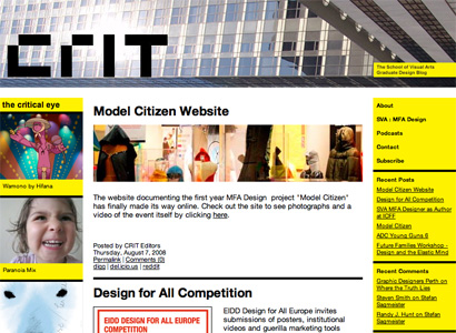
Crit, the graduate design blog for the students of the School of Visual Arts MFA Design Program.
Crit, the blog launched by the students of SVA’s MFA Design Program in 2007 aimed to engage graduate students from around the U.S., but it never quite managed to attract that audience; instead it became a great megaphone for the activities of the school, which is not a bad thing at all.
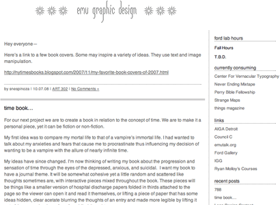
emu graphic design, the blog for students, faculty, and alumni of Eastern Michigan University’s graphic design program.
Another example is a blog like the one started by the students of Eastern Michigan University’s graphic design program as a way to add interactivity to their experience. But as some of the teachers lamented in a conversation we had, there wasn’t the amount of activity on the blog that they had hoped for. I mention this not to be gossipy or belittle the engagement of EMU’s students but to point out that what students want to do in their free time is not likely to be blogging with the classmates and teachers they just spent all day with.
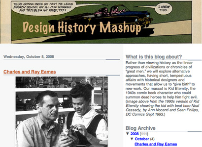
Design History Mashup, the blog for the students of the Department of Art and Art History at the University of Texas in Austin.
An interesting blog that appeared earlier this year was Design History Mashup where students under the guidance of Peter Hall posted their assignments on specific bits of design history. For me, as an outsider it was very interesting to see the ongoing results and sometimes seeing students work out their research in plain view. And it is now available as a public resource for anyone interested in design history.
The more viable alternative for using blogging as an educational tool is to take advantage of blogs that are already established and have an active readership, whether it’s Speak Up, Brand New, Design Observer or the student-friendly Core 77, where students can be part of the dialogue and be part of an audience that includes seasoned professionals, beginners and students alike. Students could be given the assignment to pick an ongoing discussion and write in a, say, 250-word comment stating their point of view, forcing them to learn how to write about design and express their opinions. Harnessing the power of the written word at an early stage is imperative, and doing it in a rather risk-free environment like a design blog is a good probing ground.

Social Curating
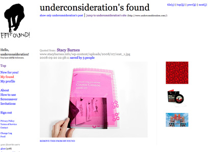
UnderConsideration’s ffffound.
It might seem like the trendy thing to recommend, but ffffound is a spectacular resource of visual resources and inspiration fueled by the constant addition of images by the hundreds of users that add content to the site literally every minute. ffffound also makes associations between images recommending similar options, resulting in a possibly endless loose image association. The site is notorious for being by invitation only, but they could surely have academic invitations for any design program interested and then teachers could assign a communal and social curation of visual material under any number of parameters. Students from a single class or from classes around the world would be given the magic script that bookmarks and adds the images and a visual well could be cobbled together for anyone to see as developed by students. Creating a cohesive collection of design work would be an invaluable exercise.

Google Earth as Field Trip
We all know that Google Earth is cool and that there is more to it than checking in to see who lives in your childhood home, more so as users add “layers” of information on it that you can traverse as your digitally globe-trek, so how could it be used for design education? Let’s take one example: The popular walking tours of New York’s typography given by either Tobias Frere-Jones or Paul Shaw. What if they created a route in Google Earth where you could go from location to location to experience, as close to the real thing as possible, the lettering that adorns the city? Google Earth’s resolution and quality leave a lot to be desired about, even with the addictive Street Level View, so maybe people that go on the tours can add their own photos to each location.

Just one of the many images taken by Michael Surtees, who took Frere-Jones’ tour.
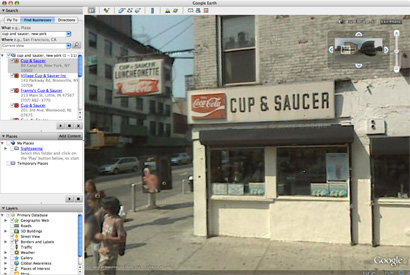
Cup & Saucer sign located through Google Earth, as seen in Street Level View.
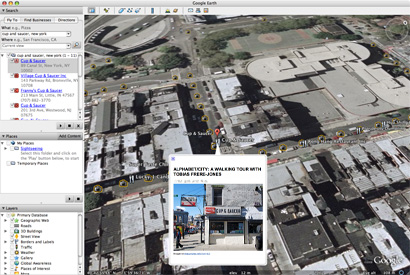
Cup & Saucer location with user-added images.
If different design programs in different parts of the world agreed to do similar local explorations, Google Earth would be a great tool to learn about the vernacular language of each location… and the additional geography lessons wouldn’t hurt at all.

Flickr and eBay as Design History
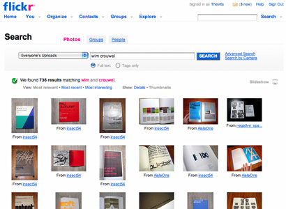
Search key words: wim crouwel.
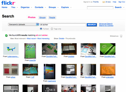
Search key words: otl aicher.
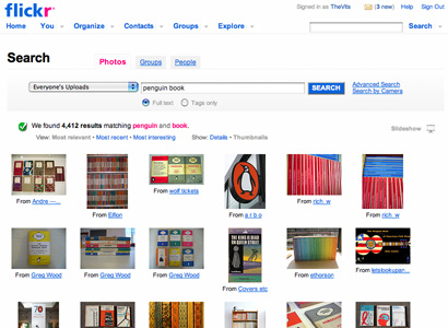
Search key words: penguin books.
Learning about graphic design history used to mean either reading Philip B. Meggs’ A History of Graphic Design or sitting through four carrousels of aging slides that, themselves, are becoming relics of design history. There is nothing inherently wrong with these two scenarios, but the ubiquity of Flickr and the generosity of designers or collectors around the world has sprouted a massive amount of design ephemera and history in its pages. Most of them are original materials taken with modern-day photographic equipment that give these pieces a palpability that they never had. Whether it’s the work of Wim Crouwel or Otl Aicher as photographed in exhibitions or oodles of old Penguin books rummaged from flea markets or antique booksellers, Flickr is awash in design history. Right under our digital noses. So, no matter which school you attend and how well stocked its library is or how good the design history teacher might be, the original artifacts of design history are only a search away.
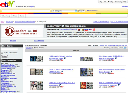
Most awesome eBay store ever: Modernism 101.
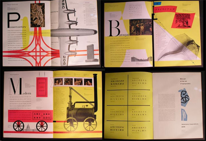
1956 Westvaco Inspirations by Bradbury Thompson, sold by Modernism 101. Auction may have ended and item may not show.
I would not encourage design educators to encourage their design students to spend their money on eBay but, not too different from window shopping, designers can see a lot of design history right there on eBay. Perhaps the best lessons can be had at Modernism 101’s store, which focuses on any publication or printed material related to graphic design from the earlier half of the twentieth century. On top of having photographs for all of the auctions — even if they are not the best photographs — the store features lengthy descriptions of each piece, acting as mini history lessons. Popular items in eBay are back issues of magazines, so if you wanted to see some covers of vintage Playboy, Esquire, Harper’s Bazaar or Fortune, eBay will do the trick.

Global Portfolios
Certainly learning about design history and standing on the shoulders of giants is no good if we can’t look at the present and at the future. It used to be that you would have to wait for the latest design annual or the latest issue of Print or Eye to know what’s happening in the world of design. Now, every designer and design firm has a web site, giving design students the opportunity to see what their soon-to-be peers are doing. Exposing students to this global breadth of work is extremely important so that they can get a grasp of the visual climate that is currently being forged. Plus, looking at cool work from France, Greece, Brazil, Israel, India or wherever, is healthy for the eyes.
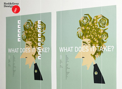
Red and Grey Design, Dublin, Ireland

Taku Satoh Design Office, Tokyo, Japan
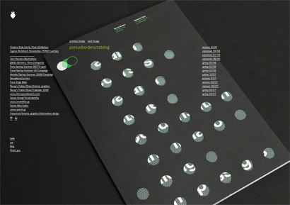
BeetRoot Design Group, Thessaloniki, Greece

Design students are entering a world that is already heavily connected thanks to the innovations in social networking web sites, the preponderance of blogs and the increasingly bulging archive of digital imagery. The tools for an integrated, global education are already in place and the material is only beginning to take form. Design students and educators can only strengthen it and make its availability wider and more relevant.


I liked your response the EMU's staff lamenting about the lack of student activity on their blog! When you've been in class all day and you have tons of assignments due "soon", posting on a school-run blog is probably the least of one's priorities! Overall I found your post very interesting, exploring this convergence of internet-enabled technologies and sites with design education. In particular I'm fascinated with the potential that Google Earth (or similar tools)have for "virtual" field trips to places that could be economically difficult for students to go see.
On Oct.22.2008 at 09:50 AM