Yesterday, while the humidity in New York grew to more than an inch thick, Bryony and I had the pleasure of spending the day inside the Herb Lubalin Study Center (HLSC) in famed Cooper Union. Founded in 1985 — and first curated by Ellen Lupton until 1992, and now headed by Mike Essl and Emily Roz — the HLSC houses one of the most impressive (and one of the few accessible) collections of graphic design work from the twentieth century. As the name implies, a remarkable amount of the collection is devoted to Cooper Union alumn Herb Lubalin, including copies of his magazines fact:, Eros, Avant Garde, and the newsprintalicious U&lc, along with countless logos and lettering samples, type specimens from ITC, and punctuated by an overwhelming amount of drawings and sketches.
The rest of the collection is made up by the work of Lubalin’s contemporaries like Lou Dorfsman, Herbert Bayer, Bradbury Thompson, Alvin Lustig and Alexey Brodovitch among others; and then there are mini collections of wood type, dutch design, posters, big magazines, little magazines, type specimens and a hundred other items to make your head spin. After recovering from the initial over ventilating we got to scouring the flat-file drawers, packed with original samples and clippings inside tidy plastic bags, and have captured a little bit of our experience here. More official-looking photographs and documentation will appear in, you guessed it, our upcoming book. Aside from these pictures we do recommend anyone with a loving interest in design to visit the HLSC if you can — it sure is better to look at the real thing, than a 3-inch wide image in a book. (Still, do buy our book when it comes out, it will have great 3-inch images!).
The light inside the center wasn’t that great, so some of the colors are yellower than they actually are. Click on any image for a bigger view.


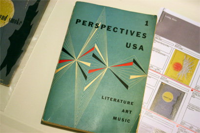
As one of the first drawers to open we were a little disillusioned that this was just one of two original book covers by Alving Lustig in it.

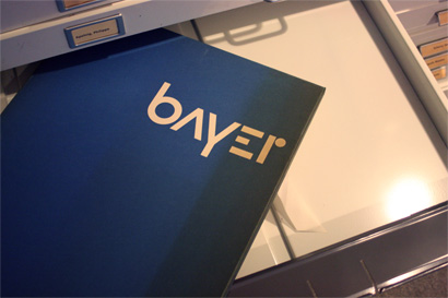
For Herbert Bayer there were some goodies, but none more appealing than this Bahausome box cover containing some of his drawings and paintings.

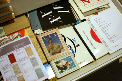
Bradbury Thompson’s drawer was just too juicy, so I couldn’t even pick up anything for this photo. There were some annual reports for Westvaco worth fawning for. And, yes, for the very discerning viewer, the black book with the XXIV on it is by Paul Rand, but page 4 had a Thompson design in it.

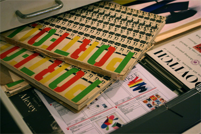
Mmmmm… Alexey Brodovitch’s Portfolio. Relive the glory with Chester’s Alexey type family.

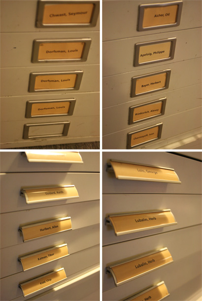
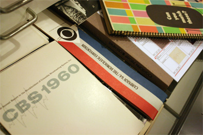
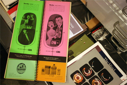
Lou Dorfsman, the art director for CBS and another alumn from Cooper Union, had not one, not two, but three drawers full of tightly-tracked typography.

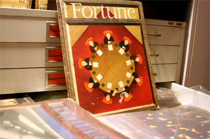
Fortune magazine, October 1939. How things have changed in the magazine world.

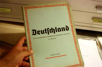
This was a drawer labeled “German Type.” No further questions, your honor.

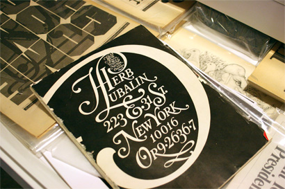
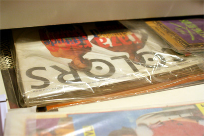
Now we come to the man whose name engulfs all these drawers, Herb Lubalin. I forgot to write down the details, but this looked like a full issue of a magazine devoted to Lubalin, and it was written in Japanese.
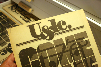
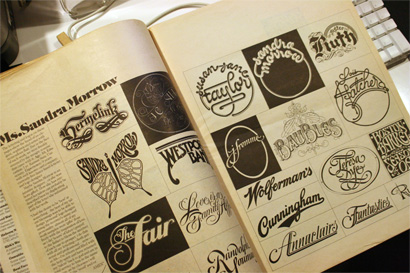
Of course, there was no shortage of U&lc samples. Catch up on all you need to know about this magazine with John D. Berry’s great book.

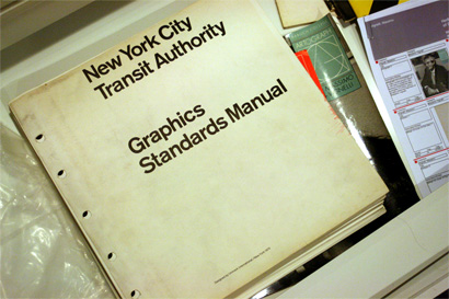
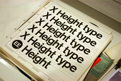
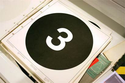
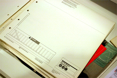
Now, this is not for the faint of heart. Massimo Vignelli and Unimark lay down the law.

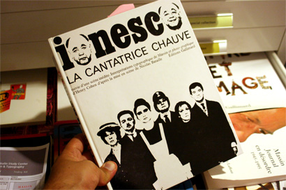
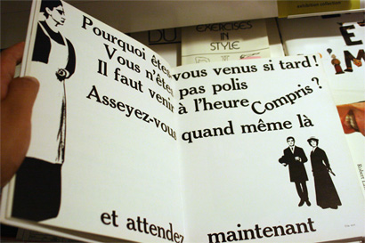
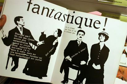
And to make your heart faint, here is Massin’s visual interpretation of Ionesco’s play, La Cantatrice Chauve. Check Laetitia Wolff’s book for all your Massin.

The Tibor Drawer. Made the palms of my hands sweaty.

An original Watching Words Move by Ivan Chermayeff and Tom Geismar.

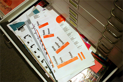
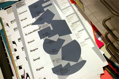
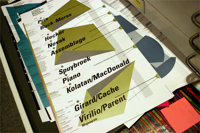
One of the last drawers had one of my favorite finds: A selection of Willi Kunz’s posters for the Columbia Graduate School of Architecture, Planning and Preservation. I never realized most of these were printed with metallic inks.


Wow: that's enough to make anyone drool. Is the center open to the public? Or do you have to get permission to view everything?
On Jun.24.2008 at 10:27 AM