By now some of you are aware of the stress-inducing book we are working on, Graphic Design Referenced. This week I had the pleasure of writing the entry of German designer Otl Aicher. Unfortunately I got carried away and wrote much more than the word count I knew I had to meet. So, since the book will only have a 285-word version I wanted to share the extended one for anyone that might be interested in learning more about this great designer or just getting an abridged version of his story — this post also combines a segment of what we are writing for our entry on Summer Olympic identities. Most of the information here is taken from the wonderful monograph, Otl Aicher, written by Markus Rathgeb. And don’t miss the Otl Aicher Flickr Pool.

As a teenager Otl Aicher was exposed to the devastating effects of the Second World War firsthand. He was enlisted, against his beliefs, in the German ground troops in 1941 and served until 1945; due to illness and injuries Aicher’s military career was lackluster, and it provided him time to continue his auto didacticism by the reading and writing about philosophy, literature and art he had begun earlier. When the war ended and American troops entered Germany, Aicher returned to Ulm and became involved in the rebuilding of the city. Along with others, he established Ulmer Kreis (Ulm Circle of Friends) and started a series of gatherings, the Thursday Lectures, which provided an environment to stimulate the war-ridden population — the posters, to announce these events, were designed by Aicher, his first foray into the practice. By 1946, the Thursday Lectures had come to include practical education courses that led the way for the opening of the Ulmer Volkshochschule, an adult education school, which would become one of Aicher’s first clients, designing their identity, brochures and posters, when he opened his first design firm, Büro Aicher, in 1947.
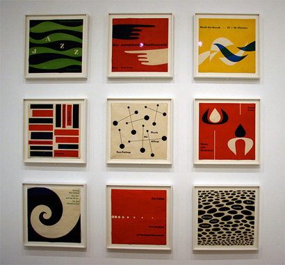
Posters for courses taught at the Volkshochschule. Photo by Negative Space.
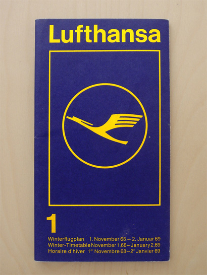
Otl Aicher and his E5 team developed the identity for Lufhtansa. Photo by alphanumeric.
In 1953, in collaboration with Swiss designer Max Bill, Aicher established the Hochschule für Gestaltung (HfG) in Ulm, a design school for architects, product and graphic designers with “a diverse education, objectivity of design methodology, and an embrace of the industrial age” as ideals, as expressed by Aicher. Aside from teaching, and taking on the directorship position from Bill in 1962, Aicher developed numerous identity projects through the E5 (Entwicklungsgruppe 5), one of the “student development teams” created at HfG to work with clients outside of academia, melding practice and methodology — most famously, Aicher developed the complex and comprehensive corporate identity for Lufthansa during this time. The HfG closed in 1968 and Aicher opened Büro Aicher once again, undertaking one of his most prominent projects, the identity and iconography of the 1972 Summer Olympic Games in Munich.
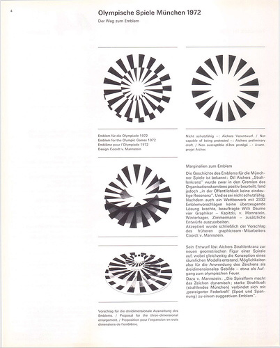
On the top right is the first rejected garland, and the top left shows the final execution designed by Coordt von Mannstein. The plate is just there to blow your mind. Image by Latierrasemueve.
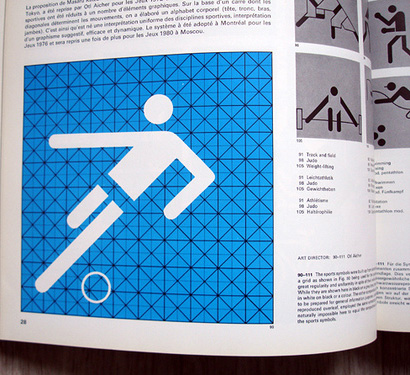
A sample of the grid used by Aicher to develop approximately 180 pictograms. Photo by insect54.
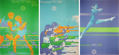
Three of dozens of posters Aicher created using images from athletes, representing the multitude of nationalities that would converge at the Olympics. Images by Blanka.co.uk.
In 1966, at the same time as Lance Wyman was awarded the program of the 1968 Games in Mexico, Otl Aicher received the commission from the National Olympic Committee for the 1972 Games in Munich — when Aicher visited Wyman, 18 months before the ’68 games began, he said that he was further ahead in their program than he was. Although marred by the terrorist activity that claimed the life of eleven Israeli athletes, the Munich Games had been approached as a way to present a different Germany from the one experienced in the 1936 Berlin Games under the ruling of Adolf Hitler. Aicher and his team developed a colorful identity that drew from the local Bavarian environment without crossing into pure folklore. The evocative imagery, focusing closely on the athletes, was paired with a solid grid system and the sole use of Univers that allowed flexibility and maintained consistency. The hypnotic emblem of the Games was not a smooth process: Aicher’s first design was an abstract radiant garland that the committee did not consider unique enough to copyright; his second design, based on the letter “M” was met with the same reaction; the NOC then decided to hold an open competition, yielding 2,300 entries, that did not fulfill their needs; finally, a member of Aicher’s team, Coordt von Mannstein, merged the original garland with a spiral structure for the winning emblem, nearly a year after the first one had been presented. With an intense interest in the communicative power of symbols that could be universally recognized, Aicher and his team developed a cohesive set of nearly 180 pictograms for sporting events as well as services through a strict orthogonal and diagonal square grid, where all visual elements were arranged at 90 and 45 degrees. The sum of all the work amounted to a very precise and structured identity with just the right amount of warmth — succinctly embodied, perhaps, in Waldi, the geometrically astute dachshund you would not resist petting.
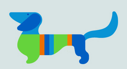
Waldi the dachshund. Image by Latierrasemueve.
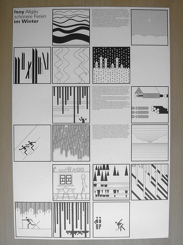
Poster as part of an identity developed for the German town of Isny. Photo by alphanumeric.
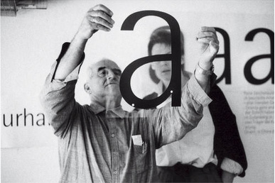
Working on the development of Rotis.
In 1972, as the Olympics unfolded, Aicher and his family moved to the Allgäu region of Germany where they purchased a property that had been named Rotis. There, he built two studios to complement the existing buildings and established his residence and office collectively labeled as the “autonomous republic of Rotis.” Through the course of the 70s and 80s, Aicher maintained a healthy practice of identity, collateral, advertising and poster work for a genial range of clients, from industrial manufacturers to small towns. Aicher’s new abode also served as the name for the four type families he started developing in 1986 when the search for a roman type that would complement Univers and other sans typefaces proved fruitless. Rotis bridges, literally, the gap between sans and serif: Rotis Grotesk (sans), Rotis Semigrotesk, Rotis Semiantiqua and Rotis Antiqua (roman) featuring gradual apparition of serifs and disappearance of single-width letterforms. In 1991, Aicher was tragically struck by a car as he crossed a highway that divided his property on his mower.


In 1991, Aicher was tragically struck by a car as he crossed a highway that divided his property on his mower.
Did the highway signs use Rodis? Helvetica? Frutiger? Talk about death by typeface.
On Jun.18.2008 at 08:09 PM