Speak UpA Former Division of UnderConsideration
The Archives, August 2002 – April 2009
advertise @ underconsideration
---Click here for full archive list or browse below
  
Social Justice 2008

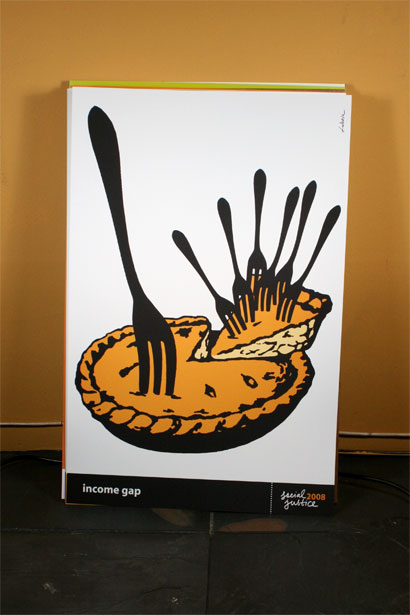
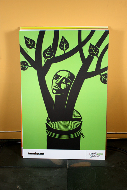
For as long as I can remember, at least ten years back, I have admired the work of Luba Lukova, with its restrained one- and two-color palettes and poignantly simple illustrations. I have always seen the work in books or online, small and only fractionally representative of the impact its bigger brethren have. With Social Justice 2008, a 21.5-inch by 14.5-inch portfolio of twelve, unbound posters by Lukova, published by Clay & Gold Editions, her work is given a second life — both as artifacts that once already existed and by assigning each with a concept, notion or social issue that is intimately tied with our current state of affairs.
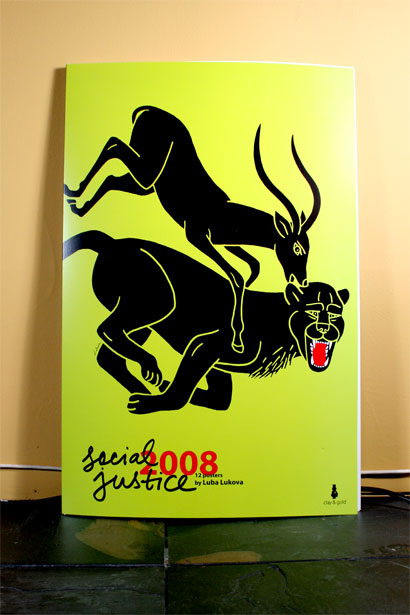
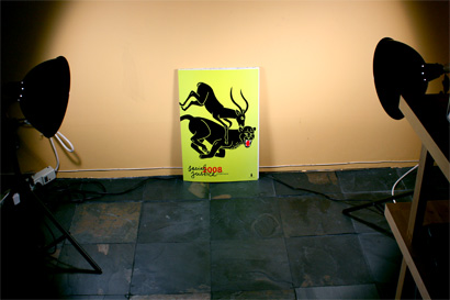
Social Justice Cover

Social Justice Cover in Context

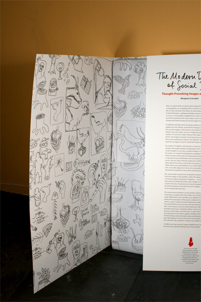
Social Justice Inside Covers

Brainwashing, Peace, Social Security, Immigrant, Sudan, Privacy, Corporate Corruption, Dialogue, Censorship, Health Coverage, Income Gap, and Ecology are the twelve posters handsomely reproduced in Social Justice — and while we have all seen these before, it’s quite amazing to see them take on new meanings by the simple act of relabeling them. The posters are accompanied by an introduction from writer Margaret Scarsdale, and in it she summarizes the effectiveness of Lukova’s work which, in its sparcity makes it easy to forget how much can be read from a well conceived visual metaphor, “[The] visual metaphor is not only a symbol of hope, it is an inexorable and urgent call for action: In a world full of duplicitous metaphors, it is time to take a critical look at the true face of the policies and procedures that shape our lives.”
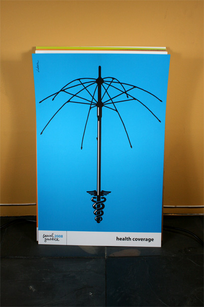
Social Justice Poster

Social Justice Poster

Social Justice Poster

Social Justice Poster

Social Justice Detail

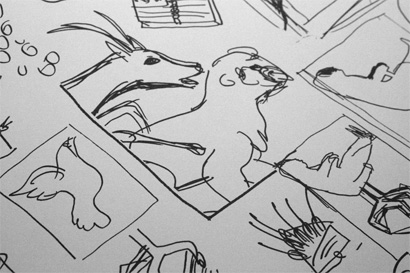
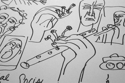
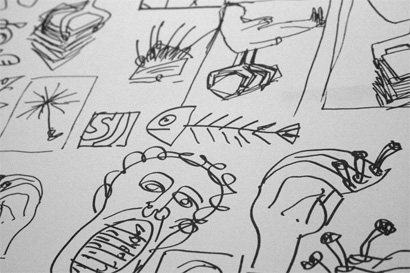
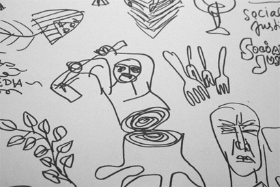
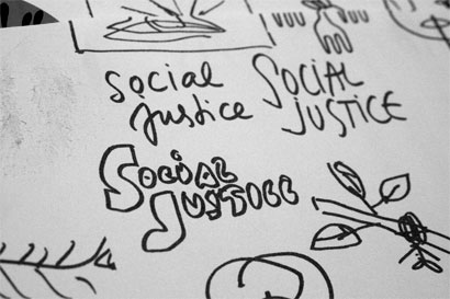
Social Justice is a very satisfying collectible for any graphic designer. Individually or as a group, these posters are a reminder of how much can be achieved through such economic visual means. And, let’s not be too un-superficial, they look great hanging on a wall. Perhaps the best part about the portfolio is the inside back and front covers and the wrapping paper that the posters come in, which are awash in Lukova’s sketches, giving us an insight of where the final images came from. Even more now than ten years ago, I remain an admirer.
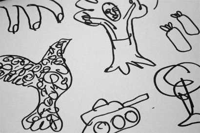
Social Justice Sketches

Social Justice Sketches

Social Justice Sketches

Social Justice Sketches

Social Justice Sketches

Social Justice Sketches

Maintained through our ADV @ UnderConsideration Program
ENTRY DETAILS
ARCHIVE ID 4628 FILED UNDER Book Reviews
PUBLISHED ON Apr.04.2008 BY Armin
WITH COMMENTS
Comments
miles’s comment is:

They wouldn't find space on my wall, they are brutal & ugly to my eyes.

On Apr.04.2008 at 05:19 PM
Jose Nieto’s comment is:

Miles, I have a lot respect for you, but your eyes are plain wrong.

This is great work by an extremely generous talent. I can't wait to get my copy.

On Apr.04.2008 at 10:49 PM
Michael Bierut’s comment is:

Some people just know how to draw. Beautiful.

On Apr.05.2008 at 08:39 AM
Petra’s comment is:

I recently finished watching the complete series: "Planet Earth," containing real brutality and not much humor. It is a pleasant surprise to find posters with brutality and much humor. In fact, I've ordered a set for my apartment.

On Apr.05.2008 at 08:43 AM
Jeff’s comment is:

Ah, these are perfect. Love the included sketches, I'm always fascinated by another designers' process. Well done, and for a good cause. Cheers!

On Apr.05.2008 at 11:38 AM
Joe Moran’s comment is:

Luba = Dear!

VR/

On Apr.05.2008 at 01:00 PM
esteban’s comment is:

Truth hurts. These ones hurts beautifully.

Bravo Luba!

On Apr.06.2008 at 02:15 AM
Pesky’s comment is:

Luba's art has a poetic quality that transcends style. I've always admired it. In fact, the message never gets lost in the economy of color, line and concept. I'd never be ale to afford the book so I do like looking at the inset examples. Thanks.

On Apr.06.2008 at 03:53 PM
Anne Stewart’s comment is:

Awesome reminder that the art of the poster has its roots in combining art and activism. We shouldn't be afraid of using design to send an explicit message.

On Apr.07.2008 at 02:57 PM
Patrick Cahalan’s comment is:

Great set. The use of the "Blue Cross blue" on the Health Coverage poster is particularly fitting.

Bravo!

On Apr.07.2008 at 04:36 PM
felix sockwell’s comment is:

i understand the dear eating the tiger as "social justice" but there doesnt seem to be any justice in having a "no coverage" umbrella.

I've always been a big fan of Luba but some of these are disparate, and a bit of a stretch. This one is just plain bad.

On Apr.07.2008 at 07:58 PM
onwuka onyinye’s comment is:

Very creative and inspiring! Art is LIFE

On Apr.11.2008 at 07:32 AM
Emily’s comment is:

Felix. Take another look and read the forward by Margaret Scarsdale. These well thought out posters appear to be a representation of the current state and perceptions of social justice. They seem to be a means of expressing notions of what needs to change cognitively in our society.

Your point is made in what you don't consider to be social justice. This IS a call to action.

Bravo Luba and Margaret!!!!!

Emily Marshall, Springfield

On Apr.15.2008 at 09:54 AM
Kate Andrews’s comment is:

Great work, thanks for the review.

On Apr.27.2008 at 09:45 PM