For as long as I can remember I have always wanted to do a printed portfolio that went beyond showing appropriately-framed pictures of my work in decently-laid out pages with titles and descriptions of each aforementioned picture. Instead, I imagined a portfolio with tight crops of images, typographic details pulled out of their original context, bits and pieces here and there, creating a teasing texture of my design sensibilities leaving the reader wanting more. Or to think of it another way, the equivalent of a reel from a motion graphics designer, with quick cuts and thumping music, three-minutes-long, bam, that’s it. But I have never actually done it. All my printed portfolios have been pretty straightforward; I have been too conservative (or too chicken might be a better way to describe it) to do anything that might overshadow the actual work. Plus, as everyone knows, putting together a portfolio is no easy task, so if I’m going through the trouble of binding something definite I want it to be as crowd-pleasing and universal as possible. But, something that gives me hope, is an alternative portfolio. Alternative as in independent of The Big Book, and alternative as in showing a different facet of my design approach.
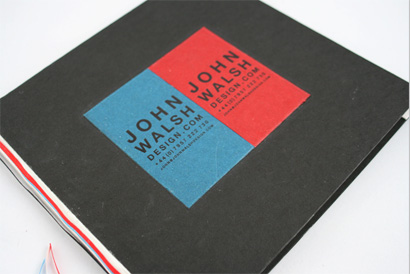
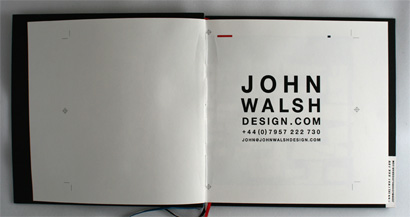
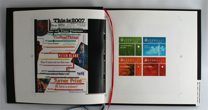
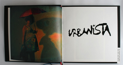
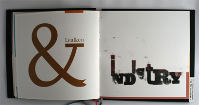
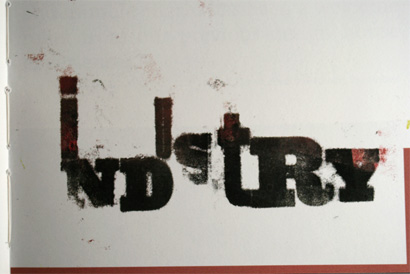
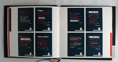
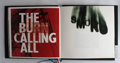
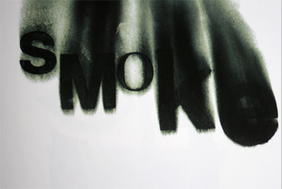
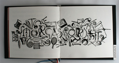
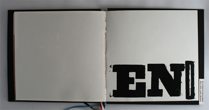
A designer I met earlier this year, John Walsh, who paid me a visit while traveling in New York all the way from Manchester, UK was kind enough to gift me with an alternative portfolio. A hand-bound eight-by-eight-inch book with colorful tassels hanging from the spine, in a black cardboard sandwiched set of glossy pages with a rough-hewn look and feel that was hard to resist. A one of a kind book. Just for me. Inside, it was filled with loose images, logos, typographic treatments, spreads (or parts of spreads) and other things that may or may not be part of other projects. Having just met him in person (and conducted an interview with him about a magazine redesign) I did not know much about John, but from this portfolio I could immediately get his design sensibility, something that might be harder to extract from a more typical design portfolio. And he wasn’t looking for a job (or at least he didn’t ask for one), he just wanted to share his work, so this slightly less formal approach seemed accesible and friendly, kind of like when you are showing your prized record collection to your buddy. Of course, like John’s, there are a hundred other variables of this form, some more adventurous than others… Maybe yours?
I still hold hope that one day I’ll get around to doing something less structured than my past portfolios and just be able to mash up something together that says as much about me as my flush-left, rag-right, 9 over 12 pt, twelve-column grid portfolio might.
[Click on images for larger view]
This post is part of (the long overdue) Small Design Ephemera series.




I too was inspired by John's alternative approach when I first came across it about a year ago. Since then, I've made use of the idea in several sample portfolios to potential clients.
It seems almost ridiculous to me now to present a traditionally structured portfolio. We are designers, why shouldn't our portfolio be just as designed at the content they are showing.
It moves the portfolio from the realm of past work and into a space illustrating our potential. Showing ideas not achievements and giving a glimpse into our style and process. Isn't that what our clients are hiring us for. We don't want them to point to an item in our portfoilo and order themselves a copy.
On Dec.20.2007 at 02:16 PM