We were recently asked to participate in a book by showing the evolution of Speak Up and how it has changed over the past five years. Happily we agreed, but unfortunately — and many of you out there will cringe at what I’m about to say — we had no actual archives, or screen shots frozen in time of what Speak Up looked like in 2002, 2003 or 2004. I know, brutal. And stupid. I had all the images and all the Movable Type templates, but those templates are gobbledygook code of MT that only mean anything when published through the system, and since many templates have replaced old ones, it would be impossible to recreate them. But I knew that I could achieve something with the help of the Wayback Machine, by looking at our two most used URLs (/speakup and /speakup_v2). I had tried this before but was easily stumped by laziness, but not this time, this time I was determined to forensically put back together those old versions. And I finally did. It was pretty amazing to see where Speak Up started and how much it has changed, but not changed at all at the same time.
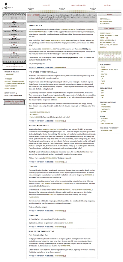
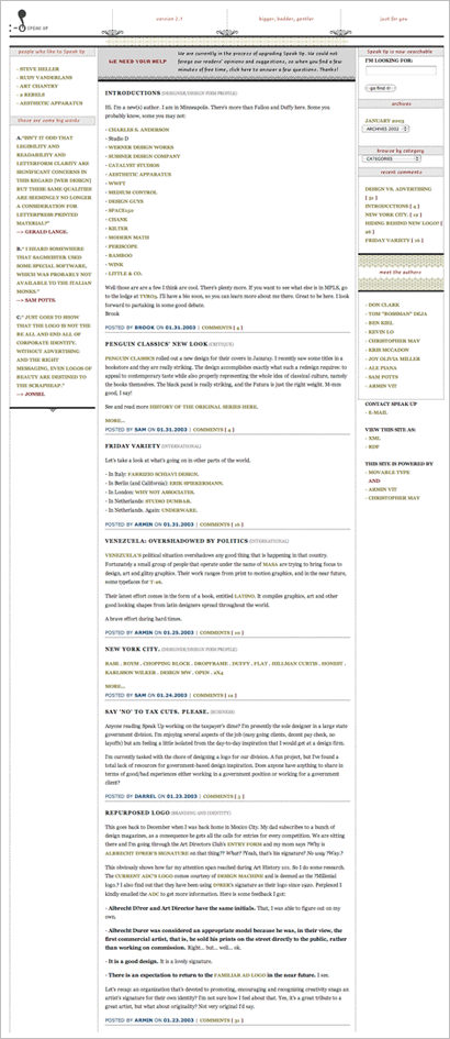
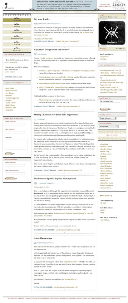
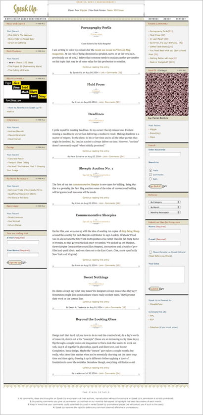
This is a very long, scrolling-heavy post, so I apologize in advance. You can see life-size versions of each image by clicking on them. All versions have had their content truncated to save some vertical space, so you will only see between three and five posts in each home page, instead of the usual ten or fifteen we have.

This is the inaugural look of Speak Up as a blog — you can see the hilarious very-first version here — where I introduced the mad pixelation (or as Stephen Coles called it, I was bitten by the Rococo Pixie) that still accompanies us today, not just on Speak Up but on Brand New and Quipsologies. On the left column, at the top, that first box of stuff was Flash. That’s right, Flash embedded in a blog in 2002! I was so cutting edge. (Irony included in that last sentence). You can also see our first and only open hiring (so far) of authors. This version was done before OS X introduced anti-aliasing on everything, and I was so proud of the pixelated versions of Georgia and Verdana.

Some time in early 2003 I did a lot of rejiggering of the sidebars. Here you can see that I intended to highlight interesting comments regularly. This may have subconsciously led to our Stop Being Sheeps. The green also became lass dire and more uplifting.

In Fall of 2003, we did a major rethinking of Speak Up and tried to make it bigger. We added sections (“Discussion”, “Business”, “Recommended”, “News and Events”, “Book Club” and “Design Help”) but it was too hard to maintain all of them and make them function properly, as each section was its own separate blog. Nonetheless, “News and Events” was a premonition of Quipsologies. Word It was introduced in this version as well. And, in collaboration with Christopher May (one of the first Speak Up authors), we did a set of icons for each category. Cute, no?
![]()


Not long after, we scrapped that convoluted version and went back to a single section. It was here when we introduced the scripty logo by Michael Clark. And advertising, which I remember fretting over at the time. We also narrowed the design, as some people complained that the design didn’t fit in their now antiquated laptops. This has been the longest-lasting version.

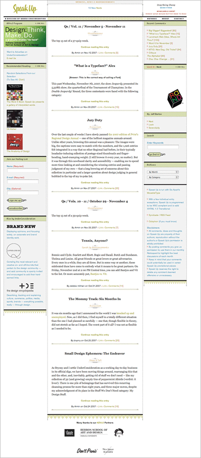
Encouraged by a database crash last year that rendered Speak Up unfunctional I decided to build it from the ground up and finally migrate Speak Up from a table and cell-based structure to a CSS-driven one. The first time I had attempted such a thing, which looking back at it now is a potpourri of oddball fixes and an inordinate amount of extra styles. In this version we introduced a brighter and bolder color palette, replacing the slightly unreadable and washed out palette from before. Much has happened to the sidebars, which are crucial when it comes to blogging, and are more so interesting to figure out than the middle, main content column. I like this version. But how long will it last? : )

And finally, you can see here an animated GIF of the five versions overlaid [2.5 Mbs]. So there you have it. A trip down blog design memory lane. Thanks for scrolling and reading all these years.


Nice visit to the past, Armin. I found Speak Up fairly shortly after I went out on my own in '02 and it was amazing to find a way to stay somewhat involved in the design community without having to leave the pj-clad comfort of my home office. Glad you're still around a kicking.
From v.1:
Pentagram
I'll admit it, there was a time when I hated them. I thought they were just doing the same thing over and over again. Found a formula and applied it to all projects. A few years have passed and I think they are VERY good and I'm very impressed with the quality of their work. People change, you know?.
By the way, was Michael B. aware of this early critique before he hired you? ;-)
On Nov.21.2007 at 11:03 AM