Graphic design might not work in the white cube, but it flourishes on a white background. A new mutated strain of design blog has evolved: The Randomly Curated Other People’s Images White Background Site, or RCOPIWS. Sites like Manystuff, Monoscope, Your Daily Awesome, and VVORK (among countless others) offer designers and design aficionados a constant flood of typographic morsels, interesting photos, arresting new art, and the like. One such site sets itself apart, notably, from the other RCOPIWSes: the collaborative image-bookmarking site ffffound.com — allegedly, but unconfirmed, initiated by online fiend Yugo Nakamura.
I started using ffffound last week, and it’s quite a fascinating place, really. The idea is that you bookmark images. Yup, that’s pretty much it. Like flickr, your account on ffffound consists primarily of a series of images, presented in chronological order with regards to their post date. Unlike flickr, which is geared towards sharing personal photographs, ffffound users share images they find anywhere on the web.
The layout ffffound employs looks simple, but the bookmarking technique is eyebrow-raisingly sophisticated: The site furnishes you with a bookmarklet which will highlight all of the images on a page with a blue border. You click the one you want, and it is then replaced by an amusing graphic that says “FFFFOUND!” in amphetaminic chalkboardesqe handwriting.
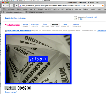
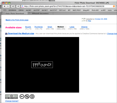
Steps 1 (click the bookmarklet) and 2 (click the image you want) for bookmarking to ffffound.
Ffffounds’ bookmarklet only highlights images that are within a predetermined range of scales; this prevents you from accedentally posting 5-pixel-square site navigation images. The whole bookmarking process is remarkably unobtrusive, because you aren’t whisked back to ffffound, and you can keep using the site you are on.
All of the stuff you post ends up on your page. Each image has three other images associated with it, randomly, chosen from the images you (and anyone else who has posted that image, as identified by a hash of the URL) has already posted. This results in a constant churn of new visual shit, both for users of the site and for casual browsers. At the time of writing, ffffound is awash with designy stuff: type samples, color studies, abstract form, diagrammatic architectural illustrations, crazy visualizations, posters, photographs of old equipment… I have not witnessed such a collaborative confluence of design-oriented material in one place.
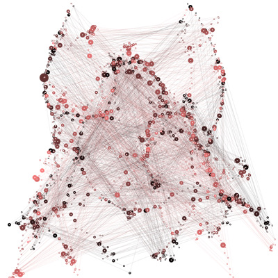
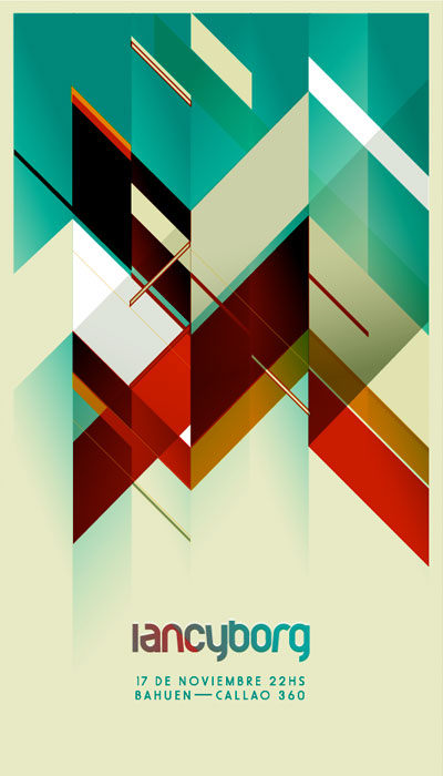


A sampling of images found on ffffound.
At first brush, ffffound’s paradigm looks to be based on your typical “Web 2.0” socially-networked navelgazery, because ffffound users have “favorite users” and “followers”. There are a lot of key differences however… You can’t tag anything, you can’t comment on anything, or write testimonials about people. You don’t even control the social network; you gather “fans”, or become one yourself, based on who bookmarks images that someone else bookmarked before you.
Furthermore, there is no RESTful API, no XML, no JSON, no pingbacks… Aside from pretty vanilla RSS syndication, ffffound offers none of the oft-vaunted programmatic interfaces that characterize “Web 2.0” sites. It’s reassuring to note, however, that the lack of these things is not an impediment to the site. It is closed and one can only join by an invitation from existing users (who can only invite three people), and therefore self-curating — I would imagine that the quality of the images in general (which right now is pretty fucking high, at least if you’re a type-nerd, designer-face like me) would degrade rapidly if anyone could join. That’s not a very democratic statement, I know; but design plus democracy equals drop shadows and other X-TREME photoshop filters, and the lack of ‘democracy’ in the case of ffffound is in line with its stealth anti-Web 2.0 ethos.
That’s not to say I don’t enjoy a bit of blogging and tagging myself. Really, being able to tag and comment and manage and share and reorganize your thingies, alongside other peoples’ thingies, in all sorts of ways in a coherent and intuitive fashion, et cetera, is why flickr and its ilk are at once both excellent resources and useful tools. But your flickr account is YOUR SHIT, specifically, implicitly, as indicated by its integrated creative commons licensing and general nomenclature (e.g., images you upload are specifically labeled “your photos”). Ffffound, on the other hand, is implicitly SOMEONE ELSE’S SHIT, which is a verrrry sensitive issue, even with all the happy-go-lucky “sharing” rhetoric that characterizes “Web 2.0” discussions. Ffffound goes out of its way to remind you of this: All images are headlined with the title of the page from which they are “quoted” (as ffffound has it), with links back to their sources. Ffffound’s lack of other typical user controls allows it to maintain that crucial distinction: By removing your voice, ffffound does exactly what it claims to do, which is grant you the capacity to bookmark images.
The de-emphasis of the user’s voice has a very interesting effect on ffffound’s content. User voice is such a cornerstone of “Web 2.0” malarkey, where many business models are variants of the idea that you, the user, shoot your mouth off so someone else can get AdSense money. As such, the action ffffound affords you is the ability to sycophantically declare that you like something, by bookmarking it. These things then get posted to your account, and if other people like them, they voice their approval in kind. You can’t really use ffffound to hate things, or otherwise. Contrastingly, I frequently use del.icio.us to hate things (note
the comment by ‘fishea’ on this link); del.icio.us remains gorgeously minimal, but your tags and comments combine with the links you post to provide people looking at your account page with a general composite viewport into your tastes.
Ffffound, on the other hand, can only illustrate your particular sensibility in the arena of graphic awesomeness. Perhaps this is why so many of the images on ffffound are typographic: Images of type are the best way to directly say something within the confines of ffffound’s system. If I was getting a degree in “postmodern anthropology”, or somesuch, I would say that ffffound is like a “distributed digital Cabinet of Wonders”, or maybe a “data-driven Exquisite Corpse, fashioned into an endless möbius strip”… but no, I’m getting an MFA in graphic design, and at the end of the day, I’m here for the type. I would say to you that ffffound is quite an interesting gem, and I’d add that the exclusivity isn’t as off-putting as it might sound… I was happy with visiting the site before an invitation serendipitously came my way. Do have a look… at the very least, you might find some crazy color palette to rip off or otherwise inspire you. Indeed!
Alexander “Fish” Bohn is a graphic designer and nacent design writer. Hailing originally from Brooklyn, he is currently a grad student at RISD, where he is researching bullshit patterns in design practice, among other things.


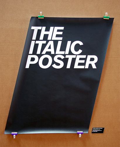
I love that Italic Poster. It gives me an idea. I could make a matching Bold Poster out of cardboard and a real heavy font...
On Oct.17.2007 at 11:41 AM