Speak UpA Former Division of UnderConsideration
The Archives, August 2002 – April 2009
advertise @ underconsideration
---Click here for full archive list or browse below
  
A Texas Dramedy

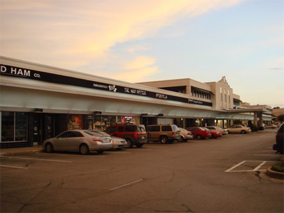
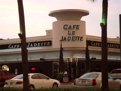
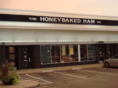
For more than 20 years, my family and I have vacationed in Texas. Weird, I know. It started when we adventured on a road trip from Mexico City to Laredo, Texas. All 16 hours of it. On ensuing trips we started driving a little further into the state, first to San Antonio, then Austin, and once all the way to Houston. Fifteen years ago, American products were not available in Mexico, blockbuster movies arrived three months after the U.S. premieres and the commercials on TV were far superior to the under budgeted Mexican ads, so for me those trips were a real treat. I especially remember seeing Robocop in one of them, and eating gummy worms and nonpareils out of the same bag. Eventually as we all grew up and my dad didn’t have the same drive of driving screaming teenagers across countries we started flying. Then I moved to the U.S. and then my parents decided to keep an apartment in Houston as their home away from home. Bryony and I have visited a couple of times, and just two weeks ago we were there, baby in tow. Besides seeing my parents, one of my recurring favorite things about Houston is a shopping strip, The River Oaks Shopping Center, set in a palm tree-flanked stretch of three blocks. I don’t care about the stores particularly, or the palm trees, or the ample parking… It’s the stores’ signage and awnings that captivate me: They are all black.

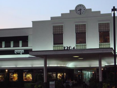
Now, this may not sound like much to you — and, indeed, there are more exciting things in life than this — but there is a subtle, welcome, and almost magical shift in the visual environment as you drive into, and through, this center. Whether you enter from the main entrance or from the end, the shift is first imperceptible and then unequivocal. After miles and miles of strip malls featuring every conceivable store in the world, all with their own logos in big, flashing, colorful letters and faux-whatever style of architecture they are trying to convey, entering a space with single-level, beige-colored buildings with logos and store names set in a strict palette of black and white can lead you to think you have suddenly gone color blind. It’s almost as if you stepped into Pleasantville, especially if you consider the rare Art Deco buildings that the shopping center occupies.
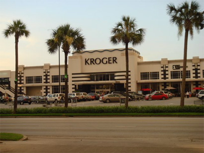
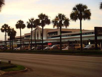
River Oaks Center

River Oaks Center

River Oaks Center

River Oaks Center

River Oaks Center

River Oaks Center

Photos: Pedro Vit… Yup, my dad

divider

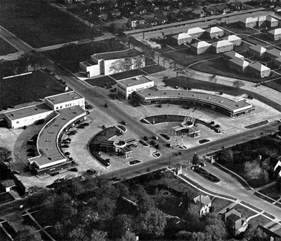
River Oaks Center, as it was

Photo: William R. Jenkins Architecture and Art Library, University of Houston

The River Oaks Shopping Center gets its name from the posh neighborhood it resides in, River Oaks — a section of Houston where the average household income in a 1-mile radius is above $100,000 a year, houses start at $1,000,000 and pretty is the best adjective to describe it. The center was built in the late 1930s, and it featured a car-friendly design set in a half circle, divided by Gray Street, that established the low-key look that the center’s expansion in 1948 would then embrace with two more Art Deco buildings. While Houston doesn’t emanate major whiffs of noteworthy architecture, it does boast a comprehensive collection of lovely Art Deco buildings that, set against the expansive openness of the city, stand out from all the big box retailers and other non-descript buildings. As the center expanded and welcomed retail heavyweights like Gap, Sur La Table and Gymboree as well as supergrocerystore Kroger, it would have been easy to let them take over the buildings with highly visible signage oozing blues, reds, oranges and every other color under the rainbow. Instead, as what I can only imagine being a result of a rule in the lease agreements from some color mastermind, all signage is restrained to white logo(type)s on black awnings. A small effort in the preservation of the original design of The River Oaks Shopping Center. And, unexpectedly for residents and retail owners, preservation has become a palpable concern as it faces the loss of two of its most iconic buildings and it would be the second vintage theater to face extinction.
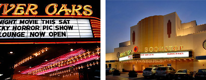
River Oaks and Alabama Theaters

River Oaks (photo by laanba) and Alabama Theaters

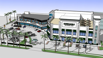
The River Oaks Theater, dedicated to foreign and independent films, and the Alabama Theater, located a few blocks away from the center, housing a Bookstop since 1989 after closing in 1983, are threatened to be demolished and replaced by condos and parking, not respectively. In other words something that brings in money. As clearly, nostalgia and well-maintained examples of classic architecture do not pay the bills for Weingarten Realty, the developer that owns the center. Certainly, Houstonians, including my parents, are upset. Petitions have been petitioned and the buildings have been placed on preservation endangered lists. The other building in the center that might be in trouble is one of the original curved entrances of the center, where Barnes & Noble, who owns the Bookstop in the Alabama Theater, is planning to erect a new store there. As the rendering below shows, B&N plans to keep a small part of the original building and then create the tallest structure in the three blocks of the center. And it looks like it might even honor the Black Rule with their logo set in black against white, instead of the green/cream/red combination they usually employ.

Barnes & Noble Rendering

Rendering of future Barnes & Noble. [Click image for bigger view]

While the possibility of change looms over the neighborhood and the historic buildings continue to make the news, there is one more highlight to be gleaned from this small patch of Texas: The River Oaks Shopping Center houses two Starbucks… one directly in front of the other.
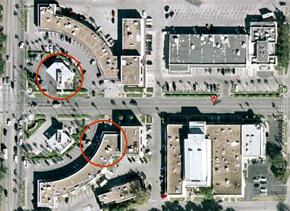
Google Map, with two Starbucks

Google Map with the two Starbucks circled

In Manhattan we may shudder at the sight of Starbucks separated by two or three city blocks and we host more than 170 of them — as proven by this brave soul — but the one bragging right we don’t have is of two Starbucks being as close together as the width of a four-lane street. Comedian Lewis Black was so startled by this, that these two Starbucks represented the end of the Universe. Per the rendering above, we can see that the Starbucks on the B&N lot will be preserved. If the giant bookseller follows its own tradition, there will likely be a Starbucks coffee in B&N, giving a single corner in the world three Starbucks.


Lewis Black on the two Starbucks

divider

I don’t know when I will be back in Houston for a visit, and as much as I like my daily Starbucks, I fear that that will be the only thing left to see in the black, white and beige respite that The River Oaks Shopping Center offered us.

Maintained through our ADV @ UnderConsideration Program
ENTRY DETAILS
ARCHIVE ID 3666 FILED UNDER Miscellaneous
PUBLISHED ON Jul.25.2007 BY Armin
WITH COMMENTS
Comments
Charles Hively’s comment is:

Thank you for taking me back to The River Oaks Shopping Center, I used to live in a lovely little cul-de-sac behind the Center and got to see first hand the changes and the consistency of the design which is a rarity in Houston. One little corrrection, the Bookstop is actually not in the Center its about ten blocks down Shepherd (the Center starts at West Grey and Shepherd) on the other side of Westheimer near West Alabama. But it would be a shame to lose it, as has happened so many times before. Unfortunately there is very little sense of history in Houston, but they still have a wonderful skyline filled by some of the world's leading architeccts including I.M. Pei and Philip Johnson.

On Jul.26.2007 at 10:57 AM
Armin’s comment is:

> One little corrrection, the Bookstop is actually not in the Center its about ten blocks down Shepherd (the Center starts at West Grey and Shepherd)

Charles, you are absolutely right. I had a sudden lapse of locations and mixed pretty theaters. Correction to the post ensuing.

On Jul.26.2007 at 11:58 AM
mandy’s comment is:

"...but the one bragging right we don't have is of two Starbucks being as close together as the width of a four-lane street."

Actually, we used to. On 42nd and 6th, just a couple of years ago, there was a Starbucks on the Northeast corner (still there) and a Starbucks on the Southeast corner, in one of the small shops in Bryant Park. The latter now belongs to 'wichcraft. But for about a year, you could get burned Starbucks coffee on either side of 42nd St. Starbucks actually muscled out a little independent coffee shot that used to be on that corner of Bryant Park, only to relinquish the space a year later. Corporate bastards.

On Jul.26.2007 at 01:24 PM
Ari Moore’s comment is:

Great post. I'm pretty sure NYC still does have some very close-proximity Starbucks, though -- there's one in an academic building on Cooper Square, and another one just across from it, on the other side of the Cube.

On Jul.26.2007 at 02:10 PM
Shane Guymon’s comment is:

Intresting, I've lived in Texas my whole life. Born and raised in San Antonio, and now in Austin, I've made my fair share of trips through Houston, haven't spent much time actually IN the city, I refer to it more as the arm pit of Texas, with it's lousey weather, 100% humidity, and way terrible traffic (like any other large city.)

But I do find that very intresting, and I feel it is definetly worth a trip to view it atleast once.

On Jul.26.2007 at 02:25 PM
David E.’s comment is:

I was in a tiny 2-story indoor mall in downtown Seattle – it took up no more than one square block. And there was a Starbucks on the first floor AND one the second floor.

Ive heard that Starbucks has opened locations directly across the street from each other, so as not to miss customers on the other side of a busy street.

On Jul.26.2007 at 02:30 PM
David E.’s comment is:

I like the black and white color scheme of the strip mall, but it doesnt go far enough. They should specify a single typeface as well.

"Cafe le Jadeite" especially needs help.

On Jul.26.2007 at 02:34 PM
might’s comment is:

Not to turn this article into a discussion on Starbucks, but in Vancouver, BC, there are two Starbucks stores kitty corner to each other on Thurlow street in the Downtown core.

I was totally amazed when I saw these photos. That mall is as beautiful as a strip mall can possibly be. I bet many companies decided not to lease space there because of the constraints placed on their corporate image.

On Jul.26.2007 at 02:55 PM
Lorenzo’s comment is:

We saw Peter Greenaway's film The Pillow Book at the River Oaks Theater many years ago.

We haven't been to the theater in quite a while, though we have been through the drive-thru Starbucks there... great concept not having to get out of your car to get coffee. Nice!

On Jul.26.2007 at 03:08 PM
Andrew J Klein’s comment is:

Houston is my home town, now I'm in Dallas.

If you can stand the humidity, it's a great place, with alot of cool new architecture going up everywhere.

P.S. I've been to both of those Starbucks, and it's actually not as bad as it looks from the arial map. They are close, but during certain times of the day, it would be hard to cross the street (Houston traffic sucks) just to get coffee, I think they are just trying to catch both directions of foot traffic.

On Jul.26.2007 at 05:04 PM
nic’s comment is:

participating on underconsideration has become an interesting exercise on knowing people without knowing them at all; which in turn evolves into such a load of heady existentialistic theory, so boring and in reality, out of my grasp, that I instead prefer to risk the following commentary, as if I knew Armin personally, in real life, in any way at all, which I don't.
Sir ( if I may...)
you are so Wiemar.
LOL

ok ok
It's a mystery, really, [an attractive one] to imagine what those first years of the Bauhaus would have been -without- the many following political tsunamis, that would arrive to spoil all the fun.
Those images remind me of projects by JJP Oud -De Stijl- or early Mies, you know, when modernism -was- an un-built project.(!)
Weird enough, today you can get to see postcards from [those futures] on malls like that; which are in no way connected with the big-time socialistic cigarette that was being collectively smoked at Wiemar at the time. Will it be that "tabula-rasa" could not exist on "free" democratic economies?
Because... mall strips like the one above [which seem so cool and neat], can only exist on the make-believe heavily regulated states that the developers and owner-associations have strictly defined in their minds, and by-laws... in an odd sort of -cultivated Wiemar-. A pantomime modern society that can only exist as semblance, and heavily over funded.
thanks Armin though, I think it's cool too, I think that I saw something like that on Alpharetta Georgia.

On Jul.26.2007 at 06:28 PM
felix’s comment is:

Great work, Arm.

Note sure I've been to River Oaks, though a good deal of mi familia resides there in Houston's jungle (I hate their giant mesquitos too). Seeing that wonderfuly starck signage I could't help but think of one of my old Dallas clients (which boasts "first outdoor mall in the United States")— Highland Park Village and teh black white beauty of Mi Cocina.

I don't miss my clients in Texas. In fact, the reason I left 10 years ago was primarily due to Henry S Miller (of HPVillage) not fulfilling his commitments. "Henry doesn't feel he should pay for the logo design" his assistant relayed over the phone. This after I had spent two months designing 86, yes 86 logos for his company. Unbelieveable.

btw- Houston is the only major city in the United States that has no zoning laws for housing/architecture. It's weird.

On Jul.26.2007 at 07:49 PM
Feldhouse’s comment is:

Nic,

Living in Alpharetta, there are many places like this scattered all over the metro area of Atlanta. The cookie-cutter feeling of everything in Atlanta is getting to a real saturation point that makes me sick. There's no more charm anywhere. If you look at this link it has pictures of what many strip malls are starting to look like around the south. Nothing is unique anymore and developers have trained consumers that they must like Barnes & Noble, GAP, and Starbucks.

I remember a trip to Houston and seeing the black & white signs thinking "either this is a way to make everyone equal or it's supposed to be high class." I still can't figure out what the purpose of it is. I'm interested to see where this goes from here.

On Jul.27.2007 at 01:43 PM
Kay’s comment is:

In downtown Seattle, when two opposing-corner Starbucks were both in the process of moving to a new corner in same intersection, there was a week or so where there was a Starbucks on every corner of one intersection.

On Jul.27.2007 at 03:34 PM
vibranium’s comment is:

RABBIT TRAIL (speaking of houtson)

My New Favorite place:

next time you're in Houston, go to The Woodlands and check out CHOCOLATA. It's awesome, and well designed.


mmmm....chocolate...

On Jul.28.2007 at 10:03 PM
Kevin Hopp’s comment is:

I know a lot of Mexicans that vacation in Texas. Doesn't seem 'weird'.

This post is absolutely great, ironically speaking.

I've never been to these places, but I've seen my childhood family vacation spot turn into the same thing... if not worse. Currently the entire South Carolina Low Country is morphing into one big heaven on earth for the capitalist-breed American... which appears to want a cultureless facade. No thinking, no questioning, just clean windows to see those shiny red price tags.

What peeves me the most about what happened in the Charleston and Hilton Head areas is the lack of connection most business owners have with the area. At this very moment, only a handful of mainstream restaurants insist on local seafood to be on their menu. If you've never visited the area, it's good to know there's plenty of seafood to go around.

So now there's an illusion in Low Country gastronomy... well kinda of. I mean unless you're black or you hang out with local blacks you're not getting what they call 'fresh' and 'local' seafood.

If only they could've taken on the attitude of their stubborn northern neighbor Rhode Island.

I don't know where I'm going with this... but something reminds me of the time I impulsively blurted out, "Nothing beats the real thing" when Barry kissed the girl in Punch Drunk Love.

I hope the theaters stay intact. I hate to imagine the long-term impact of what's already been wiped out.

~

Eff Starbucks

On Jul.30.2007 at 12:47 AM
wayne granzin’s comment is:

David E. says -

"I like the black and white color scheme of the strip mall, but it doesn't go far enough. They should specify a single typeface as well."

"single typeface"uggghhh! you should be hung by the toenails and beaten with a copy of microsoft powerpoint!

On Jul.30.2007 at 04:32 PM
Pesky’s comment is:

Thanks, Armin. I felt i just took a little design vacation. Being new to Atlanta I find it has all the charm of an energizer bunny on crack.

On Jul.31.2007 at 11:57 AM
Daren Guillory’s comment is:

The article started out great...all about the history, preservation, typography, topography and political turmoil that really is going on in Houston as we speak (up); and ended on a sour note, Starbucks.

While an interesting observation (that everyone here is already well aware of), perhaps a more enduring, thoughtful or provocative message could have been communicated. What about corporate entities transforming the landscape substantiated by examples in other cities; the gentrification of the surrounding areas, or even better, pose a solution to the problem.

On Jul.31.2007 at 02:25 PM
reallymadcow’s comment is:

Atlanta has tons of charm. In strip malls and the 'burbs, though, not so much.

My favorite crazy Starbucks situation is in the new Edgewood shopping center. In one part, there are THREE Starbucks facing the same parking lot: one in Target, one in Barnes & Noble and one in the Kroger.

On Jul.31.2007 at 02:25 PM
marc english’s comment is:

armin
i first made the road trip to laredo, when i was ten. from boston, in 1968. i made the trip from austin to laredo again, just this past june, with 10 years in between. talk about strip mall...

what was once rolling prairie, or frying-pan-flat desert scrub, is now EXITville. what were once quiet intersections between IH-35 and the Farm-to-Market roads that lead to sleepy south texas towns, are now well-lit, all-you-need pockets of resistence against the once serene drive.

i can't go on, as just thinking about the BloodBath&Beyonds and Starbucks right around the corner. or right at it. a long-time friend of mine was afronted when he drove to my house in austin, past the BloodBath&Beyond on one side, the Linens'n'Things on the other. small town living has gone the way of big town living. santa fe has a GAP and starbucks on the oldest town square in the country. as if santa few needed to blend in.

just trying to keep my head down......

On Aug.05.2007 at 11:36 PM
michele’s comment is:

Long, long before Starbucks, there were two McDonald's, side-by-side, in Bloomington, Indiana, just to cater to college kids. Side-by-side. Their shared parking lot separated them.

On Aug.14.2007 at 07:21 PM
Kevin Hopp’s comment is:

Back when McDonald's was a novelty go-to for a grease binge.

On Aug.15.2007 at 12:32 AM
Susan Kirkland’s comment is:

I spent 20 years living in Houston in the 77019 zip code. I used to walk to work and stop at the French Gourmet Bakery which was in the middle of the River Oaks Center. At the time, it was nearly empty (maybe 1980) with a cut rate linen store and little else. The highlight of the strip center was Marfreles, an unmarked black door that opened to a neighborhood pub set between the rear of a savings & loan and the River Oaks Theater. You had to know someone who knew about it to find it. Marv, Fred and Les had a small bar in Montrose, but they didn't like the rowdy change in their clientele, so they moved discreetly and only told a few. It was a favored spot for a quiet drink after seeing Casablanca or Body Heat on the big screen next door. Good read.

On Aug.19.2007 at 01:36 PM