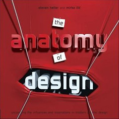
I have never been fascinated by a graphic design book. I mean, yes, I have found delightful pleasure in the content of a book, specially if it’s in regards to a designer whose work I find interesting, or if it’s a compilation of one thing (posters, 1-color graphics, typography, etc.) that satiates my yearly design intake, and even if there are no pictures to be seen, I have found fulfillment in a design book full of prose. But, until now, I had yet to marvel at a book as a whole, from its concept to execution and, ultimately, its content. Steve Heller and Mirko Ilic’s The Anatomy of Design is, possibly, the best design book I have read, seen, flipped through back and forth, gone back to and kept at the top of my pile.
 In it, and through 49 (49?) hand-picked examples, the authors aim to “anatomically disassemble piece by piece — tissue by tissue — to reveal an embedded array of influences and inspirations.” While overly metaphorical and dramatic in their introduction (of which this is only a brief excerpt), the two authors set out to do what many designers only think of or talk about casually — as in “haven’t I seen this before?” or, “dude, this is such a rip-off of [blank],” and even, “[insert obscure designer] from [insert unheard-of city] in [insert long-gone era] did this way before” — and boldly, elegantly and doggedly execute a simple thesis that plagues every designer in the world: There is nothing new under the sun. And to do so, the book is set up in a deceptively simple, disarmingly convincing and thoroughly engaging format that the authors (showcasing their amazing knowledge of the designed world) exploit, mercilessly, from start to finish.
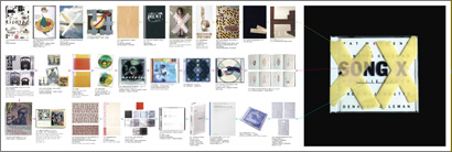
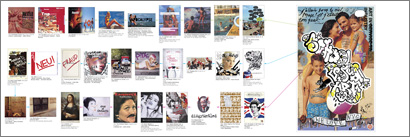
For each design example, rendered nice and big on every right-hand page — ranging from ad campaigns to book covers to CD packaging to a generous dose of posters — many of which you have probably rarely seen in other publications (or in the authors’ words, “these are not necessarily the best-known or celebrated objects of graphic design”), the authors define anywhere between three and five design ideas/concepts/mannerisms/tricks — which I feel were the hardest elements to define for the authors, but the most satisfying to skim through for the readers (“blood splatter,” “typefaces from the 70s,” “images in a grid,” “holes through the pages,” “shock of sexuality”) — that are then illustrated with more than a handful of dated and credited, known and unknown examples in a fold-out page to the left. It is when you open these pages that your (or at least my) knickers fall to the ground and the book becomes one of the most effective design history lessons as well as a catalog of timeless creativity. To boot, each example is accompanied by a pithy and informative essay that explains the design and sets up the context for what lies underneath it.
![]()

Doyle Partners CD cover for Song X, Pat Metheny. Categories: “Taping down art,” “images and opacity,” and “type and opacity.” [Click image for larger view]
![]()

James Victore poster for School of Visual Arts. Categories: “Beach stock photography,” “fake grafitti,” and “defacing faces.” [Click image for larger view]
![]()
Contrary to its subtitle, Uncovering the influences and inspirations in modern graphic design, the book never feels like an exposé of contemporary designers ripping off dead designers (or people who didn’t even know they were creating graphic design) and it rarely confirms if any of the designers were actually inspired by any of the examples, a tricky maneuver, which the authors acknowledge, “In most cases, we draw our own conclusions […] Where possible, we confirm our assertions with the designers in question, but it is not necessary. Sometimes — actually most times — designers do not know the derivation of their work.” More refreshing than designer confessions, the book shows that any given design solution is hardly unique or independent and can be arrived at through completely different and disparate funnels of eras, agendas, tools and intentions. As designers we pant for originality, but the moment we accept that we will hardly ever create completely new visual languages or images and instead keep our eyes open for what we see on the street, on TV, in museums or anywhere else, we are more likely to be able to reinterpret those visual or conceptual triggers in new and unexpected contexts, as this book proves by example.
With its rainbow-shaded and folio’d fore-edge (opposite of the spine), the book pays its respect to “writing on the fore-edge” and “rainbow,” two of the categories (that go as far back as 1996 and 1969 respectively) dissected in the book. And then paired with its own twist, a delightfully puffy and padded cover — which, by the way, is how I always imagined Ilic’s work would feel like — and executed with impeccable, contemporary typography The Anatomy of Design delivers a rich, informative and inspirational reading, skimming and learning experience. This book, I’m fascinated by.
Book spreads courtesy of Rockport Publishers.
![]()
The Anatomy of Design: Uncovering the Influences and Inspirations in Modern Graphic Design
Hardcover: 208 pages
Publisher: Rockport Publishers (February 1, 2007)
ISBN: 1592532128


I just have to stand up for the design book that fascinated the hell out of me when I first came across it, and remains riveting to this day: The Visual Display of Quantitative Information by Edward Tufte. I know it's a sub-category of graphic design, and not quite as germaine to most day-to-day design work as the book you are describing here, but dammit if that book still doesn't move me with its elegance and insight.
By the way, congrats on the new young'n, Mr. A. and Mrs. B.!
On May.10.2007 at 05:26 PM