It is early in 2007 but the funniest (and most scathing) movie I have seen all year is without a doubt Mike Judge’s — of Beavis and Butthead, King of the Hill and the turn-of-the-century-defining Office Space fame — latest effort: 2006’s Idiocracy. A movie that, apparently, no one wants you to see, as it premiered with an extremely limited release (in seven cities on a mere 125 theaters) with no promotion from its studio (20th Century Fox), no screenings for critics and, as it released on DVD this February, still not a marketing peep to push sales or rentals. But then again, who wants to see a movie about a future 500 years in the making — but unnervingly current — where stupidity, laziness, horniness and perverse, dictatorial branding have rendered society, government and etiquette into a messy, procrastinating and doomed world that has succumbed to sleazy pleasures and is dominated by corporate and retail companies, surrounded by mountains of garbage, and defined by language that has become the lowest common denominator of a combination of “hillbilly, valley girl and slang”? This is the world that the main character, played by Luke Wilson, and his prostitute partner-in-misery, played by Maya Rudolph, have woken up to 500 years after a military experiment to freeze their most competent men and women has, of course, gone awry. An early montage paints the picture: A franchise of the suburb-friendly chain, Fuddruckers, is built on top of the military base and metamorphoses in a five-century-long process into a bubbly-lettered, now oddly-coloned Butt:Fuckers.
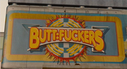
But Fuddruckers actually had it easy. Everything in America, as we know it, has deteriorated to its exaggerated (but nonetheless potentially realistic) possibilities in this dystopian movie: Costco is the size of a small village and sells livestock, Carl’s Jr. is the sponsor of the government which is now run by a porn star, a faux Gatorade-like product has replaced water, and civilians (and the President of the U.S.A.) happily fire automatic weapons into the air in celebration — or to get someone’s attention. What makes this movie so funny (and scary) is that we can imagine living in a world like this; environments like Blade Runner, Minority Report or Children of Men are easier to dismiss as something that our grandchildren’s grandchildren will have to face on their own and are perhaps easier to cope with, unlike Idiocracy where, despite its cheesy computer-generated imagery, we are drawn into this silly world — rubbernecking as it wrecks in its feasibility. Still, I snickered and guffawed throughout the movie as Mike Judge hazes American culture, barraging through — and dragging it to its most asinine extremes — everything in his path: Economics, entertainment, health, food, politics, linguistics and even, to my sustained amusement, the visual and graphic language with which we communicate.
The movie spares no detail in the satire of branding and graphic design, turning every logo, sign and poster into a dumbed-down, Web 2.0-ish, futuristic-looking style that may come sooner than 500 years from now. Either a designer with a wicked sense of humor was hired to create the myriad of logos of real and invented corporations, or they simply tagged LogoWorks and asked them to do their best work. Whichever case, Idiocracy displays some of the best graphic humor to appear in a feature film. Here are some of my favorite screen-captured moments:

Signage on a hospital facade that doesn’t fit. But, I mean, hasn’t this happened to all of us? Who hasn’t run out of room when trying to hand-letter a sign?

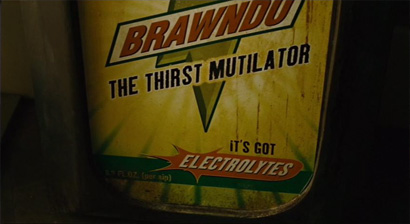
Brawndo, the faux-Gatorade product italicizes an italic for a gravity-defying slant! Do check out the kerning in “Mutilator”, and the lower case “i” in an otherwise uppercased ad.

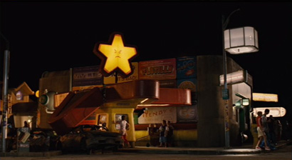
Carl’s Jr. once friendly star is now adamantly pissed off. Must be because one of its arms fell.
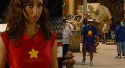
Cool Carl’s Jr. swag. But then again, everybody wears heavily branded T-shirts in this movie… Hmmmm, Not much different from today’s irony-clad apparel actually.

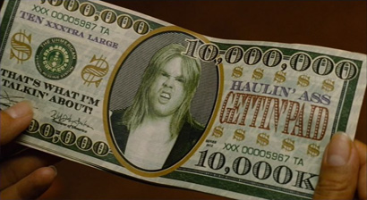
Probably doesn’t make the cut as the “most beautiful money in the world” but, man, this is so money.

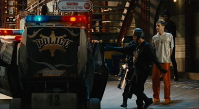
When the Police car first came out I knew this was going to be one of the best movies ever. I can’t wait for the day when the N.Y.P.D. adopts some blackletter, bling and badass curly-cues as their identity. New York’s finest would look fine in these uniforms if you ask me.
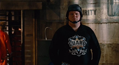

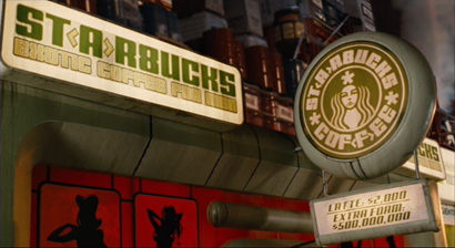
Some of the funniest visual jokes are of existing brands and their corresponding idiotic makeovers. Starbucks’ mermaid is now as pissed as Carl’s Jr. star and has replaced her crown with some sort of comrade beret and the typography has gone to the deep ends of poor taste and the shallow waters of leet speak with that “8” standing in for the “B”.
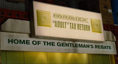
H&R Block retains its green square but has gained a multitude of bevels and shadows (sound familiar?) and is now rendered in a kickass futuristic typeface with, count them: One, two three strokes.
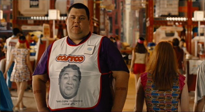
Costco, disappointingly, could actually be a redesign that would take place this decade in this way, perhaps without the multi-strokes.
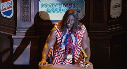
Here, we see three logos: Pepsi, which looks like it came out from the T.26 library; American Express, which must have been designed by the same agency that did H&R Block; and SBC, which, in this context, looks deliciously old-school.
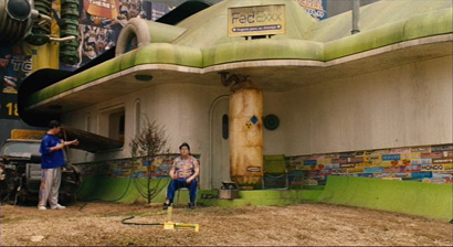
Hard to spot but, here at the top of the frame, we have FedEx getting the triple-x treatment, and it looks like the company has switched to shipping Ground only.

Yes, you are right, this logo is exactly like the 2007 version. This is funny. But not funny-haha. Funny-sad. Fox News as you may know is part of Rupert Murdoch’s News Corporation, the same empire that owns the studio that made this movie, 20th Century Fox. How sad that they could not play along. This simply looks to be another manifestation of the problems that the studio had with this movie. However, the tracking on “channel” is quite stupid.

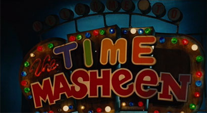
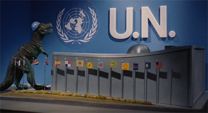
Another laugh-out-loud moment was when the main characters ride the “Time Masheen” and come to a diorama explaining how the U.N. (pronounce here as Unh) saved the world by Uhn-nazing the Nazis. The scene also reminded, in a non-funny way, of this poster by Israeli designer Yossi Lemel:
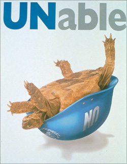


Perhaps not the most healthy and balanced recommendation, but at least it’s a lot clearer than the USDA’s.

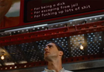
Despite his good intentions in the movie, Luke Wilson is the most hated habitant for the longest part of the movie in this mad mad world — I will spare you the details in case you do see this movie — becoming the most wanted criminal for the reasons listed in the frame below. And I can’t help but think that this blink-and-you’ll-miss-it frame is essentially the most important in the movie and the one that carries the heftiest moral: The world will end up like this if we keep being dicks and fucking up lots of shit. As designers we can’t do much to save the world but let’s try to not fuck up lots of shit and not be dicks. That’s my biggest lesson for 2007. But it’s still early in the year.
All frames are © 2006 20th Century Fox.


Can't wait to see it.
On Feb.26.2007 at 05:35 PMer,
Can't w8 2 xee it.