Speak UpA Former Division of UnderConsideration
The Archives, August 2002 – April 2009
advertise @ underconsideration
---Click here for full archive list or browse below
  
Quipsologies
~ Vol. 85 ~

A top-o’-the-morning-to-ya edition of Quipsologies.

divider

~ UPCOMING EVENTS ~

An evening with Todd St. John of Hunter Gathere as he talks about his work, explains what he does and doesn’t have to do with the design world and, most importantly, he will talk about the value of doing things the hard way. Limited edition silk screen prints by Todd St. John will be given to all attendees.
AIGA NY: “In/Between: Todd St. John, HunterGatherer”, November 15, New York.

divider

~ ARMIN VIT ~

Wow. Now that’s innovative packaging. Funny ads too.

~

If attending the legendary Basel School of Design is your unfulfilled dream, now is a good time: “The Basel School of Design is launching a new international programme, Basics in Design, beginning in the autumn of 2007. It offers foundation-level training in design basics, in keeping with the school’s form- and process-oriented approach to design. Subjects include letterform design, drawing, spatial design, and colour. All courses will be taught in English.Students in the programme will also be eligible to sign up for an intensive workshop in typography conducted by Wolfgang Weingart each term.”

~

In case you missed this link for a beatifully typographic music video (that is awfully close to Sagmeister’s latest work, by the by): The Softlightes Heart Made of Sound. Big file, longish wait. Worth it.

~

Pentagram welcomes its newest partner, Luke Hayman (yes, that Luke Hayman), to its New York office.

divider

~ MARIAN BANTJES ~

Artist Derek Stroup dresses down candy wrappers and potato chip bags.

divider

~ BRYONY ~

Communication Arts’ 50 essential bookmarks.

~

The Starbucks Experience, now availbable for your bookshelf. By Joseph Michelli.

[Via]

divider

~ M. KINGSLEY ~

The Commonwealth observation of Remembrance Day was held over the weekend, along with the annual controversyoverpoppy symbolism.

~

The band Enigma: miners of world musics and writing systems.

~

Writer Ellen Willis, the first rock music critic for The New Yorker, passed away last week. The last paragraph of her essay on Woodstock deserves extra consideration. [via]

~

The truth about architects’ shortcomings.
~


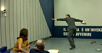
The late Jack Palance (who passed away over the weekend) may have been a self-caricature, but he did appear in (Uncle) Jean-Luc Godard’s masterpiece, Contempt — in which he tossed film canisters around like a discus. A highly-recommended addition to any Netflix queue.

Maintained through our ADV @ UnderConsideration Program
ENTRY DETAILS
ARCHIVE ID 2819 FILED UNDER Miscellaneous
PUBLISHED ON Nov.13.2006 BY The Speak Up Authors
WITH COMMENTS
Comments
Randy J. Hunt’s comment is:

Poignant observation on applicability of Willis's last paragraph in the Woodstock piece.

On Nov.13.2006 at 10:15 AM
Randy J. Hunt’s comment is:

Poignant observation on applicability of Willis's last paragraph in the Woodstock piece.

On Nov.13.2006 at 10:15 AM
Paul Sahre’s comment is:

armin,

do you have any more information on the softlightes video?

if this did NOT come from sagmeister’s studio, it is despicable.
i think it was Ned Rorem who said that “all art is cleaver theft.”

this ain’t art i guess.

-PS

On Nov.13.2006 at 05:39 PM
Su’s comment is:

The video was done by Kris Moyes.

Sagmeister has a lock on making words out of stuff now? And for how long after? Hasn't he been doing those for years? Seriously. This is like Felix springing up out of the floor when someone else manages to get some attention for doing one of those single-line illustrations(never as well as he, of course).

On Nov.13.2006 at 10:19 PM
Kevin’s comment is:

And on the note of theft and Sagmiester, should we look back to Jenny Holzer writing on bodies before he ever got around to it? Making words out of non-typographical objects has been in practice for years. Only one part of that video bothers me as being to similar to Sagmiester, but it shouldn't stop people from giving it it's due.

On Nov.13.2006 at 11:50 PM
Armin’s comment is:

Paul, other than director's name (which Su pointed out above), I don't know much about it. When I first saw the video, without looking at the credits or any further Googling, I could have sworn it was done by Sagmeister. I was very surprised it wasn't.

> Sagmeister has a lock on making words out of stuff now? And for how long after? Hasn't he been doing those for years?

Su, while I agree with you that no one designer can "own" a technique, the similiarities in lighting, materials, and the shadow-of-the-objects-making-the-letters trick are extremely similar to Sagmeister's ongoing "Things I've Learned" series. Sagmeister has been doing it for two or three years and has continued developing new "frames" until recently. I'm not claiming that he is the first or the best, but the Softlightes video is just too similar, too soon.

On Nov.14.2006 at 08:19 AM
milo’s comment is:

Hey, i didn't know, Palance appeared in Contempt.

On Nov.14.2006 at 01:47 PM
Paul Sahre’s comment is:

everyone has different thresholds for what is acceptable in terms of ‘influence.’ i guess technically all designers do is steal (take forms, colors, typefaces, etc) and re-contextualize. the problem with this video for me is that there is no re-contextualzation.

in this case, it seems like designer(s) (sagmeister inc.) working and slaving and staying up nights and developing something unique over a period of time to then have it 'un-cleaverly' lifted.

On Nov.14.2006 at 02:27 PM
M Kingsley’s comment is:

Oh my fellow designers, how you frustrate me — especially hip New Yorkers like Paul Sahre or my beloved Armin. There is more, much more, to the world than recent graphic design history.

Stefan Sagmeister is a truly gifted designer, but he in no way was the first to shape objects into words. Let's take a look back in reverse chronological order.


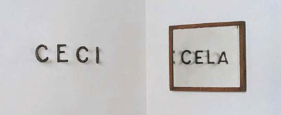
Markus Raetz (who's actually been doing this kind of work for decades), Ceci-cela, 1992-1993, 4 sculptures and one mirror


Fred Eerdekens, God-Ego, 1990, object and two light sources


Nancy Dwyer, Me, Mean, Men, Mean, 1987


Ed Ruscha, Lisp, 1965


Kolams of southern India or...


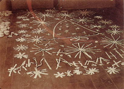
...Veves, the ritual symbols of Vodoun which are drawn on the floor in white powder.


Or, from non-traditional art like this document of an installation from 1894 — done by Marie Lieb, case no. 149 of the Psychiatric Clinic of Heidelberg — part of the Hans Prinzhorn Collection...


...which bears an interesting similarity to S.S's 1999 work for Anni Kuan.


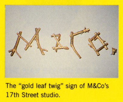
And finally Paul, you should ask Emily Oberman about this image from page 56 of Tibor Kalman's monograph.

Wait, wait! For extra credit, here's Michel Gondry's 1993 video for Jean-Francois Cohen's "La tour de Pise."

On Nov.14.2006 at 04:25 PM
Paul Sahre’s comment is:

mark,

excellent. all re-contextualizations. thanks for doing the leg work mark. all examples of much, much, much more cleaver theft.

On Nov.14.2006 at 04:49 PM
keith’s comment is:

"more cleaver theft."
I think someone should put a meat cleaver through your skull...that would be quite clever...

On Nov.14.2006 at 04:58 PM
Su’s comment is:

Armin: Oh, that wasn't for you. You were just pointing out the similarity, which I'd hope no one is silly enough to even attempt denying. But "too much too soon," is endlessly(and pointlessly) debatable, though Mark's pretty effectively destroyed anybody's chances of defining when "soon" starts.

Paul taking the leap to "despicable," though, puts an entirely different, somewhat hysterical frame on it. And calling Mark's examples "much, much, much more cleaver theft" weirdly glosses the fact that they are the ones ostensibly being ripped off.

As far as I'm aware, Sagmeister has never taken this conceit to video. If so, that alone is enough re-contextualization on the part of the video for me. Small steps are fine.

As with so many things involving people at that sort of level(that's intentionally vague), I have to wonder whether this has less to do with the work than the person, or better: his admirers; I'd wager he wouldn't be particularly concerned about it. I don't see people getting up in arms when yet another person does swirly Si Scott-style lettering, for one.

On Nov.14.2006 at 08:10 PM
Paul Sahre’s comment is:

also excellent keith, thanks for pointing out the typo.

On Nov.14.2006 at 08:12 PM
James madison’s comment is:

Thank you, Mark Kingsley, for showing how many people had this 'original' idea before Sagmeister. I wonder about the notion that you have to give props to whoever makes the biggest splash. Just because he has been doing these type things for years does that make it 'his'?
Comments like Paul Sahre's are what make everyone outside NYC hate New York and its designers for arrogating swathes of artistic territory to themselves as if nobody else in the entire world might have some prior claim.

ps - I wonder if Felix Sockwell ever tried explianing his ownership of the single line idea to Laura Lindqvist?

On Nov.14.2006 at 10:58 PM
Paul Sahre’s comment is:

it’s paul from ohio and baltimore again.

come on. there are infinite possibilities with this stuff, and this is where someone arrives? this is not a swath, this is the head of a pin.

mark’s examples are great, just not as a defense for this video. unless, sagmeister was involved. then i think they’re good examples.

keith, spell check?

On Nov.15.2006 at 08:15 AM
Paul Sahre’s comment is:

su,

sagmeister HAS taken this to video. i’ll try to find a link...

this is a subjective topic and i’m sure its been debated endlessly on speak up. the word ‘despicable’ is clearly not gray. so for me, this video has crossed the line. i’m curious if you would have the same reaction if i used the word ‘unfortunate’ instead of ‘despicable?’ maybe that is a better word to describe my feelings about this, especially not knowing who or how or why this video was made. i know i have been guilty of a similar thing in the past, sometimes consciously, sometimes without realizing it until after the fact. i would hope that someone would call me on it, if/when it happens in the future. i think we all have to be better at stopping ourselves or saying no to our clients, editors, art directors, etc... or at least covering our tracks better.

as far as what stefan thinks, i’m sure he’s ‘flattered,’ but that wouldn’t change my opinion about it.

again, all speculation, as i don’t know the specifics. if stefan was consulted, hired or involved in some other way, i love it.

On Nov.15.2006 at 10:14 AM
keith’s comment is:

If you're going to quote someone, especially over and over and over again, you should quote them correctly.
And if you want to see someone getting ripped off, go to Felix's site and look at the Nike job...

On Nov.15.2006 at 10:53 AM
keith’s comment is:

"again, all speculation, as i don’t know the specifics. if stefan was consulted, hired or involved in some other way, i love it."
Just trying to hammer out the point that because someone is the most "influential" or "public" or "controversial" they should have sole ownership of an idea won't make it true...

On Nov.15.2006 at 11:07 AM
Paul Sahre’s comment is:

keith,

my point is not about ‘sole ownership of an idea.’ its about context and, more importantly to me, its about more being aware of what the fuck we are doing.

this isn’t that hard. here it is. ready?

if you are doing something that looks like a contemporary’s fucking work, then take it in a different direction, no matter what the higher ups say, or how much you are getting paid, or how well it works for a particular project and what temporary trouble it might cause at the moment.

if on the other hand, you just get into the flow of making the thing and its too late to pull the plug, learn form the experience and try not to let it happen in the future.

On Nov.15.2006 at 12:15 PM
Paul Sahre’s comment is:

and keith, before you jump on it.

i meant to write:

...its about being more aware of what the fuck we are doing.

feel free to spell check...

On Nov.15.2006 at 12:20 PM
keith’s comment is:

point taken, but you make it seem like your good buddy Stefan is suffering anguish from this and nobody recognizes him and his great work.

On Nov.15.2006 at 01:49 PM
keith’s comment is:

and when i-t-s is used as a contraction it is "it's"
(if you really are so concerned with your spell check)

On Nov.15.2006 at 02:18 PM
Greg Scraper’s comment is:

Yeah. Your mom.

I dunno, it seemed appropriate here somehow.

On Nov.15.2006 at 02:30 PM
Su’s comment is:

sagmeister HAS taken this to video. i’ll try to find a link...

Then I'll stand corrected on that fact. But it doesn't really affect my position in the end. You're the one demanding re-contextualization.

Re: Despicable vs. unfortunate, my reaction, wording or what have you might have been a bit more tempered(but then so would your initial statement have been), though the opinion would probably remain ultimately the same. Maybe I'm being overly precise for some, but "unfortunate" is not an even trade for "despicable." There are obvious differences in implication.

if you are doing something that looks like a contemporary’s fucking work, then take it in a different direction, no matter what the higher ups say, or how much you are getting paid, or how well it works for a particular project and what temporary trouble it might cause at the moment.

Or how about this: "I think it would be really neat to have this video be a bunch of words made out of stuff. But someone's already doing that, so we'll have to bring him in to consult. Or if that doesn't work, we can just do something else altogether, based on some vague principle."

I'm sorry, but I just don't see this. It might be a courtesy(?) to do it, but there is nothing actively "wrong" with not.
And what happens if they did ask but were refused? Maybe he was just busy. Too expensive? Do we have to define some sort of level of due process after which the "originator" loses the right to complain, or would refusal indicate you're not allowed to use the technique(or at least immoral for doing so)?

On Nov.15.2006 at 03:33 PM
JonSel’s comment is:

And how would we guarantee that these guys even KNOW of Sagmeister's work? I've never seen it for real, only in the context of an article or two about him.

In the end, what impresses me is that each word in and of itself is a complex piece of work that requires a lot of effort for a 1 second visual. That they shot probably close to 50 (I didn't count, so don't sue) is amazing.

The word made of ice that melts completely away was fascinating.

On Nov.15.2006 at 03:43 PM
Sam Potts’s comment is:

I've never seen it for real

Bravo, Jon--I think that qualifies as the comment of the year.

It's a joyous video and very creative and probably a Michel Gondry homage. Originality, like consistency and Lord of the Rings trivia, is the hemoglobin of Paul's mind.

On Nov.15.2006 at 04:48 PM
Mr One-Hundred’s comment is:

Without comment from either Sagmeister or the people who made the video, isn’t this all just pointless speculation?

Or, as Neil Young might say “You’re all just pissing in the wind”

To add to the pissing, I can’t imagine Sagmeister being the kind of person who needs the design community – New York’s or anyones – to leap to his defence on matters plagiaristic. Curious to know for sure, though.

On Nov.15.2006 at 06:24 PM
JonSel’s comment is:

I'm not sure whether I'm being mocked or not, Sam. By "never seen it for real," my intention was to suggest that the awareness of Sagmeister's work – and encountering it in its real context, not an annual or design magazine – is probably on the low end, even by design fan club status.

But, I agree that amidst all this talk of creative theft, we all seem to have forgotten to actually admire the work.

On Nov.15.2006 at 07:02 PM
Armin’s comment is:

Mark, you are absolutely right and time and again you have proven that there is nothing new under the sun. BUT...

This reminds of a similar discussion we had last year, about Luba Lukova's peace poster being copied by someone else and you then added an image of a logo by Pierre Bernard and a piece by Tony Cragg that were similar in idea but far, far away from the execution that Luba has done years later. I see a huge difference between appropriating/modernizing/retooling/recontextualizing art (or design) with a new style/purpose/effect and simply copying a style/purpose/effect.

The problem I have here, and the same Paul has (I think), is that the execution of the still typography in the video is extremely similar to that of Sagmeister's. Plain and simple. I am not advocating for Sagmeister's work to be the chicken's egg, but Kris Moyes' execution is simply a clone at worst, a minor evolution at best.

***

And, girls, please, enough with the grammar and spelling lessons: We ALL make typos and get things wrong when typing on a blog between client phone calls and moving type around the screen. It's unavoidable and is the lamest form of blog taunting.

On Nov.16.2006 at 08:32 AM
Eric’s comment is:

I think Paul is going a little over the edge.
Kris Moyes did make words out of objects, but
he made different words out of different objects
than Sagmeister.

In my opinion, what you are saying approaches the idea that a car designer has to trash his concept because 4 wheels, 4 doors, a steering wheel and red paint has already been done before.

No one seems to complain when a book designer comes out with the idea of black garamond, white paper, page numbers and white space approaching some Tschichold ideal.

I have seen words made out of objects a hundred times, but does this typographic application fit the concept of the design, or is it only aesthetic and superficial?

On Nov.16.2006 at 10:19 AM
m. kingsley’s comment is:

Armin, perhaps the problem that you're actually having is confusing the form with the content — or even publicity with innovation. Calling "copy" on the execution of an idea (but not the idea) is some shaky ground that you're standing on.

There's a whole long lineage of Europeans transforming everyday materials for the purposes of a photograph — From Josef Sudek's Labyrinths to Piet Zwart's photo-montages through to Gert Dumbar and Michel Gondry. The Sagmeister doesn't (to use a branding word) "own" typography made out of bits found around the house. What he does own is nudity and dangling testicles.

And to better make (and confuse) the point about form vs. content, here's something by the late comedian Mitch Hedberg:

"If I made potato chips and put them in a can, people would say I was ripping off Pringles. But what if I put them in a bag?"

On Nov.17.2006 at 03:30 AM
keith’s comment is:

"more cleaver theft."
I think someone should put a meat cleaver through your skull...that would be quite clever...

I did it once to get the guy's attention, he's the one harping on it...and to my defense, I actually made comments about the issue.

Which I will continue to do now...
I agree whole-heartedly with Jon, I really haven't seen Sagmeister's work and I have seen this film, so if I were naivë and came across Sagmeister, I might think he were the one making the copy. It boils down to the facts of what Jon said:
"In the end, what impresses me is that each word in and of itself is a complex piece of work that requires a lot of effort for a 1 second visual. That they shot probably close to 50 (I didn't count, so don't sue) is amazing."
Sagmeister may have made some great pieces in the same thread of this video, but it has be re-contextualized ***magic word*** into a new application, which is truly a very involved piece in and of itself.

On Nov.17.2006 at 12:28 PM
Killerjoon’s comment is:

Wow... Graphic design is a scary shit!
Anyways... here is the Stephan's video. (Old school: copy & past) ^^

http://www.aiga.org/resources/movies/sagmeister/sag.mov

On Nov.17.2006 at 12:49 PM
KillerjoOn’s comment is:

Sorry. Here you go! ^^;


here

On Nov.17.2006 at 01:11 PM
Su’s comment is:

No. That was, at best, a slideshow of still pieces. They were neither done for that video(interview), nor as video(by which I meant motion).

Paul, is that the one you had in mind?

On Nov.17.2006 at 01:15 PM
killerjOOn’s comment is:

cyan vs. blue
Magenta vs. Red
Yellow vs. Yellow ???
Still motion vs. active-motion
art for interview vs. art for music video
Mashed Potato vs. French fries ???

hummm.... interesting.

On Nov.17.2006 at 01:31 PM
Paul Sahre’s comment is:

su,

the video killerjoon posted is not the one i was refering to. i have looked on-line for it with no luck. it is about keeping a diary.

i did find out a few things about the softlightes video. none of this is offered to support or refute, just fyi.

sagmeister did not have anything to do with it.

this video is indeed done by kris moyes. he is an australian director and animator. he is not a designer, at least he doesn't refer to himself as such. it looks like he has been doing this (ripping off graphic designers) for a while (easy...just kidding). for those who are interested, here is a brief interview. turns out he is 'very attractive.' (not kidding...from the interview).

http://www.modularpeople.com/03/mod_people/krismoyes/


sam,

star trek original series.
for some reason i never got into the lord of the rings.

On Nov.17.2006 at 05:06 PM
Edel Rodriguez’s comment is:

Paul,
Hi, nice to meet up here. Somehow, through links here and there, I ended up at this forum. I really enjoy it, great ideas shared by all. I read the whole thread, looked at the video, and it's pretty obvious to me that it's a case of a video director who saw Sagmeister's work somewhere, thought "hey, that's cool", and went ahead and just "appropriated" the look and not much of the meaning. My humble opinion.

On Nov.18.2006 at 04:06 PM
ron’s comment is:

It seems as though this discussion board may be dead , but I will add my 2 cents.... I think I have a unique perspective on this piece , as I am the author of the song. I found this blog by googling to see if anyone had any thoughts or critiques on our video. Like most "laymen", I am not familiar with the work of Sagmeister. In fact I had never heard of him before I read all these posts. As such I will make no defense of whether or not Kris "stole" his ideas. However I will point out that people on this blog have been going back and forth about the merits if this video and from our humble point of view , our goal has been achieved . The more people talking about the video the better. I would rather have people talking about the video and disecting it , than not talking about it all.That's money well spent.

On Nov.26.2006 at 03:06 AM