Only 63% humidity expected in this edition of Quipsologies.

A scary new “jingle” for Bazooka Joe. Don’t miss the commercials listed on the related column on the right on YouTube.
Seeing Jesus on a piece of toast is soooo Twentieth Century. Now we have Pringles man apparitions in sweaty asses. [via]
Who Knew, issue 3, is now live. This is steadily turning into a great project.
Kyoorius Designyatra 2006, the first (?) major design conference in India, will take place this coming September. Neville Brody, Vince Frost and Peter Bi’lak to appear, among others.
More printing movies: Aesthetic Apparatus’ scream-printing (man, I’m funny!). [via]
The Urban Forest Project, a collaboration between Times Square Alliance, Worldstudio Foundation and New York’s AIGA Chapter is now live. Critique from yours truly coming very soon.
Andrew Twigg interviews Brett Yasko of the Partisan Project.

This year’s Adobe Design Achievement Award winners have been announced. Among the 24 winning student projects are: a poster of everything Hank Huang owns, a campaign to push America to adopt the metric system, and a beautifully executed motion pieces that showing what the world may be like without genetically modified food.
MTV invites us to break our addiction. So, pull yourself away from TRL for a moment and think about that iPod and the pair of jeans you just bought.
Ever wonder what to cook with all those things sitting in your pantry? I know, I know, not that common here in NYC, but I long to be in that position, now that Snacksby is here.

In BBC Pictures, watch Boy George do his civic duty.
One designer’s screen dances to the beats of DJ Shadow. Observe how the most nuanced layout adjustments look exciting thanks to beat-box drums.
Witness software that makes anybody look like a hot pop star.
Industrial design from the Royal College of Arts solves one user’s extensive hand shaking.
Treading through the familiar ground laid by Tufte, Fullbright winner Professor Kobourov explains the value of information design in this Arizona Daily Star article.
Experience Maya Lin: Systematic Landscapes at Seattle’s Henry Art Gallery through September 3. If you can’t make it, at least you can hear audio from the exhibition’s curator, Richard Andrews.
For landscapes of another sort, see Zaha Hadid’s work through October 25th at New York’s Guggenheim. “My ambition is always to realize theoretical projects that seem difficult at the time.” —Zaha Hadid.

The movie industry mistakes unprecedented public ridicule for genuine interest. We were laughing at you.
Shamu, Mamu and WaMu?

“Now that pixels have replaced pencils the art of drawing has vanished. I’m so exasperated I’m designing my own book cover.”
Get yer tickets. October 14. Jean Baudrillard. Frieze Art Fair 2006. Regent’s Park, London.
Beginning in September, Montreal’s City of Words/Une Ville des Mots project will install the words of 10 Montreal authors on buildings, walls and billboards throughout the city.
An amusing detournment of a Chick tract.
Who says you need a professionally-designed business proposal? Just get Mommy and Daddy to pay for it.
Well, at least it’s a proper apostrophe.
The perfect gift for that special someone who just won’t shut up about OSX.
Not necessarily suggested for the next time a client asks you to make a logo bigger: Papers from the University of Sydney’s Key Centre of Design Computing and Cognition.
This just in: You can shine a turd!
Related: Perhaps there’s no finer example of information graphics than the Bristol Stool Scale. (not safe for lunch)
Curious about that Branding thing that everyone’s talking about? Well, the Donald’s got you covered.
More great “information” graphics.
Today’s metaphor describes the relations between vendors and clients through the example of animal husbandry.
An examination of the relationship between pin-up queen Bettie Page and photographers Pauline Klaw and Bunny Yeager.
From the new journal of critical philosophy, Parrhesia, comes this proper definition of the terms “aesthetics” and “ethics.” [via]
Particle physics wants graphic designers.

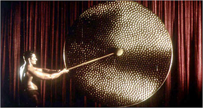
Corporate logo Ken Richmond passed away on August 3. He was the fourth man to bang the (papier-mâchè) gong at the beginning of Rank Organisation films.

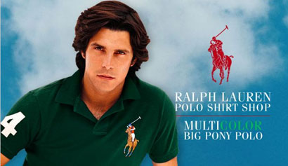
Is it me, or are the logos on new Ralph Lauren Polo shirts hideously big?
Initial dispatches from an inter-blog symposium on pornography: I still dream of orgonon and an analysis of the money shot.
An interview with Lawrence Weiner.
Jacques Lacan’s Sexuation diagrams, in case you were curious.
The earliest piece of paper has been found in an early Chinese landfill.
Milestones in the History of Thematic Cartography, Statistical Graphics, and Data Visualization [via]
Ever wonder why modernist architecture uses white?
They’re groovin’ in the ‘couve: a call for entries which explore “the material condition” of Vancouver.
If you haven’t yet, check out The Sartorialist — a wonderful street fashion blog.
More beautiful than design #1: I certainly hope you’re enjoying our annual visit from the dog-day cicadas.
More beautiful than design #2: This weekend a friend offered me a few slices of jamón ibérico which was smuggled in from Spain. If all goes well, we’ll be able to buy it in the States in 2007 — in which case, you owe it to yourself to try some. The fat melts at room temperature into an olive-oil consistency; the color is dark red, almost purple; and the initial taste is similar to a mild chorizo with great complexity and balance. Eating it is an elemental, life-affirming experience which will ruin you for mass-produced ham forever.


MTV pitching anti-consummerism. The irony is too much.
Also, I like the quips posts, but they're getting a bit unwieldy. May I suggest a more frequent, but not as long publication cycle for these? Or maybe just incorporate them as an ongoing sidebar on the main page?
On Aug.21.2006 at 11:02 AM