To certain folks of a literate nature, today, June 16, marks Bloomsday — the day in 1904 which James Joyce chose to set his novel Ulysses and the date of his first date with Nora Barnacle, who would become his wife. It is also rumored, based on a letter from 1909, this was the date of their first assignation. In true Joyceian fashion, folks across the world will celebrate by drinking, screwing, and carousing — especially in Dublin, where the book is set.
This day carries a personal significance because it also marks the birthday of Sean Kelly, one of my favorite clients.
Sean is a gallerist in Chelsea who follows both a Duchamp and a Joyce obsession. (The Men’s and Women’s rooms at the gallery are marked “James” and “Joyce” respectively.) For last year’s birthday, his wife Mary secretly gave gallery artists a copy of the Modern Library Edition and asked each to make an “intervention,” which would then be presented at a Bloomsday bacchanalia.

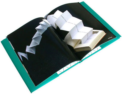
Joseph Kosuth cut a rectangular section out of the interior of the book, inside of which is a schema for Ulysses, which accordion-folds out of the book. (Photograph of Kosuth work by Steven P. Harris)
As both a gesture of thanks and as a document of the collection, the decision was made a couple months ago (at the last possible moment) to produce a slim volume on the project. The title Ulysses: Wrectified referred to Duchamp’s notion of the “rectified readymade” and was a pun on “wrecked” — a not-so-sly nod to everyone’s state after the previous year’s party.

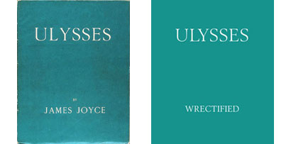
Left: Ulysses; 1922; Paris; Shakespeare and Company
Right: Ulysses: Wrectified; June 16, 2006; New York; Sally Knee, Publisher
(“Sally Knee” is an anagram of “Sean Kelly”)

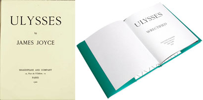
Left: Ulysses; title page
Right: Ulysses: Wrectified; title page
Joyce designed the title page and front matter for the first edition. At the time he was both experiencing eye trouble and a non-typographer. Hence, the triangle of type at the bottom, uneven line spacing and kerning problems.
Ulysses, first printed by Maurice Darantière in Dijon, was an achievement, considering that one of the most complex works in English was set by French-speaking typographers. Printing of the book came to a temporary stop in July 1921 when Darantière ran out of the letters that are more common to English than French (like “e,” “h,” “w” and “y”). In the typographer’s argot, this is known as running “out of sorts” — an appropriate description of the book’s history of typographical errors.
For Ulysses: Wrectified, rather than open the selection of typeface to whimsy, a decision was made to approximate Darantière’s Elsevir setting with a suitable digitized face. The final choice was Berling, developed from 1951–58 by the noted Swedish designer Karl-Erik Forsberg, and based on fifteenth-century Venetian faces by Aldus Manutius. Even though Berling premiered twenty-nine years after Ulysses was published, it has an appropriate fidelity to Darantière’s first edition — with one exception. Sadly, a version with oldstyle figures, small caps and other typographic details is not currently available. In this case, Berling, too, is “out of sorts.”
Note: this is an expanded version of the colophon to Ulysses: Wrectified. Many thanks to Chester at Village for his help in our initial type research, and for passing our inquiries on to Christian Schwartz and Tobias Frere-Jones. Regrettably, the book was printed in a one-time edition of 500 and is not available to the general public.


Kingsley, thanks for so much insight into Joyce's literary explorations. The New Yorker's June 19 2006 article The Injustice Collector, about Joyce's grandson "blocking" research and academic examination into his oeuvre, I was soured somewhat. Does the Ulysses: Wrectified one-time limited edition printing (not available to the general public) have anything to do with grandson Stephen Joyce and his agressive control of the estate?
On Jun.16.2006 at 08:01 AM