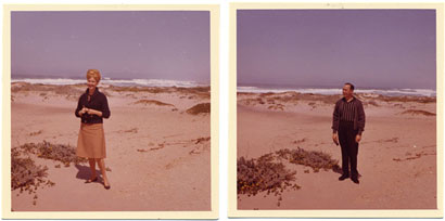
Feast your eyes and your mouse on this edition of Quipsologies.

Ken Kaess, who was chief executive of DDB Worldwide, died at the age of 51.
The Washington Nationals now have an alternate cap Sans W, perhaps in preparation for George W’s departure from the White House in ’08.
It’s official, Google’s easy webpage creator is now full, but they have a waiting list if you’re eager to get a G-domain.

CNN gets on the computer is making designers stupid bandwagon. [Thanks to Frank Lin for the link]
We’ve shown you how to make a UFO in a previous edition of Quipsologies. Today we show how to make your own Jesus Toast. [Thanks to Josh Berta for the link]
Even more from Josh Berta (a fellow Pentagrammer):
Animation celebrates its 100th anniversary
Two more entries from the same website, Mexican Lobby Cards and The Greatest Cartoonist You’ve Never Heard Of.
Then check out John Kricfalusi’s blog (he created Ren and Stimpy). Pure unadulterated cartooning! And some interesting thoughts on “design” as it pertains to cartooning.
Microsoft steals Linotype’s Frutiger LT 45 Light. A CD — like those you buy at Staples in bundles of 100 [ed. author’s drama added for effect] — serves as evidence. [Thanks to pk for the link]

Introducing Word on the Street, a series of photographs featuring, well, words on the street.
Word on the Street #1, Berlin:

Domains with .eu become available to anyone who resides in the 25-nation European Union, and sell by the thousands in a few hours.
June 17th. Every year. A ritual. One family. [Thanks to Jason Mannix]

And you thought your straw sculptures at the local diner where so ingenious and cool in their abstraction… well, you might have some competition. [Via]

A fabulous website that documents that mysterious architectural wonder known around here as “the Vancouver Special.” Images sorted by architectural details (brick facades, statuary lions, roof type, lot placement…). Just when you thought you wanted to move to Vancouver …For extra fun, leave the site and browser open on just watch them update. Kinda like a screen saver, only different.

Rejoice! Oskar Fischinger on DVD from the Center for Visual Music — including the magnificent Spiritual Constructions! (And if you don’t know Fischinger’s work, then your education is not complete!)

Currently at The Getty Center Research Institute Exhibition Gallery until June 25: Agitated Images: John Heartfield and German Photomontage, 1920-1938— an overview of the pioneering photomontage/political artist. Above, The Voice of Freedom in the German Night on Radio Wave 29.8 from 1937.
As I get older, I’m less interested in opinions, whoever holds them, and more interested in ideas and information. Excellent writing can still grab me … but I also want to learn approximately true things about film, and this requires going beyond most current models of what a piece of film writing should be.
We could, for instance, aspire to the power of fine science writing. Why couldn’t a book on cinema achieve the rigor and lucidity irradiating Jared Diamond’s Guns, Germs, and Steel, Matt Ridley’s Nature via Nurture, or Helena Cronin’s Ant and the Peacock? Nearer to home, the other arts have given us essayists who write with full sensitivity to history and technique. Charles Rosen on music, Jacques Barzun and W. H. Auden on literature, Robert Hughes on painting—all provide not only vigorous opinions but little-known information and provocative ideas. We learn from them.
Before spouting any random opinion about the AOL logo or ITC Garamond, designers might want to read David Bordwell’s Backpage: Against Insight.
Now, that’s how you write an opinion! Michelangelo Drawings: Real or Fake?
In 1997, an earthquake basically destroyed the frescos of the St. Francis Basilica in Assisi, Italy. Over the weekend, officials announced the final piece of an amazing restoration: an image of St. Matthew by Cimabue.
Meanwhile, New York City’s emerging artists are in danger of their own special kind of disaster. Berlin, anyone?
Is this Qual or Quan? “Canine Reactions to the Mona Lisa” (PDF download)
At the same time, both the world’s greatest and the world’s stupidist tattoos. Careful of that last one — NSFW.
Imagine the pitch for the redesign of Britain’s newest jail cells as wardens and policemen discuss the psychology of colors.

Hmm… this gives me an idea for a paper: “Structuralist Strategies in Late 20th Century American Tourism.”Look At Me.
Related to a previous Quip, West Yorkshire Police are searching for the owners of a book bound in human skin.

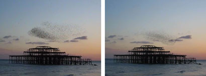
Movie Quip Time. The author of my favorite French/English blog has recently learned the word “murmuration” — as seen above.
From the department of A Good Picture Editor Could Save Your Ass In More Ways Than You Could Imagine: Perhaps you’ve all read this, but Howard Kaloogian — of the backwards apostrophe Kaloogian’s — posted an image (since taken down) which he claimed represented a “calm and stable” downtown Baghdad. Well, it seems he isn’t quite sensitive to the differences between alphabets. The photo was actually taken in Istanbul.
As expected, Kaloogian responded by blaming someone else (the US Army) and then everyone’s favorite scapegoats, liberals, as he passed the hat.


I'm honestly surprised such a big case is making progress as fast as the Linotype/Microsoft one is. At this rate, they'll settle before Vista ever makes it to market.
On Apr.10.2006 at 09:55 AM