Speak UpA Former Division of UnderConsideration
The Archives, August 2002 – April 2009
advertise @ underconsideration
---Click here for full archive list or browse below
  
Paul Rand’s Final Logo Part 2
Doug Evans + Partners

It was all quite surreal. Both meeting Doug Evans and being in the presence of a trove of Paul Rand work, yet not being at the Yale archives. Doug and I had traded emails for the better part of two years, several of which he was not on the same continent as me and this was the first time we stood face-to-face.

We were to meet at 7am on a workday at his storage locker in Lower Manhattan. It was in the middle of New York’s 10 straight days of rain which came in October. It was pouring and I was late and lost. I decided to walk one block east after standing on a corner getting wet even under an awning, and I found it.

Doug already had a bakers’ rack wheeled out of the 5’ X 10’ space but the rest was filled with boxes stacked to the ceiling. We were looking for a single sheet of paper.

Fueled by a combination of history and simple pride, Doug and I were driven to find Paul Rand’s original sketch of the Servador logo. Doug knew it existed. I just hoped. Two weeks earlier, I had posted an article highlighting what we believed was Paul Rand’s final logo for a company called Servador. Well, not only had it come into question that it was Rand’s final logo, but that he had even designed it at all.

I believe we moved some scuba gear out of the way. A few lamps. Two leopard statues. Maybe they were dogs. A 3’ X 4’ original silk-screened poster autographed by Rand. The signs were good. There was a bunch of other stuff but it was the three or four file boxes which had my focus. Finally, we reached them.

Doug found the Servador sketch almost immediately. I have to say, his files were surprisingly well organized considering the hodgepodge of collectibles in the locker and Doug’s Einsten-like hair. The sketch was perfect and exactly what we wanted. We had actual proof that Rand designed the Servador logo. There was more though. For the next half hour, sketch after sketch of logos emerged along with faxes, computer printouts, doodles, personal letters, and sketches of posters and book covers. In addition to those covering Servador, we found material on American Express, Sears, USSB, NPR, Enron, and Computer Impressions (One of three companies of Doug’s for which Paul Rand designed a logo). There was a world of design history there, never before seen by most of the profession, never by Steve Heller and possibly Marion Rand. Maybe no one other than Paul Rand, Doug Evans and their clients had seen this work.

We were moving quickly. I was trying to take in and absorb the work knowing that once it passed my eyes, I would probably not have the chance to see much of it again, at least not the originals. I found myself staring, almost paralyzed at times looking at faded pencil drawings only to be pressed by Doug to keep focused.

We also found a file for Doug Evans + Partners, Doug’s consulting firm, loaded with sketches and back-and-forth from Paul and Doug. The process was similar to Rand’s other late work. Rand would do all of the sketching and Doug would produce the work on the computer. There were many faxes and what was surprising to both of us was that the dates showed that the work was actually done after Servador, and in fact was done right before Rand passed.

As quickly as we had unloaded the space, we repacked the locker and headed for a copy store. As I rushed and fumbled to make copies, Doug raced to his apartment to wash up and pack as he was in New York for less than 24 hours. He picked me up before I was really finished, and then we drove to Steve Heller’s office in Midtown and showed him the sketches. Heller confirmed the autheticity of the Servador logo and commented on Speak Up regarding Doug Evans + Partners, Rand’s actual final logo. Heller wrote that Rand’s final logo “was, in fact, designed for Doug Evans’ consulting firm and was fine-tuned by Rand while he was in his hospital bed.” Heller went on, “I do recall him telling me on the phone that he was working on a logo days before he passed.”

After Heller’s confirmation, I went to work and Doug drove straight to Connecticut to share the work with Marion Rand and to leave it with her. She in turn has passed the work to the Yale Archives where she believes it belongs.

Paul Rand’s actual final logo was for Doug Evans + Partners. Below are the sketches and final designs. Enjoy.

Click on sketches for a larger image

DEP_Rand003_sm.jpg

DEP_Rand004a_sm.jpg

DEP_Rand004b_sm.jpg

DEP_Rand005_sm.jpg

DEP_Rand006_sm.jpg

DEP_Rand008_sm.jpg

Paul Rand’s logo for Doug Evans + Partners, one-color and full-color:
DEP_2Final_lg.jpg

Click here for Part 1 of Paul Rand’s Final Logo

Maintained through our ADV @ UnderConsideration Program
ENTRY DETAILS
ARCHIVE ID 2560 FILED UNDER Branding and Identity
PUBLISHED ON Mar.16.2006 BY David Weinberger
WITH COMMENTS
Comments
JonSel’s comment is:

"Your typographic skills are less than minimal."

That's just fantastic. And seemingly true.

Great stuff, Dave.

On Mar.16.2006 at 08:47 AM
Daniel Green’s comment is:

The "Now try screwing this one up" admonishment was my personal favorite.

Priceless!

Great work, David.

On Mar.16.2006 at 09:03 AM
SON Of BASS and RAND’s comment is:

Impressive to Say the Least, David.

PAUL RAND will Live Forever in our Hearts and Minds.

I'm emailing your Editorial to others at this moment.

Great seeing you write again!!!

DM

On Mar.16.2006 at 09:22 AM
bryony’s comment is:

It seems amazing to me that work that has been scrutinized and analyzed as much as Rand's can still deliver surprises of this kind to those removed and close to him. Beautiful.

There is indeed still amazement to be found in this world and I thank you David for finding it, and Doug for keeping and sharing it.

The added bonus of the commentary: priceless.

On Mar.16.2006 at 09:48 AM
Koleslaw’s comment is:

Great job, David. Seeing any designer's process / sketches is a treat. But you gave us Rand's. Thank you.

On Mar.16.2006 at 09:54 AM
Joshua’s comment is:

you kick ass man, keep up the good work!

for letting the history of graphic design appear to our eyes.. there is so much more to do! so much graphic designers undocumented that have done some crazy work, let's all follow your moves and find more about our professions history!

Joshua

On Mar.16.2006 at 10:31 AM
Nate Voss’s comment is:

That turns me on. Love the process work. Invaluable. Really, really, really great. That logo is so good it makes me forget the shambles that at&t left us in a few months back. Just brilliant.

On Mar.16.2006 at 10:56 AM
jenny’s comment is:

Thank you David! Seeing the process work is indeed a treat.

On Mar.16.2006 at 11:45 AM
Sheepstealer’s comment is:

First, thank you for this post. I'm still in an emotional tailspin trying to imagine myself going through Paul Rand’s storage locker.

Secondly, I have to comment on the element of this logo I like best — letterspaced, lower-case letters.

ss

On Mar.16.2006 at 12:26 PM
Michael Surtees’s comment is:

Great passion Dave.

On Mar.16.2006 at 12:38 PM
M. Bouchard’s comment is:

Thank You!

On Mar.16.2006 at 01:36 PM
JonSel’s comment is:

That logo is so good...

Really? Let's be realistic here. It ain't Rand's best work, but I'm willing to cut the guy some slack since he wasn't in the best of health.

On Mar.16.2006 at 01:52 PM
Nate Voss’s comment is:

Jon, I'm assuming you're talking about my comment there, that logo is so good. Nobody executes like that anymore. Open up the STEP 100 or the HOW annual from the past few months and sift through the logos. This sort of rationed beauty is falling by the wayside; and apparently it is in favor of animated gifs. It is simple, elegant, and perfect. It does not need to be anything more than it is, and it doesn't try to be, either. It just is. And I'm hopelessly nostalgic right now for the good ol' days, so I'll be quiet…

On Mar.16.2006 at 02:14 PM
Hyun’s comment is:

Nate,

I love some of Paul Rand's work but I guarantee u to that if u were to see that logo in Step or How's annual, you would've just flipped the page without even noticing it.

I wish people would be a bit more rational about some of his works.

On Mar.16.2006 at 02:41 PM
Tan’s comment is:

>It is simple, elegant, and perfect.

I, too, think that there's more than a little idol worshipping here. But it's forgivable I suppose.

The logo is a nice monogram, but it's a little unbalanced, and could use further type study. The plus sign should visually match the type in weight and I'm still not convinced that tracked out lowercase is more legible than all caps.

This logo is the equivalent of a master chef making a grilled cheese sandwich. Let's appreciate it for what it is, but lets honor the man by tempering the discussion with some professional honesty and critical evaluation.

Great find David. You're like Indiana Jones — for your next mission, find the expanded 8th copy of the Gutenberg Bible. Go.

On Mar.16.2006 at 02:47 PM
David E.’s comment is:

It's awesome that you found this. I wish I could see more. So long as everyone else is critiquing the logo, I'll add my thoughts:

I don't think it works. The words "doug evans" and "partners" both seem to want to start and end on their own baseline, which of course they couldn't. It's almost symmetrical, but not quite. I think this is why if feels unbalanced.

On Mar.16.2006 at 03:15 PM
Tim Lapetino’s comment is:

>This logo is the equivalent of a master chef making a grilled cheese sandwich.

Perfect, Tan.

Just b'c it's a Rand logo--and the "lost" one, at that, some people are freaking out. If I woulda posted this on the Logo Smackdown a while back, I don't think it would have gotten the same response.

Not a bad logo, but I too would have liked to see it taken farther. It seems like Rand's work now feels like it *really* belongs to another stylistic era. And like it or not, we're moving on. Different identity styles are fashionable.

That's why it's nice to see work that bridges the gap between today and Rand's time--like the new Sprint logo, which I'm falling in love with. It strikes an excellent balance between those two visual worlds.

On Mar.16.2006 at 03:16 PM
Nate Voss’s comment is:

That logo is most certainly not off balance. I believe if I had seen that in an annual my comment would have been "oh, that's nice, it's an old fashioned logo," before flipping the page. And yes, there's more than a little idol worship here, thank you very much. I'll not be critiquing Paul Rand today.

On Mar.16.2006 at 03:20 PM
Su’s comment is:

This sort of rationed beauty is falling by the wayside; and apparently it is in favor of animated gifs.

Oh, Jesus Christ.

Why not just stick with the standard iPod comparison and have done with it?

It's not just an old-fashioned logo. It's an old logo. This has less to do with anyone's dislike of current logo trends than the fact that it just plain wouldn't go now. Lots of people like 20s/30s clothing; I think it's neat. The people who choose to dress that way daily still tend to look like idiots.

Also: Yes, idol worship. It's not nearly his greatest work, and I'd venture not that great at all. Letterspaced lowercase already pointed out. Weird/gross colors; the cross in the middle is distracting; I don't get the attached leg on the big e at all; the d and p near each other on the left make a distracting shape again and confuses the reading direction. It goes on and on.

On Mar.16.2006 at 03:26 PM
Nate Voss’s comment is:

Armin, come on. You have to admit that was textbook 'snotty.' Have a nice day, everyone.

On Mar.16.2006 at 03:36 PM
SON Of BASS and RAND’s comment is:

Not Rand's his Best Work, you say...

A Milestone Compared to the below Referenced Marks!!!!

http://www.chevron.com/

Lippincott, Simply a Shading Exercise.

Not as Omnipotent as Lippincott & Margulies Original Chevron Identity.

ManPower, Shockwave Anyone???

Rebranded

http://www.brandrepublic.com/bulletins/design/article/541904/manpower-unveils-fresh-brand-identity-advertising-push-/

Original

http://www.brandsoftheworld.com/search/?action=1&text=ManPower

Gimme, Gimme Shock Treatment, GOD Bless Joey Ramone.

http://www.brandsoftheworld.com/search/?query_id=3218068&page=1&mtype=&brand_id=28949

Analysis and Commentary, Maestro Tony Spaeth.

http://www.identityworks.com/reviews/2006/manpower.htm

Intel An Identity Redesign Marketing Fallacy.

Better Chips, yes.

Actually the Original Drop Down "e" was ingenious Revolutionary for its time. Aesthetically a Better Design than the Redesign. It has more Verve than the Revitalized Intel Redesign based on Steve Addis Design

and Samsung.

Analysis and Commentary, Maestro Tony Spaeth.

http://www.identityworks.com/reviews/2006/intel.htm

Amateurish At Best

http://www.worldspace.com/press/01_06_2006.htmlywca.

Verizon is a Milestone Compared to this.

The Abstract KM is Totally Unreadable!!!!!!!!

http://www.kerr-mcgee.com/media/news/archive/news2006/news_20060118.htm

Old Kerr-McGee Identity

http://www.brandsoftheworld.com/search/?query_id=84364&page=1&mtype=15&brand_id=4785

Feeling NOSTALGIC, you SAY.

I never leave my 1950s, 60s, 70's and possibly 80s Identity Time Capsule.

Certainly, Better and more Memorable years for Originality,

Omnipotence, and Ubiquity in Identity Design.

Sorry for going off topic. However, I am making a point.

Old vs New or Fomalism vs Functionalism.

You may Remove if you were going to Discuss any of these Identities.

Don't want to SPOIL your Fun!!!

DM

On Mar.16.2006 at 03:53 PM
felicks s’s comment is:

so much for sabatical, eh DM?

nice treat, doug. thx

for diggin it up... would love

to see the Enron logo

dug up. It was designed, commisioned

rather, by my old boss

rick boyko in 1995 or 6.. a few

years before we started "BIG".

with Rand, the lessons

abound. high and low, brutha.

On Mar.16.2006 at 04:01 PM
Tselentis’s comment is:

I was rather disappointed by the end result, and must admit that it looks like the fruits of a beginning or intermediate student.

The grilled cheese analogy really sums it up. The logo is quite pedestrian.

On Mar.16.2006 at 04:20 PM
Su’s comment is:

DM: What exactly does pointing at a bunch of non-Rand work have to do with this piece by Rand as compared to other work by Rand?

I'm perfectly comfortable providing a "snotty" response to fanboy suckup. It's not as if Rand himself was a master diplomat. I rather think he'd be a bit annoyed by it all. This is really great from a historical/documentation approach, but otherwise, I don't know.

(Assuming that Nate hasn't actually just stomped off...)

What, besides being a cheap non-sequitur dig at technology, do animated GIFs have to do with this?

Beyond that, motion is now much more than in Rand's time an immediate concern in (logo)design. I'm actually impressed that the recent AT&T mark specifically took that into consideration right up front, since you brought them up.

As to the second part of my comment, there is a big difference between an old logo and a recently-crafted "old-fashioned" logo. If you examine examples of the latter, you will find that despite surface appearances many are still modern and would not likely have been created in the time period they are aping. This is important.

I await an actual response to my criticisms. They are necessarily subjective and obviously open to argument. There are also more of them.

On Mar.16.2006 at 04:21 PM
Nate Voss’s comment is:

For crying out loud. Fine. First, let me check the AIGA Medalist webpage for "Su" …

…wait…

…wait for it…

… okay no, not there. So that there is no confusion, I am only pointing that out so that there is verifiable confirmation that Paul Rand did, in fact, know how to design. Infer what you will from there. Onto my counterpoints, so pleasantly requested.

By animated Gifs, I meant the proliferation of modern technologies and production methods in reproducing designs leading to the advent of dimensionality and animation of identity marks. While inevitable, the jury is still out as there have been few to no examples of this being done better than the 'old fashioned' logos (though Sprint has created a wonderful bridge between the two). Therefore, in order to rip on the new logos that are pretty bad, I called them "animated Gifs."

I love that you enjoy the at&t logo. That clears up a lot of questions for me.

I would like to comment on the rest of your criticisms, but nothing really stirs me up that much. I don't see anything wrong with liking a Paul Rand logo, and if you don't like it, great. Now have fun disagreeing with people; I am actually going to leave the discussion now, so you'll have to pick a new buddy. Thanks --

On Mar.16.2006 at 04:43 PM
Bunko’s comment is:

The visual muddle created by the proximity of the lc "d/p' of doug and partners is poor typographic judgment indeed. It reads as "pp." And from afar, especially the final black version, lead me to think this company is called e+. All in all, c-.

Who is this Paul Rand you speak of?

On Mar.16.2006 at 04:55 PM
Rob’s comment is:

First of all, does it really matter what the logo looks like, or whether it works or didn't work? This isn't about judging the logo of a dying man, it's about celebrating his legacy, the gifts he's left behind. Love him or hate him, Paul Rand has been one of, if not the, most influential designers of the 20th century and early 21st century.

What David has done is to be congratulated. His desire to solve the mystery and ensure that the historical record is correct is just an awesome act of passion for the field of design. And it literally took my breath away to read the story and see the scans because they are a part of history. Design history. Whether they are 'great' design to our 21st century minds is meaningless. They are a reminder of the past that we should not forget in today's world of translucent globes and 3-D identities that may only last five years at best.

On Mar.16.2006 at 04:56 PM
Tan’s comment is:

I think I hear a soft, sad hymn played by an alto flute and some bagpipes in the distance.

On Mar.16.2006 at 05:06 PM
Su’s comment is:

Ooh, appeal to authority with bonus ad hominem. I thought I was the snotty one. Have a nice day, Nate. Since you stated you won't critique Rand today, I await the day you will. Do let us know.

There are so very many reasons I am not and probably never will be be in an AIGA list, even if you skip the most blatantly obvious ones. Also, I never claimed to like the AT&T logo; read again.

I don't see anything wrong with liking a Paul Rand logo[...]

Maybe we've stumbled upon a core problem. The question doesn't seem to be whether this is a good logo, which is open to argument. This a Paul Rand logo, which is apparently not. I wonder if the inverse of this will occur on the day Futurebrand produces something you all like.

A thought exercise: Given that this logo's relation to Rand was largely unknown previously, what would you all have thought were it shown to you in isolation of that fact?

For the record, I like a lot more of Rand's work than any of you are likely to have ever assumed. This logo, however, is grilled chese. Made with Kraft Singles, even.

On Mar.16.2006 at 05:20 PM
dan’s comment is:

Okay - perhaps it might be better to say the IDEA is good (i'd even say great in my books) and in the (g)rand scheme of things its THE LAST in an epic list - to be honest I know I probably wont be making something that simplistic without a whole lot more practice, and apart from the coment about the cross hair I dont think there is anything else to pick at. Such a treasure for all and the history of graphic design. The End....?

On Mar.16.2006 at 05:36 PM
David E.’s comment is:


At the top of my browser it says "Speak UP>Design Dialog." The key word being "dialog." You post a logo on a design blog, what do you expect designers to do?

What David has done is to be congratulated.

I did congratulate him. In fact, I said it was awesome.

So anyhow…The animation aspect really means nothing. Any good logo could probably be cleverly animated by a good Flash designer. For design, the same criteria for good and bad still apply. Plus, this wasn't a logo for a big corporation. Even if it had been created today, it was unlikely to have been animated on the internet.

Good logos make me feel disappointed in myself, like "Damn, I wish I had come up with that." I couldn't imagine anyone feeling that way about this logo. And I don't agree that the logo necessarily looks old fashioned, I just think it isnt that good.

On Mar.16.2006 at 05:41 PM
ben weeks’s comment is:

You're a good writer David. Nice story and description. Very good opening. You didnt hold me to the very end.. but I'm quite tired and am barely able to skim :) Well done though.

On Mar.16.2006 at 06:15 PM
Chris Dixon’s comment is:

An excellent documentary on a complex personality.

The quality of the work shows me one thing — Rand was a human being. He did not posess super-powers, he was not a God or an Alien. A human being who had good days and bad days. (Admittedly, a bad Rand day is probably better than some of my best days).

Every designer — AIGA Medalist or not — has done work which they would consider not to be their best. Does this make them any less of a designer?

What Rand would think of this logo we may never know, so it must exist, like the rest of his work, as being open to interpretation, critisism and debate. It is just another peice of a very complex puzzle which we will probably never solve.

Perhaps, if he had had another day to work on it, he may have scrapped it and started again, or tweaked it to its ultimate perfection, or rationalised it in such away that it all made sense.

Let’s appreciate the genius of the man, but to Deify him is to miss the most important lesson which he left us — human beings are not perfect, and therein lies the charm.

On Mar.16.2006 at 06:42 PM
marian bantjes’s comment is:

Interestingly, the most pertinent comments on this (imho) were made in comment 1 and 2.

The best part of these images are the comments written by Rand. The process is interesting, but the cantankerous remarks are priceless. In his own handwriting, the connection between us and him is so much greater than anything he might have written and had published, or any of the amusing Rand stories that float around out there.

You see, this is the power of graphics: his hand, the observation of the process (despite the outcome) is right there for us to see ...

Indeed, what graphic designer can not read this story and strain at the leash with lust to get our hands on those boxes? I wish David could have copied everything ... I hope one day someone has the sense to publish the whole damned lot, warts and all. I'd read it, (at least the images, such as these), and so would you.

On Mar.16.2006 at 10:29 PM
Raven’s comment is:

DM- Nice to see you're out of hiding. :) Did RAND provide you any interesting quips you might share with us, about his design process and what types of things inspired him to work?

Alrighty then....

Now to my thoughts. Cute article. Go Indiana-David and the Temple of Forgotten Logos :) I've got a fondness for seeing works in a variety of stages of progress (...Peer reviewed Journal articles before their peer reviews are very, very interesting. IMHO)... and seeing how art changes from initial thoughts to final work is really interesting.

As for the logo itself? Eh. I'm not that impressed.

On Mar.17.2006 at 12:29 AM
m. kingsley’s comment is:

I see a formal resonance between the Doug Evans logo and the design of Joseph Beuys' Hauptstrom stamp.

Beuys would apply the stamp on actual and symbolic objects to engage them in his concept of "social sculpture"; where the sculpture is created through interpersonal relations between people and their surroundings. For example, collectors can purchase numerous paper bags, airline vomit bags and other detritus; all symbolically charged after some sort of interaction with Beuys. The stamp therefore acts as a "logo" or "chop" which identifies the interaction as official.

Here's a blurry Hauptstrom stamp...

...and here's a clearer one on a postcard.

The spaced lowercase, the cross, the symmetry of the angular quotation marks, the circular form… hmmmm…

On Mar.17.2006 at 04:18 AM
SON OF BASS and RAND’s comment is:

Ravenone:

Yes, and Yes

If I think of any, I'll write you in Private.

Will take this time to say. To Fully understand Rand was to know Rand and be in his Presence.

Which is why, I will Emphatically tell you. Don't Listen or Pay Attention to stories about Rand from Second Hand Information or People that were never in his Presence.

As well, People that have an AXE TO GRIND.

Paul Rand's Genius, Greatness, and Contribution to The World and Visual Communication will Outlive any Negative Bullshitthat people have to say about him under the Guise of Critique.

Funny, none of the People Saying Negative Things about Rand on this Site, would Qualify to be admitted into his Program at Yale. I'm 99.99% certain all would Fail his Program if they were Admitted.

Perhaps that is the Problem!!!

I'm not officially back.

DM

On Mar.17.2006 at 11:00 AM
Rob’s comment is:

I think I hear a soft, sad hymn played by an alto flute and some bagpipes in the distance.

Well Tan, it is St. Patrick's Day.

On Mar.17.2006 at 11:26 AM
pk’s comment is:

i'm kinda let down by the work. i find some of his later work sterile, this falls into that grouping. it reminds me of cummins and enron: decent formal studies missing his trademark humor. it seems pedestrian for him. as dm mentioned, yeah: better than the examples he pulled out. but i also think any argument could be swayed in that direction with properly-selected examples which skew a sample in a desired direction, so it proves the statement to be completely subjective.

i think making a broad brush stroke like "nobody will ever beat rand" is pedantic. the motivations behind identity work now have changed so much from circumstances during his working lifetime that the comparison seems invalid.

the best part of this is the posthumous discovery. i know exactly how that feels; i had to go through the same process while researching oz cooper (who's one of my favorites) for a project in tribute to/poking fun at him at thirstype years ago. the prize of discovery after archeological digs is pretty nifty.

On Mar.17.2006 at 08:06 PM
aizan’s comment is:

hey, does anyone know where the sketches for the enron logo are?

On Mar.18.2006 at 12:33 AM
Jakester’s comment is:

Funny, none of the People Saying Negative Things about Rand on this Site, would Qualify to be admitted into his Program at Yale. I'm 99.99% certain all would Fail his Program if they were Admitted. Perhaps that is the Problem!!!

Irrelevant and non sequiter.

You wouldn't get in either, but it doesn't stop you from posting...

On Mar.18.2006 at 01:11 PM
Michael B.’s comment is:

A little off-topic, but I'm reading Conspiracy of Fools, Kurt Eichenwald's amazing book on Enron, and came upon this passage describing the unveiling of Rand's logo for the company.

"...We tried to develop a new logo that would reflect the dynamic company Enron has become," he [Enron CEO Ken Lay] said. "It will be recognized as the logo of a company leading the energy industry into the next century, into the next millenium...It's a logo we'll all be very proud of."

Lay gestured to the covered object. "And here it is!"

Recorded trumpets blared. Lights flashed. Smoke enveloped the stage. Someone pulled a rope, lifting the covering cloth. On the stage rested a giant sculpture — a single tilted E. Multicolored lights surrounded each prong of the letter. The crowd loved it.

They celebrated the logo's birth for an hour, then trickled back to the office, where delightful surprises awaited. The logo was posted in hallways; new letterhead and business cards were at their desks. It was official: Enron had a cool new icon to show the world.

Within hours, the world would laugh it off the stage. Houston faxed the logo to Enron's offices in Europe. But in transmission the middle, yellow prong disappeared, leaving the new design menth to celebrate Enron's triumphant ascension looking more like an electric plug. Worse, to the Italians it resembled an obscene hand gesture...

Back in Houston, dismay grew; the yellow prong also vanished when run through the copying machine. Somehow, Enron had spent millions of dollars on a new business logo without bothering to check if it worked in business. Soon the hallway signs went down, the new cards and letterheads were shredded. With no fanfare, another logo was introduced, replacing the yellow prong with a green one.

The symbol meant to carry Enron into the next millennium hadn't lasted a week.

Actually, I bet it looked good with yellow instead of green. By the way, and maybe fortunately, nowhere in Eichenwald's 675-page book does Paul Rand's name appear.

On Mar.18.2006 at 03:09 PM
Moiz S.’s comment is:

Thank you David. This was a treat.

On Mar.19.2006 at 03:25 PM
SON OF BASS and RAND’s comment is:

Aizan:

"hey, does anyone know where the sketches for the enron logo are"?

According to Steve D. Heller in a Private Conversation with him comparing our inventory for certain Rand Artifacts.

Mr. Heller informed me. The Bulk of Paul Rand's Archive was Donated to Yale University along with approximately Seven Thousand (7,000.000) Books from his personal archives. Over half being Rare Books. The Original Sketches for his Identity work are all being Archived at Yale.

Personal Friends of Mr. Rand were allowed to Posses Items

they wanted from his Archive before it was Donated to Yale.

Jakester, Jakester, Jakester:

It took you Three Months to try and Sucker Punch me from the AT&T Discussion.

Perhaps, Not in the Classroom.

I studied with Bass and Rand in REAL LIFE!!!!!!!

In my Best Tony Montana Voice.

SAY HELLO TO MY LITTLE FRIEND!!!!!!!!!!!

PK Very Astute Observation. That's all I was saying, in reference to JonSel's Comment. "Not his Best", Compared to What... Rand's other work or the Identities of Today. The Identities of Today emphatically Do Not Measure Up.

It seems as if the comments were in reference to the Identity being Designed for Doug Evans, a Boutique Identity and not a Fortune 500 Corporation Identity where Rand Certainly Excelled.

Rand didn't Play Favorites, he Developed and Designed many Boutique Identities.

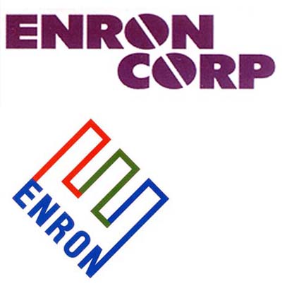
Paul Rand's Enron Identity replaced the Identity that was Developed and Designed by Lippincott & Margulies, 1990s.

This Analogy is Circumspect why ENRON 1990's Identity needed a Revitalization. It only lasted four (4) to six (6) years. Before Rand Revitalized it.

Unfortunately, little did we know, Enron was a POWDER KEG.

Comparison Below.

My Life's Mission to Smooooth things with Su. I guess, I Deserve the Public Display of Affection. I don't hold it against him.

One of the few times I Shot off my Mouth without thinking, I regret it, and Su won't let me forget it.

Michael B. Interesting Account. Seems as if Enron didn't refer to the Black & White Version.

I'm looking at Paul Rand's Enron 12 x 12 Identity Manual Now.

DM

On Mar.20.2006 at 09:29 AM
elee’s comment is:

I don't understand you guys. This logo is full of Rand's classic humor and visual pund. How can you miss them. First I believe he intentionally put the letter "d" and the letter "p" placed very close to eacher other is achieve a wonderful visual play on the coincidence. There almost seems to suggest that Doug is also the Partner.

When I looked at the logo longer, I cannot escape the sense that the logo is smiling at me. A happy smile. Almost seem to say- this one is for you kid! I think Rand is playing with us. He is leaving us with a wonderful smile.

elee

On Mar.26.2006 at 03:29 AM
KP’s comment is:

I agree elee: no designer can avoid seeing the relationship of the p and d so close together without making a decision: let the frission be, or make the space more "comfortable" by separating them more. Let's assume PR didn't miss it, either.

Thanks again to DW for the article. Sure, Doug Evans had the sketches, Felix, but it took Dave's efforts for the work to be seen here on Speakup instead of us hauling our sorry butts to the Yale library.

On Mar.26.2006 at 03:45 PM