Speak UpA Former Division of UnderConsideration
The Archives, August 2002 – April 2009
advertise @ underconsideration
---Click here for full archive list or browse below
  
Quipsologies
~ Vol. 43 ~

Stories of theft, grossness and more on the pimping of brands in this edition of Quipsologies.

~ ARMIN ~

Yet one more relevant blog to link to. This one, ideasonideas, is handsomely designed. Brought to you by Vancouver-based smashLAB.

~

This was going to be the closing of the above sentence, but this link deserves its own quip: smashLabs self-promo ads.

~

Via Typographica, Jonathan Hoefler points us to a typographically awesome, A-to-Z, Flickr collection of graffiti artist Eine.

~

“The clearest example of math’s disruptive power is in advertising. There Google and other search companies built on math are turning an industry that grew on ideas, hunches, and personal relationships into a series of calculations. They can pull it off because, quite simply, they know where their prospective customers are browsing, what they click on, and often, what they buy.”

Math is the new copywriter. [Thanks to Randy J. Hunt for the link]

~

Bruce Sterling is in The Well, discussing the State of the World, 2006. [Thanks to Catherine Morley for the link]

~ BRYONY ~

Picking up on the reportage started last week by M. Kingsley, Rick Poynor writes on the ADC’s new campaign and how it makes design look dumber than ever.

~ M. KINGSLEY ~

You think American media is nuts? Take a look at the Russian Marketing Blog.

~

The sun’s not yellow, it’s chicken: Truly Groundbreaking Advertising Ideas

~

Russell Baker meditates on the history and tradition of the Sunday paper and reviews “The World on Sunday: Graphic Art in Joseph Pulitzer’s Newspaper (1898-1911)” by Nicholson Baker and Margaret Brentano.
~

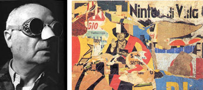
Mimmo Rotella (above left), the Italian member of the Nouveau Réalisme movement (along with Arman and Jacques de la Villéglé) passed away last week in Milan at age 88. At right is his 1961 work “Il Giuramento”. (Via Artnet)

~

The more ill-spent parts of my childhood involved a certain publication which contained Eldon Dedini’s images of “saucy satyrs and curvaceous, rosy-cheeked nymphs”. Dedini died Thursday in Carmel, California at age 84.

~

Rounding out the obituary hat-trick is Jacques Faizant, who was until last October the political cartoonist for Le Figaro. President Jacques Chirac remembered him as “a dear friend” and “one of the most brilliant cartoonists of our era”. Faizant drew Chirac “like the Concorde, starting with the nose”. He was 87.

~

Also via Artnet… Artist Lane Twitchell designed lavish packaging for the first in Starbucks’ new line of premium coffee: Kenya Kirinyaga.

~

The amazing and crazy J. Otto Seibold is the latest contributor to the Target juggernaut, with this whimsical website for a children’s book club.
~

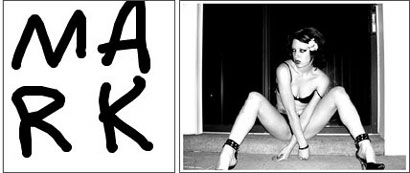
Retrievr gives one the ability to search images on Flickr by visual suggestion. How my sketch above to the left resulted in the image to the right, I’ll never know. Perhaps it’s Eldon Dedini’s fault.

~

On a personal note, a wagging finger of shame to the thieving Brazilian bastards who took our work for Central Park SummerStage, shown in detail below…

…and came up with this pirated graphic system for a pirated music festival near S�o Paolo.

And no, it’s not “appropriation”. Appropriation is a charged technique used to express a determined criticality. There’s no overriding comment here; only theft, you bastards.

Maintained through our ADV @ UnderConsideration Program
ENTRY DETAILS
ARCHIVE ID 2518 FILED UNDER Miscellaneous
PUBLISHED ON Jan.16.2006 BY The Speak Up Authors
WITH COMMENTS
Comments
pnk’s comment is:

re: Retriever: it's gotta be that M, M.! Look at the legs.

On Jan.16.2006 at 12:31 PM
m. kingsley’s comment is:

pnk - That's just a coincidence — but an interesting one, isn't it? The page takes its cue from areas of color; so in this case, it's really the density of blacks grouped around a white center sitting in a white perimeter.

Retrievr is hours of fun. Of course, I'm drawing tons of NSFW sketches — and only getting cakes, pies and birds-in-flight in response.

On Jan.16.2006 at 12:52 PM
Paul’s comment is:

MK...

Thanks for the short takes...I love the Siebold design. I've been collecting his books for my daughter...great work. Also, nice Starbucks packaging!

You guys always mine the best stuff out there making Speak Up one of the best places on the web for staying in touch.

...and let's call Interpol on those sneaky South Americans!

On Jan.17.2006 at 11:59 AM
Derrick Schultz’s comment is:

Mark,

at least they pirated something good. and at least you can see the context for which it was stolen. not justifying (well, kind of), just stating.

On Jan.18.2006 at 08:11 PM
Dado Queiroz’s comment is:

Damn -- and sometimes I ask myself why I don't praise brazilian design practice, beeing a brazilian designer myself. Thanks for reminding me of (only) one (of several) reasons to keep on not praising it.

It's weird, though, as I just got back from S�o Paulo (four hours drive from Curitiba), where I was discussing this very same topic. I was pretty upset with a streetwear brand that copies products from Puma, Adidas etc., just making one or other change and putting their logo instead. Got even more upset when the person I was talking to told me it was not an unusual practice at all... I mean, it's not like chinese "Louis Vitton" purses or "Diesel" shoes, as these people call these products their own "creations". It's just these people's (mis)conception of "inspiration" and "references".

The funny thing is these are the same people who complaint that we, brazilians, don't give our national products the deserved value, and that we prefer what comes from outside. They seem to forget theirs are not national products, but the testament of a culture's lack of... y'know... of... of I can't even describe what.

This issue surely deserves much more thought and better "diplomatic" apologies, but I'm tired of the trip -- you should see our roads! ha! -- and this is certainly not the appropriate place for such.

A few more things, though:

-1- It's presumable that the thief put his hands on the original piece in NY, wich means we're talking of a person that probably belongs at least to a higher middle class, as they spent some money getting there -- wich, in turn, means s/he has a minimum cultural background.

-2- If it wasn't in NY, it surely was through someone s/he knew who's been there, or throuh a design book. Both of these assumptions reassure the economical/cultural background of the thief.

-3- Perhaps he just went across it in the internet, making my detective efforts rather useless.

-4- What were the odds?

On Jan.18.2006 at 09:34 PM
Pesky Illustrator’s comment is:

I think a good rule of thumb, Dado, would be that if a particular design motif travels over 700 miles from its point of origin then it's cultural cross-fertilization and not grand theft. Besides, it's not exactly as if designer A invented the graphic arrow. Picking the SAME color and typeface is a little spooky though.

I'm not that familiar with Brazilian design but would love to see some examples of cool stuff...

On Jan.18.2006 at 10:44 PM
m. kingsley’s comment is:

Dado —

Every year, Central Park SummerStage presents either a Brazilian music festival, film festival or combination of the two. For two or three days, it's all Brazil, all the time; where even the DJs between acts are Brazilians playing Brazilian music. It's quite wonderful and one of the highlights of the season.

So the chance of someone in Brazil acquiring a brochure is pretty good.

One interesting aspect of the faux SummerStage festival is the list of corporate sponsors; which includes American Express, MasterCard, Red Bull, Phillip Morris and Smirnoff. Not one sponsors the real one in Central Park.

I don't think the head office for each brand would take too kindly to the knowledge they were affiliated with known pirates.

So perhaps this is free reign for me to release my new lines of Red Bull condoms and Smirnoff soda! Better yet, perhaps it's time for them all to make nice and finally give money to Central Park SummerStage; which has presented free concerts, dance performances, spoken word events, and film screenings to several million people over the past 20 years.

They certainly deserve it more.

On Jan.18.2006 at 11:06 PM
m. kingsley’s comment is:

Pesky — you could be quite sure that when Coca-Cola used Antonio Carlos Jobim's "�guas de Marco (Waters of March)" in a commercial, money changed hands over a distance greater than 700 miles.

By the way, aren't you currently in Atlanta? Hmmm... that's about 850 miles from New York...

On Jan.18.2006 at 11:19 PM
Pesky Illustrator’s comment is:

Kingsley, perhaps my made-up rule should be changed to 851 miles. I don't know what you New York Yankees are up to anyway. Antonio Carlos Jobim's "�guas de Marco (Waters of March)is an international classic, so maybe this "rule of thumb" only refers to minor work. I'm making it up as I go along, what the heck do I know.

On Jan.18.2006 at 11:28 PM
Armin’s comment is:

> I'm not that familiar with Brazilian design but would love to see some examples of cool stuff...

Pesky: Feeling Hot, Hot, Hot… And Like Designing.

**

Also, in the next edition of Quipsologies more design plagiarism!

On Jan.19.2006 at 08:36 AM
Pesky Illustrator’s comment is:

)))))))))))))))))))))))))))))))))))))))))))))))))))))))))))))))))))))))))))))))))))))))))))))))))))))

(((((((((((((((((((((((((((((((((((((((((((((((((((((((((((((((((((((((((((((((((((((((((((((((((((((

)))))))))))))))))))))))))))))))))))))))))))))))))))))))))))))))))))))))))))))))))))))))))))))))))))))

(((((((((((((((((((((((((((((((((((((((((((((((((((((((((((((((((((((((((((((((((((((((((((((((((((((

)))))))))))))))))))))))))))))))))))))))))))))))))))))))))))))))))))))))))))))))))))))))))))))))))))))

((((((((((((((((((((((((((((((((((((((((((((((((((((((((((((((((((((((((((((((((((Brazil=hot))

On Jan.21.2006 at 08:31 AM
Dado Queiroz’s comment is:

I have an insider tip for you about brazilian music. If you want to sound like a real connoiseur (or however it's spelled), you should call Antonio Jobim just Tom Jobim, as he is known in Brazil. "Tom", here, sounds like english "Tohn", as in John with a T. "Jobim" is a bit tricky to teach here, but a good advise is not to adapt a spanish pronounciation, as portuguese J has nothing to do with the spanish one, that sounds like the english H (jefe = hefe).

Yeah, really busy Saturday, mine.

:)

Pesky -- thanks (I guess...)

On Jan.21.2006 at 03:14 PM
Pesky Illustrator’s comment is:

Dado,

Of course. That wasn't irony. And I just bought Brazilian coffee beans this morning too.

On Jan.21.2006 at 10:51 PM
Dado Queiroz’s comment is:

All right -- Great -- Thanks!

It's just that I didn't recognize the Copacabana sidewalk pattern before I posted that comment... A bit embarassing, I know...

Enjoy your coffee (some say the colombian one is very good too).

On Jan.22.2006 at 11:54 AM
Bradley’s comment is:

You know what sucks? Those SmashLAB ads. Cheap, amateur, smarmy and awful. A pathetic attempt at shock that reveals a serious deficiency in conceiving anything imaginative or ground-breaking.

If you want to experience something that'll really make you uncomfortable in a deep, penetrating fashion read Brief Interviews with Hideous Men by David Foster Wallace.

On Jan.22.2006 at 08:35 PM
felixxx’s comment is:

Mark,

Wow. Thats gotta be compyright infringement! Dude!

If I were you, I'd serve a cease and desist to whoever

the culprits are over in Sao Paulo.

Ay yai yai, amigo.

or is that Ay Carumbah?

I love a good

mosh pit. Give em a

few elbows for

me, eh? Criminy.

On Jan.22.2006 at 09:28 PM
Dado Queiroz’s comment is:

Felix, in Brazil, we speak portuguese, not Bart Simpson's spanish. So, the appropriate statement should be "puta que pariu" (pootah k pahrew -- kind of) or perhaps "mas que bosta" (this one is too tricky for a first lesson).

On Jan.23.2006 at 07:18 AM
felixxx’s comment is:

mut bien, homes. i stand correcto-mundoed

ps- no tengo el cow, chico

On Jan.23.2006 at 10:55 AM