Once more, M. Kingsley rules this edition of Quipsologies.

The entry deadline for the Art Directors Club Young Guns show is February 1.
A propos, music critic Kyle Gann has some thoughts on the myth of young genius.
Here’s a wonderful on-line collection of The Masses — the great American radical magazine. Published from 1911 to 1918, it featured artwork by such luminaries as George Bellows and Stuart Davis.

On the list of many things that I missed last year are the results of October’s Netherlands Latte Art Championships, which ranked the coffee foam designs of 10 baristas.
…thus compelling an obligatory mention of the famous cosmos-in-the-coffee cup sequence from Jean-Luc Godard’s 1967 film 2 ou 3 choses que je sais d’elle.
Dutch type foundry Underware has been running type workshops for the past two years, and the form of December’s theme, “Good Times”, emerged only when viewed from above.
I’m intrigued by Howard Barker’s Theatre of Catastrophe: “Theatre of Catastrophe takes as its first principle the idea that art is not digestible. Rather, it is an irritant in consciousness, like the grain of sand in the oyster’s gut.” What an interesting premise when beginning a design project.
It’s turtles all the way down at Flower Mandalas.
I’ve been meaning to post this for a while: Procrastination, knowledge work, and important problems.
Personally, I like the one from 1969. What do you think of the Super Bowl logo?
The new corporate logo signals that the Intel� brand, and what it stands for, is evolving. It is the most visible representation of our company, and the new logo serves a powerful tool that strikes the right balance between building on our heritage and signaling the evolution to platforms. This emphasis on the corporate logo aligns with how people buy their technology today-in a complex marketplace with many devices, people look to the source brand first.
— from Intel’s automatic response to “your new logo sucks” emails.


The latest marketing stunt?

My family follows a very simple tradition to growing up: Start with taking care of a plant and if it survives graduate to a small pet. If it survives go for a large pet. If you both survive, then you might consider a child. For those timid at heart, I suggest starting with a petit cactus.

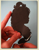
For $20 you can get Karl Johnson to cut you up in perfect profile, and you can even order additional copies for $10 to send to all your loved ones.
An unusual menu that is causing some discussion as far as information design goes. [Via kottke]

A collection of airline baggage labels from around the world. [Thanks to Sarah Ladow for the link]
The boys from Be A Design Group are collaboratively designing the cover of the next annual STEP 100. It’s pinned up, go critique.
Suddenly, taking an inch off of that oversized brochure doesn’t seem that problematic. At least, no one is calling my work a “nibbled Wiener sausage”.
We have added a growing collection of recommended and relevant design titles to Speak Up. A complete list can be found here. And random selections can be spotted on the end of the left column. Check often for updates.


RE the petit cactus: on the page you link to, there's only one customer review, and its from someone who paid for the item but never recieved it and never was able to get in touch with anyone about it. So use caution if you're thinking of ordering it...
On Jan.09.2006 at 12:38 PM