Speak UpA Former Division of UnderConsideration
The Archives, August 2002 – April 2009
advertise @ underconsideration
---Click here for full archive list or browse below
  
Quipsologies
~ Vol. 21 ~

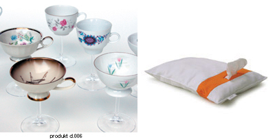
Casino carpets, posters, neurons and a chair whose back rest doubles as a coat hanger in this edition of Quipsologies.

~ BRYONY ~
The 8th International Poster Biennial in Mexico is now open to the public, with some astounding entries.

~
Live from New York Cityyyy.

~

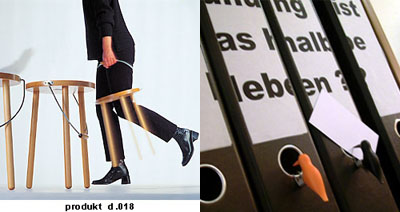
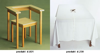
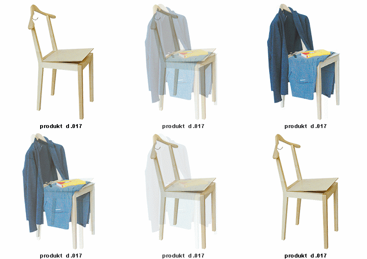
Some interesting products being created at details:
~ MARIAN BANTJES ~

From my friend Gillian Muir, who keeps me up on science things:

“Well they’ve finally done it. For a long time, neuroscientists have had a sort of facetious joke about the “grandmother neuron”—the hypothetical cell in everyone’s brain that responds to the image of their grandmother. The idea behind it is that other human’s faces are so important to us, and we recognize faces so quickly, that there must be some very solid encoding of this information in the brain and the joke was that there was one cell dedicated to each face. So this week’s Nature has an article about neuronal activity recorded from human brains (they were people with epilepsy who were undergoing some electrode placements to control their seizures—the people are awake while this is happening and consent to taking part in these kind of experiments). They found a neuron that only fired when the people were shown different pictures of Jennifer Aniston (but not to pictures of her with Brad Pitt!—whatever that means) There was also a Halle Berry neuron (the experiment was at UCLA). Other experiments by the same researchers found a Bill Clinton neuron, a Beatles neuron and Michael Jordan neuron.

Cool, huh?”

Cool, indeed.

~ M. KINGSLEY ~

Recent history of the Outdoor Life Network logo.

A small tragedy of watching the Tour de France is seeing the state of the Outdoor Life Network’s logo. For a couple years, it was pretty good — a flat leaf in a circle — and a world of improvement over an earlier version. Sadly this year’s update reminds me of the STP logo and makes me wonder if they are now more NASCAR than Nature.

~

Television writer John Rogers, author of the consistently great and entertaining Kung Fu Monkey, discusses the political bias of Hollywood — a position probably applicable to much of American media.

~

Sixty-four nights of Leno, Conan and Letterman are compressed in Jason Salavon’s The Late Night Triad.

~

The story of George D. Watt’s Deseret Alphabet.

~

First item on the checklist: make sure the logo isn’t backwards.

~

A current exhibition in Los Angeles which is worth a visitMargaret Kilgallen: In The Sweet Bye & Bye, in the Gallery at the Roy and Edna Disney/CalArts Theater; until August 21, 2005. Kilgallen had a wonderful sense of old-timey Tuscan typography and color. She passed away in 2001 at the age of 33.
~

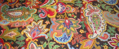
Step and repeat: A comprehensive survey of American casino carpeting.

Maintained through our ADV @ UnderConsideration Program
ENTRY DETAILS
ARCHIVE ID 2370 FILED UNDER Miscellaneous
PUBLISHED ON Jul.18.2005 BY The Speak Up Authors
WITH COMMENTS
Comments
Tan’s comment is:

I'm not in love w/ OLN's new logo either, but their last version always made me think they were associated with the CBC b/c of the maple leaf.

It can also be said that the old logo was more fishing and hunting, while the new one is definitely sports-driven. Less bass fishing, and more snowboarding/kayaking.

That's not so bad, is it?

On Jul.18.2005 at 02:30 PM
Jeff Gill’s comment is:

Mr Kingsley, what's with ignoring everything east of the San Andreas fault? Why not give us some tidbits from New York once in a while?

(Jason Salavon's site [leno/o'brien/letterfman] is fascinating.)

On Jul.18.2005 at 02:50 PM
m. kingsley’s comment is:

> It can also be said that the old logo was more fishing and hunting, while the new one is definitely sports-driven. Less bass fishing, and more snowboarding/kayaking.

> That's not so bad, is it?

Tan, I've been following the Tour for years, and consequently, been watching OLN. They relaunched their "re-brand" on July 2 with an announcement that they were going to air "Survivor" reruns. Personal tastes in logos aside, that's not so good, is it?

Besides, have you seen how the on-air commentators for the Tour de France are dressed? Between the updated logo and the LL Bean short sleeved shirts, it looks like they're capable of giving you a new muffler and oil change.

I also miss coverage of the running of the bulls in Pamplona, Spain. I looked forward to the daily play-by-play of gorings, followed by hospital-bed interviews with the survivors.

...

Jeff, I guess there's just no pleasing you. For accuracy's sake, the Mormans settled east of the San Andreas fault.

On Jul.18.2005 at 03:35 PM
m. kingsley’s comment is:

p.s. Tan, the CBC logo (aka "the Exploding Pizza) was designed by Burton Kramer in 1974.

On Jul.18.2005 at 03:39 PM
Jeff Gill’s comment is:

You know I'm only being silly, Mark. Keep the interesting stuff rolling in, no matter where it comes from.

On Jul.18.2005 at 03:43 PM
Tan’s comment is:

Mark — I wasn't suggesting that the old OLN looked like the CBC mark, only that the maple leaf made it look Canadian, like CBC.

And yes, the LL Bean shirts do not go well w/ the new logo. Neither do the commentators, especially the guy that talks too much with his hands.

On Jul.18.2005 at 04:49 PM
m. kingsley’s comment is:

Tan, the spaz with the hands is Bob Roll, known to his friends as Bobke.

On Jul.18.2005 at 10:57 PM
a superhero by night’s comment is:

OLN's new logo is pretty lame, in my opinion.

It reminds me of these logos that you can find on their respective websites:

Back to Basics

Kia

I bet some executive at OLN wouldn't approve it unless:

1) it was 3-d looking

2) it would be able to break apart and fly into place in an animation for their website

3) it has to look like this one design his 14 year old kid made in photoshop

But that's just my guess; I can't back up those approval guidelines.

On Jul.20.2005 at 11:42 AM
a superhero by night’s comment is:

In bullet point 2, when I said "website", I really meant "broadcast".

Looks like I need to hire a copy editor for my blog comments.

On Jul.20.2005 at 11:49 AM
Shahla’s comment is:

The poster “EJECT (Bush)” of the biennial in Mexico reminds me of a button I saw on a cart on the National Mall last month while visiting DC during this event— It read:

“RECALL BUSH”

reminiscent of what Californians (not this one) did recently.

Or was it “Impeach Bush”… I don’t remember, exactly, but the graphic of �eject’ certainly brings back memories of how I turned off the television every time Bush (the father) whined:

“I’m sick and tired of…”

—finishing his sentence with:

you!

On Jul.20.2005 at 09:01 PM