Speak UpA Former Division of UnderConsideration
The Archives, August 2002 – April 2009
advertise @ underconsideration
---Click here for full archive list or browse below
  
Design Clichés

This post is about those symbols we use … or rather, those other people use … to indicate common themes, concepts or ideas. Those symbols which have been used so often that they’ve become clichés. I warn against using them: or challenge designers to breathe new life into their rotting corpses. Welcome to the land of the living dead.

Hopelessly Dead
The Lightbulb
It’s burned out. Should not be used to indicate ideas, innovation, intelligence …
If this is your bright idea, you’re not very bright.
Could be used to indicate: light

The Globe
Your client is WorldX, TravelX, GlobalX, TransX, InternationalX, InterGlobalTransWorldX …
The symbol to use is … anything but a globe. Nope, not even as an outline or a wireframe or a 3D rotating thing. There’s got to be something else … got to be ….

Compass
I know! How about a … See above.

The Handshake
It’s the grip of death. It should not be used to indicate sealed deals, friendship, trust, approachability, connection, race relations (The interracial handshake? Puhleeez!), or pretty much anything else. Furthermore, in this author’s opinion all handshakes should be Photoshopped out of any image.
Could be used in: irony or humour


Reprinted without permission from Armin Vit.

01010101
Ah the binary code. What a short life it’s had as a graphic symbol! Why, only a few years ago it had to be explained to people, now … a graphic cliché! Check those royalty free images of “digital” things carefully. You open the hi res and What’s that? The whole thing is covered in 010101010 … Kewl.
Could be used for: ummm …. er …. ????

The Rainbow
Pretty as they are, they’ve been a cliché in photography for eons. Why do they still keep showing up in graphic design? Nothing says kiddies like a rainbow. Nothing says “make me barf” like a rainbow.
Still acceptable as: prismatic spectrum, re: light.

Pointing Finger People
You know the ones: “Look dad! Look at that incredible new building!” “Look Honey, at this amazing tradeshow display!” “Look son! Don’t step in the dogshit!”
Could be used with: multiple pointing finger people: intended absurdity.

Bubbleheads
I’m certain someone famous is to blame for this. Under the excuse of “universality,” people who can’t draw represent humans with round balls for heads, floating above the body. Kill the Bubbleheads! Kill them all!

The Puzzle Piece
Hmm, something’s missing. Might it be your brain?
Could be used to represent: jigsaw puzzles

The Spine
Yeah, the human spine. It has no more support, having been used countless times for any doctor, clinician, masseuse or whatever that has anything to do with the back. Totally amazing to me, as it’s such a disgusting looking thing: like an alien worm. Yuck!
Could be used for: horror sci-fi

Phoenetics (fo-net’-iks)
Oh, this is the one that people think they’re so clever for thinking up. I knew enough to decline a client’s request to do this for their logo about 10 years ago. If the company name requires this tired trick, maybe it’s time someone came up with a new name … or used some graphic ingenuity.
Could be used in: a dik’-shu-ner-ee
(Apologies: required diacritic marks not available in HTML)

Endangered
The Swoosh
Personally, I’d put this in the Dead category, but so many people seem to be addicted to this substance I’ll just issue a health-warning for now. Use of the swoosh (the loop, the wave, the underscore) indicates, imho, a lack of concept and may be dangerous to your health.
Could be used to indicate: burning rubber

The Heart
Now some of you may disagree, but I think there’s some life in the old ticker yet. Used simply to indicate love, friendship, joy, peace etc. etc. it’s an absolute cliché … and yet, and yet I’ve seen it done with success. But use with extreme care: it can break.

Pharmaceutical Pills
Yeah yeah, we’ve seen closeups, rows and rows, patterns made out of, pill bottles full of, spilled over a surface, broken open, in the hand, filling various unlikely containers …
“We’ve got a story on presectiption drugs … hey, let’s get a bunch of pills and arrange them in a rainbow!” You go!
This one’s hanging by a thread for its life. Someone give it an upper.
Could be used to show: a specific pill

<computer code>
<like this!> especially for the <company name>. Oh, they work with computer code, right? Them and 10 million other people. Still, inventive use of code could potentially contain funny in-jokes to computer geeks.
Could also be used for: Coding manuals

The Sun
Why is the globe dead and the sun is not? I don’t know. The sun is weak, the sun is tired, but still it shines on. Just don’t use a child’s hand-drawn sun; that’s dead.

Surprisingly Robust
Flowers
Who’d’a thunk? Surely the biggest cliché on the planet, but still full of life. I don’t get it, but it would appear you can still use flowers with gay abandon! Go nuts; use them for everything! Maybe it can fill in for a globe or something.

Got a genuine, bonafide design cliché to add? Speak Up!

Maintained through our ADV @ UnderConsideration Program
ENTRY DETAILS
ARCHIVE ID 2342 FILED UNDER Miscellaneous
PUBLISHED ON Jun.21.2005 BY marian bantjes
WITH COMMENTS
Comments
Jeff Gill’s comment is:

Flush-left Helvetica (or other favourite sans) over large areas of flat colour = look how modern we are!

Or maybe it just means "we saw it in all the annuals, so it must be modern--and so Legible, baby!"

Please correct me if I'm wrong here. I am after all just a self-taught hack in North Wales

On Jun.21.2005 at 05:14 AM
Jeff Gill’s comment is:

I was forced to make an ad yesterday with the headline: Think outside the pan.

On Jun.21.2005 at 05:52 AM
DesignMaven’s comment is:

I think LIFE can be breathed into all those that you mentioned except the SWOOSH.

The Swoosh is not among a Semiotic Category. Meaningless to say the least.

Predominately most categories you've shown fall under the Semiotic category of of Glyphs, Pictograms, Pictographs. All legitimate.

Except the binary code.

The problem, in the beginning Identity Design was religated to only a Trusted Few.

The symptom EveryDesigner and their Mother think they can Design and Identity.

Fact of Matter, they can't. Which result in these Cliche' Driven Unimmaginative Identities.

Solution:

Originality Breathes LIFE into those Cliche' Driven Symbols!!!!

On Jun.21.2005 at 06:13 AM
Matt Squire’s comment is:

In response to Jeff Gills comment about flush left Helvetica, yep, maybe a cliché, but I have come across very few companies that produce the tension and perfection achieved by the Swiss originator of this craft.

On Jun.21.2005 at 07:04 AM
Veerle Pieters’s comment is:

Hmm, it is easy to show what's a no go but I guess It is little harder to show us your skills and educate us what bright ideas you come up with instead. Not that I am an expert or anything, this could have been interesting if there was at least a comparison.

On Jun.21.2005 at 07:36 AM
Armin’s comment is:

> I guess It is little harder to show us your skills and educate us what bright ideas you come up with instead.

Skills, ideas.

> this could have been interesting if there was at least a comparison.

It would actually be interesting if anyone could come up with good examples of these bad cliches here in the comments. I was trying to come up with something but I got nothin'.

Last year I did use a compass for a logo. And I thought it turned out rather sweet. Cliched. But sweet.

On Jun.21.2005 at 08:20 AM
coudal’s comment is:

Ban the 3D Orb in all of its manifestations.

On Jun.21.2005 at 08:46 AM
Patrick C’s comment is:

Armin, I remember your compass. And I got a laugh out of seeing the compass come up in Marian's list—you can run but you can't hide from these clichés.

I nominate meaningless directional arrows that for a time were being plastered all over photographs and vector illustrations on web sites.

On Jun.21.2005 at 09:04 AM
Todd H’s comment is:

In what seemed like a week of miserable hell, I had a client sketch and demand a conference program logo with Ball-Head People.

Agree...death to ball head people!!!

On Jun.21.2005 at 09:11 AM
Bob’s comment is:

"techno" design. It was cool and avant garde 10 years ago, on rave flyers only mind you, but when I see it now I get a headache.

and "big brand" parodys.... see reason above

On Jun.21.2005 at 09:27 AM
Design Police’s comment is:

Last year I did use a compass for a logo. And I thought it turned out rather sweet. Cliched. But sweet.

Funny, it kind of looks like a sun too.

On Jun.21.2005 at 09:30 AM
Matt Squire’s comment is:

talking of rave flyers, I guess typefaces have the same clichéd moments, and that bought Eurostile to mind, nothing but that on dance flyers over here in England

On Jun.21.2005 at 10:14 AM
Justin Mayer’s comment is:

What about verbal design cliches?

I cringe whenever I hear about "aesthetically pleasing" design

On Jun.21.2005 at 10:18 AM
Matt Squire’s comment is:

Where I work 'Its a process' comes up in every meeting... annoying

On Jun.21.2005 at 10:27 AM
Tim’s comment is:

Death to "we want something sexy"!!!!!

On Jun.21.2005 at 10:34 AM
Bob’s comment is:

a students famous last words... 'well it looked good on the computer!'

On Jun.21.2005 at 10:37 AM
Jeff Gill’s comment is:

computer mouse = computers & internets

confession: I once did a brochure for an industrial cable maufacturer's new online order tracking system. It featured a mouse with the wire going to a cable spool. Looking back, I still think the execution was rather nice, but the idea definitely came from the obvious side of town.

On Jun.21.2005 at 11:00 AM
DesignMaven’s comment is:

Guys and Dolls:

Marian's list is what it is. Well researched;

to be taken humorously. And aid in facilitating Guidance and Direction.

Yes, these are Bastardized, Overused, and Abused Identity Cliche's.

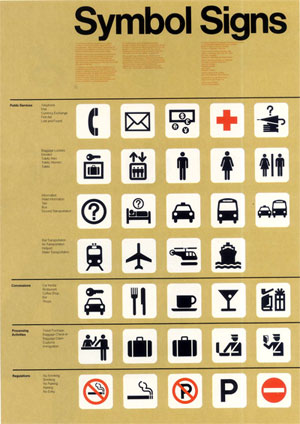
Except the Bubble Head. In Semiotic and Inconographic Design. They're Designed with utmost simplicity (rounded heads) to Transcend Language. Something a Semantic Driven Identity cannot accomplish.

Brief History, of International Symbols. Other than ICOGRADA, and AIGA. GYLPHS, Inc. formed in the 1960s was an Organization formed to encourage the development of Universal Graphic Symbols. The concept for such a symbol was suggested by noted Anthropologist Margret Mead. And presented in 1964 to the United Nations by a Canadian Delegation as part of a program of International Cooperation Year. The organization was formed shortly thereafter with Margret Mead and Rudolph Modley as co-chairman. Other Directors were Professor Harold Lasswell, Yale University, James R. Patton Jr. Counsel, Curtis Roosevelt, United Nations, and Emily O. Barnes, Secretary.

The Interational Graphic Symbols were Developed to incorporate a limited number of Graphic Symbols, with Single and Clear Meanings for Worldwide use.

Before there were no International Standard for Graphic Symbols. At airports around the world. We had a communication mess on our hands.

The International Symbols has gone through two incarnations. The last being Developed by the United States Department of Transportation in Washington D.C.

Encouraged by the Federal Design Improvement Program 1972 Designed by Cook & Shanosky Associates in association with AIGA.

Cook & Shanosky's International Pictograms been the most enduring.

Yes, Symbols Transcend Language. At least the BEST Symbols accomplish this.

They're Drawn with Legibility in Mind.

Opposed to someone not having a Proclivity for Draughtsmanship. I suppose, Designer(s) challenged with Draughtsmanship capability lean toward their innate simplicity and legibility.

Designer(s) need not be able to Draw. Designer(s) only need to be able to Conceptualize. Original Ideation, of course.

On Jun.21.2005 at 11:05 AM
livenootrac’s comment is:

Could we get a replacement suggestion for the bubblehead.

On Jun.21.2005 at 11:09 AM
Armin’s comment is:

> What about verbal design cliches?

Whoah, whoah... before we veer into this tangent I would have to say that it is not appropriate for this thread. This thread is focusing on cliches that designers use that ultimately make it to the world and are seen by the masses rather than bad "design speak", which I think we have discussed in another thread but at this point I can't remember which specific one.

If we wanted to discuss "verbal design cliches" it would have to focus on copywriting that makes it out into the world.

Sorry for the policing.

On Jun.21.2005 at 11:13 AM
Justin Mayer’s comment is:

Sorry for the policing.

No problem. Thought someone might point that out.

Drippy paint is my least favorite cliche.

On Jun.21.2005 at 11:33 AM
livenootrac’s comment is:

How about bubbles evolved:

On Jun.21.2005 at 11:40 AM
beto’s comment is:

Great post. Sure I do have some cliche peeves of mine as well:

- Any logo with a ".com" on it

- Any logo with a swoosh on it

- Any logo called "trendy" these days (calling a certain graphic style "trendy" sounds like the kiss of death to me)

- Ditto on techno design with the "@'s" and the URLs and the whole Internet theme. These days, it just feels like TV makers were still touting the wonders of color TV.

- The bubbleheads... um, tough call. I find hard to think how could it be done less cliché without breaking its great simplicity. As designMaven posted above, the so-called bubblehead was conceived with instant legibility in mind, regardless of language, culture or race differences (and that's something you certainly appreciate on an airport). Actually there's nothing wrong with the figures themselves, except the sorry bastardization they've been object of.

On Jun.21.2005 at 12:11 PM
Rick’s comment is:

Marian, that actually made me laugh out loud. Thanks!

Jeff, a thin, tight Helvetica is fashionable at the moment (hello Crate & Barrel for the last eight years), but just because you're aware of it doesn't neccessarily mean the consumer even sees it yet. It'ss kind of that way for so many aspects of this job: By the time things are passé to us, they're barely on the radar of the hoi polloi.

Last year I did use a compass for a logo. And I thought it turned out rather sweet. Cliched. But sweet.

Armin, didn't you also have a Globe with Binary code in the Logo Sins thread? (This coming from the designer of a Parking Sign)

Drippy paint is my least favorite cliche.

On that subject, I can't believe nobody has ever mentioned the Sherwin Williams logo.

Not only is it a horrible execution that doesn't reduce well... it's a friggin can of toxic red paint covering the globe! And it says "Cover The Earth"!

That, I believe, is The Worst Logo Of All Time

On Jun.21.2005 at 12:16 PM
Design Maven’s comment is:

International Symbols: Developed by AIGA, Federal Design Improvemt Program, and U.S. The Department of Transportation.

Designed by Cook & Shanosky Associates 1972.

(For much larger image click here)

On Jun.21.2005 at 12:18 PM
marian bantjes’s comment is:

computer mouse = computers & internets

excellent, bonafide cliché.

___

Maven, while i recognize and appreciate the origin and evolution of the Universal Graphic Symbols, the fact is that the bubble head has made its way far deeper into graphic iconography than I think was ever intended. I see no need for a bubblehead in a logo or diagram.

___

Could we get a replacement suggestion for the bubblehead.

Look at heads. They have shape, noses, ears, necks, go from there.

____

Armin, sorry about the compass. You did do a very nice compass, and I remember at the time being impressed with how well you did with a cliché.

____

C'mon people think. Graphic clichés. Not just things you hate; graphics that you see over and over used for the same ideas.

Admittedly I've been mulling this over for a few months, but I am only one and you are many.

On Jun.21.2005 at 12:24 PM
marian bantjes’s comment is:

techno design with the "@'s"

yes.

the .com thing is just ... a dinosaur, not really a graphic cliché, imho.

On Jun.21.2005 at 12:27 PM
margot ’s comment is:

The color halftone filter in PS.

It's everywhere lately, anyone else notice this? I used to think it was fun and edgy. And then I saw it on a McDonald's Happy Meal box. I believe it was applied to Ronald himself. Sheesh!

On Jun.21.2005 at 12:36 PM
Justin Mayer’s comment is:

In interactive design we have the ever-present file folder tabs to represent sections of a website or application--the filing cabinet visual metaphor, an e-commerce design cliche.

I can't believe nobody has ever mentioned the Sherwin Williams logo. That, I believe, is The Worst Logo Of All Time

I agree. It has the same effect on me as a swastika.

On Jun.21.2005 at 12:47 PM
marian bantjes’s comment is:

Ban the 3D Orb in all of its manifestations.

Jim, could you give me an example? (a picture?) What's it used for?

BTW, all: I was putting off making an example of the puzzle piece when i opened a marketing magazine, and there it was: the puzzle piece (which is also running in an ongoing campaign for one of our newspapers) ... on the facing page was an image of a CD with the binary code printed over top of it. I had to laugh.

On Jun.21.2005 at 12:51 PM
Michael Surtees’s comment is:

apologies in advance if this has been posted somewhere else on SU: Logo Trends 2005

On Jun.21.2005 at 12:56 PM
Daniel Green’s comment is:

How about the Latin -- or Swiss -- Cross (as is used by the International Red Cross) as a symbol for health related topics?

I worked for healthcare clients for a long time, and I'm thankful to have avoided that one.

On Jun.21.2005 at 01:00 PM
DesignMaven’s comment is:

Beto:

Great comment and mind you very Humorous.

Marian:

Actually, Customs and Immigration on the poster are differentiated. Just wanted you to KNOW ICOGRADA and Canadian Authority were in the forefront and largely responsible for the International Standard of Iconographic Symbols.

As I always LUV to say... Blame Canada, Blame Canada...

I already have it on Good Authority Pentagram will Design the next set of International Iconographic Symbols.

My Request, a Gradient. Make sure Armin is Design Chief in charge Gradients.

How wonderful LIFE can be...

On Jun.21.2005 at 01:04 PM
DesignMaven’s comment is:

Michael Surtees:

I have the hardcopy. Didn't know the online version was available.

Thanks, for posting Bill Gardener's Identity Trends from GD USA. Its the second year our own Felix has made the list.

And as usual, Bill Gardener has miscredited Landor with the Development, Ideation and Creation of an Identity. Which I intend to address in an upcoming Speak Up Editorial.

Daniel Green:

In reference to the Red Cross. It has a Duality.

It was Designed in the 1800s as an Identity for the Red Cross. No one knows who actually Designed the Identity.

Of course, Swiss Airlines incorporated the Identity.

It is used in International Symbols to represent first Aid.

Again, nothing is more appropro. and Legible than the Red Cross Symbol to represent First Aid.

I don't see it overused and abused as iconography. The symbol inself has limitations.

On Jun.21.2005 at 01:25 PM
Michael Surtees’s comment is:

DM: looks like my sloppy editing got the best of me again - beto beat me to the punch... Of course your insights are always welcome though.

On Jun.21.2005 at 01:33 PM
Brian Keith’s comment is:

I believe that all of these clichés can still be used when combined with other symbols that create new meaning and communicate effectively.

Many of these communicate so well because they are universally understood. The way that we “breathe new life into their rotting corpses” is to combine them with other ideas.

On Jun.21.2005 at 01:50 PM
Daniel Green’s comment is:

Again, nothing is more appropro. and Legible than the Red Cross Symbol to represent First Aid. I don't see it overused and abused as iconography.

Maybe it's overuse has recently burned itself out, but it was used to death in trite ways in the 80's. (BTW, you probably know this, but long before Swiss Airlines, the configuration has been a standard for the Swiss since the 1200s.)

The way that we “breathe new life into their rotting corpses” is to combine them with other ideas.

Or as Alan Fletcher put it, the trick is to take a cliché and "make it purr like a metaphor."

On Jun.21.2005 at 02:11 PM
Mike Langlie’s comment is:

Re: Rick's comment:

"On that subject, I can't believe nobody has ever mentioned the Sherwin Williams logo."

I actually did, on Oct. 29, 2002:

http://www.underconsideration.com/mt-static/mt-comments.cgi?entry_id=1289

:)

On Jun.21.2005 at 02:45 PM
kc’s comment is:

i submit for consideration:

1) rounded corners

2) 1960s/70s wallpaper (yes! it's on the cusp!)

3) everything-is-boxed-in-by-a-hairline-rule

i list these with confidence; but as a confession/disclaimer, i must admit that today, while working on a logo for a healthcare provider, i drew in my sketchbook:

- a heart

- a sun

- a hand (not shaking, mind you, but a hand nonetheless)

On Jun.21.2005 at 03:05 PM
John Washburn’s comment is:

V. amusing.

One thing... the swoosh has been dead for at least five years. Even Swoosh No More gave up trying to index swooshes by the end of '99.

Any bit of viable dna that it had would have then been finished off by the Verizon pseudo swoosh "check" mark. I think the Sherwin Williams mark is an absolute glimmering gem compared to the Verizon mark.

On Jun.21.2005 at 03:06 PM
Rick’s comment is:

I actually did, on Oct. 29, 2002:

Show off. Heh heh.

On Jun.21.2005 at 03:26 PM
Design is fun’s comment is:

How 'bout talking about what is "cliche?"

That's a cliche.

You guys are all screwed.

On Jun.21.2005 at 03:59 PM
john’s comment is:

coming to you from the world of entertainment design, where the employment of cliche is a daily (soul-crushingly) part of operating, i've found that successfully subverting a cliche symbol is the best way to use one: i.e. the three-eyed happy face i did for a movie poster a number of years ago. Maybe not the most genius of my work, but it sure as hell beats two heads floating in sky (which ends up as the finish two-thirds of the time (no exaggeration).

Extra added bonus secret info: Movie Typography Division... Trajan = BIG SWEEPING EPIC!

Distressed Typewriter font = YOUTHFUL AND EDGY!

(But then you guys already knew THAT one...)

Salud y'all!

On Jun.21.2005 at 04:42 PM
Steve Mock’s comment is:

Two ::colons::? Num6ers for letters?

In deft hands most of the posted symbols are very much alive. ('cept a swoosh - as noted.)

It's the tricks that get dated and tired.

:: Please note that I am as 9uilty as anyone ::

On Jun.21.2005 at 05:00 PM
Troy’s comment is:

Right on! So true on so many levels.

And the use of wood type like ornaments, dotted lines for separating information, and retro script typefaces for logotypes is soooo five minutes ago.com

On Jun.21.2005 at 05:04 PM
mother lion’s comment is:

>You guys are all screwed.

well well well. that is certainly a good example of a verbal cliche, if i say so myself.

sorry, arminito--i know you don't want this veering off, but i just couldn't help myself.

everyone else has to listen to armin.

On Jun.21.2005 at 05:51 PM
Gunnar Swanson’s comment is:

I’ll ’fess up to one: I used puzzle pieces as the main motif on a brochure. Mitigating circumstances include it being before many Speak Up folk were out of grade school and my having been much younger than Bob Barr was when he had his youthful indiscretions but I was old enough to know better.

I had thought I’d breathed new life into it by doing a cool scribble texture and printing it in metallic magenta ink but I was old enough to know better. I have nobody to blame but myself.

On Jun.21.2005 at 09:40 PM
gregor’s comment is:

birds, butterflies, and cute fuzzy little animals, illustrations or not.

an yup, I just pitched a concept with a sweet little hummingbird, 'cause, cliche or not, I love sweet little hummingbirds.

On Jun.21.2005 at 10:24 PM
ps’s comment is:

It was Designed in the 1800s as an Identity for the Red Cross. No one knows who actually Designed the Identity.

Of course, Swiss Airlines incorporated the Identity.

maven, swiss is using it as it represents the swiss flag. the red-cross logo is the swiss flag reversed. maybe because it was founded by a swixs, henry dunant i believe, in geneva, switzerland

On Jun.21.2005 at 11:30 PM
design is a wet blanket’s comment is:

so, in the spirit of not just being a misanthrope, can we agree that "cliches," especially in terms of design can be helpful in some ways, because the audience knows what they're getting.

ie. it is a visual language that we all speak already. thus the conversation is well understood by all parties.

or, compasses and rainbows are okay.

On Jun.22.2005 at 12:47 AM
Oscar’s comment is:

I don't know that it's gotten quite to cliché level, but I got a laugh out of this guide to book covers featuring womens' feet, legs, and/or shoes.

On Jun.22.2005 at 01:04 AM
Bill Gardner’s comment is:

In regards to the LogoLounge recent Logo Trends Report published annually in GDUSA, I am cautious to always warn with these articles that this is not an endorsement of any trend. I agree with Beto, I too would stay away from anything using the word "trendy". Read through the opening of the article and you'll notice the word trendy doesn't appear but the word evolution does. Evolution is what leads to the advancement of a species. Armin's list of overused visual cliches are all members of the precambrian era. These ideas, as overused and doomed as they may be are still part of the heap off which the next great idea may evolve.

A music critic was on NPR's Fresh Air with Terry Gross some years ago discussing the British Invasion. The conversation referred to the likes of the Beatles, the Rolling Stones, The Zombies, The Birds, you get the idea. The interviewer asked the critic to share what some of his favorite songs from the period were. He said his favorite songs were on the B sides of the records and he shared why. I thought his answer was very perceptive.

All of the bands started using the same formula to craft their music and it didn't take long for a particular formula to reach saturation. At this point the groups would start to look for something fresh and new. Imagine all these artists leaving this saturated cluster and projecting out like orbiting satellites looking for the next big thing. Soon, someone would have a hit and all of the other artists would abandon their little satellite and start to cluster around the new successful formula, and this repeated. The records the critic loved were those made by bands that were searching for the next big thing, right before they abandoned a new style to again become a follower.

I love that story because it reminds me that at some point in time, a trend is not yet a trend. But when someone else accidentally hits on the same idea or when someone emulates something that is not a trend, that is the birth of a trend. And for a period of time, those originators of the trend flourish because they know HOW they arrived and not just why they arrived at their solution.

As a last aside, keep in mind that all examples used in the articles or in the book series are pulled from logos that have been submitted to LogoLounge and credits are given exactly as entered by the members and not by myself. As the site has over 20,000 logos we rely on our membership for accurate claims of ownership. Always feel free to contact me directly with any credit concerns. I listen pretty well.

Bill Gardner

Gardner Design

LogoLounge.com

On Jun.22.2005 at 01:16 AM
Aaron’s comment is:

For God Sake what about the bleepin' eyeball! It makes me want to puke. "But eyeballs are a window into the soul!" Shut the hell up hippie loser.

On Jun.22.2005 at 01:21 AM
marian’s comment is:

so, in the spirit of not just being a misanthrope, can we agree that "cliches," especially in terms of design can be helpful in some ways, because the audience knows what they're getting. ie. it is a visual language that we all speak already. thus the conversation is well understood by all parties.

I can't agree. Let's say you have a client "IdeasOnline". The most obvious thing to do is use a mouse with a lightbulb over top of it. To you this may be the most easily "understood" representation of the company, to me it's lazy, unoriginal and unimaginative.

cliché: "A trite or overused expression or idea" ... "an expression or idea that has lost its originality or force through overuse"

And here is a good little piece on what a cliché is and what it isn't, which serves very well to the topic, and comments at hand.

Like you, I am reluctant to follow links, so if you're too lazy to go to a short, good and somewhat amusing read there, I will paraphrase one thing he said: "A cliche is not just something that lots of people [use]; It's something that lots of people [use] and it conveys some sort of idea or message. A cliche is, in other words, a metaphor characterized by its overuse."

The metaphors conveyed in my list of graphic clichés are:

lightbulb = idea

globe/compass = worldwide

handshake = trust

010101 = digital

rainbow = happy/innocent (kids, kids' things)

pointing finger people (borderline) = "this is so exciting"

bubbleheads = people

puzzle = something's missing (& implied: "we have the missing piece")

spine = medical+backs

phoenetics = literary or hard-to-pronounce

the swoosh = energetic!

heart = love

pills = pharmaceuticals + implied "danger" "overuse" and "abuse of")

computer code = "we work with code"

sun = happy, cheery, or tropical

flowers = happy cheery (but loosely, which is maybe why there's lots of room to move there)

Does this mean you shouldn't have an image with a globe in it anywhere? No, it just means that if "international" or "worldwide" in the concept you're trying to represent, to use a globe is a cliché.

What's bad about that? Well, for one thing, when we create work for clients, presumably we do try to make it unique and identifiable. The more clichés you use, the less unique it is. Think deeper.

If you were a writer, and your work was littered with written clichés, you wouldn't be considered a very good writer (unless writing in parody, or somehow using the clichés to make an ironic point). In fact, if you were a writer, and you used one cliché, an editor would probably take it out.

On Jun.22.2005 at 01:53 AM
marian’s comment is:

How about the Latin -- or Swiss -- Cross (as is used by the International Red Cross) as a symbol for health related topics?

Was it somewhere here on Speak Up, or was it in a conversation ... someone told me that the Red Cross is very fussy/heavy about the use of this symbol ... much like the Olympic Committee is very fussy/heavy about the use of the olympic rings. And I really can't remember seeing it used for any health organizations, doctors etc.

The Red Cross symbol has a special status, in that it is, I believe, an emergency symbol not to be taken lightly: it needs to be recognized worldwide as a place where people can go for aid. Theoretically, I think e.g. trucks with the red cross symbol are not supposed to be targeted in war.

Maven? Know anything about this? Am i misinformed?

Anyway, that would make sense to me, and that it would be protected heavily as such would make sense. Maybe i'm not looking hard enough, but I've never seen it used for anything other than Red Cross / emergency medical ... as a representative icon, not a metaphor.

ergo, no cliché.

On Jun.22.2005 at 02:14 AM
Von Glitschka’s comment is:

Then again the whole idea of icon design for both GUI environments and print capitalize on clichés to guide and direct the user.

So the 'House' icon you see in your browser may not be very unique but it's highly effective none the less.

Like most things it's a balance.

On Jun.22.2005 at 03:54 AM
m. kingsley’s comment is:

Marian, two years ago we trod upon this familiar ground.

Back then, I shared this list:

(long inhale)
1. flat/non-design with flush-left san serif font - usually in an acrid color.
2. "illustration" style that consists of a rough line drawing/tracing (often of something like a groovy clubkid listening to headphones) in a large field of flat color -- usually combined with typography taken from #1.
3. shakey type in motion graphics ala "se7en".
4. flat, direct photographic lighting with kino lights (banks of flourescents).
5. silhouettes as illustration.
6. cross-processed photos of rock musicians squatting on the streets of the east village -- shot with a wide-angle lens.
7. relying on emigre fonts to do the work for you.
8. irony
9. "skip intro"
10. design or branding firm websites that describe a proprietary "process" which is often pure drivel or designbabble.
11. design porn
12. cd labels that are nothing more than a flat flourescent color -- or white.
disclosure: i am often guilty of 8 of the above -- probably all 12 if i would only be honest. hell! i even went so far as to hide a "nina" in a recent illustration!
ooo, before i forget...
13. hiding the word "nina" in an illustration.

Since then, my list of the above sins has grown to 11 and I'm now mixing clichés as fast as I can. For example, here's a heart AND an arrow combined:

In the long run, if you keep the client in mind and find yourself coming to a cliched conclusion; then who cares what other designers think. Chances are they're not the ones who will hire you.

One last thing... the project that I hid the word "Nina" in the illustration was a string quartet's first album. I only told them about it after it was printed — to their delight. In fact, we're starting work on their second release. Which might suggest IF you can truly empathize with the client and IF you're truly working on their behalf... you just might get away with a hijink or two.

...might...

Now to bed — wondering how many people know the Nina joke.

On Jun.22.2005 at 03:56 AM
marian’s comment is:

Ouch. Before my time ... only just. Same friskin' title, too. (Isn't that what the-place-that-shall-not-be-named is for?)

In the long run, if you keep the client in mind and find yourself coming to a cliched conclusion; then who cares what other designers think.

There are more people in the world besides designers and clients. There are people who use and observe designed artefacts ... they're the "readers." They need to differentiate between this and that, and that helps the client, too. When we rely on clichés to get our message across, we make things that look like many other things with the same message, because we're all using the same visual metaphors.

Yes, there are different ways of expressing those metaphors, but that's how things become clichés, is by being used over and over in every imaginable way until there's no more life in it.

That's my case.

Now, I'm dog tired, so I'm gonna hit the hay, go out like a light, and hopefully sleep like a log.

On Jun.22.2005 at 04:22 AM
Tselentis’s comment is:

We're losing work because anybody can afford the latest computer and software.

On Jun.22.2005 at 04:29 AM
m. kingsley’s comment is:

As I was just about to close the laptop...

> There are people who use and observe designed artefacts ... they're the "readers." They need to differentiate between this and that, and that helps the client, too. When we rely on clichés to get our message across, we make things that look like many other things with the same message, because we're all using the same visual metaphors.

Yeah, yeah, yeah Marian... generally yes.

But since you're in a non-reading mode ;) let me repeat:

IF you keep the client in mind, IF you can truly empathize with the client and IF you're truly working on their behalf... then a cliché is just another way of saying "solution".

Listen, even if Gunnar gets everyone all certified; there will still be those with the ability to transform a cliché, and those without. No one's going to die and the bad results will just make the good look better.

Remember, I'm the guy who thinks there's no such thing as a bad typeface.

On Jun.22.2005 at 04:53 AM
Jeff Gill’s comment is:

1. flat/non-design with flush-left san serif font - usually in an acrid color.

Corroboration! And from the remarkable newyorkophile, Mr Kingsley, no less.

On Jun.22.2005 at 07:12 AM
Pesky Illustrator’s comment is:

Maybe it's because as an illustrator I get called on to solve these things using old metaphors, but I never feel like cliches are an obstacle. It doesn't stop me from looking for a newer idea to express a universal subject. It's just the common route to a concept. It depends on how atrocious the usage is. If I don't sleepwalk thru the work, I can usually come up with something somewhat harmless at best and outstanding at best... It's not like clubbing baby seals to death.

Cliches are just reconigizable communicators. Shorthand for complexity. We still have choices in the limitations. It doesn't matter if designers are tired of them. A square sun icon or a fish on a bicycle logo just goes over their heads and (usually) gets rejected as a solution because ordinary people don't really like confusion or ambiguous communication symbols much as designers do. It shows a generation that's lost it's sense of a commonality with plain folks. Which is why, perhaps, so many new ads get vulgar.

Crudeness is NEW. Sure, they like cleverness but that's just one of the many designer parlour tricks- a little substitution and it looks like an i-d-e-a. Saying something NEW requires elegant insight simplified.

The Japanese have a word for it: SABUMI. When we do come up with a fresh approach, something really smart that both communicates the ordinary concept and, at the same time, refreshes our sense of a beautiful solution, then something is satisfied in our quest for new design.

I have a file of new icons, new concepts that really look good, only most clients don't want them. But they are fun to dream up! Well, that's my take on it......

On Jun.22.2005 at 08:46 AM
krazykat’s comment is:

Speaking from north of the border, what about "old glory", the "stars and stripes" etc. as a design cliché...if your design doesn't work just tack a little patriotism onto it and it'll get them every time.

We're just as guilty up here when we indiscriminately throw in the red maple leaf or the word 'eh'. The Union Jack, the hammer and sickle, yadda yadda. Way overbranded, way overused!

On Jun.22.2005 at 09:12 AM
Patrick Bennett’s comment is:

Excellent post! It's been a while since I've been in this neck of the woods, but this post really caught my eye.

Anyway, a couple things.

I happen to have worked on a number of online Verizon campaigns and I would agree that the logo... uhm... leaves a bit to be desired. However they aren't gonna change that any time soon. No amount of appeareances on top 20 lists of brands that are in desperate need of a redesign is going to change that, it seems. In fact, the internal concensus is that it's "great!"

Incidently, I've also used the bubble headed icon a number of times, but I think this symbol can still be used if employed in an unexpected fashion. I often use it to represent the faceless corporate American stooge.

So, like Steve, I think many of these symbols can be used well (except, of course, the swoosh!), they just generally aren't.

On Jun.22.2005 at 10:04 AM
Daniel Schutzsmith’s comment is:

One cliché I haven't seen mentioned here is the use of Application or Operating System GUI's in design. I haven't seen many lately, but it seems everytime a new OS comes out from Apple or Photoshop gets updated, someone out there feels the need to take a screen capture of the actual GUI and include it in their design when it clearly has no place being there.

On Jun.22.2005 at 10:53 AM
John Washburn’s comment is:

No amount of appeareances on top 20 lists of brands that are in desperate need of a redesign is going to change that, it seems. In fact, the internal concensus is that it's "great!"

Of course, if they admitted that it is not in fact great, then mayhem would naturally ensue. I think it's symptomatic of the need for brand managers and caretakers to not admit that they've presided over disaster... but we digress.

On Jun.22.2005 at 11:02 AM
marian’s comment is:

It would appear that some of us think there's no such thing as a graphic cliché; some of us think there's nothing wrong with a cliché; some of us think that clichés are good, simple solutions; and some of us are confident in our own inate ability to both use the cliché and transcend it by the sheer genius of our design.

I, however, maintain my initial stance.

In literature, if I were to pick up a book and the first sentence was, "King Peter ruled his lands with an iron fist in a velvet glove..." I would roll my eyes, put the book down and move on.

Authors also struggle to find the perfect metaphor that isn't also a cliché. What if her eyes really were green as grass? Too bad; find another way, or make something extraordinary out of it.

Yes, yes, I know we're all geniuses, making extraordinary things out of lightbulbs and puzzle pieces. Uhuh. Great! Good job. All I'm saying in my article is that these are clichés, and imho, there's got to be a better way to express these ideas than falling back on the most obvious.

Most of the time, when i see a graphic cliché, i roll my eyes and move on.

On Jun.22.2005 at 11:24 AM
Pesky Illustrator’s comment is:

Marian, with all due respect, I don't think I said that there is nothing wrong with cliches. I just meant that some things are determined by their familiarity as common objects. When a client wants a sun as an icon, for instance, it stands to reason that his/her objection to alternatives is challenging to solve when it doesn't involve sun shapes. It's what is done with the common symbols that makes it a tired idea. Using a cliche as the ONLY way to approach designing something is dull. I'd agree with that. There's got to be a better way to express a concept than the first cliche available... I think that's what you meant, isn't it?

On Jun.22.2005 at 11:49 AM
Jason J Cho’s comment is:

FWIW, the swoosh was already a cliché years and years ago:

http://www.thestreet.com/tech/internet/986150.html

http://www.50cups.com/swoosh/

On Jun.22.2005 at 12:04 PM
DesignMaven’s comment is:

Peter:

"It was Designed in the 1800s as an Identity for the Red Cross. No one knows who actually Designed the Identity".

"Of course, Swiss Airlines incorporated the Identity".

Peter, GOD Bless you; Henry Dunant

is the name I was searching. And couldn't find.

Within my archives. I have the Design Credited and Uncredited. I initially found the book with the uncredited Identity. Profound Apologies. That's what I was alluding too when I mentioned Duality of the Symbol. The Swiss Flag and the Red Cross. Swiss Airlines incorporated the Identity becuase of the Swiss Flag. Writing fast and not re-reading my post.

Again, Many thanks. I'm a PURVEYOR of Swiss Design. I should know better.

Marian:

You're absolutely correct. Has to do with the Matra and/or Code of the Geneva Convention. In reference to Red Cross Vehicles, Doctors and Medics.

Bill Gardener:

I've always enjoyed your Logo Trends in

GD USA.

You have Felix to thank for this. Felix brought this to me attention. I'm preparing Documentation for the miscredited entries. I will send them to you as well, me compadre' Armin for perusal before I post.

I have a very large Database of Identities with actual credit of Designer, Consultancy, Firm.

Inviting you to Chime In. It'll be FUN and Respectable. We aren't going to desecrate and blaphame anyone.

You'll have the right to refuse involvement or laugh with us.

Actually, don't expect to write my Editorial until end of Summer. It could be Fall. I'm up to my KEESTER in work.

You can expect a private email from me within a couple of weeks, or before. I lost my very loooong list need to conduct my research once again.

Trying to contact the Original Designer(s) for confirmation, perhaps participation.

I hope you can print the retractions.

DesignMaven

On Jun.22.2005 at 12:30 PM
theo’s comment is:

a candidate for impending clichédom: The deer/moose/elk head, preferably with dramatic antlers, and usually in silhouette. Throw that on top of any design and its rendered insta-hip and "edgy".

On Jun.22.2005 at 12:39 PM
<$MTCommentPreviewAuthor encode_html=’s comment is:

This post, while interesting in learning the vast wealth of visual knowledge carried by commenters, does nothing to construct.

Taking "design cliche" out of context and writing about random devices perhaps overused is cannibalistic and hippocritical.

Just as much a crime, perhaps, as using them in the first place.

On Jun.22.2005 at 02:07 PM
Jeff Gill’s comment is:

AUTHOR: Jeff Gill
EMAIL: jeff@noveltymeats.co.uk
IP: 81.153.247.57
URL:
DATE: 06/22/2005 03:30:53 PM

On Jun.22.2005 at 03:30 PM
marian’s comment is:

to $MTCommentPreviewAuthor encode_html:

,,|,

On Jun.22.2005 at 04:03 PM
Snoop Doug’s comment is:

I recently had a client ask for an identity that had a torn paper or painterly element to it. It was for a non-profit. Fortunately, I was able to steer them away from it.

On Jun.22.2005 at 05:26 PM
Handel’s comment is:

"... the Nina joke"

Hirschfeld?

(I went through a period in high school obsessing over this guy's lines)

On Jun.22.2005 at 05:29 PM
Lautaro Gabriel Gonda’s comment is:

"Clean and Simple"

God, I want to kill somebody.

On Jun.22.2005 at 05:35 PM
m. kingsley’s comment is:

> Hirschfeld?

Exactly.

...and I'm working on another round of Ninas this very day.

To some, it's juvenile. For the client and myself — hilarious.

On Jun.22.2005 at 05:41 PM
ariad’s comment is:

1. a law against ps embossed logos or part of logos (and idiots that use such filters for logos) + the same for those who make bitmap logos unstead vectors

2. anything with ps lens flares

3. glows on every damn packshot

4. star-shapes for highligthing prices or extra messages

5. using skyish blues as backgorunds for food packages

6. using ice cubes for every beverage packaging

plop!

On Jun.22.2005 at 06:20 PM
Michael Bernstein’s comment is:

I nominate horizontal screen-lines as intended to indicate 'technology', or 'computers', or 'video', etc.

Admittedly, this design element isn't used as often in a logo as it is in a complete identity (website, brochures, etc.), but it definitely counts as an overused cliche.

On Jun.22.2005 at 06:20 PM
ariad’s comment is:

one more: ban COMIC SANS forever! I think we've seen enough of it.

On Jun.22.2005 at 06:26 PM
Iam Serious’s comment is:

Andre The Giant.

On Jun.22.2005 at 06:49 PM
Iam Serious’s comment is:

BTW, cliches rock!

On Jun.22.2005 at 06:58 PM
Stephen Carr’s comment is:

Great, this is just what "designers" need, some rules. I feel that design really works best when we define rules about it and then make fun of the people who don't obey these niche rules.

Let's make our designs so abstract and esoteric that the general public neither knows nor cares what we are going on about.

On Jun.22.2005 at 09:49 PM
Stephen Carr’s comment is:

Looks like even the author is guilty of breaking the rules, look - a heart (to represent love): heart

On Jun.22.2005 at 09:53 PM
kev’s comment is:

Does popping up comments in a separate window count as dead?

On Jun.22.2005 at 10:43 PM
FriedGeek’s comment is:

::Dead::

- Beautiful busness people talking on cellphones

- Foreshortened people on white looking up at the camera

- Background patterns on blogs that look like brothel wallpaper

- That one blond with the boom mic phone that's on every catalog cover and is waiting to take your order

- Xtreeeem XGEN Xploded 3D shapes (Ok we've all had one of those for our wall paper at some point)

On Jun.22.2005 at 11:42 PM
marian’s comment is:

Looks like even the author is guilty of breaking the rules, look - a heart (to represent love)

yep. i never said i was never guilty of using these things. i have even, in the distant past, used the globe, the code, the 01010, bubble-heads ... and possibly even the puzzle (i hope not, though).

note also that the heart is merely endangered, and i will undoubtedly use it again.

then make fun of the people who don't obey these niche rules.

that is, beyond a doubt, my favourite part.

On Jun.23.2005 at 01:39 AM
shadai’s comment is:

#not fresh#

- pixel-fonts

On Jun.23.2005 at 03:34 AM
Jimm’s comment is:

arrows. silhouettes. stars. drop shadows. communism.

On Jun.23.2005 at 11:07 AM
Tom Michlig’s comment is:

Come on now, have some fun with this. Posts like this ARE constructive because it gets folks thinking about their own work and hopefully at least trying not to conform to tired cliches.

For GUI purposes, there are some cliched icons that remain popular because they are just plain effective. If people have to spend time orienting themselves to someone's idea of "rad" navigation in order to find instructions for the heimlich maneuver, the poor bastard who's choking is in trouble :)

But this discussion is a lot of fun for plenty of other design applications, so here's a couple:

1. I can't believe no one mentioned the "Photoshop layer mask collage mishap". Hey, look at that heavy machinery blending into the back of that smiling caucasian guy's head, all morphing down into a duotone of a globe with binary code going around it!

2. Vector illustrations of people with pointy feet and hands (kind of a combination of a star and a person). Gag.

3. Random stock photos of mostly caucasian models, used to represent your employees, your customer base, etc.

For example, for an ad campaign: Close-up of random person's face or from the chest up, short, catchy quote in sans serif font. Each ad has a different "character" and fabricated quote. Ugh.

4. It's bad enough when you see the same stock photo used to sell two completely different products, but how about when you see that same photo on the COVER OF THE STOCK PHOTOGRAPHY CATALOG IT WAS PURCHASED FROM! Good research, there, guy.

5. A name or phrase, in a legible (usually sans-serif font) at full opacity, with the same words enlarged and dropped behind it, sometimes in a script font, at something like 25% opacity. Sweet.

We've all been tempted to cross over into the mundane from time to time (deadlines, project apathy, etc.) It's good to have a forum to share our experiences!

On Jun.23.2005 at 11:08 AM
Dave Selden’s comment is:

Random additions:

  • Thought bubbles
  • Coins/Dollar Signs/Money
  • Ethernet cords=internet
  • Road signs ("Information Superhighway: 1 mile")
  • Photography featuring "light painting"/gradient backgrounds
  • Stock photos with phones or computers in them, especially women wearing headsets
  • Cooper Black
  • Offline metaphors in online settings
  • "Urban" looking layouts - spray paint, graffiti, grit
  • Stamped metal/bolts/gritty/machine-like layouts, particularly navigation meant to resemble a machine
  • On Jun.23.2005 at 11:22 AM
    schmerles’s comment is:

    Geologists do it switched. I never saw the compass with castling E and W.

    On Jun.23.2005 at 11:52 AM
    Bouchard’s comment is:

    Tooth : Dentist

    House : Builder

    Eye : Eye Doctor

    Sissors : Hair Dresser

    Drive through any suburban downtown street and your sure to see some, or even all, of the above graphic clichés — repeatedly.

    They're magnetic I say. They're like, 100 lb symbols at the disposal of everyone.

    There is a fine line between using these "cliché" graphics to communicate an idea, and communicating an idea effectively. As easy, and obvious, and boring as they are, they usually work — much to the chagrin of other more "creative" solutions.

    On Jun.23.2005 at 01:45 PM
    Marnie’s comment is:

    If you look in the new GD USA (June 2005) Inhouse Design Awards, you will find six of Marian's cliches in three pages of the Identity Design section...

    On Jun.23.2005 at 02:11 PM
    Tom Michlig’s comment is:

    How about Trade Gothic? I love that font but I'm always cautious when using because it seems like such a designers' favorite. It's almost like Helvetica is the lesser of two evils, between the two.

    I'm not sure if this is technically a cliche, or more of a cop-out:: How about when someone chooses a font for something that is supposed to look handwritten? Either a script font or a more distressed, handwriting font. It's something design geeks like us would only notice, but I hate when I see that type of thing and start noticing the repeating letters that tip me off that it's a font. Script and other display fonts are OK for certain purposes, but when someone's trying to simulate a hand-written letter and/or a signature, it's lame-ola to see the exact same shape for every "e" or every "s", etc. Buy a pen and a scanner.

    On Jun.23.2005 at 02:37 PM
    Waylan’s comment is:

    I haven't read all the comments so maybe this was mentioned but don't forget about all those spiral logos. Mr. Hutchinson's comments on each of the logos is rather humourus. Enjoy.

    On Jun.23.2005 at 03:36 PM
    Nick’s comment is:

    the following could probably/hopefully be added to the endangered species list:

    1. distressed type (done in photoshop to resemble letterpress)

    2. the obligatory backwards letter (I'm pretty sure there's a law saying that every poster announcing a design thesis show has to contain at least one)

    3. wings

    4. And the one that really makes me cringe: handwritten type that is then digitally respaced and aligned for "legibility" (and the subsequent removal of all personality)

    On Jun.23.2005 at 03:43 PM
    Susanna’s comment is:

    This discussion is making me think!

    For cliches, how about:

    - a film strip for anything movie-related

    - a megaphone for an announcement

    I don't know whether to be pleased or concerned that a logo I created recently looks very similar to one of the ones featured in the Logo Trends 2005 article. Just goes to show that if you look around enough, chances are *someone* has had the nearly same idea you did.

    On Jun.23.2005 at 04:13 PM
    Rico’s comment is:

    May the phrase, "Think outside the box" disappear back into it.

    E

    On Jun.23.2005 at 06:50 PM
    Rico’s comment is:

    May the phrase, "Think outside the box" disappear back into it.

    E

    On Jun.23.2005 at 06:51 PM
    Graphic Disaster’s comment is:

    leetspeak—or should i say l33t5p34k— needs to disappear as well. thankfully i believe it is on the way out in most circles.

    On Jun.23.2005 at 07:23 PM
    Curiosulus’s comment is:

    As a designer wannabe (cliche) I have scanned through the articles and above comments and have come to the conclusion that visual cliches are geometric, universally/widely recognized images and symbols, abstract, interpretive, photographic, and/or almost everything else -- certainly almost everything since what, the impressionists? I guess my choice is to become a programmer or just worry about context, communication, and presentation as best I can.

    My favorite piece of advice that I was given just before before running away to design school was that as soon they start giving you rules about what you should or should not do find a way to break them. Now .... what can I do with bubble heads? ; )

    On Jun.23.2005 at 07:41 PM
    Brandon Buerkle’s comment is:

    Correct me if I'm wrong (I could always use the instruction and liberally imparted wisdom of my peers and elders), but the last cliché on your list (the flower), is not a cliché. Or at least it's not a cliché in the way you've stated. What is the flower supposed to be a visual metaphor for in this sense? As a metaphor for gardening or growth, I would have to agree. But as decoration, as an obligatory piece of ornamentation (perhaps to convey the look and feel of a given time period), etc., the flower (or rather, flowers, in their near infinite variety) has as much versatility as just about any other object out there. "[U]se them for everything"? I don't see that happening. (Granted, I don't get out much, so if I'm wrong, point me in the right direction. It would be fun to see.) Use them for growth, gardening, plants, maturation, and so on, in the context of a logo? Now that's cliché.

    On Jun.23.2005 at 10:56 PM
    marian bantjes’s comment is:

    - a film strip for anything movie-related

    - a megaphone for an announcement

    EXCELLENT!

    the last cliché on your list (the flower), is not a cliché. Or at least it's not a cliché in the way you've stated.

    You are correct. It shouldn't be there.

    Even the swoosh is iffy. I have it in there as representing "energetic!", which is legit; but its presence is, I believe, adding to the confusion.

    Tooth : Dentist

    House : Builder

    Eye : Eye Doctor

    Sissors : Hair Dresser

    These are good, too, but like the spine to represent anything to do with backs, they are also almost descriptive, rather than metaphoric. But I'd squeak them in on the Spine principle.

    On Jun.24.2005 at 02:16 AM
    Hashim’s comment is:

    See this logo which combines the globe AND handshake!

    On Jun.24.2005 at 10:23 AM
    Hashim’s comment is:

    http://www.ubs-inc.com

    there we go

    On Jun.24.2005 at 10:23 AM
    Christina’s comment is:

    Bubbleheads

    Invention and development partially attributed to Otto Neurath. He was searching for a graphic way of depicting complex information in the simplest possible way, which translated to an excellent language for international and rapid communication (airports, driving)

    No idea who is responsible for bringing it into mainstream design. I think it was an interesting fit and self referential, though now overdone so that it's lost all historical reference.

    On Jun.24.2005 at 11:43 AM
    Pesky Illustrator’s comment is:

    No one has yet mentioned anachronistic symbols that have long since disappeared as functional objects but nevertheless remain as visual cliches:

    Hourglass = Time

    Bow + Arrow + Target = Accuracy

    Spyglass = Searching the Horizon

    Factory Smokestacks = Industry

    Magnifying Glass = Investigation

    Stupid Dad + Smart Mom = Reality

    I'm guilty as hell having used every one of these shamelessly at least once in my so-called career. In the future, I promise to use incoherant but pretty abstracts. Honest.

    On Jun.24.2005 at 12:17 PM
    marian bantjes’s comment is:

    Pesky, these are such excellent examples (though the last one is probably not graphic), I don't understand your snarky addendum.

    Surely there is a vast range of possibilities between the cliché and "incoherent but pretty abstracts." This type of comparitive extremism is often used in political arguments to convince people that if they don't do "X" the only alternative is to fall into the hands of the devil and burn in some kind of hell-on-earth.

    On Jun.24.2005 at 01:23 PM
    pesky Illustrator’s comment is:

    "Snarky" is my older brother, Marion, not me! Snarky Illustrator. West Coast guy. Perhaps I was being a bit snarky, I admit. Sheeesh... I got a paper bag full of beautiful unsold abstract logos myself. Lighthearted comments gone awry, I suppose.

    The second reference is beyond me. Devils? Hell? Extremism? Let's not bring theology - or is it political argument - into this. I agree with you on the vast range of possibilities exist too. So I can appreciate the premise that you started: how can we inject life into the old corpses. Snarky comments not being one of the ways, obviously.

    And I'll give that evil brother of mine a good talking to. Thanks for the advice.

    On Jun.24.2005 at 02:54 PM
    Rich’s comment is:

    script lettering:

    See highlights magazine.

    On Jun.24.2005 at 06:07 PM
    Snarky’s comment is:

    Marian,

    I am so sorry, Pesky told me. The antidote for this estrangement: Stick Figure Death Theatre:

    http://members.tripod.com/~Rustin_The_Hippie/stix.html

    On Jun.24.2005 at 08:38 PM
    Derrick Schultz’s comment is:

    Keys.

    In any design that wants to imply security, a key is almost always used. Often with something more distinctly relative to the brand being shown in the negative space of the teeth.

    On Jun.25.2005 at 09:51 AM
    shishira’s comment is:

    bangalore forums has a bubble in it which i think is slightly of the same old concept of chatbubbles think a good break away

    On Jun.25.2005 at 11:49 AM
    Tom Michlig’s comment is:

    How about the CD-ROM, as either an icon or a photograph, to stand for technology? Did someone already mention this?

    On Jun.25.2005 at 11:55 AM
    marian’s comment is:

    Keys are another excellent example, and I'd like to go one further on that in that it is often an anachronistic key ... i.e. a skeleton key, which is funny in that it is representative of perhaps the least secure security you can have.

    As for the CD + technology ... ye...es, to a certain extent, but on the other hand the whole technology/computer thing is represented by a number of things, thus diluting the "cliché" aspect. I would say the CD is endangered.

    Also, I want to clarify ... some people have mentioned GUIs and the need to represent things simply, and this is perfectly acceptable and desired. In that case the graphic works as an icon ... so the bubblehead international symbols are as fine and desirable as a lock or key on the GUI to represent a secure site, or the heart to represent "favourites" etc.

    It's when we enter the realm of the creative, or metaphoric representation that these graphics become clichés. In photos, diagrams, logos, etc.

    Furthermore, I think i want to retract my retraction about the flower. I think it is a cliché when referring to happiness and joy, but, as noted, still surprisingly robust.

    On Jun.25.2005 at 03:23 PM
    Gunnar Swanson’s comment is:

    Pesky Illustrator and I had an email discussion a while back about my use of the AIGA/DOT bathroom door guy for the “mine” Word It. He expressed his dismay at the use of the cliché and suggested that any other simplified human form would have been an improvement. I claimed that some uses of the guy were not fungible—it is the ubiquity of the particular and specific generic form (I put it in itals because how often do you get to write something as delightfully seemingly-oxymoronic as “particular and specific generic”?) that gives it meaning. Blood out of the graphic turnip or pathetic reliance on the obvious? Maybe both.

    The problem of depicting people without ending up in an uncontrolled synecdoche cycle where the images characteristics become too specific for the intent—the photo of the (white male) policeman become a photo of White Guy Cop thus says “cops are and should be white guys” rather than merely “police officers”—isn’t an easy thing to get around. And “bubble heads” aren’t a panacea. Maybe not even a solution in most cases. Kill them all? No. Kill the ones you showed? Without hesitation or consideration of mercy.

    On Jun.26.2005 at 12:23 PM
    Pesky Illustrator’s comment is:

    Gunnar, now the cat is out of the bag, so to speak.

    On Jun.26.2005 at 01:51 PM
    Tom’s comment is:

    What about the MacOS X icons? Although they're often clichés [Safari's compass, iTunes' quavers] and sometimes anachronistic or confusing as PI suggested e.g. Preview's icon [photo inspecting tool?] they still appear fresh and clever. So maybe it's the execution that is important - although tiny icons are a different case from advertisements.

    On Jun.26.2005 at 03:55 PM
    Reno’s comment is:

    No offense to my Muslim friends, but the Red Crescent just doesn't work as well visually as the trusty ol' Red Cross. I certainly understand why Islamic countries wanted to use a different mark, but I've never really associated the red cross (by this I mean the organisation and the little red "plus" symbol) with Christianity per se. Well, whatever you have to do....

    I guess I should probably come out as someone who loves the Sherwin Williams logo. Maybe it doesn't reproduce well, but I think it's just so damned charming. The whole toxic aspect of it never occurred to me. It makes me think of some quaint Tom Sawyer fence painting scenario.

    On Jun.27.2005 at 01:41 AM
    briank’s comment is:

    - Foreshortened people on white looking up at the camera

    HA! We used to refer to it as and "Alien Abduction shot".

    On Jun.27.2005 at 10:34 AM
    gldmorris’s comment is:

    Euro-snobbery shown by using a plus sign in place of an ampersand, not to mention multiple or compound words without word space but separated by contrasting weights of univers.

    On Jun.27.2005 at 01:39 PM
    gldmorris’s comment is:

    Euro-snobbery shown by using a plus sign in place of an ampersand, not to mention multiple or compound words without word space but separated by contrasting weights of univers.

    On Jun.27.2005 at 01:39 PM
    cmj’s comment is:

    Sayings

    Think outside the box

    Of all the sayings, thinking outside of the box has got to be the biggest cliche of them all. Really, if everyone is thinking outside the box, then who is thinking in the box? If nobody is actually in the box, then what happens to the message we are trying to get across that needs to be in the box? There's nobody there to create it. So, the message gets lost. Why don't we just say, Be more creative ... ?

    On Jun.27.2005 at 02:59 PM
    wren’s comment is:

    This topic is only serving to make me question anything I've ever designed (possibly a good thing, granted)--although this might be off-topic, how about examples of GOOD, innovative and fresh design? Now that we've outlined everything a good designer should avoid, what's the alternative (beyond the vague command of "be creative")? If you can't use a CD-ROM, binary code, mouse or keyboard to signify 'computer', to what should we turn?

    On Jun.27.2005 at 07:24 PM
    Mark Notermann’s comment is:

    Thanks, Maven for clarifying semiotics vs. clichés.

    Overbaked Cliché:

    Hand Print=Children/Kids/daycare/preschool/????

    Please Stop!

    On Jun.28.2005 at 04:51 AM
    Dug’s comment is:

    marian

    The Red Cross symbol has a special status, in that it is, I believe, an emergency symbol not to be taken lightly: it needs to be recognized worldwide as a place where people can go for aid. Theoretically, I think e.g. trucks with the red cross symbol are not supposed to be targeted in war.

    Maven? Know anything about this? Am i misinformed?

    Well, a French film-maker tells the story of painting a giant red cross (using bloodied sheets) in the courtyard of a castle to prevent allied bombers targeting the makeshift hospital. I couldn't find a link to the exact reference, but certainly troops are supposed to avoid targetting red cross or red crescent installations.

    (So not a cliché in my mind)

    wren

    If you can't use a CD-ROM, binary code, mouse or keyboard to signify 'computer', to what should we turn?

    Maybe the answer is to avoid symbolising a computer altogether and instead focus on its purpose or function (teaching / learning / data / business transactions etc).

    On Jun.28.2005 at 05:34 AM
    Armin’s comment is:

    I think I finally came up with another design cliché:

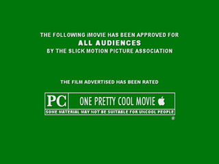
    Using the movie rating layouts to advertise something — ot simply to be clever about something — that has to do or happens to happen in or around movies and movie theaters. Q for Quit Smoking, S for Silence your Cell Phone, Rated R for Rad and more come to mind.

    On Jun.28.2005 at 10:01 PM
    Adrian’s comment is:

    I am coming in way late on this, but I don't think anyone has mentioned the cliche that annoys me the most:

    Chess

    It drives me nuts to see chess used as a universal symbol of problem solving, or whatever. If I didn't play chess, maybe it wouldn't bother me...

    On Jun.28.2005 at 11:54 PM
    Suresh’s comment is:

    - What about the Guy in american flag clothing pointing finger towards you and says "America Wants You" [I dont know what you call him]

    - And then the smileys... :)

    - Gear wheels for Machines

    - Color Pencils and Grey color for Graphic Designers

    -

    On Jun.29.2005 at 11:01 AM
    Juepucta’s comment is:

    Keep in mind that the main reason we find cliches annoying is that they lack originality. As people that work with creativity, for us that is a must-have. But by default, a cliche lacks it.

    So while it is valid to avoid them when coming up with, say, a company logo, it makes sense for them to be used on software icons and airport signs. You want them to be foolproof.

    Just as it is annoying for somebody to illustrate "idea" with a light bulb, it is imperative that people know they are heading to the luggage carrousels when they see the little "bag" icon and so forth.

    G.

    On Jun.29.2005 at 11:02 AM
    Snarky’s comment is:

    Armin:

    I'd think the item you pointed out is too young to be a cliche yet. Isn't it? How many usage times are necessary for an idea to be called a cliche? Ten? A thousand? It's an interesting point though...

    Suresh:

    He's called Uncle Sam.

    Pesky:

    The Japanese word is "shibumi" not "sabumi" and it has to do with great refinement underlying common place appearances. "Sabi" is what you seem to refer to. Shibumi, in art, takes the form of sabi - elegant simplicity, articulate brevity.

    Are question marks cliches? We use them all the time. Have any new punctuation marks been created lately? Seems there must be a few...

    On Jun.29.2005 at 11:48 AM
    Gunnar Swanson’s comment is:

    In the words of that great philosopher Jimmy Buffet:

    Clichés:

    Good ways

    to say what you mean

    and mean what you say.

    On Jun.29.2005 at 01:19 PM
    Matt’s comment is:

    Sitting around thinking of Clichés.

    I am Cliché for thinking that.

    On Jun.29.2005 at 02:13 PM
    marian bantjes’s comment is:

    Gunnar, not for the first time, i totally disagree with Jimmy Buffet.

    Some really great graphic clichés have been posted in these last few comments.

    As king of this post, bonafide additions to my original list would be:

    chess = strategy, problem solving

    gear wheels = machines [or process or thinking!]

    pencils or paintbrush = creative

    film strip = anything movie-related

    megaphone = announcement

    Hourglass = Time [time is running out]

    Bow + Arrow +/or Target = Accuracy [or, gag, "on target"]

    Spyglass = Searching the Horizon [or "looking ahead"]

    Factory Smokestacks = Industry

    Magnifying Glass = Investigation

    key (skeleton key!) / lock = security

    handprint = children or handmade things (I'm recently guilty!)

    [new!] fingerprint = unique, or personailty (guilty!)

    ethernet cord = internet

    coins / money = finance

    endangered

    house = comfort, security

    [new!] registration marks = printing

    clichés to represent computer-related business or ideas:

    CDs, mouse, ethernet cord, keyboard etc...

    however, when the list gets that long, it doesn't leave many options.

    A few that I'm not sure of, now, because they don't represent ideas, but are certainly clichés to represent specific things:

    Tooth = Dentist

    House = Builder

    Eye = Eye Doctor

    Scissors = Hair Dresser

    which makes the following from my own list suspect:

    spine = anything to do with backs

    bubbleheads = people

    Probably not technically clichés but certainly very tired graphics:

    person with the boom mic phone waiting to take your order

    uncle sam/we want you

    star people: illustrations of people with pointy feet & hands

    the obligatory backwards letter

    smileys/emoticons

    including the following from my own list :

    phoenetics

    pointing finger people

    plus countless others listed above, and ... in fact, the list of "tired graphics" could go on forever, but without serving as stand-ins for concepts or ideas I won't list them as clichés.

    This may be splitting hairs, but I have to draw the line somewhere.

    I'm not saying "don't ever use them," I'm saying try very hard to think of something else, and if there's no way around it, try to give them some kind of twist or unique perspective to transcend the cliché. Or as Gunnar would say, get blood out of the graphic turnip.

    So while it is valid to avoid them when coming up with, say, a company logo, it makes sense for them to be used on software icons and airport signs. You want them to be foolproof.

    Yep, I said that already:

    Also, I want to clarify ... some people have mentioned GUIs and the need to represent things simply, and this is perfectly acceptable and desired. In that case the graphic works as an icon ... so the bubblehead international symbols are as fine and desirable as a lock or key on the GUI to represent a secure site

    ... though you, Juepucta, said it better.

    ARE WE DONE?

    On Jun.29.2005 at 03:02 PM
    Lyndi Parrett’s comment is:

    cant handle when someone says "I like that".

    great! now tell me what you like about it.

    On Jun.29.2005 at 04:36 PM
    Tom B’s comment is:

    Here are a couple of design clichés that really grate on me:

    1: The rubber-stamp effect. Used to make a piece look 'official'. This is particularly annoying when it hasn't been set to overprint any colour beneath, competely destroying any illusion of reality. And besides, who uses rubber-stamps these days?

    2: The use of Courier, or another monospaced typeface, used to make text appear 'as though it's been done on a typewriter'. Firstly, the difference in ink between a typewriter and a printing press is clearly obvious. And secondly, who uses a typewriter these days.

    Too many people in large organisations seem to think that bad, clichéd design = good direct mail.

    On Jun.30.2005 at 04:44 AM
    herge smith’s comment is:

    Hey, great post.

    But I have a confession... I'm a bubble head user.

    Oh yes, I bubble head all the time in my blogstrip... and it's soooo true I CAN'T DRAW a damn thing.

    I particularly love the missing piece - having worked for IT 'solutions' companies you see this ALL the time.

    On Jul.01.2005 at 04:35 AM
    Marnie’s comment is:

    > endangered: [new!] registration marks = printing

    I agree 100%!! I just did a cover for a new text on printing. My proposal to the author: "No registration marks, and no CMYK color bars!" Fortunately he agreed and said "I'd rather it had a picture of a cat on the cover, than a picture of a printing press."

    The worst are the registration marks that are intentionally out of register to show the different colors! What kind of a message does that send?

    On Jul.01.2005 at 11:56 AM
    Tromley’s comment is:

    While its not something we design, unless we choose colours: ribbon motif = support has become a bit grating. Its become so saturated its near impossible to differentiate, or, cliche.

    Oh, but i recently did a swoosh which I think effectively avoided the issues of swoosh (although I still felt guilt).

    On Jul.04.2005 at 12:15 AM
    Karla’s comment is:

    i think you dont have any idea of what the word "symbol" means....

    On Jul.06.2005 at 11:02 AM
    Jennifer’s comment is:

    Too many people in large organisations seem to think that bad, clichéd design = good direct mail.

    Unfortunatly, that's the stuff that works in DM!!! I work for a publishing company that sends out DM packagages to promote our magazines and -- I swear to you, we've done tests -- that is the s**t that works. It's very sad.

    On Jul.06.2005 at 03:34 PM
    Tom B’s comment is:

    Unfortunatly, that's the stuff that works in DM!!!

    This attitude really gets on my nerves.

    It isn't bad design that makes a DM pack work. It's thorough, rigorous solutions based upon proven techniques.

    To approach a design project by saying 'lets do this as badly as we can - cos that's what works' is, quite frankly, shameful.

    If something is seen to work, then you should try your damndest to understand why it works - and then try to make it work better.

    DM should allow us to achive really great, results-driven, accountable design. Too often, however, designers are terrified to go near it - frightened that testing might reveal their bad decisions.

    This attitude does exist in other professions: some architects deliberately design ugly buildings because 'that's what people want'; some cooks make disgusting food because 'that's what people like'; some filmmakers produce terrible films because 'that's what people want to watch; but this is not a good thing.

    Designers should be able to produce work that can stand up to rigorous testing, but that also supports the brand and the aspirational vision of the client's company.

    If we don't even attempt to do this - or worse, deliberately do it badly - then we might as well not even bother.

    On Jul.06.2005 at 07:50 PM
    Janis’s comment is:

    Lovely list -- but what about turquoise and lime ANYTHING? Especially with a sans serif font like Helvetica. If I never see another brochure, logo, marquee, or website with fripping turquoise and lime again, it'll be too soon ...

    Like the blog! Glad to have found it.

    On Jul.06.2005 at 08:36 PM
    Jennifer’s comment is:

    To respond to Tom B.:

    This is deviating from the topic at hand but I feel like I should respond...

    (I don't work in the promo dept that does the DM, I'm the Web AD. But I've seen the DM stuff up close and spoken to the designers.)

    We do testing. Extensively. We don't purposfully do "bad" design! But there are things that are proven time and time again... Typewriter style "letters" work, "Yes!" stickers work, "certificate" style reply cards work... the list goes on.

    The testing continues with attempts to improve on the design and copy but at the end of the day, we're trying to sell something. And we're going to go with what generates sales.

    I don't believe that's selling out. It's just separating personal preference from what works.

    Obviously there is a line that shouldn't be crossed. And as designers we need to have those lines. But how close should they be to "fine art" and how close should they be to what is appealing to our audience (while still supporting the brand, of course)?

    On Jul.07.2005 at 12:08 PM
    Tom B’s comment is:

    I don't want to start ranting, but I do want to back up what I have said. I do a lot of DM work and feel that it is a hugely misunderstood field of design.

    By saying that you are 'separating personal preference from what works' you are implying that what works is not what you like. This is what i meant by 'deliberately doing bad design' - you don't like it, but you do it anyway.

    As designers, we must constantly question our own preference - Why don't you like these techniques?

    I gave my reasons for disliking them in my earlier post. Not only are they clichés, they are awkward symbols. As I said, who uses a typewriter these days.

    I can't argue with the results of tests, that would be foolish. But I can attempt to understand why the tests show what they show.

    'Typewriter' typefaces, for example, work because people believe they have been produced in very small quantities - only sent to a handful of winners. But there are other ways of achieving the same psychological effect that won't cheapen the client's brand image.

    Decent testing of DM must take into account the long-term effect a piece has on a brand identity as well as immediate response to a piece. A mail pack with sweepstakes may appear to be working well, but if no-one buys the associated product, or never returns to the company in the future, then the piece is no good.

    I certainly don't think that design for DM should be like 'fine art'. In fact it should be even more dependent upon testing. However, we need to know what things to test, and how to interpret the results of these tests.

    The attitude I was attacking is to say 'testing contradicts my personal preference; I'm a great designer so my personal preference must be right; therefore design for DM must be bad design by nature'

    That's just narcissism.

    Jennifer, I think we're both saying the same thing really - good design is design that achieves results. I just think that we shouldn't just accept things without questionning them, and trying to improve upon them.

    Okay, rant over.

    On Jul.07.2005 at 09:07 PM
    Jennifer’s comment is:

    Tom,

    Got it. Yes, I do think we are saying much of the same. And believe you me, there's plenty that comes out of our promo department that is questionable design-wise and I wonder what they're thinking sometimes.

    I guess it's just lazyness that we occasionally do what we know will bring results even thoug it's a "cliche".

    On Jul.08.2005 at 10:39 AM
    antagonist’s comment is:

    I'm bored of looking at too many designs with the gradient-bubble look. As soon as APPLE set the trend of it, shit loads of designers played it out. I'm definitely one of the guilty few... and I really got to break out of that "style". But if you can use that similar style but ADD something NEW to it and break that monotony, it would be definitely refreshing. :)

    But...yeah, if you want to design something that's very cliche, use it when VERY NECESSARY... or at least add some NEW styles to it.

    On Jul.08.2005 at 12:57 PM
    Felix’s comment is:

    CSS newbie and designer wannabe here.
    Love this thread. Curious to know what you all think of this (keeping in mind the 'keep it simple' philosophy
    and that it is used for an elementary school golf tournament):

    Thanks!

    On Jul.11.2005 at 10:47 PM
    Wiley’s comment is:

    How about those aerial photos of some guy/girl in a suit or something looking up at you with his/her arms crossed and a cheesy grin .... little feet-big head ...... find something else to fill up the space in your website please ...

    On Aug.06.2005 at 10:48 PM
    Tero’s comment is:

    Nothing can ruin my day like a memo written in 14pt bold italic comic sans, having centered paragraphs and 1 cm margins. *puke*

    On Aug.11.2005 at 09:54 AM
    Christopher’s comment is:

    The 3D will broke all

    On Sep.01.2005 at 04:17 PM
    wren’s comment is:

    Holy dear god, is there any design out there that is NOT considered a cliche by designers who've "seen it all"? This whole topic smacks of world-weary snobbery, ridiculing the pathetic designers who've made the unspeakable mistake of using a compass or a sans-serif font in their design. You can take any brochure, ad, whatever, and pick it apart: "Oh, horizontal stripes, they're SO last year." "Can you believe it? A picture of a dog! PUH-LEEZE!" I'm not arguing against all the comments here--yes, the lightbulb is overused and the handshake is hackneyed--but just because you don't like something or feel you've seen a lot of it doesn't automatically mean it's a cliche and it certainly doesn't mean it's bad design.

    On Oct.20.2005 at 09:57 AM
    Steve’s comment is:

    Anyone used the old, standy-by "Package-Movers-Moving Van" images to announce a company changing addresses? Guilty... twice in 3 years... i suck

    On Oct.21.2005 at 11:05 AM
    Kev’s comment is:

    Scanlines. Deliberate pixelation. Overuse of gradients. To be honest I wouldn't have a great problem with actual design elements being cliched or hackneyed - they are often a necessary evil for certain audiences.

    What annoys me is certain stylizations that are overused and unnessessary in most cases. And sometimes even obscure a message. For instance, a less than tech savvy client of mine mistook a scanline/pixel effect on the main company photo for a lack of picture quality.

    On Mar.11.2006 at 09:14 PM
    Katrina’s comment is:

    just because you don't like something or feel you've seen a lot of it doesn't automatically mean it's a cliche and it certainly doesn't mean it's bad design.

    I totally agree.

    On the other hand, designers experiment... take old ideas and make them better, and hopefully something new and fresh will come out of it. Armin's compass, for example, has been done before, but not quite the same way he's presented it. It's definitely a sweet and refreshing logo.

    The fact that designers are taking on the challenge of creating something new with what's been done before is what should be recognized. If it fails in its execution, at least they've tried and better ideas can come of it. There are always new ways of recreating the old. We're all just flowing along the progression of human nature...

    On Mar.14.2006 at 12:10 PM
    Frederick’s comment is:

    Graphic design itself is cliche.

    On Oct.17.2006 at 12:50 PM
    RosebudandGrumpers’s comment is:

    I have these to add: Microsoft Clipart, Victorian copyright-free Clipart, Animal silouhettes, Comic Sans, Dingbats, Spam, Proverbs.

    My fascination with design clichés is only growing; as I continually try to push the boundaries between the clichéd use of cliché, and the elegant application of clichés. Pushing the cliché into another realm, much like the appreciation of kitsch.

    On Oct.27.2006 at 08:04 AM
    T. Bones’s comment is:

    I noticed that people mention the cliché of deers, moose and butterflies as far back as June '05. It is now January 2007 and still designs are being littered with these tired, vacuous symbols. I declare hunting season open, let's cull those herds and squash those hideously overused butterflies. FIRE and SQUASH AT WILL!!!

    On Jan.14.2007 at 03:59 AM
    Mark’s comment is:

    Instead of talking about what's cliche'd how about whats NOT cliche'd?

    ;)

    eh?

    On Jan.16.2007 at 06:34 PM
    mole’s comment is:

    "Instead of talking about what's cliche'd how about whats NOT cliche'd?"

    Such as? Eh? ;)

    On Jan.19.2007 at 02:15 PM
    GK’s comment is:

    WAKE UP!

    EVERYTHING IS CLICHE.

    Who ever has one original thought?

    Designing is begging, followed by a little borrowing and then some stealing.

    On Jan.22.2007 at 06:18 PM
    GK’s comment is:

    Sorry, someone just said that a few posts ago.

    Redundancy is cliche.

    On Jan.22.2007 at 06:35 PM
    Joseph’s comment is:

    "Nihilism is best done by professionals."

    On Apr.28.2007 at 12:24 AM
    purplesimon’s comment is:

    It doesn't really matter if any of these are cliches, as long as the client doesn't say: can we make the logo bigger?

    On May.16.2007 at 05:09 AM
    James M-C’s comment is:

    The only things that aren't cliche are obscure or pretentious.

    On Jun.29.2007 at 05:17 PM
    Kevin Hopp’s comment is:

    I agree, this is nothing more than a rant with no regard to solving the problem.

    It's so cliche to badmouth cliches. And what's even more cliche is to scrutinize cliches you don't use, but accept the ones you do use.

    ...oh the luxury.

    On Jun.29.2007 at 08:14 PM
    Rosebud&Grumpers’s comment is:

    cliché rocks if you brave enough

    On Aug.25.2007 at 04:02 AM
    Gunnar Swanson’s comment is:

    cliché rocks

    You mean pet rocks?

    On Aug.25.2007 at 01:32 PM
    dracon’s comment is:

    And what's even more cliche is to scrutinize cliches you don't use, but accept the ones you do use.

    On Aug.30.2007 at 11:44 AM
    silenciodíaz’s comment is:

    I have to disagree with you. Sure, there are a plenty of clichés that have no value at all (like swooshes, globes, and so on), but there are some others that come from great ideas, and can still be used correctly —but with care, of course: the lightbulb, heart, speech balloon... It's not my faul as a designer, for example, that those ideas have been exploited just for the sake of a trend.

    And about the bubbleheads, well, sure they're clichés at best, but one should admit that it's really hard to think about a design that could compete in simplicity with them. What I really dislike is the fact that the proportions are almost always the exact same —from the signals of the bathroom, etc—, no matter the design, and that they're used regardless the style of the composition.

    On Aug.30.2007 at 04:48 PM
    the bruce’s comment is:

    The thing that is really driving me crazy is the removal of superfluous vowels. There's a burger place around the corner called, "BRGR" and a garden place called "GRDN" etc. I think this trend is stpd.

    On Sep.07.2007 at 11:10 AM
    Lena ’s comment is:

    I went searching for some of these clichés, and this is what I found...

    Globe + arrows =

    a rather large swoosh:

    Hey, this globe actually has a real globe:

    A slightly blurry gobe:

    arrows:

    THE globe:

    swoosh:

    lightbulb:

    I could go on, but really, who wants to look at these all day?

    On Sep.09.2007 at 10:21 AM
    edwin’s comment is:

    There is so much visual information in our society, is has become very hard to create an unique apeeling visual symbol.

    On Feb.07.2008 at 01:49 AM
    jon adams’s comment is:

    I saw the words "aesthetically pleasing" among these comments. I am a graphic designer and writer. A/D, C/D... been there. This is just a comment about something I saw on the TV recently:

    A makeup artist was being interviewed during a news program. The credit below the person referred to her as and "aesthetician." I wanted to call her to ask where her theory of art had been published.

    On Feb.07.2008 at 09:30 AM
    balabo_tk’s comment is:

    On May.11.2008 at 11:33 AM
    nic’s comment is:

    Well, Armin, that logo is more a star than a compass... So it's twice as much a clichee, it's both a compass and a sun...(!)
    but, to the point:
    I think, and agree specially if such is the case, that what is meant here is dead-head redundancy: "the clichee as a shortcut to avoid craft"
    hence:
    a bulblighty bulblight
    a sunny sunlight
    a global globe
    ...

    On May.11.2008 at 01:19 PM
    Al’s comment is:

    Names listed with the first name all lower case and the last name in all caps (name NAME)...or a similar thing where each name is in a different font weight. Seems like 90% of all TV shows and movies have their credits done in this style.

    On May.20.2008 at 12:27 AM
    balabo1_ts’s comment is:


    [@map/map_4g5_mordy.txt||5||p-1||1|| @]

    On Aug.02.2008 at 04:07 AM
    balabo1_ts’s comment is:


    [@map/map_4g5_mordy.txt||5||p-1||1|| @]

    On Aug.02.2008 at 04:07 AM
    names are cliche’s comment is:

    You know what else is cliche? Letters... i mean they are so like 700 BC. Can't we move on already?

    But seriously... do we need yet another "design cliches" post? Some things work, and some things don't. Now there are definitely trends I wouldn't care to never see again, but seems to me that as designers, our time would be better spent creating viable alternatives rather than critiquing everyone and their mother's.

    Sorry to rant... just couldn't take it anymore.

    And one more thing... I will never apologize for using flush left Helvetica, thank you very much Armin Hofmann.

    On Nov.26.2008 at 05:30 PM