In this edition of Quipsologies: the sounds of branding and of the crowd cheering for Armin.

The Design Trust for Public Space is rethinking New York City’s most recognizable symbol — the taxi. This landmark effort is taking place on the eve of the taxi’s hundredth anniversary in 2007.
June 16, 2005, 2—5 pm
Parsons School of Design

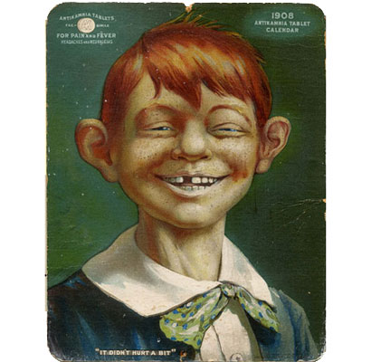
Salvador Dali comics, the Jack Kirby influence on Roy Lichenstein, and the origins of Alfred E. Newman — all revealed in Craig Yoe’s Modern Arf: The Unholy Marriage of Art & Comics.
Sometimes a sound can be the logo.
Music Thing has a series on composers of very short pieces of music used as brand signifiers:
Britain’s Channel 4
Intel inside
Brian Eno’s 4-second composition for Windows 95
The THX sound
The Macintosh startup sound

Zaha Hadid designs Coppola’s latest issue of All-Story magazine, proving once again that architects long to be graphic designers. As a subscriber to this magazine, I read through it with little concern for the design; her juxtaposition of the cornerless buildings with the short stories does little to elevate the text. Is she designing the magazine or promoting her own work? Maybe she’s doing both.
Coca-Cola’s Fresca gets a makeover ( press release / images). Name that font used for the fresh Fresca logotype.
Microsoft has a graphics program in the works (from the Seattle P.I.). Be afraid?!

North Carolina State’s Design program gets featured in USA Today, for redesigning the food pyramid. It’s a project that’s press worthy with social relevance.

Top 10 things NOT to say in a design critique. Funny and nostalgic.

Live report from the HOW Conference:
Chicago, IL 2005. Armin Vit, ferocious blogger, imaginative designer and excellent press releaser, kicks ass in Print’s Ironic Chef. With an avalanche of creativity under 300 watching eyes he beat powerhouse designers Brian Collins, Cheryll Towler Weese and fellow Pentagramer DJ Stout. One could say it was a good fight but it was a pounding, a knockout, a hole-in-one, a 360� two-handed slam dunk… you get the idea. Mr. Vit is the youngest jewish mexican designer to ever win Ironic Chef — and that’s saying a lot. In the first challenge, the designers were faced with creating a logo and ad for the United Nation’s temporary move to Brooklyn. Vit’s solution for an ad provided the right amount of Brooklyn authenticity and attitude to veer the crowd in his favor. In the second challenge, participants were asked to position Chicago as a contender for the 2012 Olympics. Monsieur Vit, having spent over three years as Chicagoan clearly had an advantage over the rest. For the logo, Vit used Chicago’s famous cow as a way to represent the Olympics as the ultimate branding event by literally branding the Olympic rings in the cow’s ass. And as an alternative cow spots could be used to replace the rings. Lastly, for the ad campaign, Vit dug deep into Chicago politics to craft a poignant campaign. The crowd roared and Vit triumphed taking home a goodie bag courtesy of Veer.
[Please excuse the third person, self-promotion melodrama… hehehe… in all seriousness, it was a really fun event and I’m just glad that I was able to pull something out of my behind under such pressure and against great competition. A great fun event, brilliantly put together by the team at Print. For a brief overview of last year’s Ironic Chef (and HOW Conference) see Debbie’s recap]


The June issue of Fast Company is dedicated to the "Masters of Design". Scroll all the way down to see all the content.
The front section is a little flakey (ie. how to act like a designer... or just look like one), but overall it's worth reading to see how a business magazine interprets design.
On Jun.13.2005 at 05:31 PM