Speak UpA Former Division of UnderConsideration
The Archives, August 2002 – April 2009
advertise @ underconsideration
---Click here for full archive list or browse below
  
One Size Fits All

Yeah, yeah, you’ve seen one, you’ve seen them all. Um … until, that is, you see all of them all at once …


I was in Saskatoon, Saskatchewan a few weeks ago. That’s “hicksville” to those of you who don’t know it by its other moniker, the “Paris of the Prairies.” I grew up there, and it is remarkable for how little it changes. But this time I did notice something I hadn’t seen before: an extreme proliferation of these low-tech, customizable, neon-lettered signs. This wasn’t a case of “Ew, look at that.” followed a day later by “Ew, there’s another one.” Nope, this was a case of “Holy crap, look at all these signs!”

They are everywhere: streets are lined with them one after another, and despite the visual overload, they are remarkably eye-catching and weirdly unique.

I couldn’t help but think of the sign salesman, what a killing he must be making. I was also intrigued by the rustic simplicity of the things. Steel square tubing forms the frame, sometimes with wheels, sometimes not; plywood, painted black; some plastic strips to hold the letters—and voila!

It didn’t take long before I decided I had to photograph them, and I soon became obssessed. Driving my elderly mother around town, it was difficult for me to resist the urge to slam on the brakes every few blocks, or careen around corners in an effort to capture another one. She simply wouldn’t understand, so I had to pass on some real beauties.

Not just for the “Brass & String” stores (as my friend Dan so adeptly labelled those hapless businesses you can’t possibly imagine anyone making a living from); these signs are used to advertise everything you can imagine. From home businesses to businesses which, in most other cities you might think would be concerned about … er … graphic standards.

They are on busy streets, side streets, in fields, strip malls, in front of churches and schools, on lawns in front of houses.

No business or organization, it seems, can do without one of these signs.
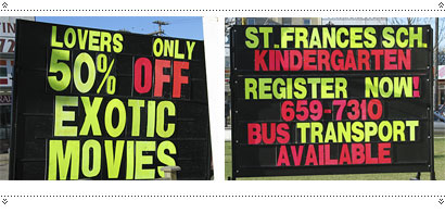
But, wait! Lest you think I’m here to bemoan and decry these as excrescences upon the urban landscape, I have to confess that I am not. There is something intriguing about the concept: think about it: One typeface (only upper case), a few different sizes, rigid linearity, and a limited amount of space. Hmmm … sounds an awful lot like a student typography exercise.

And indeed, I started to become quite interested in the variety of expression within such a limited range. No, these signs don’t have personality (or at least, about as much as your average Saskatoon citizen), but they do have a certain inventiveness, coupled with accidental brilliance.
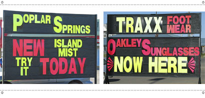
Or simply accidence.

I don’t see these as a blight, merely a passing phase, soon to be replaced by some more “sophisicated” version, or digital display. I would like to have one in front of my house. It might say

Got something to say? Say it big. Say it loud. Say it in neon letters.

Maintained through our ADV @ UnderConsideration Program
ENTRY DETAILS
ARCHIVE ID 2317 FILED UNDER Essays
PUBLISHED ON May.24.2005 BY marian bantjes
WITH COMMENTS
Comments
m. kingsley’s comment is:

Ah, the whistling repertory of the common man... aka the vernacular

Marian, your "marquee signs" are slightly different (neon letters), yet similar to source material appropriated for non-vernacular design use. For example, this CD box set designed by Giulio Turturro:

It's funny how everyday folks seem to be able to deal with the lack of proper punctuation; compared to the design-types in the New School thread.

On May.24.2005 at 01:51 AM
Sheepstealer’s comment is:

Ah yes, hand-assembled, adjustable typography. These have a certain low-tech charm that I love.

BVT I7 DOE5N'T 5TART TO R3ALLY GE7 KO0L UNT|L THE9 L05E SOME []F TH3 LET73RZ.

On May.24.2005 at 02:30 AM
Daniel Green’s comment is:

My gosh, Marian, you mean there are actually more of these that you didn't photograph?

Maybe you've stumbled onto the roll-out of Saskatoon's new graphic identity system.

Forget graffiti, forget Native cultural appropriation -- this says, loud and proud, "Yous ain't in the big city no more, eh."

On May.24.2005 at 08:30 AM
Andrew Twigg’s comment is:

Shocking! Were I not originally from a small town myself, I don't think I'd believe it.

Fascinating, really. I don't think it's all that different than what happens in urban areas: where one "loud" sign would stand out, when you cram so many of them together, they all fall back to a white noise, not at all unlike the thousands of billboards and storefront signage I see (but don't notice) every day here in Chicago.

On May.24.2005 at 10:09 AM
gregor’s comment is:

ah, these lovely road sign signs! Growing up in Madison, WI and when travelling the state for hockey tournaments as a kid (oops, I just spilled the story of my childhood in a word) an earlierier iteration of these were the norm, as they are also on the coastal areas here in Washington State.

Me thinks they are the choice of choices in Saskatchewan for a few reasons: cheap, weather resistant, and easy to replace a broken letter or number, not to mention change your message as often as you want!

What Wisconsin's signs didn't have were the one's where there is some attempt to creat a distinct look in the very narrow confine of the signs. Poplar Springs wins my vote for most innovative use of the grid in these shots!

On May.24.2005 at 10:22 AM
beto’s comment is:

Never before I had seen such an overwhelming diversity in graphic displays.

You know, as in combining red letters with green letters, alternating text sizes of the same font and/or rows of different font colors! Brilliant!

If Henry Ford had been an ad salesman, he would probably had come up with something like this. However, it's got to be said the heavy dose of involuntary humor implicit on this mega-practical, one-size-fits-all line of advertising is not lost on me.

On May.24.2005 at 12:36 PM
marian bantjes’s comment is:

My gosh, Marian, you mean there are actually more of these that you didn't photograph?

Many, many more. I shot all of these (and more, I spared you) on 2 streets in about an hour and a half, total. But they really are all over the city. I meant to go back and get the one in front of a grand "old" (for Saskatoon) church, and the one in front of the Parktown Hotel, which had fallen into a comical state of disarray.

Interestingly I was in Winnipeg a few weeks later and thought I might see them there, but no: I didn't see one.

Poplar Springs wins my vote for most innovative use of the grid in these shots!

Yes! I particularly like the way the message works as a single sentence, and in its disconnected parts.

I also like Gibson's Fish & Chips: v nicely structured.

And for some reason I'm really charmed by "congratulations cora lee & lisa". I love the idea of the personal message. If I had one in front of my house I could say things like "I'm feeling sad today." or "check out these poppies!" or "sleeping: I was up til 2am"

On May.24.2005 at 12:36 PM
Ryan Peterson’s comment is:

Wow!

Sobey's has served Billions and Billions of Warehouse Meat Packs to satisfied customers?

Oh wait, thats the McDonalds in the background, not the fine print. Nevermind.

On May.24.2005 at 12:59 PM
ps’s comment is:

will be interesting to see how the signs develop once television and computers reach saskatoon...

On May.24.2005 at 01:24 PM
bd’s comment is:

In 2002 I took a big road trip across the US and spent a little time in Canada — specifically the Winnipeg and Regina area. These signs were all over the place. Having never seen something quite like them I too took a bunch of pictures.

Strange that you didn't find any in Winnipeg... what about Regina? Anyone?

On May.24.2005 at 01:34 PM
Robert L. Peters’s comment is:

Marian - a guy I know quite well lives in the woods east of Winnipeg and passes dozens of those signs every day along Canada's #1 highway - almost all of the signs are overtly commercial and almost all are illegal, as they encroach on the requisite 200' sign-free zone (measured from the center line of the right-of-way) dictated by the provincial government in order to protect its citizens from undue distractions (causing trafic accidents) and to provide them with enjoyable vistas along provincial highways and roads.

Well, because this guy is bothered by the visual pollution cluttering the otherwise spectacular prairie vistas, he and covert friends have taken to liberating the black sign-boards of their neon letters from time to time - usually by the dark of night, sometimes removing select letters and words, and sometimes leaving a 'blank slate' or a message such as 'MORE IS LESS.' So, now he has a collection of the removed letters and has been pondering a good cause (non-consumerist, digilante) for which to re-post the letters in a re-constructivist fashion. If you have any thoughts or suggestions re: the redeployment of the characters, let me know... I could put you in touch with the guy.

On May.24.2005 at 02:27 PM
marian bantjes’s comment is:

If you have any thoughts or suggestions re: the redeployment of the characters, let me know... I could put you in touch with the guy.

Exciting! Typography students, look out.

On May.24.2005 at 02:49 PM
Ryan Peterson’s comment is:

will be interesting to see how the signs develop once television and computers reach saskatoon...

I agree ps, I envision television commericals and flash intros to websites. Floating neon letter forms on black rectangle backgrounds, coming together to form messages with missing letters.

I smell a design movement.

On May.24.2005 at 04:18 PM
gregor’s comment is:

will be interesting to see how the signs develop once television and computers reach saskatoon.

urban elitism aside, tv and computers have infiltrated just about every nook and cranny on the planet - it's just that for most people they aren't the central to their existence.

it would be hard to imagine the Gas Bar or ST. Frances School plucking down money for an ad campaign or even a website targeting small town populations where walking to either Gas Bar or ST. Frances would be faster than finding it on the web.

but hey, take the concept and run with it and make your own design movement, though the "no-logo" folks may have beat you to it albeit a bit politically charged.

waiting for the 1st manifesto.....

On May.24.2005 at 05:46 PM
Ryan Peterson’s comment is:

Don't worry, my remarks about the TV ads and websites were completely facetious, I grew up in a small town in Wisconsin myself. (Where fun included running around at night and changing what signs like these said.)

I'd start that manifesto, but it would take a whole bunch of marquee signs and neon letters, and I just don't have those kind of resources.

Guess I could contact Robert's guy.

On May.24.2005 at 06:07 PM
gregor’s comment is:

I grew up in wisconsin too - but not small town. I know it was the comment was facetious. I just like to be the contrary one ;/>

On May.24.2005 at 07:06 PM
Nick Fr�hling’s comment is:

I was just in Medicine Hat, Alberta this winter and was also taken aback by the neon-sign-invasion. You could stand on any street corner and literally see these signs at each business, and lots of times with more images than text, like the typical "Wow", "Deal" or "$$$" type graphics.

However, since I was already doing a photo-essay of the proliferation of Canada's first Canadian Idol, Kalan Porter, in the small city, I think my relatives already thought I was weird enough.

However, I've got some great pictures of the self-titled "Kalanadians" and their branding madness, if anyone's ever interested...

Anyone?

On May.24.2005 at 08:04 PM
Michael Surtees’s comment is:

Nick: having the unfortunate luck of being born in Saskatoon and then living in Medicine Hat for college, I would be interested in seeing the madness...

On May.24.2005 at 08:17 PM
marian bantjes’s comment is:

nick,

i'm interested.

On May.24.2005 at 08:17 PM
marian bantjes’s comment is:

and lots of times with more images than text,

Ah, that would be the magnetic version. I got some of those too, but they were less interesting to me than the type-restricted, ultra-low tech variety.

On May.24.2005 at 08:19 PM
Derrick Schultz’s comment is:

These signs are part of the reason I'm in graphic design today.

When I was 16 (after I left my Wisconsin suburb . . . coincidence, or time for a reunion?) I got a job at a local nursery and tree farm. One of my jobs was to go out and change our sign (the black and red type on yelllow, trailer hitch-style) about once a month. It was my favorite hour every month. The place had been in business for 10 or 15 years, so they had bought more than a few sets (none of which used the same face), some of the letters were yellow and cracked, or others had tape added to make them more prominently used letters (can you tell how excited it made me?) I loved pulling each letter and crossing it off the list, making sure it was evenly spaced on the board (because fully centered is the only way to go on these kinds of signs), it was better than any kind of watering I could have done.

I don't think I ever realized that that was what graphic design was (in some odd way), but it must have been subconcious when I applied to design school a year later.

I went back to the job the summer after my first year at school. I thought I'd try something different for our sign — something a little more designer friendly. Needless to say, left justified didnt go over too well with the big wigs at the nursery.

On May.24.2005 at 08:35 PM
Daniel Green’s comment is:

Growing up in Madison, WI

I grew up in a small town in Wisconsin myself

after I left my Wisconsin suburb

Whoa, there are a lot of Wisconsinites on this thread. Your post must be striking a chord of recognition with us, Marian.

On May.25.2005 at 08:22 AM
gregor’s comment is:

LOL [my son taught me that awhile ago and now i get to use it!]. Wisconsin and Saskatoon have a bit in common at times - the cold flatlands, chasing little black discs on frozen lakes for fun, gangs of young fellers in red coats every fall armed with rifles and shooting, well, whatever they legally can. a drive between Madsion and Fon Du Lac no doubt would have it's share of the same type of signs.

How many Wisconsinites here are still in Wisconsin? In Seattle every corner I turn it seems like I'm met with another Wisconsin expat or former Minnesotan!

On May.25.2005 at 10:53 AM
Derrick Schultz’s comment is:

I should point out that my story comes from a nursery in Pennsylvania, and not Wisconsin.

On May.25.2005 at 10:55 AM
Ahrum Hong’s comment is:

Awesome. Tibor's dream come true.

I wonder if its gotten to the point where the people of Saskatoon would be hesitant about the quality of your establishment if you didn't have one of these signs.

On May.25.2005 at 10:59 AM
Kate Sinclair’s comment is:

Just wanted to let you know these signs are all over eastern Canada too. I live in Halifax and recently the government has been trying to pass legislation limiting these signs becuase they say they're distracting to drivers. Like you said there are hundreds along one stretch of road.

Side note: I used to work at a garden centre and I had to put together these signs everytime the specials changed. Good times.

On May.26.2005 at 09:38 AM
jimmijam_sk’s comment is:

These signs are all over Regina as well.

My pops knows the guy in Saskatoon who owns/rents the majority of these eyesore signs and his business continiously expands as the need for the corporate world to display themselves in a "uber ugly" style moves onward.

One style of signs that are popping up across Regina are the "Postcard Portables" type - where the sign is professionally designed, printed and glued upon what looks like billboards on wheels. Now these are cool and quite astetically appealing.

As for future styles of signs, just wait for the prices of plasma technology to drop. They are already using plasma displays in shopping malls across Saskatchewan (see saskwatch.tv for more info) for fancy-schmanzy flash-esque advertising.

On May.26.2005 at 10:14 AM
Jeremy Mickel’s comment is:

> BVT I7 DOE5N'T 5TART TO R3ALLY GE7 KO0L UNT|L THE9 L05E SOME []F TH3 LET73RZ.

I think the inventiveness of substituting missing letters is interesting.

Backwards 3 for E

Upside-down W for M (and vice versa)

Upside-down V for A

5 for S

On May.26.2005 at 11:30 AM
Gunnar Swanson’s comment is:

This conversation keeps bringing me back to one of those inevitable rhymes (from Warren Zevon’s “Hockey Song” on My Ride’s Here:

A scout from the Flames, came down from Saskatoon

said, "There's always room on our team for a goon.

Son, we've always got room for a goon."

There were Swedes to the left of him

Russians to the right

a Czech at the blueline looking for a fight.

Brains over brawn, that might work for you

but what's a Canadian farm boy to do?

On May.26.2005 at 01:54 PM
Jenn’s comment is:

Funny, i live here in saskatoon and barely notice the signs, likely due to the fact that there are so damn many of them. I once worked at a business that used these signs as a cheap form of advertising. Every month we would gather as employees to decide what exciting phrases we could cram into the 28 or so spaces...Ohhh, imagine the thrill. Then a man and his truck would roll up and plop down the contraption and add our little message, as these are mostly rental units. Such joy we would feel, marvelling in the beauty of our little wonder.

On May.26.2005 at 05:03 PM
gregor’s comment is:

buckets of thanks Gunnar. Now that song, previously erased from memory will run through my mind like molasses as I drift off to sleep.

Funny, a string of comments from designers and not a peep about the face of the letter on these signs. not quite sans, further away from serif I'm oddly attracted to the combination. Most are charatcters are closest to helvetica nueue while some have an Imago nuance.

hmmmmm.

On May.26.2005 at 08:25 PM
Keith’s comment is:

I need to take a sales seminar from the salesperson at the sign company! I can just see it now. One size fits all web sites.

On May.28.2005 at 10:48 AM
Mark’s comment is:

A few winters ago I was driving past the Golden Mile Mall in Regina when the portable sign made me guffaw. Some joker had changed the sign from SANTA IS HERE to SATAN IS HERE.

On May.31.2005 at 06:25 PM
Kevin Steele’s comment is:

Thanks, Marian. I found this an interesting collection. In some of my visits to my hometown of Saskatoon I ahvhe photographed some of these signs, but I had not noticed how prevelant they actually are.

On Jun.02.2005 at 12:35 PM
kadavy’s comment is:

It makes for better vernacular typography than say, Microsoft Word, since they are forced to choose letter sizes that have a geometric relationship with one another...and only one font.

On Jun.03.2005 at 09:49 AM