Speak UpA Former Division of UnderConsideration
The Archives, August 2002 – April 2009
advertise @ underconsideration
---Click here for full archive list or browse below
  
Ultimate Character

It’s been a while since we had a Friday Variety post and in anticipation of the festivities, I thought we could all do with a little love and sharing.

Now, I have compiled a bunch of samples to inspire your answer to come, samples that do not particularly relate to my personal response to this Variety, but nonetheless could spark some thoughts:

You could be inspired by any (a-z) lower case character

FChar_lc.jpg

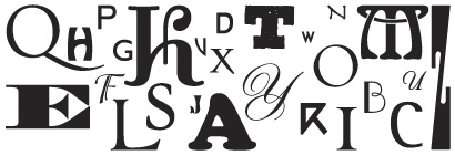
Or maybe by the always favorite caps

FChar_caps.jpg

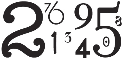
Will numbers do it for you?

FChar_numbers.jpg

And for those more abstract souls out there, maybe symbols are your source

FChar_symbols.jpg

Here is my Friday question to you, what is your ultimate, most perfect, approaching-sainthood character of all times? Not for a logo, not for an initial cap, not for 5pt legibility. Your own little character you want inscribed in the inside lid of your coffin so that you can stare at it for eternity.

Maintained through our ADV @ UnderConsideration Program
ENTRY DETAILS
ARCHIVE ID 2274 FILED UNDER Show and Tell
PUBLISHED ON Apr.08.2005 BY bryony
WITH COMMENTS
Comments
+’s comment is:

+

would be it for me...

On Apr.08.2005 at 09:04 AM
Bryony’s comment is:

any particular typeface?

On Apr.08.2005 at 09:05 AM
+’s comment is:

Bryony, I've been partial to Process Type's Locator for the past year — it's hard to judge if it will be timeless, but it's good as any.

On Apr.08.2005 at 09:20 AM
franz’s comment is:

On Apr.08.2005 at 09:53 AM
Armin’s comment is:

Just to get started with a few:

From left to right: Dead History's S / Radio's R / Arcana's g / Whitman's k / Missionary's 8

On Apr.08.2005 at 09:56 AM
Zoelle’s comment is:

Nothing r�cks harder!
(Except maybe the exclamation mark!)
On Apr.08.2005 at 10:01 AM
Matilda’s comment is:

There is nothing more beautiful than a Clarendon 2.

On Apr.08.2005 at 10:22 AM
Jeff Gill’s comment is:

I am rather fond of the capital Q, espcially when the tail is not connected, as in Cartier Book:

They look a little odd there on their own, but in text rather lovely:

But to pick my ultimate, most perfect, approaching-sainthood character of all times? Impossible.

On Apr.08.2005 at 10:41 AM
steve’s comment is:

-

a dash says a lot, it's on a tombstone to define the existence I'll have on this earth, so for being so little, it'll say a whole lot. and it can be in any font (except a handwriting font) since they are still dashes.

On Apr.08.2005 at 11:00 AM
Steve Mock’s comment is:

I'm a fool for the lowercase double-decker gees. MrsEaves gee is pretty sexy.

I like the symbol for the number phi, too. As a geeky math thing. Rendered here in the STSong OSX system font.

On Apr.08.2005 at 11:34 AM
Isaac Tobin’s comment is:

My all time favorite character (right now) is the old lead monotype Bembo "f." The digital version will have to do for this sample. Other favorites include Bembo "r," Fournier "R," Adobe Caslon Itlaic "&," and Gotham Bold "R." The Clarendon Condensed "R" is also wonderful, although I don't have the typeface here at work.

Isaac

On Apr.08.2005 at 11:52 AM
Jason Tselentis’s comment is:

Any rendition of µ or π. AK12 gives them an awfully nice shape as sans serifs.

Since leaving my calculus days behind, I seldom use these characters unless writing a cousin or uncle overseas—which never happens because I've forgotten nearly all of my Greek.

On Apr.08.2005 at 01:11 PM
Jackson Cavanaugh’s comment is:

My favorite letterform changes at least once a month. Currently, it is the lowercase k, especially when they have a nicely closed counter on the top.

On Apr.08.2005 at 01:51 PM
gregor’s comment is:

On Apr.08.2005 at 02:33 PM
Rick’s comment is:

I'm not sure. It would have to be either:

!

or

?

Either way, I'd like it set in Knockout Full Bantamweight, from Hoefler.

On Apr.08.2005 at 02:44 PM
kevin lo’s comment is:

hmm, I would say the pilcrow (unfortunately not on my good computer right now, so no pictures)... and there's nothing quite as sexy as a "double e" ligature, or a "ct" ligature.

and on the ampersand note: check out my friend Rebecca's obsessive project:

AND

On Apr.08.2005 at 03:00 PM
Shahla’s comment is:

Out of many favorites including � or � here’s a tweaked graphic to start.

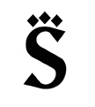
This lowercase letter in Zuzana Licko’s Matrix has sharp �serifs’ that are reminiscent of the dots made with calami. So I present you with a three-dotted �s’. In Farsi there is a phoneme for �sh’; that same letter with out the dots signifies an ess.

On Apr.08.2005 at 04:13 PM
Steven’s comment is:

Well, I like all sorts of letterforms, depending on the font, etc. But, I've always thought that the double-s was a fairly quirky character and a nice personal symbol, especially when set in Osprey or various blackletter fonts, like the two on the right.

On Apr.08.2005 at 04:52 PM
Feaverish’s comment is:

I am sexually attracted to Futura's ampersand...

On Apr.08.2005 at 05:04 PM
Gunnar Swanson’s comment is:

I hate to be the cliché graphic designer (the punch line is “why does it always have to be a light bulb?”) but I think we need more characters to choose from, especially punctuation marks. Not many interrobangs around and even fewer good looking ones.

I like the [Armin and Bryony—�What do you call the upside down question mark?] in Spanish. It gives you warning in “normal” use but also leaves the opportunity to start a sentence as a question and end it as something else. We do stuff like that in conversation but we’re generally limited to a small vocabulary of punctuation. I did a interropause [can anyone think of a better name?] for The Society of Typographic Aficionados Font Aid I’s question mark collection

but question marks generally seem to mean “this is the end of an interrogative sentence” even though we often want to mean “this is uncertain” or “there is a question in this phrase but we’re moving on to the next phrase” and even an interrobang might vary depending on whether the interrogation or the bang is the dominant factor.

On Apr.08.2005 at 05:05 PM
BlueStreak’s comment is:

>Your own little character

>inscribed in the inside lid

>of your coffin...

:: :: : the Tango Whiskey : :: ::

On Apr.08.2005 at 10:02 PM
Hector Mu�oz Huerta’s comment is:

I love geometric and sturdy characters and triplex italic is plenty of them.

I like tyfa caps.

But the grand prize for being engraved inside my coffin is for this never issued lower case g, designed by Paul Renner, because by the way I’m a lower case - double storied "g" lover.

On Apr.08.2005 at 10:33 PM
KM’s comment is:

On Apr.08.2005 at 11:22 PM
Bogan’s comment is:

id want a...

?

everything anyone wants to know ends with one of those, from the lowliest of questions to the most complex philosophical debates. From 'how's the weather today?' to 'what is the meaning of life?'

? would definately do it for me

On Apr.09.2005 at 05:07 AM
marian’s comment is:

The winner is the Fette Fraktur capital S:

with runners-up: Plantagenet dagger, by Ross Mills; Cobra lowercase x and Monarchia Swash ffi ligature, both by Frantizek Storm.

I'm sure there's an italic ampersand out there that could win my eternally dead heart, and I'm also very fond of capital Qs with very long tails.

On Apr.09.2005 at 03:25 PM
Jeff Gill’s comment is:

Marian,

should you ever be setting a menu in Welsh you will have the perfect opportunity to use Storm's lovely ligature. Coffee is Welsh is

coffi

-

Also,

I am very fond of this Hoefler Text black italic ampersand

and just about everything else in that font--heck in the whole typeface.

On Apr.10.2005 at 04:52 AM
Candy Rudolf’s comment is:

i really really, love these

arial/ arial/ century gothic

what is that symbol called?

On Apr.10.2005 at 09:20 PM
Candy’s comment is:

oh, and how can I forget the symbol for pi.

Does anyone know WHO designed that symbol?

and does anyone know of a font with a bunch of different versions of the pi symbol?

On Apr.10.2005 at 09:33 PM
Jeff Gill’s comment is:

Candy, according to my computer's character palette

æ is called Latin Small Letter AE

œ is called Latin Small Ligature OE

π is the 16th letter of the Greek alphbet and has been around for a very long time indeed. I once listened to a radio program on the development of writing systems, but alas all that I learned leaked out.

On Apr.11.2005 at 06:12 AM
Nicole’s comment is:

They are actually called diphthongs...

On Apr.11.2005 at 10:38 AM
Jeff Gill’s comment is:

Nicole, interestingly, the American Heritage Dictionary & Wikipedia only refer to diphthongs as sounds, not characters.

Mr Bringhurst refers to them as typographic diphthongs, which seems wise, especially when in the presence of the unlearned or, like me, slightly learned.

On Apr.11.2005 at 10:52 AM
BlueStreak’s comment is:

I use the 2nd edition of Brinkhurst's Elements of Typographic Style. On page 271 he refers to � as "aesc" and pronounced ash. On page 277 he refers to � as ethel.

One of my personal peeves is the pedantic way Communication Arts uses �. It may be overtly proper, but it's a visual/reading roadblock and a pain the arse everytime I hit the word aesthetic.

On Apr.11.2005 at 01:05 PM
BlueStreak’s comment is:

Oops... Bringhurst, not Brinkhurst!

On Apr.11.2005 at 01:07 PM
Jeff Gill’s comment is:

Thanks, BlueStreak.

On Apr.11.2005 at 03:13 PM
Matt’s comment is:

Candy Wrote:

Does anyone know WHO designed that symbol?

Candy, here's some background on the use the symbol to denote the mathematical constant 3.14(15926535897932384626433...)

We should say a little of how the notation p arose. Oughtred in 1647 used the symbol d/p for the ratio of the diameter of a circle to its circumference. David Gregory (1697) used p/r for the ratio of the circumference of a circle to its radius. The first to use p with its present meaning was an Welsh mathematician William Jones in 1706 when he states 3.14159 andc. = p. Euler adopted the symbol in 1737 and it quickly became a standard notation.

see more

On Apr.11.2005 at 03:21 PM
Matt’s comment is:

Candy Wrote:

Does anyone know WHO designed that symbol?

Candy, here's some background on the use the symbol to denote the mathematical constant 3.14(15926535897932384626433...). However, the character of Pi existed long, long before...

We should say a little of how the notation p arose. Oughtred in 1647 used the symbol d/p for the ratio of the diameter of a circle to its circumference. David Gregory (1697) used p/r for the ratio of the circumference of a circle to its radius. The first to use p with its present meaning was an Welsh mathematician William Jones in 1706 when he states 3.14159 andc. = p. Euler adopted the symbol in 1737 and it quickly became a standard notation.

see more

On Apr.11.2005 at 03:21 PM
R agrayspace’s comment is:

I have always been fond of how the Futura lower case looks like a little fish. Always makes me smile.

On Apr.11.2005 at 03:26 PM
Bryony’s comment is:

It is interesting to note how many find symbols and ligatures to be the most interesting, and only a few letters set in interesting typefaces made it to the list.

Wonder why?

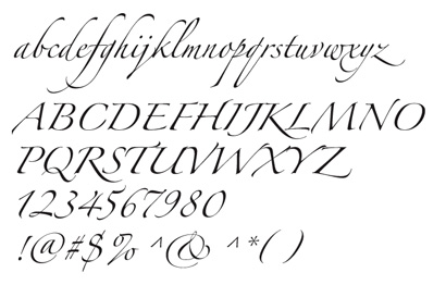
On the other hand, I think Zapfino has some of the sexist characters out there:

On Apr.12.2005 at 12:16 PM
Jeff Gill’s comment is:

Bryony, I completely agree. And the myriad of alternates and ligatures means that every word set in Zapfino can almost be its own little work of art.

I think it is sad that some folks have murmured against it just because it comes with OSX.

On Apr.12.2005 at 03:45 PM
Bryony’s comment is:

zapfino + open type = pure fun dancing bliss

On Apr.12.2005 at 04:09 PM
Steven’s comment is:

Well, after seeing BlueStreak's Whiskey Tango and Marian's Fette Fraktur "S", and before this thread slips into archive oblivion, I wanted to upgrade my previous submission to the �ber Fette Fraktur double-s:

(with additional help from Emigré's Whirligig)

On Apr.18.2005 at 01:05 AM
BlueStreak’s comment is:

Ultimately wicked SS!

Bringhurst calls that little jewel the eszett.

To the black letter lovers, I've been holding out, but will share. Here's a little shareware font treasure that I've been saving for just the right project to call it's name. Take a look at Aaron Beck's Beckett.

It's almost as sweet as Fette, and maybe just a little more readable. I think the cap S is particularly nice, as well as a new eszett for the Soshea collection.

On Apr.18.2005 at 10:21 AM
cj’s comment is:

Not sure if it is considered a character, but since it has it's own key command it works for me. It can lead to so many things (and I think it would be great to have on the inside of my coffin. My favorite is the…

On Jul.01.2005 at 05:20 PM