Speak UpA Former Division of UnderConsideration
The Archives, August 2002 – April 2009
advertise @ underconsideration
---Click here for full archive list or browse below
  
Quipsologies
~ Vol. 2 ~

Peanuts, thugs and cakes make up this serving of Quipsologies.

~ BRYONY ~

The image of Planters Peanut’s Mr Peanut will appear on 75,000 automotive in registration stickers Suffolk, Virginia (home since 1913 of Planters Peanuts). The deal appears to be a simple acknowledgement to the good deeds the company has done for the town over the years and not a paid placement.

~

Seventeen staffers at Saatchi & Saatchi [in New York] resigned this week in the wake of the agency’s split with Mike Burns, a vice chairman and worldwide account director on key client General Mills.”

~ ARMIN ~


Don Hogan Charles for The New York Times

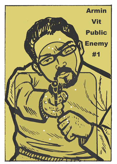
Who’s the Thug? “[A] husky white guy, maybe a little German, maybe a little Italian, some Irish,” writes Michael Wilson for The New York Times “with his pug nose and his thick head of dark, wavy hair.” Originally commissioned to be a nobody/anybody, theories abound on its real-life inspiration.

~

Go behind the scenes in the making of The Cakes featured in Veer’s January 2005 catalog.

~

Play the guessing game, at Be A Design Group: Who’s the next female partner at Pentagram?

~ M. KINGSLEY ~

I agree with Adam Gopnick, New York City street signs are getting too big.

Maintained through our ADV @ UnderConsideration Program
ENTRY DETAILS
ARCHIVE ID 2223 FILED UNDER Miscellaneous
PUBLISHED ON Feb.20.2005 BY The Speak Up Authors
WITH COMMENTS
Comments
Peter Kent’s comment is:

I'd like to see a cake with the thug on it, eating peanuts.

On Feb.21.2005 at 02:15 AM
RavenOne’s comment is:

I'd give a dollar to whoever can say "Planters Peanut’s Mr Peanut" 5 times,really fast...without messing it up. What a tongue twister!

As for signs getting too big...

Hrm. Haven't been to NYC in a while; maybe someone put miracle-grow for Inanimate Objects on them? As for their choice of abreviations -3av, it reminds me a bit of AOLian. Isn't Ave. short enough? What's next? 3a? or 3? or maybe THREE DOTS! HA, THAT'LL SHOW YA.

On Feb.21.2005 at 02:21 AM
M Kingsley’s comment is:

Bryony, if you keep bringing up Mr. Peanut, I'll keep bringing up these links:

In the 1970s, Toronto-based artist Vincent Trasov took on the persona (and shell) of Mr. Peanut -- even at one point running for Mayor as Mr. Peanut.

This was part of a collaboration with Michael Morris known as Image Bank. Some Speak Up readers may be more familiar with the Toronto art collaborative known as General Idea. While they began a few years later, the sense of humorous cultural/media critique was similar. General Idea were also publishers of File 'megazine', which featured Trasov's Mr. Peanut in earlier issues.

Pictures of Mr. Peanut on summer vacation can be found http://www.belkin-gallery.ubc.ca/webpage/archives/babyland1.html" target="_blank"> here, with a more randy display on http://www.belkin-gallery.ubc.ca/webpage/archives/babyland2.html" target="_blank"> this page (scroll down a bit).

(Nothing like a running gag — esp. the third time around)

On Feb.21.2005 at 02:41 AM
Derrick Schultz’s comment is:

New York is not a hard place to get around in. If you don’t know where you are, you don’t deserve to be here.

um, wow. I try to be nice, but when the NYC elitism goes too far, I have to speak up (sorry, no pun intended).

I havent seen the signage, so it could really be overdone. But the idea that everyone knows what Park Avenue or Madisaon Avenue looks like is pretty ludicrous. I may be venturing far out, but I would guess that NYC is probably one of the larger tourist spots in the US. The signage most likely is not for the everyday New Yorker, but for the people who visit for a week or a day at a time. To say that is the homogenization of America is pretty intense. It sounds more like an environmental and universal design consideration.

On Feb.21.2005 at 09:20 AM
M Kingsley’s comment is:

> ...the idea that everyone knows what Park Avenue or Madisaon Avenue looks like is pretty ludicrous. I may be venturing far out, but I would guess that NYC is probably one of the larger tourist spots in the US. The signage most likely is not for the everyday New Yorker, but for the people who visit for a week or a day at a time... ...It sounds more like an environmental and universal design consideration.

Derrick, the larger signs are for the benefit of cars; the bane of New York. Ours is a walking city under siege from the automobile.

Several years ago Mayor Rudolph W. Giuliani, after spending too much of his precious time stuck in mid-town traffic, blocked certain mid-town intersections from pedestrians. The City installed fences at the corners and crosswalks at the center of the blocks; issuing jaywalking tickets to anyone who dared cross at the intersection — yes, jaywalking tickets in New York.

But this isn't the only institutionalized assault by cars on people. http://en.wikipedia.org/wiki/Robert_Moses " target="_blank"> Robert Moses was the 'mastermind' responsible for the Cross-Bronx Expressway; which destroyed 159 apartment buildings and cut the Bronx in half, destroying once-vital neighborhoods. His office was at the foot of the TriBorough Bridge and one of his responsibilities was overseeing toll collection, so one could easily guess where he fell on the car/pedestrian debate.

When you're walking and taking the subway, the current-sized signs are more than adequate. In fact, many in mid-town are also backlit at night. A huge sign, probably the result of a standardized NY State DOT sign regulation, is mismatched for the context.

On Feb.21.2005 at 01:11 PM
Albert B Jr’s comment is:

The Thug is none other than the quintessential puggy, hot-headed, slick and quick-drawin' gangsta…Joe Pesci!

On Feb.21.2005 at 03:44 PM
Jeff Gill’s comment is:

I've got no argument with the anti big sign lobby, but Mr Gopnik (funny name for a Republican hater) affected such a smug, whiny tone in his article that I was ready to head down to the NY DOT office and volunteer to help hang the signs just for a chance to spite him.

On Feb.21.2005 at 04:18 PM
Armin’s comment is:

The main problem with the Thug, as I see it, is his pants are up too high… that just blocks blood circulation to the rest of the body.

On Feb.21.2005 at 09:59 PM
Steven’s comment is:

The thug looks like he's straight out of The Venture Brothers, on Cartoon Network.

From the NYTimes site:

It is the official target used by the Department of Homeland Security.

Yeah, that's right. The terrorists are gonna look like this guy. Yup, and of course, the guy has to have dark, curly hair; never any blonde-haired bad guys, are there?

I also like how there's that inner shaded area for emphasis, just in case you were unclear about where to aim.

On Feb.22.2005 at 03:16 AM
Michael Lewis’s comment is:

While I am quite familiar with large street signs at intersections in many other U.S. cities, I'd love to see a picture of what the New Yorker author is so piqued about.

On Feb.22.2005 at 12:57 PM
Albert B Jr’s comment is:

> Yeah, that's right. The terrorists are gonna look like this guy. Yup, and of course, the guy has to have dark, curly hair; never any blonde-haired bad guys, are there?

Political correctness rules the roost. I would imagine if Homeland Security existed back in the days of the Iron Curtain, the Thug would be blond, of course, and maybe leaner and muscular. Well, the guy has got to look good in black and white, and you have to see the shape of his melon. I'll bet you'll hear cries for blood if you draw a dark, curly beard and a turban on him.

On Feb.22.2005 at 03:04 PM
Steven’s comment is:

I'll bet you'll hear cries for blood if you draw a dark, curly beard and a turban on him.

Oh, I don't for a minute that there would be an uproar if he wore a turban; and rightfully so, mind you. (However, the 9/11 hijackers went out of their way to look very western.) I just think that it's amusing that this out-of-date caricature image is the "official" target of Homeland Security. It's just not very forward thinking and plays into stereotypes.

In fact, this target image was made back in the height of the Cold War era, e.g. late 50's / early 60's, so I think that some of those aspects play into it. Certainly, there are/were as many dark-haired commies as there are/were blondes. But in general, the gross (racist) stereotype exemplified here is the representation of a bad-guy as someone with curly, dark hair, i.e. a non-white person. It's directly related to the kinds of racial profiling harassment that cops do all the time.

On Feb.22.2005 at 04:39 PM
Albert B Jr’s comment is:

I do agree with the stereotypical, dark-haired bad guy. And its a shame that our culture is deeply buried with this notion, greatly caused by the media (for instance, westerns and cop shows from the 50s/60s) and racial discrimination. Or course, I'm sure the artist instinctively created the Thug not knowing anything about the sensitivity of stereotypes, and he just needed a general image of a bad guy of his era. Since the mob was big at the time, I think he had that in mind. Hence, it makes sense for the Thug to be kept only for the police and the FBI.

I really see no need to update Mr.Thug, although we tend to want to bring some sense of reality in who we shoot, instead of some comicbook-like character. I think there is some bit of enjoyment shooting this guy besides a diagram. I'm curious if Jack Kirby influenced our Thug artist.

On Feb.22.2005 at 05:19 PM
Michael Surtees’s comment is:

Who’s the Thug?

"I called downtown and they sent up an artist and he was terrific," he said. "I told him what I wanted. He was a quick study. He did excellent, really. Young guy."

I always wonder about illustrations like this. Was the artist a pillar of the community, or someone that was a bit mischievous. If they're from the wrong side of the tracks, what would hold them back from adding something subliminal in the hair or some of the other negative space areas?

On Feb.22.2005 at 05:56 PM
Armin’s comment is:

An interesting contribution to the thug discussion, courtesy of Pesky Illustrator:

On Feb.25.2005 at 12:11 PM
Pesky Illustrator’s comment is:

Thanks, Mister Vit. With the exception of the right eye it kinda looks GOOD. I mean BAD.

Any of you designers need your target portrait done?

On Feb.25.2005 at 03:25 PM
Pesky Illustrator’s comment is:

I guess not, thugs. LOL

On Feb.27.2005 at 10:10 AM