In the past five days since the U.S. Presidential elections there probably has not been a person connected to the internets who has not received some sort of graphic in their email. Following is an overview of just five days of work. And you thought you worked fast…
Named after Massachusetts Governor Elbridge Gerry, to Gerrymander is to aggressively redraw electoral districts to the advantage of a particular political party. The map is an easy, sometimes objective, sometimes controversial device to convey information or opinion.
Since many of us around the world are familiar with the final red/blue — red for Republican, blue for Democrat — post-election map, the shape of the United States makes a good beginning point.
Our first example comes from Jeff Culver in Seattle via Boing Boing. Instead of showing the extremes of red and blue, he used their percentages to create more nuanced hues and a better understanding of President Bush’s “mandate”.
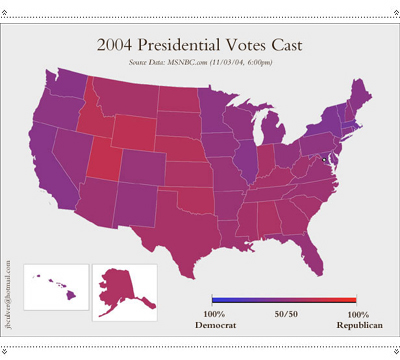
A district-by-district color mix can be found here. Scroll down to an amazing image of population density for comparison.
This java-script map is found at electoral-vote.com The size of each state was determined by their relative number of electoral votes.
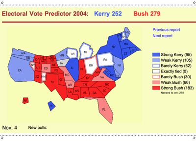
Next, something else making the email rounds.
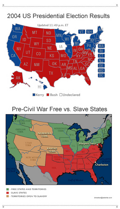
A typography/map hybrid editorial cartoon from John Sherffius of the St. Louis Post-Dispatch:
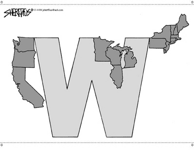
…and another version from Doug MacGregor of the The Ft. Myers News-Press:

Red and Blue in an international context:

Cartoon maps from Drew Sheneman of The Newark Star Ledger…
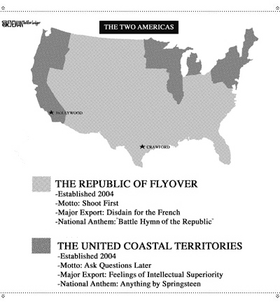
…Terry Mosher (also known as Aislin) of The Montreal Gazette…
.jpg)
…and Bob Englehart of The Hartford Courant:
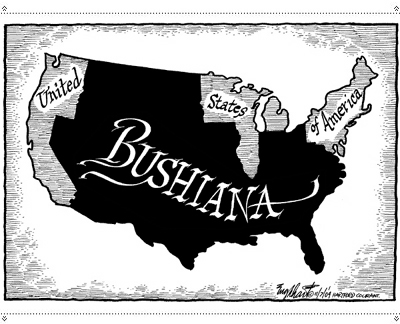
A couple of Gerrymander proposals…

… including one from Muslim Wake Up!:

And our last ‘map’ comes from a recent issue of Le Monde:
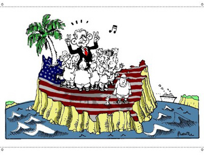
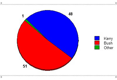
There are other ways of visually describing the extent of the Bush “Mandate”. For example, we’ve seen a classic pie-chart…
…but there are other methods available too. Here’s the top section of a chart by Christopher Evans which compares voting trends against unverifiable average IQ scores…

…and a selective masking of the front page of the Los Angeles Times from Bag News:

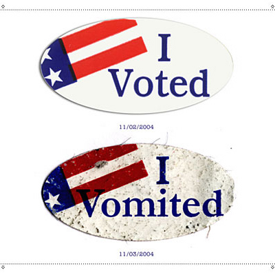
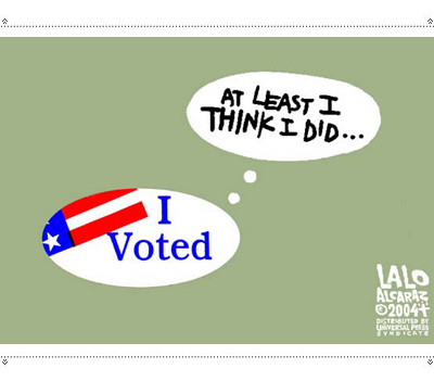
In some districts when one casts a ballot, they are given an “I Voted” sticker; which is ripe for parody. Here’s the sarcastic response of Igor Knezevic…
…and a more ambivalent one from Lalo Alcaraz of the LA Weekly:
Home-done redesigns of Time Magazine have made frequent appearances in our inboxes. One could shrug off this most recent one…

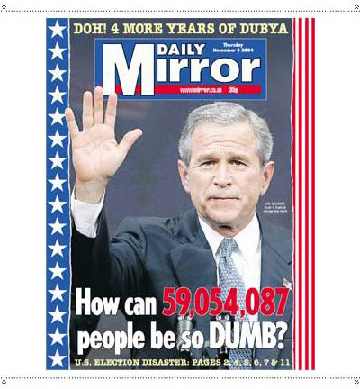
…if it wasn’t for the appearance of this cover from the Daily Mirror in England…
…or this cover of Courrier International, which loosely translates to “(expletive deleted) four years!”

So as we leave this quick survey, if anything we have shown has offended you; please accept our sincere apologies.
![]()
Many thanks to Diane Cohen, Jonathon Rosen, Kristin Hambsch, Beth Tondreau, Ken Thomson, Mary Eiben, Armin, Laura O’Keefe, Robin Silverman, Cheri Dorr, Janice Pedley, Jurgen Miller, Marian Bantjes, Denise Schiffer and Pooja Badlani for forwarding us their email.


Igor Knezevic's is my favorite.
On Nov.07.2004 at 11:03 PM