Speak UpA Former Division of UnderConsideration
The Archives, August 2002 – April 2009
advertise @ underconsideration
---Click here for full archive list or browse below
  
A Different Logoscape

I’ve just returned from a road trip to Saskatchewan—that’s the prairies, land of the small town and almost non-existent village. City verticality disappears as the land stretches out before you; even the towns display a horizontal front with their wide streets and one- and two-story buildings.

With this change in the landscape I also noticed a change in the graphic visual scape. In villages of 20 to 3,000 people the towering presence of corporations familiar to us as city-dwellers all but disappears. Gone are the McDonald’s, Safeway, Home Depot, Nike and Wall-Mart. In their place, the independent restaurant, grocery and hardware store reigns, with the usual jumble of eclectic, quirky signage. The faded, hand-painted sign of Hazel’s Coffee Shop (its letters crazily misaligned where “Hazel’s” is painted over the trace outline of “Bob’s”, begging all sorts of questions about the history of said cafe) competes, competently enough, with the Helvetica all-caps of Shanghai Family Restaurant—Canadian and Chinese Cuisine, across the dirt street.

My favourite sign, perhaps, was painted in large, black sans caps on the front and side of a white clapboard building in a village that appeared to have a population of 10 at the most. It said, “Throne Store,” effectively telling me that this place was called Throne, and here was its store. Short and to the point.

Now I do apologize for not having more pictures. Snapping photos of signage as you zoom by at … ahem … excessive speeds is not easy. Nor is slamming on the brakes, or—if one is not driving—convincing one’s driving partner to stop and turn around. But I did get enough to illustrate some points I think.

The prairie grain elevator, for those who don’t know, was once the ubiquitous landmark of every town. It served as both signage for the town and as billboard for the grain company to which it belonged.

These used to be Pioneer, UGG (United Grain Growers), Pool (Wheat Pool), and Cargill. Unfortunately, most grain collection has become centralized and this signage, along wth the iconic grain elevators themselves are rapidly disappearing.

Even the smallest of towns seem to be investing in some pretty fancy “Welcome” signage, perhaps since the demise of their practical announcement of presence on the grain elevator. There is a common theme: the name of the town, often a slogan or message, some icons that depict the region, and lots of colour.

Of special note is the Co-op. A behemoth on the prairies, but unknown everywhere else, this purveyor of groceries, hardware and gasoline is present in towns and cities of every size across Alberta, Saskatchewan and, I presume, Manitoba. Following is a rare occurrence of their old 2-colour logo. These days it is represented only in red on white or white on red as you can sortof see on the flag.

I began to think about the locals of these small towns, and in particular the farmers, from the perspective of what they see and are familiar with on a day-to-day basis. Corporate logos are not absent here, they are merely different from what I’m used to. As I began looking at the landscape with an eye for graphics, I started to become obsessed.

Metal grain bins marked with the logos of Twister, Butler, Flaman, Steel-Rosco, and Westeel.

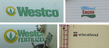
Buildings, bins, tanks and towers sported the logos of what I presume are fertilizers, herbicides, pesticides and other chemicals.
Trains have a much higher presence here.

Vehicles are mostly GM, Ford and Chrysler products (and what a relief it is to see all those trucks driven by people who actually need trucks!). Gone are the Mercedes, BMW, Lexus and VWs that populate Vancouver. Even my Subaru draws a stare—”not from around here,” they know even before checking my out-of-province plates. (Here’s fun: drive into a really small town on the prairies, drive slowly up and down the residential street(s), and then leave. The locals will gawp.)

And then there’s the farm machinery. Case, International Harvester, Massey Ferguson, New Holland, Kubota …
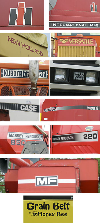
and that country sweetheart of design (god knows why), John Deere.

I went up to the lakes region and started to notice the logos of campers and motor homes, spanning 30 years. Travelaire, Scamper, Prowler, Vanguard, Slumber-Queen, Frontier, Shasta, …
Alas, my desperate photos taken through the bug-smeared windshield did not exactly turn out.

Oh, and we too have an election year, though ours is mercifully over while yours in the US drags on. Most campaign signage is of the mass-produced, predictable variety, but I did see a couple of the following for the man who campaigns with neither a last name nor a political party, which I found to be one of the most highly visible home-made signs I’ve ever seen.

I have provided no critical commentary on this adventure in an alternate logoscape (this is, after all, not a book), but it was interesting to look at my world (graphics) from a different perspective and it’s something I hope to remember to practice again, the next time I enter a landscape not my own.

Maintained through our ADV @ UnderConsideration Program
ENTRY DETAILS
ARCHIVE ID 2007 FILED UNDER Miscellaneous
PUBLISHED ON Jul.08.2004 BY marian bantjes
WITH COMMENTS
Comments
Sam Sherwood’s comment is:

You city folk and yur fancy pants e-lectronic picture machines.

I live in Hartville, Ohio, home to the Menonites (Amish people with cars) and their monstrous structures. The hub of town is the local Giant Eagle — once an IGA — that competes with a small-time grocery chain and civilization dwindles as you travel in any direction.

After a lifetime of living in a small town, you develop a love-hate relationship with the 'design' of your environment. So many signs lend themselves to the Podunk atmosphere, yet it's hard to look at one and not think, "Boy, I could really make something of that place."

Think of it like being surrounded by potential work, with no real means of tapping into the source. Of course, this doesn't mean that I'd like to pave the farmland; however, the llama farms shouldn't be allowed to have the best signage in town. It just isn't right.

On Jul.08.2004 at 02:04 AM
Randy’s comment is:

I'm not certain if these morning feelings are of inspiration or envy.

Either way, thanks Marian. A treat of an essay.

My vote's for Rick.

On Jul.08.2004 at 06:43 AM
Ian McFarlan’s comment is:

I live in a small town (farming community) in Ontario and I find that we have much the same style of signage and logos. However, more and more the corporations are starting to make their presense known.

Which is too bad - communities like this one are dieing.

On Jul.08.2004 at 07:41 AM
Armin’s comment is:

"New York is Big… but this is Biggar"

— Biggar, Saskatchewan

That's awesome! You don't get that kind of slogan from no big city ad agency.

Lovely "report" Marian, thanks.

On Jul.08.2004 at 09:03 AM
amanda’s comment is:

Ahhh, good old Sask. So flat, so many bugs, and sooooo many cracks in the highway.

I agree that the small communities that lack starbucks and walmart are a dying breed. Perhaps I should hop in my car sometime this summer and drive some prairies.

On Jul.08.2004 at 09:12 AM
Tom Dolan’s comment is:

Would be great if Rick's last name is Green or Forrest. :)

On Jul.08.2004 at 09:24 AM
ginny’s comment is:

I just recently took a road trip up to Sleeping Bear Dunes, Michigan. 6 hour drive from Chicago. 1/3 of it was a single lane highway which curved around all of these small lake towns.

What I love about your report, marian, is that it reminded me how much I paid attention to the design surrounding these small towns. How I actually "read" each store sign while driving by and that I couldn't wait to pass it on the way back to take a picture. But isn't it funny, that as designers, we think about design all the time. Road trip? Look at THAT logo, look at that sign, OH the kerning! hahaha! Sometimes you have to laugh.

Thanks for this, it was a good way to start the day!

On Jul.08.2004 at 09:36 AM
Darrel’s comment is:

Brings back memories of summer vacation at the grandparents in southern Manitoba.

Beautiful country up there...but I can only take it in one-week doses.

On Jul.08.2004 at 09:47 AM
marian’s comment is:

"New York is Big… but this is Biggar"

Speaking of taglines or slogans, this is one of my all-time favourites. They've been using this since as long as I can remember. Consistency, consistency, consistency.

Would be great if Rick's last name is Green or Forrest.

Wow, maybe it is! That never occurred to me ... that's some big-city thinkin' there.

On Jul.08.2004 at 09:48 AM
Kevin’s comment is:

Thanks, Marian. I grew up in Saskatchewan but live and work in Toronto. These are things I think about and notice when I go home.

On Jul.08.2004 at 11:17 AM
Schmitty’s comment is:

Sundown in the Paris of the prairies

Wheat kings have all their treasures buried

And all you hear are the rusty breezes

Pushing around the weather vane Jesus

Marian, I love the Agri-Industrial design of farming communities where the tallest building is either the grain elevator or the church steeple.

Please share more of your images!

On Jul.08.2004 at 12:17 PM
Michael Surtees’s comment is:

Marian or anyone else that's driven through Sask., have you ever seen the "Hay" billboard between Saskatoon and North Battleford? If my memory serves me correctly it's essentially a big ball of Hay rolled up with the words "Hay. We got your attention - advertise on this billboard etc"... or something along that line anyways. Nice variety of images btw.

back to my Frankie Goes To Hollywood CD

On Jul.08.2004 at 12:39 PM
marian’s comment is:

Schmitty, I'll see your Tragically Hip and raise you with some Rheostatics:

I thought of the clean light

and the places that we'd hide

in a church

in Saskatchewan

I don't have a lot else worth putting up, but last year I did take and post these landscapes.

Michael, alas I have not ever seen the HAY billboard, and I've driven that highway many times (tho not this time). I did, however, see a "Made You Look" billboard in Edmonton, I think.

... and did anyone notice how I made it through the entire post without using the B-word?

Back to my Neil Young CD

On Jul.08.2004 at 12:49 PM
Tan’s comment is:

Awesome visual narrative marian.

Reminds me of small towns I've driven through in Eastern Texas like Fredericksburg and Guene, as well as rural ones in Minnesota like St.Cloud, Brainerd, and Wabash.

>Even the smallest of towns seem to be investing in some pretty fancy “Welcome” signage

They're a big deal here in the States as well. I love the ones that are adorned with seals from the Rotary Club, the 4-H, etc.

On road trips, I used to take and keep photos of small town population signs too. You know, like "Brainerd, population 830". I love the ones that look like they've been corrected by only 10 or 20 people too.

Gotta do a road trip with the family soon. It's been too long.

On Jul.08.2004 at 12:56 PM
Rob ’s comment is:

Wow, that was such a beautiful piece, every image moving in its own way. Really touched on some memories for me having grown up in the West Virginia.

Before they put in the big interstate, and before I was truly cognizant of the design side of my personality, I would drive from college to home on a two-lane highway through the mountains. Through tiny towns with handmade signs and barns with big type selling everything from cigarettes to the local creamery.

As the road was widened to a super highway, many of those signs, and a piece of history, began to disappear. Supplemented by many of those things us city dwellers take for granted, the McDonald's, the Wal-Marts, Exxon, etc...

Thank you Marian for a wonderful journey that if, for just a moment, brought me back to a simpler place and time.

On Jul.08.2004 at 01:05 PM
Kevin Lo’s comment is:

I know it ain't the same or relevant, by why is there so much good indie music coming out of Winnipeg, Manitoba???

A canadian ex-pat missing the wide open spaces that only existed in my imagination anyways. Thanks Marian.

On Jul.08.2004 at 02:11 PM
Robert L. Peters’s comment is:

Thanks, Marian! Great perspectives from Joni Mitchell country.

You are blessed with an observant nature and an analytical mind (as well as a sharing spirit, of which we are all the beneficiaries). A fresh view (from an 'outsider') is always valuable and helps frame the commonplace in a new light. As McLuhan said, ''Fish did not discover water.''

I was on a road-trip this last weekend as well (climbing in The Needles of South Dakota) and clocked about 2400km en route, driving through towns like Belle Fourche, Spearfish, Deadwood, Hill City and the like. A rich vernacular is still exhibited in much of the signage along the way (early Camp and Boyscout Heavy) though the Walmarts and major brands have certainly invaded the small-town scene in recent years. Overall, I was struck by the overtly solicitous nature of much of the signage (it seems that Selling Stuff is considerably more important than providing information to passers-by). Trumping all other impressions though was the incredible display of American nationalism and the red/white/blue star-striped leitmotif of an over-bedraped Independence Day. (Sobering, and somewhat scary).

The funniest sign I saw on the trip was a hand-lettered board atop a rusted-out oven with its door hanging ajar out in the middle of a barren field - the sign simply read: ''Open Range.''

Keep up the good work, Marian.

On Jul.08.2004 at 02:17 PM
Robert L. Peters’s comment is:

I know it ain't the same or relevant, by why is there so much good indie music coming out of Winnipeg, Manitoba???

Here's one reason...

It's colder here in winter than most humans could ever imagine. In summer (now) there are massive hordes of blood-thirsty mosquitoes. These two factors (and their renown, yes, please help spread this message) keep people away in droves, keep real estate and living costs at a low level that artists can afford (without having to 'sell out' or work day jobs) and protect the Winnipeger's way of life. Sweet?

On Jul.08.2004 at 02:38 PM
marian’s comment is:

I would drive from college to home on a two-lane highway

I have a thing about back roads in the prairies. I insist on taking the smaller, indirect routes from place to place as much as possible. This is easier in Alberta where the roads are much better. Saskatchewan is notorious for the condition of its roads, but you really do see more interesting things this way. (Except for that HAY thing.)

These two factors (and their renown, yes, please help spread this message) keep people away in droves

You tell'em Robert ... despite my alluring travelogue, there are great sacrifices made by all the people of the prairies unrelated to limited fashion options and a lack of fancy cars.

BTW, speaking of information graphics, this one is a complete aside: from the return trip through Jasper National Park in the Rockies. They had these speed limit signs with photos of animals on top (mountain goat, elk, deer, moose & wolf). I have never seen this before but found it interesting because it answered the belligerent question "why should I slow down?" (That's 70 kph, kids, not mph.) The speed limits posted for curves are often pathetically low, causing drivers to scoff at the warning, so perhaps the thought of plowing into a wolf or elk is more of a deterrent. But I have to say, I found the photos extremely distracting. Makes a handsome graphic, though.

On Jul.08.2004 at 03:14 PM
Rick’s comment is:

Marian-

Very nice! Great picures, perfect commentary.

So much design is off the radar; it's cool to have a sideways look.

Sorry to plug myself, but I posted something similar (albeit way less involved!) over here

Regards

On Jul.08.2004 at 05:45 PM
DesignMaven’s comment is:

Marian:

Breath-taking Photos, You know I'm GOO GOO GHAA

GHAA, over this kind of stuff.

Grain Towers and Water Towers over the country side are my favorites. I'm a sucker for hand lettering. I believe it is a lost artform. Not practiced much anymore.

Hand lettering on the side of buildings definitely reminiscent of old cowbow movies.

Kinda makes you wonder of the artist or craftsman

that left his/her indelible mark on society.

As well, their background and training.

Westco, Engro, Wheatland, all great Identities.

I won't expound on Raymond Loewy's International Harvester, Henry Dreyfus, John Deere nor Case.

Couldn't you have snuck in Canadian National Railway, Allan Fleming ???

Canada is Great and Interesting. Maybe you can expound on the Wheat Symbol.

I'll assume in agriculture. Wheat is the gross national product. Correct me if I'm wrong.

It's been forty (40) years since I've had a Geography Class.

Incredible Editorial!!!!!

On Jul.08.2004 at 05:51 PM
marian’s comment is:

Couldn't you have snuck in Canadian National Railway, Allan Fleming ???

Y'know I really wanted to, and it wasn't as though they weren't around, it was just that zooming-by-in-a-car thing. CN is certainly one of the all-time great logos.

Alas, my reason for being in Sask. wasn't for graphic research, and it was only half-way through my trip that I started thinking about doing this post, so the theme is not as coherent or comprehensive as i would have liked. However, a study of the wheat symbol would be interesting, among other things. I hope to return one day with the express purpose of capturing a lot more--especially the hand-painted signs, before they're all gone.

At the risk of baiting you -- Lowey did International Harvester? Did he do that IH (which I really like)?

It was interesting to me how much nicer the older versions of all the farm machinery logos were. The new ones look oddly like lawnmower graphics.

On Jul.08.2004 at 06:12 PM
amanda’s comment is:

Agreed on the indie music from Winnipeg = good thing.

Victoria, or i suppose the island in general, is also a haven for wonderful artists (music and other). I suppose the inspiring atmosphere has something to do with it.

The Weakerthans are soooo super. I am looking forward to seeing them live at Calgary Folk Fest in a few weeks. Sarah Harmer is also another Winnipeg fave.

On Jul.08.2004 at 06:55 PM
DesignMaven’s comment is:

Marian:

Promiss not a Sunday Sermon. The International

Harvester Identity you are showing is actually the redesign by de Martin-Marona & Associates. (1973)

Their redesign is based on Loewy's Original.

The original International Harvester is identical

without the outline. It is the same except the "i" is super-imposed without the outline.

Meaning there's no gap between the letters IH.

The dot over the "i" on Loewy's original has a wider gap.

Quick Question:

Do Designer(s) and/or Consultancies such as WAWA Design, Rolf Harder,Axion Design, Burton Kramer and Gottschalk & Ash continue to be leaders and maintain prominence in Branding and Identity in Canada ???

Like the U.S. is their a new Generation of Designer(s) and Consultancies doing Pioneering work. ???

Stuart Ash, Rolf Harder and Allan Fleming my favorites being among the Greats like Bass, Rand and Glaser.

On Jul.08.2004 at 07:44 PM
marian’s comment is:

Hoo boy. You're really putting me on the spot, Maven. Fortunately I think I've been fairly straightforward in the past in confessing the gaping holes in my knowledge ... but I'm still embarrassed to admit that I don't know.

Shocking, yes!

I've actually never thought of "branding" and "Canada" in the same sentence before {{blush!}}. On the West Coast where I am there's a whole lotta design, but not much to speak of in that big, branding way. There is KARO, I suppose ...

There's a branch of Gottschalk & Ash in Calgary (and of course back East in Toronto and Montreal), and well, who knows what goes on in Toronto that I don't know about. There's Mr. Mau, of course, but despite Roots (don't get me started) I wouldn't classify his as a branding firm.

So you've caught me out on 3 weaknesses: I am up on neither branding, nor history, nor Toronto (which is where it all happens). Yes, I should be ashamed of myself--especially as some American, like yourself, might come along and educate me in public.

or perhaps ...Tan?

On Jul.08.2004 at 08:26 PM
Skip Lineberg’s comment is:

I enjoyed this post very, very much. Like you, I am a signage afficianado. Your photos reminded me of my childhood days and weekend trips through rural, southeastern Pennsylvania to our weekend cottage in the mountains. I own a marketing firm, and my graphic artists have taught me a good bit about typography and the elements of good design. Again, thanks for sharing ... and keep up the great blogging!

On Jul.08.2004 at 09:01 PM
Michael Surtees’s comment is:

I'll throw a couple new CDN names out for the sake of argument.

Concrete Design Communications

EPOXY Design, Communications, Interactif, Motion

Herrainco Skipp Herrainco

IRIDIUM

karacters design group

Lime Design

Nolin

o r a n g e t a n g o

paprika

TAXI

back to my Leonard Cohen CD

On Jul.08.2004 at 09:26 PM
marian’s comment is:

Oh yes, I'm familiar with almost all of those firms, I'm just not sure I'd call any of them branding firms of the type I thought Maven was referring to.

Back to my Sam Roberts CD

On Jul.08.2004 at 09:42 PM
Tan’s comment is:

>some American, like yourself, might come along and educate me in public...or perhaps ...Tan?

Sorry marian, like you, when I think of Canada, I'm more aware of smaller, more boutique design shops like Concrete and karacters, whose work I've always admired.

Since we're talking farm equipment, thought I'd bring up this great Canadian ad agency — Adfarm. It's an ad agency originally out of Calgary that specializes in agricultural clients — big ones like ADM and Caterpillar and the likes. I've seen some of their work and have been very impressed.

Anyway, go back to the sex thread marian. Your postings there are better than reading Penthouse Forums. Go.

On Jul.08.2004 at 11:46 PM
marian’s comment is:

Heh, heh, Tan, you've discovered my secret writing talent.

Speaking of farm machinery and Penthouse Forum ...

On Jul.09.2004 at 12:00 AM
Brad Brooks’s comment is:

Oh please no. Now I have images of tractors and half-naked cheerleaders running round my head. And it's only a quarter to eleven in the morning...

On Jul.09.2004 at 04:43 AM
DesignMaven’s comment is:

Marian and Michael Surtees:

Just chiming in. Thanks, to both. I'm familiar

with four or five of the firms Michael.

Marian lay off Brucey. (laughs)

He'll soon be a TITAN.

Seriously, I know how it is when your doing your own thing. Not much time to know what everybody else is doing.

One of the things about me. I've never actually quite grown up. Meaning, I'm still a FAN. I love getting the annuals

and I love seeing what everybody else is doing.

Especially Europe and the Far East.

I'm surprise more U.S. Branding and Identity Consultancies haven't opened shop in Canada.

Like TAN. I enjoy the boutique firms as well.

I think much of the Designery stuff is created at this level.

No shame in not knowing. That just means your

busy with the AIGA and Creating. Which is the way it should be.

More pictures in the Future. And don't forget Allan Fleming's Canadian National. One of the Great Identities of the Twentieth Century.

Hey Marian, if anybody ever has the nerve to

Revitalize Canadian National Please let us know.

Stuart Ash is one the Greats in Identity Design.

Rolf Harder as well.

Good to know Gottschalk & Ash is continuing to carry the torch. Even if it's in name only.

I hear a lot about Nolin these days.

On Jul.09.2004 at 07:43 PM
marian’s comment is:

Revitalize Canadian National Please let us know.

Yep ... I'll post a photo of me picketing in protest.

On Jul.10.2004 at 12:35 AM
Justin Young’s comment is:

It's great to see chatter about design in Canada! FYI, Gottschalk+Ash International is indeed alive and well and continuing to do significant branding projects under the leadership of Stuart Ash. We're currently working on the design and wayfinding program for the new Vancouver Convention Centre, wayfinding for Canary Wharf in London, UK, brand identity for Iovate Health Sciences (markets the MuscleTech line of products) as well as many other North American and European branding projects. Check out some of our projects at www.GplusA.com

Justin Young, Director of Client Services

On Aug.10.2004 at 10:03 AM
cweese’s comment is:

Ooh, please let me in on this one! You feel like you're stuck way out in the boonies and all of a sudden there we are on Speak Up in livng color - thank god for internet is all I can say.

If you'd gone four or five blocks into Landis (all the way to the other end of town - it's the next town NW on the highway after Biggar), there is the most lovley hand-painted signage on the old hotel in town. I have pics, I will post them when I get home tonight.

Another great sign is Payton, SK, but I don't have a pic of that one yet.

On May.11.2006 at 12:29 PM
cweese’s comment is:

Off track but maybe an interesting anecdote... I once picked up a hitchhiker at Biggar (which I am not in the habit of doing) because I figured he was either someone I knew or really, really lost... most people travelling through take the more direct highway from S'toon to North Battleford.

Anyways, I rolled down the window and was greeted by this rolling Aussie (or rather, New Zealand) accent. He was a young guy travelling through to Provost, where his mother had done a work swap on a farm over 20 years ago, and he was going back to visit the family. And I have a standing invite for a place to crash if I'm ever in New Zealand :)

On May.11.2006 at 12:45 PM
cweese’s comment is:

So, I lost a bit of enthusiasm when I realized this post was two years old... somehow it ended up on the 'Recent Comments' sidebar. But anyways, here are the photos, for anyone who happens to be following.

On May.19.2006 at 01:42 AM