Speak UpA Former Division of UnderConsideration
The Archives, August 2002 – April 2009
advertise @ underconsideration
---Click here for full archive list or browse below
  
Unilever: 25 Times Friendlier

“Unilever is one of the world’s leading suppliers of fast moving consumer goods in foods, household and personal care products.” Last Wednesday, Unilever launched a new brand identity.

The current logo has been reliable and distinguished — and we don’t want to lose those characteristics — but not as open and friendly as it could be, not enough to enable us to put it onto the packs of everything we make. That requires it to speak of Vitality, so it will change.”

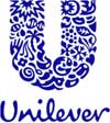
The new logo tells the story of Unilever and vitality. It brings together 25 different icons representing Unilever and its brands, the idea of vitality and the benefits we bring to consumers and the world we operate in.”

My first thoughts on this identity designed by Wolff Olins, are very positive. The previous “U” which is still on the Unilever’s website is awkward and industrial. The new “U” which is made up of 25 different icons has a fresh energy and a wonderful texture. The fact that these icons are microscopic, doesn’t bother me. It kind of has a Chuck Close thing going on. At minimum, when small, it is still a very nice “U”. Once you get closer to it, however, or once it gets much larger, there is a lot to discover. I would love to see it painted on a wall at headquarters. It would be beautiful. The type is also a departure from the old thin serifs. The new script is playful and human and successful.

I can’t help but compare this to a few other identities. The first is the old Pharmacia & Upjohn logo which incorporated a hand, bird and star on a purple stone. The trouble with that mark was that there were so few elements that you were forced to wonder what they stood for and why there were only three and what were they doing on a purple rock. The new Unilever “U” has enough symbols that are integrated with each other, that no single symbol calls too much attention to itself. It is more of a mosaic. Which brings me to the Altria symbol. Like Unilever, Altria is also representative of the various brands and products that fall under its umbrella. Altria uses colored squares and Unilever is using icons. One of the goals of the icons was to appear friendlier and it succeeds in this way. Altria could probably use a little more “friendly”.

Good job, Unilever.

Maintained through our ADV @ UnderConsideration Program
ENTRY DETAILS
ARCHIVE ID 1953 FILED UNDER Branding and Identity
PUBLISHED ON May.17.2004 BY David Weinberger
WITH COMMENTS
Comments
JonSel’s comment is:

I'm with you on this, David. I only wish they had a larger version of it on the site that I could look at more closely. My first reaction was a bit skeptical, as it is one damn complex mark. But if they managed to show it successfully at that small size on the web, then print shouldn't be an issue. The most important aspect is that it makes you like twice (and possibly a third, fourth and fifth time) and that is one of the hardest goals to achieve in a logo for a corporation of this size and breadth. In one fell swoop, they went from looking like a massive industrial company, cranking out product after product in a dimly lit factory to a smaller, more lean organization loaded with personality and vigor. And that script logotype is a very brave move for them. Nicely done.

On May.17.2004 at 09:22 AM
Armin’s comment is:

The redesign came at a hefty price too: �7m. (UK Pounds are at 1.7 to 1 US Dollar — that's expensive).

I'm trying to dig up a bigger logo too. Initial reaction: much, much better. That scripty type does make the company seem more human, warm and friendly.

On May.17.2004 at 09:52 AM
Joseph Szala’s comment is:

I agree the old logo was very much in need of a change. It was very industrial and cold. The new logo is warm and "friendly" but it is very complex. The movement to a script typeface I think was brilliant and that in its self gives a warmer feel. I always try to follow the rule "Maximum meaning, minimum means". When designing a logo, one should not try to say everything all at once, which is the purpose advertising and marketing. The logo should be meet the preliminary goals of warmth and friendliness. In this case the goals are met, but then they are diluted by adding too many caveats. This logo says so much, it could be put on a billboard with a catchy tagline and be a great ad campaign in itself.

All in all, I think it is better than average. Goals were met, but new problems are relevant.

On May.17.2004 at 09:57 AM
Alan C’s comment is:

What a wonderful surprise! I too think its a success, and a tremendous improvement over their previous mark.

On May.17.2004 at 10:12 AM
Jon Parker’s comment is:

I like the script, but I'm not crazy about the detailed "U".

I'd like to see how it holds up on a fax. Or embroidered on a corporate golf shirt.

Perhaps it's the marketing team's agenda the designers wont' be able to use the logo "too small", because it just won't hold up? Very crafty...

On May.17.2004 at 10:19 AM
Jon Parker’s comment is:

I also wonder how it looks as a "fav icon" in a URL address bar.

On May.17.2004 at 10:21 AM
Peter Scherrer (ps)’s comment is:

hmm, i like what they are trying to do. and i think they are succeeding to some extent. however, i personally get a very dated impression from the new identity. i might not get the strength of the company in the mark as well, something i thought would be important for them. does the script seem a little too quarky, or would a more streamlined script ala Speak Up serve them better?i'll need to see how the mark is used to build my full opinion on this one, right now its a "yes, but"...

On May.17.2004 at 10:22 AM
Peter Scherrer (ps)’s comment is:

by the way: i think you did an excellent job with this post david. thanks!

On May.17.2004 at 10:24 AM
JonSel’s comment is:

From the Unilever press release: Consumers are demanding more and more from the companies behind the brands, increasingly bringing their views as citizens into their buying decisions.

Beyond looks, a company this large needs serious motivation to change a decent, longstanding logo. This is a great example of using identity correctly as part a master strategic plan with clear goals.

Relating back to PS's "Evil Empire" thread, I wonder why this one finds favor here? Is it just the looks of it? Is it the smart strategy? What is it?

On May.17.2004 at 10:30 AM
marian’s comment is:

Well not meaning to be all jump-on-the-bandwaggony, but I love that mark! But to those who know me, that would be no surprise.

It's funny though, have I told y'all about the conversation I had with some designer friends about a month ago to the reaction they got to a simple, clean logo they did: it was like, "Is that it?" Implied: is that all we get for our money? As though more money should equal more stuff in the logo.

Seven million pounds??? Are you sure? If so, that would go to the above sentiment that the more you pay the more stuff you should get in your identity. In which case ... corporations everywhere, I am so set to give you some very complicated logos.

I have to say I'm not kooky about the script though. It seems to lack craft. I understand the reasoning behind it, but something a little more refined seems in order.

Anyway, it's great to see something different in the logo arena. I think it will serve them well.

On May.17.2004 at 10:40 AM
Steve Mock’s comment is:

Brilliant? Brave?

I don't know.

Looks like easy money to me.

But I only looked once.

On May.17.2004 at 11:20 AM
len’s comment is:

i would be very interested to see other comps or prelim sketches for this project, if this was the most effective execution of the strategy... not crazy about it at all. but it sure is better than what they were working with before...

and, on a slightly related note - what's with all these "evil empires" and new logos? unilever, ups, that fedex kinkos frankenstein job... pretty soon the vatican will conduct some focus groups and roll out it's "warmer, friedly, more presonable" cross, due to all the negative feelings the old one held in consumer's minds...?

On May.17.2004 at 11:51 AM
Peter Scherrer (ps)’s comment is:

pretty soon the vatican will conduct some focus groups and roll out it's "warmer, friedly, more presonable" cross

i think they are too busy declaring new saints.

On May.17.2004 at 11:54 AM
kev’s comment is:

I'm with Jon Parker.

The U is bad. Way too detailed for a logo, and even if it weren't, it'd still be ugly.

The script is okay. I'm not a fan of most hand-lettering, but this isn't bad, even if it reads as "Unilevev".

On May.17.2004 at 12:15 PM
Darrel’s comment is:

$12 million dollars!?

On May.17.2004 at 12:22 PM
Darrel’s comment is:

Oh. Wait. That probably included implementation, eh?

On May.17.2004 at 12:23 PM
Stephen Coles’s comment is:

I'm with David. It's hot. There are very few ways to make fine detail work in a logo. They made it work without ignoring any of the rules for a good trademark.

On May.17.2004 at 01:13 PM
Feluxe Socksmell’s comment is:

It kind of has a Chuck Close thing going on.

Urgh. Hardly. More like post Pushpin Sibley Peteet Richards Group whimsical masterbation.

I like the redo, the mark in general, but the indiviual elements, taken separately are vague and poorly depicted. You have to admit the bird is terribly rendered.

But lets look at the bright side: its better than it was before and its not in a blue square.

On May.17.2004 at 01:16 PM
Feluxe Socksmell’s comment is:

They made it work without ignoring any of the rules for a good trademark.

Rule of readability.

Lets call our babies somewhat unreadable at that size.

On May.17.2004 at 01:19 PM
Brady’s comment is:

My first reaction was that it looked like a mark for a children's book publisher.

A horizontal lockup would be much more interesting.

But, I like it. Even though it's presentation on the web site is quite clunky - ironically right out of the gate probably violates usage guidelines - I think I will like it more when I see it in various formats.

Overwhelmingly appealing or not, applause should go to Unilever for bucking the trend of international conglomerate sterility and bringing a real, human quality to their identity.

While Altria tried, other oligopoly brethren like P&G, ConAgra and pharma/healthcare companies (the ones who should have a human quality) like GlaxoSmithKline, Merck and others could learn from Unilever's example. Not that they should all go out and do scripty, hand-drawn identities - but they could learn something from it.

Now, design aside, an interesting question would be is the softer-side of Unilever genuine or will it play similarly - not exactly - to Philip-Morris/Altria reaction. It's always difficult for a behemoth of the industrial complex to convince us of such a soft makeover.

Interesting to note that the new script - while it is much more hand drawn - has a similar bounce and rhythm to Johnson & Johnson.

- -

> The redesign came at a hefty price too: �7m. (UK Pounds are at 1.7 to 1 US Dollar — that's expensive).

$12M US is a lot. Yet, it is only 0.17 percent of Unilever's nearly $7 Billion US (with a capital B) global advertising budget.

- -

> I'd like to see how it holds up on a fax.

Fax? What is this 'fax' you speak of?

Web, email, Acrobat... and we still are concerned about how a mark looks on a fax.

Whenever I think of a fax, all I can think about is the line from Almost Famous:

"A mojo. It's a very modern machine that transmits pages over the telephone. It only takes 18 minutes a page!"

On May.17.2004 at 01:22 PM
Tan’s comment is:

>12 million dollars!?

The focus group study/research (international) for the mark probably accounted for 2/3rds of that cost. Really. Every icon in the U must've gone through individual focus groups, not to mention the hundreds upon hundreds of alternative designs. Mind-boggling when you think of it.

I like it. But my first impression was that it's too retail. Don't know if it's strong as it needs to be. And yes, it is busy, but there's a simplicity still retained. Very nice script type too.

Brady — I'm all fine for more humanity, but only if it's genuine and suits a purpose. Nothing wrong with sterility if that's what's appropriate.

But thumbs up overall.

On May.17.2004 at 01:46 PM
Michael Surtees’s comment is:

I want to like the logo, but can't. The idea to include a lot of elements that perhaps can be separated is nice, yet the execution seems smudgy. To me it feels like it was finished with a blue bic pen. It also seems crowded - perhaps if a third of the elements were taken out, my eyes would have something more solid to rest on.

On May.17.2004 at 03:01 PM
Patrick C’s comment is:

I almost can't think of what to say. I don't know if I like it. The script font works IMO. Great choice there. But I don't know about that U. It breaks a lot of rules and I don't know that it gains enough in breaking them to be successful.

I don't think that U is what comes to mind when I think of Unilever. It just doesn't seem appropriate, style-wise, for a company of this size. Maybe I'll grow to like it.

On May.17.2004 at 03:53 PM
Todd W.’s comment is:

"That emper'r ain't got no clothes on."

Maybe that's a cheap shot in the midst of this lovefest, but my initial reaction was - ugh! Aside from about 3 of the micro-icons, the rest of the logo components are completely illegible. What I gather is supposed to be the sun in the upper left actually looks like a comic book explosion. "Wham! We're Unilever!"

I do like the script logotype, though.

On May.17.2004 at 03:54 PM
marian’s comment is:

No really, the more I look at it, the more I like it. It's quirky, pretty and kindof funny. For such a huge corporation, this is a major statement. And from a distance, or if you squint, it's a really strong "U" and surprisingly compact. I can easily imagine using this as a sponsor logo on some Arts material (one of my logo tests). And best of all, it's one colour and flat. So I have some issues with the execution of the script, and some people have issues with the execution of the elements, but ultimately I think it's unique and strong.

On May.17.2004 at 04:48 PM
Ezekiel’s comment is:

Agree about freshness of this ID. But I was wondering if viewed from far away it might looked like a dirty U. Is that appropiate? No if we think of Unilever "cleaning strength". Those mini-icons are not very clear to me. Beatiful but...a bit graysh to my unconscious.

On May.17.2004 at 05:50 PM
Armin’s comment is:

Here is a slightly bigger version of the logo. (I have e-mailed a media contact person to see if we can get a bigger file).

I'm having a really hard time making any further judgements because I can't see the details (and we all know who's in the details). This just points to the fact that the logo shouldn't be reproduced small, but we all know that.

The main issue I have with it, and as many have mentioned, is that it doesn't exactly feel like it belongs to Unilever. But this is not exactly bad… it's good bad. It's a nice change of pace. It looks much more like a non-profit organization, so they succeeded in making it more friendly and humanistic.

Without paying much attention to the actual icons — and by squinting — it also feels like it could be a logo for any island in Hawaii that starts with a U.

The "n" is a bit weak… but I like how they pulled-off the shape of the U, it is well executed.

Running this logo through focus groups, executives and any other committe-loving people must have been absolute hell.

On May.17.2004 at 06:20 PM
Ezekiel’s comment is:

I like the humanistic tone of the logo, too. Will it possible to have an identity that will speak truly to the consumers. If this is the case, we'll have to see in 2010 how Unilever manages ecological concerns. In their webpage they say is a strategy aimed to that year. I hope logos may bring a little bit of peace to our highly stressed corporate world

On May.17.2004 at 06:25 PM
Paul K’s comment is:

The "r" needs to be redrawn -- it does look too close to a "v", as kev implied -- and the first thing (honestly) I thought of seeing all these organic shapes mashed together was the movie Alien.

It's a novel approach, but it's creepy.

On May.17.2004 at 07:39 PM
kevinhopp’s comment is:

I agree that getting a logo that costs over 10 million dollars through the committees would be nightmarish.

However it is surviving your pseudo committee here at SU. Good thing it doesn't have a beating heart, I think it would feel a little awkward being drug into this American Idolish thing going down here.

Did it ever occur to possibly get the designer's thoughts? WOW! What an idea. Maybe then we can understand what's happening here with the script, the icons, the U. Wouldn't it be nice to understand the troubles and rewards they had working with the client in getting this piece together?

This - pin your opinion on the logo - approach, doesn't take us anywhere constructive or realistic.

Although the logo is getting more positive review than negative, this is still a Speak Down mentality. Without knowing the WHY behind the HOW, we are really spinning our wheels, aren't we Armin?

I'm sorry if I have to cross a few of the threads together here. When you post opinions without consideration of facts you look like you're out for personal gain, when you clearly contradict yourself, (see: WHY and HOW) your intentions will be questioned.

I mean one has to think....

These Titles Do Not Satisfy Your Personal Delusions.

-r:borg

On May.17.2004 at 07:44 PM
kevinhopp’s comment is:

I actually disagree with the "v and r problem"

On the grounds that there is a V preceding the R, establishing the form of the letter V. Isolating the two letters you will find that they are of the same nest (go figure) but move left to right in two different routes...

On May.17.2004 at 08:04 PM
Tan’s comment is:

>This - pin your opinion on the logo - approach, doesn't take us anywhere constructive or realistic...When you post opinions without consideration of facts you look like you're out for personal gain, when you clearly contradict yourself, (see: WHY and HOW) your intentions will be questioned.

Realistic? What do you mean by that — as opposed to fake opinions?

I've seen this criticism before about these types of SU crit. While I agree that it'd be great to have some additional background and case study info on its creation, really, in the end when a logo is launched, it's fair game for consumption, opinions, and critiques from anyone and everyone.

Course, there's more value in informed than uninformed opinions. But considering that this is a design blog, you can argue that no opinion is totally uninformed. You may disagree with that statement, in which case — don't participate, avert your eyes, change the channel, whatever.

And for the record, the thread is Weinberger's, not Armin's. Good thread.

Ease up a bit man.

On May.17.2004 at 08:25 PM
kevinhopp’s comment is:

Realistic? What do you mean by that — as opposed to fake opinions?

Practical insight. Basing an opinion on more than your intuition. An educated statement.

it's fair game for consumption, opinions, and critiques from anyone and everyone.

Do you know what projection means?

You may disagree with that statement, in which case — don't participate, avert your eyes, change the channel, whatever.

Dude, c'mon now, you're joking right?

And for the record, Armin comments are addressed in the beginning, he is obviously interested in this thread....

On May.17.2004 at 08:55 PM
JonSel’s comment is:

So Kevin, put up or shut up. You seem to be quite angry with this site. Fine. But bring something more than anger. That's the joy of the open blog format. Nobody's opinions are any better than any others. You get to add your part. So, get the info from the designers at Wolff Olins and help us out.

On May.17.2004 at 10:20 PM
Bob Corporaal’s comment is:

I like the logo and it seems they also wish to emphasise their roots. Unilever is a Dutch company and the logo and the lettering is very similar to the traditional Dutch Delft blue porcelain.

I wonder what the reasoning is behind this for such an international company...

On May.18.2004 at 01:41 AM
jose’s comment is:

i echo armin's sentiments. it reminds me too much of "aloha" and white sand beaches. but this logo is indeed more friendlier than the last one.

On May.18.2004 at 07:59 AM
Todd W.’s comment is:

Practical insight. Basing an opinion on more than your intuition. An educated statement.

Aside from myself, I doubt there are many commenting here who rely solely on their intuition when commenting about a design. I gather some of you folks have actually had a formal education in design, which I assume would provide some basis for opinion beyond simply pulling something out of the air.

Besides, if the logo requires that its designer explain it and the thought behind it, it's not particularly effective, is it? Of course, the thought process would be interesting to hear, but not strictly necessary to discussion.

On May.18.2004 at 08:31 AM
David Weinberger’s comment is:

"I gather some of you folks have actually had a formal education in design"

Most unintentionally funny comment ever.

"Besides, if the logo requires that its designer explain it and the thought behind it, it's not particularly effective, is it?"

If the designer needs to explain what a logo is, literally, it is not effective. Like if I said, "Can't you tell that the logo is a Balloon that represents innovation and freedom. How could you think it was a leaf?"

However, you absolutely can not completely judge an identity without knowing about the company. Often times, on Speak Up, we judge a design solely on its design integrity and craft. In that case, no explanation or knowledge of the company is needed and that is fine. We are designers and design integrity and craft are part of our expertise and passion. To determine if an identity is successful overall, you do need to understand what the company does and what their objectives are. For instance, if a company is changing their business focus and introduces a new logo that looks completely different from what they had, someone may say, "I don't like it because it makes them look like a completely different company." Well, mission accomplished but the reaction is negative because the objectives weren't understood.

On May.18.2004 at 09:19 AM
Darrel’s comment is:

Web, email, Acrobat... and we still are concerned about how a mark looks on a fax.

Lofi vs. hifi. And the world still used fax machines. Don't konw why, but they do.

As for the mark being illegible, well, it's just a 'U'. At small sizes, it's a textured 'U'. I think it reads just fine.

On May.18.2004 at 09:37 AM
Feluxe Socksmell’s comment is:

how a mark looks on a fax.

youd be suprused how much official company business takes takes its course via fax. sure msnbc's butterfly is primarily an rgb (and moderately successsful) mark, but you cant exclude simple b/w communication.

eh, screw it. lets print it all in 4Cs.

On May.18.2004 at 12:08 PM
Brady’s comment is:

Interesting, a lot of people commented on the $12million price tag but not the $7billion ad budget.

Put it in perspective. Say you have a client that spends $100million on advertising. Think it would be a grat opportunity to do their new brand ID? Your comparative budget on a new ID for that company would be a grand total of $170.

Twelve-large does not sound so bad now does it?

- -

> youd be suprused how much official company business takes takes its course via fax. sure msnbc's butterfly is primarily an rgb (and moderately successsful) mark, but you cant exclude simple b/w communication.

Not denying that at all. It was more of a comment on that it is amazing that we still need to be concerned with it.

Of course, I don't exclude b/w communication because that is where all of my marks begin.

If it does not look good in b/w how can it look good in color?

I've never seen it before, but I bet there is a brilliant 1c / black version of MSN's butterfly.

I also think my point was also more about the fact that:

NO MARK LOOKS GOOD ON A FAX.

In Unilever's case, off the top of my head, I would probably focus on the logotype as the main image on a fax. For one, as an opportunity to give it more play and also to keep the ID as clean as possible.

- -

> This - pin your opinion on the logo - approach, doesn't take us anywhere constructive or realistic...

I agree and disagree with this.

Pinning our opinions on the mark in question is constructive because a lot of what is being said is about our reaction to the esthetics of the design. While our attention to this may be more accute than the gen-pop it is similar to that type of reaction.

Just because we are designers, are we not entitled to react as regular Joe would.

Then I find that we are not just tossing opinions out without being informed. Some of the opinions, are based on what is presented in the press release. Unilever explained the why in the release. We take that information and the attached visual and run them through the meat grainder to see if they mix.

As Educated Designers (hopefully if your are contributing to this site you are in constant education) - the next step would be to hear from Wolff Olins to get the full circle,

The is the beauty and the problem with being in the inner circle of the design profession - we are privy to the workings of these things that the gen-pop take for granted or in most cases don't care about. That's the problem, design is such a closed profession that it is no wonder the public are - after a century - still lost as to the what, why and how we do things.

On May.18.2004 at 02:53 PM
laura’s comment is:

I think the U is brilliant. But the type underneath screams the 90's to me. I'm just not a fan of hand lettered type. It's too wedding invitationish for a corporate logo. But I haven't seen anything done like that U, good or not, it's original and grabbed my attention.

On May.18.2004 at 05:47 PM
Feluxe Socksmell’s comment is:

NO MARK LOOKS GOOD ON A FAX. said the idiot.

C'mon man. Great marks look BETTER on a fax.

On May.18.2004 at 09:00 PM
Feluxe Socksmell’s comment is:

Brady:

Sorry for the idiot remark. Dont mean to turn things ugly. But, just visited your site- one ironic contention: you say "Who we are is as important as what we do" after being greeted with "A logo is not a brand" and a depiction of Times Square New York (as opposed to Charlotte) I suppose where has nothing to do with whom? .

Eh. I think I'm just tired of people to piling onto the ole run downBrandwagon. Woops. New word. Brandwagon. Say it. Brandwagon. Now march on soldiers.

On May.18.2004 at 09:15 PM
Feluxe Socksmell’s comment is:

of Note:

My family lives in Charlotte. Yes, they're all nuts there. My mother especially. She works for Billy Graham. (No shit)

On May.18.2004 at 09:35 PM
Brady’s comment is:

Mr. Smokesmell,

It must be my Southern Sweetness, but I was on my way up to Manhattan to kick your ass.

Then I saw your apology.

Aww man! I can't be angry at you!

> Sorry for the idiot remark.

What I meant was within, rather than right on the forehead, of the comment. Maybe I should have typed the long-winded version:

NO MARK - INCLUDING ONES THAT LOOK LIKE THEY ARE FAXED - WILL EVER LOOK EXACTLY LIKE ITSELF ON A FAX. THEREFORE ALL WE CAN DO AS DESIGNERS IS MAKE THE BEST ATTEMPT AT PRESENTING THE MARK OR THE LOGOTYPE APPROPRIATELY FOR THE MEDIUM - IN THIS CASE, A FAX.

Which is why I suggested that the Unilever fax format could possibly focus solely on the logotype at an appropriate scale to fit the format and the technology.

> one ironic contention: you say "Who we are is as important as what we do" after being greeted with "A logo is not a brand" and a depiction of Times Square New York (as opposed to Charlotte) I suppose where has nothing to do with whom? .

Not sure this has a place on this discussion, but I'll bite.

The "who we are..." statement introduces the background of CBG and its partners which give you, the public and potential clients the crux about why CBG exists and who is behind it all. The bios of the partners explains very openly who we are where we came from, where we are now and where we want to go.

The section that follows is introduced by the converse of the previous statement in "What we do is driven by who you are." This relates back to how we gave our readers insight into not only what CBG is, but who CBG is. This is improtant because that is how we work. We want our clients to tell us not only what their company is, but who they are as well.

We have found that the best way for clients to be "original" - not status quo - is to reveal who they are. Because business, no matter how big or small is won or lost on relationships. Because brands are revealed - not built.

As for Times Square v. Charlotte - as I explained above, where has something to do with whom. But, where are you gonna find an over abundance of logos? Here or there? Which best illustrates the idea of "A logo is not a brand?" A sea of logos plastered everywhere in the heart of the city that never sleeps? Or a half dozen of tall buildings that make up the city of banks?

> I think I'm just tired of people to piling onto the ole run down Brandwagon.

Not sure exactly what you mean but a willventure a guess that you are tired of the rash of graphic designers/firms claiming to do "branding".

Well so am I.

That is why we position ourselves as not being a "branding firm" which is better sounding than "This is not your father's branding firm." (Zing, Oldsmobile!)

My career has been based in branding since '96 when I was introduced to a form of it. Over the last 8 years I have spent my time finding what makes me tick when it comes to brands. I'm not happy with the current behemoth brand shop model nor am I ever going to be happy just "doin' low-goes and web paygez" - to coin a phrase - just because someone's brother told them they needed one.

So this is where we are.

And I'll be damned if we are going to perpetuate the intereference of personal taste and mediocrity in this city.

On May.18.2004 at 11:30 PM
Andrew Breitenberg’s comment is:

It is a miracle that it made it through the boardroom (they must've started this one in 1988, which would explain its look). We all seem to agree that it looks nothing like a logo for a jillion dollar corporation. So why does it work? It DOES look like a non-profit arts logo for a shop with 7 employees. How could this possibly be a “step in the right direction” for Unilever? It conveys playful and light-spirited behavior. It conveys friendly warmth. What on earth does this have to do with Hellmann's or Surf? Or more to the point, with the company under which these brands operate? This logo is for people in the business of buying and selling businesses. It is not for the consumer. The consumer sees Dove soap and they should very well get friendly and warm through that brand. But Unilever? It should be a mark that shows foundational stability, longevity and integrity.

Here the new logo fails.

On May.19.2004 at 08:16 AM
JonSel’s comment is:

foundational stability, longevity and integrity

Aren't these givens with a big, multinational corporation nowadays? (Well, maybe not the integrity part.) To build a successful, strong identity, an organization must find what is unique about themselves — and something their customers will connect with — that sets them apart from their corporate peers. For a newer venture, stability and strength are more important attributes to sell, simply because they don't have a history to fall back on. But Unilever certainly does, and that enables them to reach deeper into their well to find something more interesting to say to their consumers.

On May.19.2004 at 09:55 AM
Armin’s comment is:

Not sure if this sould be common sense, but who designed the original Unilever logo?

On May.22.2004 at 10:42 AM
debbie millman’s comment is:

The Unilever logo was designed in 1969 by Collis Clemens and modified in 1990 by Ken James. The blue is (was) Pantone 293.

On May.22.2004 at 11:00 AM
Armin’s comment is:

Thank you!

On May.22.2004 at 11:48 AM
miles newlyn’s comment is:

I designed the Unilever U, contracted by Wolff Olins, but I didn't design the script.

I'm not sure where to start on this, so if you've any questions, I'll try to answer them.

On May.24.2004 at 04:48 AM
David Weinberger’s comment is:

Welcome Miles and great work. Here are a few questions to start.

1. When you were engaged in the project, was the idea of a "U" with 25 icons the objective or did you come up with the idea?

2. Did you create each icon individually and them fit them together or was it always a mosaic?

3. Are you happy with the script and do you feel it compliments the "U"?

4. Can you show us any sketches from your process?

5. Is there anything that Speak Up has been completely wrong about in relation to the process or outcome of this design?

On May.24.2004 at 07:36 AM
miles newlyn’s comment is:

1. the idea of a U composed of elements was a simplification of a much more complicated illustration.

2. It was always a mosaic. the U changed shape only slightly.

3. The issue with the script was that is sat comfortably beneath the U, that meant the 'l' needed to be fairly centered in the word, hence the unusually wide 'n'.

4. Unfortunately not, I think that confidentiality agreements prevent this.

5. Whilst it did take quite some time to draw, particularly in terms of getting everthing to fit, the actual process was very smooth with the client, there was no comitee. the major hurdle was the agreement of meaning for the 'icons' in so many different countries/cultures.

The 'why' is Vitality.

I'd say that there was nothing wrong with looking 90's, 80's, 00's or any other period for that matter, so long as the work has the ability to trancend that period, and that means it must touch something deeper within the psyche.

On May.24.2004 at 09:34 AM
Armin’s comment is:

Miles, thanks for the insight.

My first question, well, it's not so much a question but a request, is if we could see a larger version of the U? Could you post a jpg of it? (Or you can send it to me and I'll upload it here). I'm really curious to see it up close and get a sense of the detail.

Was it hard deciding on the 25 icons? Many of the seem very abstract, was this a concern, that people could read weird meanings into some of them?

On May.24.2004 at 09:56 AM
miles newlyn’s comment is:

I'd love to post a larger version, but I don't have the authority, that lies with Unilever.

There's a description of the icons and what they mean (in Dutch) at

http://www.marketing-online.nl/nieuws/moduleitem32238.html

People will read different meanings in to the icons, that was not a problem, people make their own stories and I like that. A concern was that some of them might have been unrecognizable if too abstracted. Some concepts such as freshness aren't easily symbolized, so there was an openess to meaning from the start.

On May.24.2004 at 11:57 AM
mazzei’s comment is:

I bet it will be beautiful animated. It is very detailed but anyone who knows anything about production can find techniques where it would print well all around. What do the icons within the illustrated “U” stand for? I know there was a explanation of what the company “does”...how does this logo relate to that?

On May.24.2004 at 12:11 PM
Sam’s comment is:

Not for nothing, but here's the same idea done earlier and nicer.

On May.28.2004 at 09:32 AM
Frank Lin’s comment is:

My initial average joe gut reaction when viewing it was: "eh, very decorative...tropical, cheesy.."

Upon reading this article and the comments involved, I do think it was quite ingenius to involve 25 different icons into the "U" shape. The sum is definately greater than its parts...

But I felt the scripted typeface makes the identity seem overdone because the logo mark already conveys friendly and humanistic in such a big way that the typeface supplements not complements it -- which I believe is over the top. Perhaps it was already tried before; it is my initial hunch that having a slightly more rigid typeface would convey that Unilever is a solid and "serious" company that ALSO has a big heart(from the "U" mark)...Also I am curious, what if the 25 icons were rendered in a different style - instead of something soft/organic maybe something opposite of it...GEE I guess I am dreamin' out loud again...please excuse me.

On May.28.2004 at 01:45 PM
Hollis’s comment is:

Reminds me of a day at the beach. The "original" type feels like the illegitimate handmade offspring of Mistral and Brush Script. For a very small piece of 12 million, Doyald Young could have made this right. I applaud the bold shift away from the corporate towers. Surf's up.

On Jun.03.2004 at 03:28 PM
Kasturi’s comment is:

I vote for the new logo because, it reflects the plurality. Use colors that shall bring out a essence of unilever multi-product portfolio and image as a eco-friendly, caring MNC.

On Jun.08.2004 at 01:13 AM
Bert Vanderveen’s comment is:

A quick and dirty translation of the info Miles pointed to, explaining the 25 symbols:

The logo consists out of 25 logo's, symbolising the various brand of Unilever and it;s mission statement 'Unilver contributes vitality to life'. The discriptions of the icons are::

Sun: our most important natural source of energy. Start of life, ultimate symbol of vitality. The sun stands for Port Sunlight, origin of Lever Brothers - as Rotterdam was the origin of Margarine Unie - and several other U. brand. Flora, Slim•Fast and Omo all use sun rays to point out their strenghts.

DNA: the double helix, the genetic blueprint of all life and a symbol for the bio sciences; the key to a healthy life. The sun being the largest building stone of life, DNA is the smallest.

Bee: for creation, pollination, hard work and biodiversity: bees symbolise both challenges and chances in the field of environment.

Hand: symbol of sensitivity, care and need; stands for both skin and touch.

Flower: represents scent; in combination with the hand the flower stands for moisturising care products and creams.

Hair: symbol of beauty and looking good; combined with with the flower it stands for purity and scent and together with the hand for softness.

Palmtree: een cherished commodity. Apart from palmoil it supplies lots of fruits, like coconuts, bananas and dates. Also symbol for paradise.

Sauces and spreads: stands for mixing or stirring; also refers to the addition of taste.

Spoon: symbol of food, tasting and cooking.

Bowl: full of deliciously smelling food. Can also represent a ready-made meal, warm beverage or soup.

Condiments: represents adding taste and fresh ingredients.

Fish: stands for food, see and fresh water.

Glitter: clean, healthy and full of energy.

Bird: symbol of freedom; stands for relexation after the daily work and getting more from life.

Recycling: part of our efforts in the field of durability.

Lips: stands for beauty, looking good, and taste.

Ice: A gift of nice food, fun and enjoyment

Tea: a plant or the extract of a plant, like tea; also a symbol of growth and of agriculture.

Particles: refers to science, bubbles of air and the sound of those.

Deep freeze: the little plant symbolises freshness, the snowflake stands for deepfreezing

Surf: symbolises cleanliness, freshness and energy, for body care as well as for laundry (in combination with the shirt)

Droplets: refers to clean water and purity.

Little cup: stands for packaging - a cup of cream coupled with personal care.

Clothing: stands for fresh laundry and looking good.

Heart: symbol of love, care and health.

+++

Apologies in advance for bad spelling, et cetera ; )

On Jun.11.2004 at 09:27 AM
Jothan Cashero’s comment is:

I'm seriously surprised at home many people have reacted positively to this logo. I've been working with it off and on for the past month (on an internal project for UBF) and I think it's a horrible solution for Unilever. Considering the majority of their mark's reproductions end up as 1/8th by 1/8th squares on their packaging, the general mass audience will never see anything but the solid, scrunched "U" composite; which, by itself, is horribly generic and completely lifeless.

Whether or not the rendering of the 25 separate icons bothers you (and personally, I think it's a look that will become instantly dated), the bottom line is this: this is an incredibly impractical icon for a company that needs a very moldable and expandable mark for a wide variety of audiences.

On Jun.15.2004 at 02:44 PM
Ricardo Matos’s comment is:

Metro de Lisboa Diagram

Please, can you remeber me if W.Ollins did these too?

Same kind of illustration for the line symbols...

(bad i don’t have bigger version)

i think they hired the same illustrator....

On Jun.22.2004 at 07:12 AM
miles newlyn’s comment is:

Yes, Wolff Olins did these.

It was a different designer though.

On Jun.30.2004 at 06:02 AM
Mark’s comment is:

Is it me or the old Unilever logo had its design centered around the Twin Towers?

The new one?

Completely 1960s.

On Sep.06.2005 at 08:00 PM