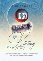
 As stated in the book’s back cover, this book is easy-to-read, fun-to-browse and — quite definitely — picture heavy. Leslie Cabarga’s Logo, Font & Lettering Bible is a, sometimes chaotic, 200-plus page ode to practicality and technicality delivered in a package bearing more resemblance to New York’s Times Square than — as self-described — a bible. Sarcasm aside, this book is indeed one of a kind in its painstaking effort to detail digital techniques for creating sharp-looking logos and lettering in an entertaining and easy-to-follow manner — think of it as a software manual on steroids. The author’s sense of humor only adds to the book’s appeal, as when describing a Pricker: “A device for stimulating certain sensitive parts of the anatomy during bizarre sexual rites involving satin cords and clothespins. May also have been used to effect a transfer of a pencil or charcoal sketch to the final media for inking” (p. 66).
Questionable though, are comments like: “I believe that if one thousand halfway decent designers each presented logos to Exxon, Sony and Nike and each of those companies picked one logo out of their respective hats and used them, there would be no measurable effect upon these companies’ year-end financial statements.” (p. 37). But this book’s purpose is not to engage in discourse regarding design’s effect on business. And while providing helpful advice on “creative copying” and how to become informed from sources like old Yellow Pages or lettering books, Cabarga states that “Other good sources are graphic design magazines (especially the annual compendiums of the year’s best)…” (p. 38) Harmless and incidental but, for critique’s sake, must be mentioned if we care to shed the notorious “appropriation” that goes on in design.
The book’s strength ultimately lies in Cabarga’s ability to explain verbally and visually how to create popular and very varied styles of lettering. Incredible Type Trix is the most rewarding section of the book providing meticulous, step-by-step examples for creating shadows, highlights, facets, dimension, perspective and other lettering techniques usually hard to achieve on one’s own. He tries to do this equally for font-creation but it seems like this third chapter (Fonts — The Art of Making Faces) should have been left out for a book deserving its own attention. (Which incidentally is one of Cabarga’s upcoming projects — a manual for FontLab, a digital typeface editor).
Parallel to the tips, trips and techniques are a few basic nuggets of history and information that help ground many of the author’s examples and provide a quick slap of education for those designers whose cup of tea is not history. Equally brief, but highly more entertaining, is the last chapter (Business Section) where Cabarga shares his hard-earned wisdom regarding finding business, pricing, working on spec and clients. At times the book seems like a tool for beginning- to intermediate-level designers (in both theory and technique) yet manages to be insightful, entertaining and technically relevant to warrant a place in any designer’s library. If nothing else, it might help with “creative copying” as the book itself is full of fanciful lettering from numerous sources and by various contributors that make this book definitely fun-to-browse.
Logo, Font & Lettering Bible by Leslie Cabarga
Hardcover: 240 pages
Publisher: How Design Books (March 2004)
ISBN: 1581804369


You know, I've been reading this book off and on for a month now and I must say it was worth the purchase. I wish it wasn't so garishly designed though. At points it actually gets in the way of the comprehension of the material. But all in all, props to the man for writing a book that gets to the details of what we do.
On May.15.2004 at 11:50 AM