Speak UpA Former Division of UnderConsideration
The Archives, August 2002 – April 2009
advertise @ underconsideration
---Click here for full archive list or browse below
  
Monday Variety

Seems like a slow day. Here is some interesting design and branding news.

Not KinkEx “At a Dallas event this morning, FedEx Corp. unveiled the new brand identity for recently acquired Kinko’s retail locations: FedEx Kinko’s Office and Print Center.” Here is the new logo and a storefront design.

New Iraqi flag: “Iraq’s U.S.-picked leaders approved a new flag for the country, making a dramatic change that dumps the Saddam Hussein-era colors and slogan “God is great” and introduces symbols of the Tigris and Euphrates rivers, a spokesman said Monday.” Here is the old one.

New $50 bills unveiled:“The Bureau of Engraving and Printing Monday unveiled a redesigned version of the $50 bill, the latest in a series of currency redesigns intended to thwart counterfeiters.”

Coca-Cola C2:“New York-Coca-Cola officially announced it will enter the mid-calorie cola arena this summer with a new product called C2.” Here is the new can

Maintained through our ADV @ UnderConsideration Program
ENTRY DETAILS
ARCHIVE ID 1921 FILED UNDER Miscellaneous
PUBLISHED ON Apr.26.2004 BY David Weinberger
WITH COMMENTS
Comments
.sara’s comment is:

I like the FedEx Kinko's logo, even the asterisk dingus (wonder how long it'll be until they release a squishy version). The little arrows, nor the solid purple triangle they form, are the same arrow(head) as that within "FedEx," but I think they echo it well. And, y'know, they reinforce FedEx's colours. I also like the non-serifed face for "Kinko's" (the name of the "Express/Ground/Home Delivery" face escapes me at the moment).

Funny, you should mention the newly-approved Iraqi flag; I was just looking at it this morning and I don't care for it. It's much brighter and fresher (duh) than the previous flag, but it feels so bottom heavy, like it's going to flip over at any moment. I do like the symbols included (cresent for Islam, the blue for the rivers, the yellow band for the Kurdish minority), but.. eh. Of course: it's not my flag, nor have I ever tried to design a flag. So.

Does the "C2" remind anyone else of the logo for "T2"? Or is it just me (and the fact that I'm now saddled with The Terminator as my governor)?

On Apr.26.2004 at 01:55 PM
Mike’s comment is:

The FedEx Kinko's logo initialy reminded me of the E-Trade logo. Then again, maybe it's just me.

On Apr.26.2004 at 01:57 PM
Steven’s comment is:

Could the new Kinkos logo be anymore of a hodge-podge, clunky, additive mess? I like the abstract logo, although it really does reminds me of e-Trade. Ugh! The whole thing looks like it was hacked out in a weekend of "committee design."

I was checking out the design of the new US $10 the other day, and I kind of like the direction of these. Most other countries have really great looking monetary notes and ours always looked so... stodgy and plain. So I think the new direction is a step in the right direction. I'm really intrigued by the irridescent gold ink. What is that stuff? Is it regular ink? It has a texture like thermography.

And the new Coke can is yet another example of a hack, additive design. Whatever. It's just more crap sitting on grocery store shelves that I'll ignore.

On Apr.26.2004 at 02:06 PM
Steven’s comment is:

Oh, and the Iraqi flag... It's alright I guess. The whole subject gets me frustrated and sad. I wonder if the flag design will last beyond the time of the provisional government.

On Apr.26.2004 at 02:10 PM
debbie millman’s comment is:

>Could the new Kinkos logo be anymore of a hodge-podge, clunky, additive mess?

No, I don't think so. It is truly horrendous. Right up there with the Verizon logo. Does anyone know who did it?

On Apr.26.2004 at 02:18 PM
Patrick C’s comment is:

The FedEx/Kinkos logo really blows IMO. It is a bloody mess. The icon is ok, but the combination of everything isn't working. Besides, are people supposed to say: "run over to FedEx Kinkos and get this copied?" What a weird thing to have to spit out. Mind you, I'm not holding the design firm resposible in this case because I suspect they didn't have much room to move.

American money is boring. Always has been, and based on these examples, always will be. I haven't been overwhemled by Canada's redesigning process over the last few years, but it looks a lot better than this.

Coca-Cola C2 = ASS. A complete "add-on." But then, I'm kind of tired of CC's whole look (not that I drink the stuff).

On Apr.26.2004 at 03:30 PM
jonsel’s comment is:

Kinko's

I think Landor in San Francisco is responsible for this one. Too many visuals are really cluttering this thing. I love the symbol, although it definitely struck me as an E-Trade derivative. The name is dreadful. At least UPS had the good sense to call the rebranded Mailboxes stores "The UPS Store." I gather some high-end Kinko's managers are being integrated into the combined company and needed to be placated. Hopefully in about 3 years they'll lop the "Kinko's" name off.

Coke

Interesting that they are going somewhat against the trend for "light"-style products by using black and darker colors. My first reaction without knowing the product is that it is a stronger, more caffeinated version, not a lighter, carb-friendly drink.

On Apr.26.2004 at 03:35 PM
len’s comment is:

FedEx Kinko's

anyone else ever use the word "FedEx" as a verb? like, "honey, ill be on my way home soon. i have to go fedex out some discs." funny, then, how this company couldn't figure out which brand had all the equity in this transaction. (one is synonamous with "overnight delivery," the other synonamous with "hack printing.")

as for the logo... the contrast between the black weight of the FedEx and the light weight of the Kinko's isn't working for me.

C2

jonsel, i agree. where's the helvetica neue ultra light extended? where's pms 283c? it looks more like it would be a jolt cola-type drink.

On Apr.26.2004 at 03:49 PM
Tan’s comment is:

Yup, Landor SF did the new Kinko's mark.

While I don't love it, I don't think the mark is atrocious. I like the asterisk, though the type solution is weak. And that's not because I bleed Landor red either. Hey, at least there's not a 3-D drop shadow, glow, or arc (not intended as a cheap shot, David :-))

I admit that the problem to me is the nomeclature and brand hierarchy. Two disparate brands that make sense together, but yet, still need to retain some separation. It is a little messy. And it's not the same situation as UPS and Mailbox Etc. -- their core services were more obviously tied. Plus, Mailbox Etc. wasn't a strong brand to begin with, so nothing was really lost by killing it. Not the case with Kinko's.

I think you're correct Jon. I wouldn't be surprised if there was a migration strategy to lose "Kinko's" altogether down the road. I'm actually surprised they didn't roll out with it from the get-go. But that's just my speculation here.

On Apr.26.2004 at 04:04 PM
James Craig’s comment is:

> it looks more like it would be a jolt cola-type drink.

You're right. The dark black-to-red fade is very reminiscent of Jolt. I wonder if C2 will be a new recipe or just a half-and-half blend. ;)

On Apr.26.2004 at 04:06 PM
David Weinberger’s comment is:

as for the logo... the contrast between the black weight of the FedEx and the light weight of the Kinko's isn't working for me.

You're right. The unfortunate thing here is that they still look like two separate entities which is exactly the opposite of their goal. It looks like when you walk in, there will be separate Fedex and Kinkos counters. Usually when two brands merge and both names are kept, they are treated the same typographically.

The symbol is unfortunate. First, it's one of those designs that can probably fit any project and creative brief that comes along. Most importantly though, is that the FedEx logo does not need a symbol. When Kinkos finally goes away, are you left with the FedEx and the symbol? I hope not.

On Apr.26.2004 at 04:08 PM
Greg’s comment is:

I was saddened by the loss of KinkEx. It's unfortunate that they decided to just add the names together. I can't wait until FedEx buys Starbucks and rebrands all three together (or the other way around.) Kinko StarEx to the rescue!!

The flag I thought was alright. I read that they were going to make the "moon" at the top the same color as the "rivers." That'd be ok by me. I was surprised there weren't stars and more stripes, honestly.

The American currency is definitely getting more interesting. Not necessarily better, but more interesting. I didn't like the back, thought the green was a little too fluorescent. Could have just been the picture though. I like the inclusion of the national colors into the national currency. Seems like a long time coming.

I was surprised too by the C2 can. Thought it would be heavier, not lighter.

On Apr.26.2004 at 04:44 PM
Tan’s comment is:

>The unfortunate thing here is that they still look like two separate entities which is exactly the opposite of their goal.

You can't assume this is true. This identity clearly alludes to a partnership of services, not an absorption. The closest relationship I can think of is Blockbuster and Paramount. Both are owned by Viacom -- with Blockbuster basically serving up Paramount products as one retail channel. Both strong brands, with a clear product symbiotic relationship.

Remember, Fedex shipping is a peripheral service of Kinko's. "Business" is the umbrella service category of both.

But I do agree that it would've been cleaner to merge from the start.

>it's one of those designs that can probably fit any project and creative brief that comes along

like an arc to represent global, right?

On Apr.26.2004 at 05:03 PM
David Weinberger’s comment is:

nice bait tan,

UPS has used a shield for a long time, well before Rand's version. You wanna pick on one aspect of it, OK. A new shield clearly fit them.

Again, the new FedexKinkos symbol seems like one of those that you see at every crit for every project. It doesn't add meaning, differentiate, reflect heritage, clarify the name, etc. All of the things that a logo should do.

You can't assume this is true. This identity clearly alludes to a partnership of services, not an absorption. The closest relationship I can think of is Blockbuster and Paramount. Both are owned by Viacom -- with Blockbuster basically serving up Paramount products as one retail channel. Both strong brands, with a clear product symbiotic relationship.

The Kinko's website clearly states, "New name, New logo, New beginning." I don't have to assume, Tan, I just have to read. It's actually nothing like Blockbuster and Paramount which are clearly separate brands.

On Apr.26.2004 at 05:20 PM
Feluxe Socksmell’s comment is:

I wish I could show you the exploratories for Fedex but should I, I'd need you for bail.

Did I say I worked on it? No I "di'int"!

Personally I like the asterix, dislike the type.

On Apr.26.2004 at 05:22 PM
Steven’s comment is:

Honestly, other than showing off their new acquisition, I see absolutely no added value in this new Kinko's ID/"brand." And, I'm sure that it will have a very chilling affect with the company loyalty to all of the former Kinko's employees. To them I'm sure it's a very clear indication of their overall devaluation.

IMHO, it a rebranding that didn't need to happen. As boring as the old Kinko's brand was, at least it was direct. This new mutation/mutilation does nothing for me.

On Apr.26.2004 at 05:24 PM
Valerie’s comment is:

Jonsell (and others) - I totally agree about the C2. My first glance of the can reminded me that I need to make a dentist appointment. It looks a lot like Rock Star energy drink, although they got their diet version right by using a white can with light type. Even the name sounds like it would be a more extreme (or even Xtreme) version of the original. While Coke Light sounds pretty lame, even 80s, there's gotta be something other than C2. Overall, it's deceiving.

The Fedex/Kinkos logo kind of threw me off. The asterik reminds me of the late 90s dotcom craze. Maybe it's the etrade similarities, or that the colors that remind me of MSN. In any case, I'm not a huge fan.

On Apr.26.2004 at 05:33 PM
Brian Warren’s comment is:

C2 - totally reminds me of Terminator 2

I dont mind the fedex/kinkos thing as much as I thought I would. I like the spikey dingus, but I dont really understand the placement. I'd like it integrated more into the design of the logo. It's cool though, it looks nice as an element of the signage. Just doesn't integrate as well as I think it could.

50s, well, we're moving in the right direction. Our money in the US is so bland compared to others. So much white space on the back - such huge margins, is there a reason they're so huge? Everything is so tightly packed, it's hard to see why the uneven huge margins are necessary.

On Apr.26.2004 at 06:00 PM
Rick’s comment is:

I'd like to echo and refine something I read here re: Fed Ex and Kinko's.

FedEx started referring to themselves that way only after it had fallen into common parlance. Nobody said, "I'll Federal Express it to you". They responded to what people had already adopted and claimed it as their own. That was smart. (And thank you, Simon Williams).

So one would think that FedEx, recognizing that nobody is going to say, "I'll stop by FedExKinkos Office and Print Center Yadda Yadda Hey Now to make some copies", would have done what they've done before and kept it short and useable. I don't get it.

The asterix thing is totally inoffensive. It's completely safe. And while I suppose many here dislike it because it's not really solving anything, I think it adds that post-crash newer-new-economy iTunes soft-edged approachable aesthetic that modern people resond to. No it doesn't DO anything, but I think maybe that's the point. It's got the orange, it's got the friendly trendy green, it's got no right angles.

Now, I think we all agree that the arrow in the negative space of the E and x kicks ass. Why oh WHY didn't anyone look at the way that purple triangle points? Is it supposed to be pointing at "Kinko's"? And why would it? I'm confused.

Regarding the American money: I believe there's a conspiracy afoot to make our cash look so ridiculous that we don't wake it seriously at all. I mean, as it is with direct-deposit and debit cards I never really SEE my money anyhow - it's an idea, not really moolah. So now, the more it looks like it was designed by a seven-year-old, the less I'm going to ever care about cash, ever CARRY cash... and then they'll just track me with my cards (and the RFID tag I'm sure they've embedded in my brain).

Thank you.

On Apr.26.2004 at 06:04 PM
Rick’s comment is:

TAKE it seriously, damnit! TAKE, not WAKE.

On Apr.26.2004 at 06:05 PM
Tan’s comment is:

>I wish I could show you the exploratories for Fedex but should I, I'd need you for bail...Did I say I worked on it? No I "di'int"!

This smells like bullshit Felix. Only one way to find out, which I'll do.

I do agree w/ you about the asterisk/type assessment.

>I don't have to assume, Tan, I just have to read

My point was that the company name/logo suggests support of two branded services under the same roof. Nothing in the copy suggest "the opposite goal" as you've assumed and stated.

But I still suspect this is a migratory/transitional strategy.

On Apr.26.2004 at 06:15 PM
JonSel’s comment is:

I see the FedExKinko's symbol functioning well in advertising and at retail. It's infinitely more flexible than "FedExKinko's" from a visual branding perspective and it can be used possibly to break some of the preconceptions people have of Kinko's and FedEx as separate entities. In that light, I see its value. It could also very well serve as a bridge identity. If the FedExKinko's name is temporary, then at some point, the symbol will remain when the new, future name takes over. At that point, the FedEx and Kinko's associations will be accepted and the name can speak to the broader your-office-away-from-home message.

recognizing that nobody is going to say, "I'll stop by FedExKinkos Office and Print Center

This is what is so mindboggling, because FedEx has gone through this experience before. Very shortly, people are either going to refer to the stores as "FedEx" or "Kinko's", but never "FedEx Kinko's". I don't think this clears up the new makeup of the stores. Are they still Kinko's as we know it but now with FedEx shipping capabilities? Are they a FedEx drop-off with some copy machines? It seems like an endorsement deal might have worked best, retaining the Kinko's masterbrand with an added FedEx endorsement. A new brand should aid the consumer, not confuse.

On Apr.26.2004 at 09:12 PM
Niall’s comment is:

A more appropriate Iraqi flag?

On Apr.26.2004 at 11:53 PM
Sam Sherwood’s comment is:

The asterisk is strong with this one, joining the ranks of such hits as etrade and travelocity. I think this particular mark's saving grace is the inheritance of a bold color scheme... and since Kinkos never did the whole 'professional printing' gig in the first place, the myriad colors shouldn't be a problem at all!

Soon, we'll all be making trips to Fedinko's - Print It, Ship It, Get the Hell Out™.

The combination of names strikes me more like gloating. With FedEx in bold and Kinko's very light, there's no question who owns whom. I think I'll throw the whole project into my "I just don't get it" box and leave it at that. It makes for a nifty sign.

On Apr.27.2004 at 01:22 AM
DesignMaven’s comment is:

Three competing elements. Two different type styles and a symbol. Could be worse.

I would have dotted the eye with the asterisk.

All in all Successful.

1. Addresses Propriety

2. Memorability

3. Livability

4. Usability

Every Brand Revitilazation will not sweep you off your feet.

I'm constantly reminded the most ridiculed Identity in History was Lucent Technologies created by Landor.

Fourteen years later. Perhaps the most copied and Bastardized Identity in History.

On Apr.27.2004 at 08:59 AM
Valon’s comment is:

You know, first off when I read today's subjects I thought to myself...damn it, there's nothing that I care about that I want to spend time on writing something....then after reading the furious comments..well, I changed my mind (:

I don't have a problem at all with coke trying to reinvent themselves with a new drink, even if the drink itself symbolizes T2 or has extra caffeine. I even don't have a problem with FedEx trying to widen their capabilities and go even further than UPS, Airborne, or any other shipping company - Even if it takes FedEx to make a mess out of their nice negative arrow by adding an * on top of their heads. $50 looks great!!

--- What I really find interesting is branding of the countries. I suppose starting with Iraq now we will see other countries trying to reinvent, merge, and rebrand themselves. I wouldn't be surprised if I saw a new flag for Afghanistan with a tag line on the bottom.

Afghanistan - Vini, Vidi, Vici�.

I know I am being sarcastic - but, c'mon a new flag !? Flag's cannot be designed by a designer - they are only designed by history and thus the designer is the history itself, not a person, an agency, a studio, a commitee, or whoever else thought of the new design in less amount of time than it took to put the last one down.

// However, I am looking forward to drinking a nice C2, while spending $50 at the variety of new services that FedEx Kinko's Printing and Shipping Center has to offer.

On Apr.27.2004 at 09:19 AM
Feluxe Socksmell’s comment is:

I'm constantly reminded the most ridiculed Identity in History was Lucent Technologies created by Landor.

Ridiculed by who? I like that identity. It remains original, corporate, ballsy and still works.

Fourteen years later. Perhaps the most copied and Bastardized Identity in History.

Wow. Bastardized? How about Verizon? the lucent mark a beautifully executed idea as far as I can tell and sets a standard in corporate identity. If by bastardized you mean copied, I dont think Cialis counts...

On Apr.27.2004 at 10:33 AM
amanda’s comment is:

sorry pals - US money is lame.

Ours is better.

Kids playing hockey on money was the best idea ever.

On Apr.27.2004 at 11:07 AM
graham’s comment is:

. . . Lucent Technologies created by Landor.

Fourteen years later. Perhaps the most copied and Bastardized Identity in History.

you mean the brush stroke circle? really nice logo (i do like it) . . . it's an enso . . . you know . . . centuries of culture . . . form is emptiness, emptiness is form . . . if you go to japan they've got quite a few of them . . . copied and bastardized?

On Apr.27.2004 at 11:20 AM
Patrick C’s comment is:

I too have always liked the Lucent logo. Very nice work. I don't see how it's been bastardized.

On Apr.27.2004 at 12:31 PM
Sam’s comment is:

What's in the C2 can--blood?

On Apr.27.2004 at 12:49 PM
jonsel’s comment is:

blood?

Low-carb blood. For the vampire trying to lose that spare tire.

On Apr.27.2004 at 01:24 PM
Kitty’s comment is:

The first thing that FedEx Kinko's logo reminded me of was the multicolored Microsoft butterfly. Something about the colors looks just like it.

On Apr.27.2004 at 02:23 PM
Kevin Lo’s comment is:

US/Iraqi Flag

Just so its clear, and I'm surprised no one has brought this up yet, but the old flag existed long before sadam, for over 40 years in fact. The colours and 3 stars represent pan-Arab nationalism, all Sadam did was add "God is Great" to the flag in 1991.

Beyond the fact that the "new" flag is just plain ugly, how the Hell does an unelected, provisional governing council (appointed and maintained by the US military) have the right to impose a new flag when the state is still in such utter chaos? Why should there even be a new flag, are the people living there no longer Iraqis? If John Kerry wins(please...) causing "regime change" in the US, will there be a new US flag(I know its a ridiculous example, but c'mon). You'd think they would have higher priorities right now....

The whole mess is just sad, sad, sad....

On Apr.27.2004 at 07:38 PM
Brady’s comment is:

Amazingly, I really am dumbfounded by all of the exhibits in the Monday Variety and don't have much to say.

On Apr.27.2004 at 11:18 PM
Brady’s comment is:

Wait...

FedExKinko's Office and Print Center

Did they demark the purple arrow in the dingus specifically for the people who did (do) not see the arrow in the Ex?

This is depressing.

C2

Isn't Coca-Cola -- CC -- which would be C2?

Did you know that Coca-Cola -- the company -- internally refers to Coca-Cola -- the beverage -- as 'K'. This is for brevity and elivates confusion in communications.

So...

Why not call it K2 and have some wacky co-brand with the sports company and ... oh, who am I kidding?

Coca-Cola is a great company. But, sometimes you do scratch your head and long for beverage brands more like the ones they market in Japan. There's some fun stuff going on over there.

It will be interesting to see if this goes the way of -- shhh! -- new coke.

On Apr.27.2004 at 11:48 PM
Armin’s comment is:

Late to the discussion. The FedEx Kinko's is, regrettably, a joke. I really like the execution of the asterisk itself, the transparency and overlapping is well solved and nicely executed. It does have that certain neutrality where the asterisk could be attributed to a number of brands across many industries, making it very unspecific (not good). It looks really nice as a sign and it will serve greatly to locate a Fedinko's when you need one. The colors are great too.

However, when all is put together it compeletly falls apart and is a mishmash of styles that don't exactly work together. Landor pulled this one off quickly (based on when the original press announcement came out) though. Not that it should serve as justification or anything.

On Apr.28.2004 at 11:50 AM
DesignMaven’s comment is:

To Felix, Graham and Patrick

I'll deal with my good friend Felix first.

Initially when Lucent Technologies invited Respected Identity Consultancies to compete for the project.

Landor was invited. Along with Anspach Grossman Portugal and Siegel & Gale.

As the story was told. Neither, Anspach Grossman

Portugal, or Siegel and Gale would have created an Abstract Identity for Lucent. Based on their market research i.e. Qualitative Analysis, Quantitative Analysis, and Focus Group Research Testing.

Referencing Eugene Grossman and Alan Siegel as reported in EYE Magazine and other Design periodicals of the era. circa 1991 0r 1993

Lucent Technologies purportedly is the first total abstact Identity in the United States.

For a Multi National Corporation.

Total abstract identities were not the norm in the United States. Within the early and middle nineties.

Lucent Technologies was the first. It was highly ridiculed because it was different and broke all the rules.

Before Landor, Chermayeff & Geismar created abstract Identities for The White House Conference On Children 1970. (brush stroke abstract)

The National Park Service and United States Department of Interior. (hard edge abstract)

As well, Rudolph De Harak's Identity for the Department of Transportation. (hard edge abstract)

John Massey's Identity for the Department of Labor. (hard edge abstract)

These Identities are not noted because they're

Government Agencies.

Although, SAUL BASS created total abstract identities for MINOMI. A sports manufacturer in Japan.(torn paper abstract)

SAUL BASS also created (hard edge) Abstract Identities for KOSE; Japanese Cosmetic Manufacturer. JOMO. (Japan Energy Company)

http://www.j-energy.co.jp/

CrossReference:www.underconsideration.com/mt-static/mt-comments.cgi?entry_id=1780

FROM THE BIBLE OF TAN LE.

The Secret Power of the Blue Square.

Jan.22.2004 at 05:30 PM

Quoting, Tan Le.

I've heard that it's actually a dragon or pheonix or something like that -- circling around its tail.

I like the Lucent logo too. Of course, it's been copied to death by every company that starts with "O".

Tan was referencing smaller lesser known companies.

Graham and Patrick

I didn't say I did not like the Lucent Identity.

It's one of my Favs.

Just stating the facts as written. Lucent was highly ridiculed. In the beginning. I suspect it has grown on everybody.

Case Closed

Any Aguements!!!!!!!

Armin This is the problem with me not being able to POSTphotos

and Designs to substantiate my research.

Always some STUD POKER PLAYER like Felix trying to Bluff my Call.

TAN

How's your ONE POCKET GAME???

First thing we do at the First Annual Speak Up Conference.

Straight Pool

Nine Ball

One Pocket

We'll get Felix to Rack em

up!!!!!!!!!!

Felix Verizon, Not my favorite in the beginning. It has sort of Grown on me.

Krispy Creme Donuts really erk me.

As well the Identity for FCC. Federal Communication Commission. There are others.

On Apr.29.2004 at 03:07 PM
graham’s comment is:

maven, me old mucker: have a proper little read of my post again. you'll see there's nothing about your liking or otherwise, just wondering about the copied and bastardised part . . . wondering how a logo that in the first place is a very familiar part of one culture (the enso is almost to japan what the cross is to western culture . . . almost), i.e. copied and bastardized in the first instance, could then in itself become copied and bastardised . . . a bastardisation of a bastardisation perhaps? but then . . . the object of the enso is to try and create the perfect flawed thing, every time identical but very different . . . so then it is never being copied or bastardised: indeed, every use and redrawing of it could be considered another mantra towards enlightenment-so in either case, copied and bastardised?

so, still wondering about and interested in (as i was in the first place) this: . . . Lucent Technologies created by Landor. Fourteen years later. Perhaps the most copied and Bastardized Identity in History.

On Apr.30.2004 at 02:24 AM
graham’s comment is:

maven: also, in terms of abstraction-this mark, the enso, is pretty concrete. as a symbol it embodies the thought and practice of almost a thousand years-the sheer act of drawing, attempting to draw a circle-in-one-stroke seems to me to be both a practical exercise in mark making as well as a statement of the essential in mark making, i.e. that the simplest shape can take on a near infinity of forms. in relationship to a communications company like lucent, these notions seem far less abstract than, say, the 'eye', 'bee' and 'm' that many seem to think flawless and unarguable.

On Apr.30.2004 at 03:54 AM
DesignMaven’s comment is:

Graham

You should re-read my post April 29, 2004 3:07 pm

You should re-read Tan's comments. Which support

my statement. A link is provided. I also post his comments.

I'm not understanding which part of copied and bastardizing you don't understand.

If a company knowingly uses an Identity because they like the aesthetic or does not support their marketing or communications strategy.

For the most part has nothing to do with their Goals and Aspirations. That's a Bastardized Identity.

Doesn't take a Rocket Science to figure it out.

Again, I can give you hundreds of examples of Bastardized Identities.

The criteria for symbol making in the USA is not

the same as in Europe.

By the same token the Late Marcello Minale of Renowned Identity Consultancy in Europe Minale Tattersfield Criticized the work Martin Sorrell created for British Airways. Referencing the Tale Fin Design. Marcello Minale Deemed the work a Disaster and Failed attempt at Branding.

He was Frank and Matter of Fact.

Others have said the same of Martin Sorrell's work

for British Airways.

It is the same I am saying. In reference to the Lucent Technologies Identity Regardless of the Origin. Total Abstract Identities were not the Norm in the United States.

Furthermore, the work of Wolff Olins have been heavily Criticized. From everyone around the Globe.

I can document these cases for you. There is no need. It has been written. For everyone to read.

You just have to know where the bodies are burried.

I have Landor's Identity Manual for Lucent Technologies. As well their marketing and communications statement.

Well aware of what History behind the symbol.

That does not negate the fact of my the symbol

has been bastardized. By lesser known corporations.

On Apr.30.2004 at 03:23 PM
DesignMaven’s comment is:

Graham got distracted.

The end, I was attempting to say. Does not negate the fact other smaller lesser known companies

have Bastardised Landor's Lucent Technologies Identity.

Landor's Identity was ridiculed because Landor

broke tradition.

Total Abstract Identitie were never implemented

until Lucent Technologies Identity.

Don't know how to make any plainer than that.

On Apr.30.2004 at 03:32 PM
bryony’s comment is:

CNN > New Iraq flag: Designer speaks out

On Apr.30.2004 at 03:58 PM
Armin’s comment is:

[…] "It must be a powerful simple design. Something like the Canadian flag. Simple, straightforward very strong statement."

Go Canadians!

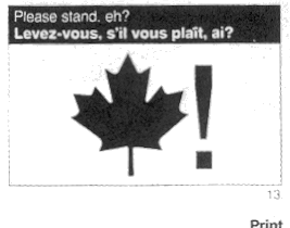
Anytime Canada is mentioned in a design conversation I can't help but think about that article Tibor did for Print on branding Canada.

(This is all I could find on the web, and if I wasn't so lazy I'd scan it from his book… but today, it is not meant to be)

On Apr.30.2004 at 04:36 PM
graham’s comment is:

maven: no, you're right. you couldn't be any plainer.

On Apr.30.2004 at 05:13 PM
DesignMaven’s comment is:

Graham, a friend that read my

post to you thought there may be a translation

problem with me using the word abstract for non discript Identity Design.

He suggested I use the terminology

FREE FORM. Which connotes none rigid.

Thus Identity Design in the United States

has enjoyed a long tradition of very Rigid

and Sterile Identities. Unlike Europe and

Japan. Whom has always enjoyed a certain

amount of Lattitude and Flexibility within

their Identity Design Practice.

The United States did not enjoy such Freedom

until Landor broke tradition. With their Lucent Technologies Identity.

Which was not understood at the time by the masses.

Landor like Wolff Olins has always been experimental and ahead of their time.

I'm reminded, no one liked Wolff Olins

Identity for Athens 2004 in the beginning.

Now it is highly praised and acknowledged.

Again, the same with Lucent Technologies.

It is because Landor broke tradition of

Rigid and Sterile Identities. Everyone in

the USA enjoys a certain amount of Lattitude

and Flexibility in Identity Design.

Europe and Japan has always enjoyed our new found Lattitude in Identity Design.

I thought mentioning Legendary

European Identity Consultant Marcello Minale of

Minale Tattersfield would spark an

association of what I was referencing.

GOD BLESS Marcello Minale I dearly miss him.

On Apr.30.2004 at 11:19 PM
david’s comment is:

I imagine landor did this logo. I believe the redesign of the original federal express logo to "FEDEX" costed fedex 6 million. wow. anyway, i like the kinkos fedex logo.

On May.04.2004 at 02:23 PM
olivia’s comment is:

On May.11.2005 at 08:42 PM