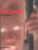
 Imagine you’ve spent 30 years of your life as a film director. Your latest feature has the financial backing of Paramount Pictures and its star, Tom Cruise. They release it during the summer, and while your film succeeds at the box office, critics give more praise to the opening credits than the movie itself. A graphic designer named Kyle Cooper upstaged your two-hour action/adventure with a two-minute spectacle. Andrea Codrington introduces us to Kyle Cooper, and delivers anecdotes like this, revealing what’s beneath the surface of the Yale-educated designer. Codrington, who’s known as a senior editor at I.D. magazine, is also a columnist for the New York Times and former editorial director of the AIGA. She also contributed to the book Pause :59 Minutes of Motion Graphics.
In this book, Codrington reveals Cooper’s oeuvre, influences, and education. His religious background may come as a surprise, considering the gore and horror he injected into Se7en’s opening credits. You may also question Paul Rand’s supposed influence. Coming out of such a rigorous typographic upbringing as his, it’s hard to notice Cooper’s attention to details under the quick cuts and typographic distress in title sequences like The Island of Dr. Moreau, Flubber, or Se7en. Freezing the motion in the printed pages of the book, we get a glimpse of action before it happens. Moving images become mere images. Being his most renowned sequence, Se7en appears frozen as storyboards. This was disappointing, but revealed the creative process.
Taking film into the printed environment presents obvious challenges, and letdowns. What gets left out? How does the reader account for missing “footage”? Codrington assists with her commentary that fills in the blanks, giving us details on movement, soundtrack, edits, symbolism, and the context of the film itself. Cuts are abrupt. The pacing is fast. Type runs to the foreground against dense shadows and muted color. We see how the compressed and energetic nature of Cooper’s work resembles music videos.
If film titles mimic the genre of music videos as Codrington suggests, perhaps Cooper will follow Spike Jonze, Chris Cunningham, and Michel Gondry. These music video directors have their very own DVDs with the luxury of motion and audio to project their 3-5 minute masterpieces as intended. I wonder if Paramount Pictures would fund such a project for Cooper, or if Yale University Press had considered it in lieu of the book?
Kyle Cooper by Andrea Codrington
Monographics Press, Yale University Press
Monographics - Series editor, Rick Poynor
Paperback: 112 pages
ISBN: 0300099517


i've always liked the title sequences to woody allen's films.
in what way does codrington suggest that film titles mimic music videos?
On Feb.13.2004 at 11:03 AM