Speak UpA Former Division of UnderConsideration
The Archives, August 2002 – April 2009
advertise @ underconsideration
---Click here for full archive list or browse below
  
High for Low
kitsch (kich) n. [[Ger, gaudy trash]]
  1. Sentimentality or often pretentiously bad taste, especially in the arts: “Doyle decorated his walls with Salvador Dali posters and other erotic kitsch, as if his room was a rejected stage set from Boogie Nights.”
  2. Displays or artworks of bad taste that are tastelessly vulgar.
  3. Having uncultivated tastes.

It’s Friday the 13th. I spent the morning wincing through Chronicle Books’ Trash: The Graphic Genius of Xploitation Movie Posters. Each page contains posters with bombastic typography and gaudy colors, not to mention vulgar illustrations. What’s not to like? When does a communication problem require the designer to provide a “vulgar” visual solution? Share your own kitschy designs. Too embarrassed? Never stooped that low? Then show us some kitschy examples.
Maintained through our ADV @ UnderConsideration Program
ENTRY DETAILS
ARCHIVE ID 1825 FILED UNDER Show and Tell
PUBLISHED ON Feb.13.2004 BY Jason A. Tselentis
WITH COMMENTS
Comments
brook’s comment is:

i guess i've never really associated kitsch with vulgarity. i think i think the uncultivated tastes definition is the more common one. kitsch is fun! sometimes. sometimes it's just stupid. i can dig up an example or two later.

On Feb.13.2004 at 07:25 AM
Zoelle’s comment is:

My wife hates this design of mine:

I still kinda like it. It's not vulgar, but I consider it kitsch.

My personal favorite kitsch item is the gazing ball.

On Feb.13.2004 at 08:44 AM
Kiran Max Weber’s comment is:

Wooden ducks and dried flowers. 99% of people like that shit.

On Feb.13.2004 at 10:07 AM
Armin’s comment is:

I don't know if this applies exactly but it's the closest I have come to kitsch… maybe not, but I tend to not show this to anybody, until now: The Carpet Guy.

It has that car dealership feel with the blinking headlines, the big-ass phone number on the top, the big-ass banners, the speech bubbles and the carpet guys. I like to think it's a little bit sophisticated for the subject matter.

(I did not do the logo, just the web site)

On Feb.13.2004 at 10:37 AM
Jason’s comment is:

How long ago did you do the carpetguy site, Armin?

On Feb.13.2004 at 10:58 AM
marian’s comment is:

I haven't done anything for Disney, recently, but in my role of Communications VP for our local chapter of the GDC, I did my first issue of our newsletter on "The Future." The front cover had a very far-out illustration of a fortune cookie done by a friend of mine. For the back cover, I was thinking of using a crystal ball, so I went hunting on Getty for the right image (yes, Grant, I also checked Veer) ... and then I found ... this image. This unbeliveably kitschy image. It was an "oh my god!" kindof image. At the mere thought of using it, I just started laughing--my then co-workers gathered around and we agreed, I HAD to use it. So, the back cover, of my first communications piece to all my fellow designers:

I wrote "We see more involvement in the GDC in your future" around his head. I hope they laughed.

On Feb.13.2004 at 11:02 AM
Armin’s comment is:

Not long ago, probably early 2003 or late 2002. Around the time I realized I didn't enjoy spending my weekends cleaning our apartment and went looking for a cleaning service which led me to The Carpet Guy.

On Feb.13.2004 at 11:03 AM
rebecca’s comment is:

Cursi: (adj) Said of a person with pretensions to refinement and elegance. 2. Applied to that which, appearing to be elegant or luxurious, is ridiculous or in bad taste. 3. Said of artists and writers, or of their works, when they vainly attempt to show expressive refinement or elevated feelings.—Diccionario de la Real Academia Espanola

The title of this book is The Culture of Cursileria: Bad Taste, Kitsch, and Class in Modern Spain. I was psyched to get a chance to use those little Fournier heart ornaments at the bottom.

On Feb.13.2004 at 11:22 AM
Armin’s comment is:

Rebecca, that is really cool. And also, the word cursi is one of my favorite adjectives.

On Feb.13.2004 at 12:22 PM
brook’s comment is:

i guess this is the most kitschy thing i've done. i like it though! it's an invitation for a kid's pool party, a handmade run of 30 or so. Super Happy Turbo Animal Fun Goggles!

On Feb.13.2004 at 01:03 PM
Brian Warren’s comment is:

Oooh, i like those goggles.

On Feb.13.2004 at 01:40 PM
KM’s comment is:

When does a communication problem require the designer to provide a "vulgar" visual solution?

When the client is a rock band. It is then, most definitely, appropriate.

On Feb.13.2004 at 02:21 PM
Jeff G’s comment is:

I showed this logo at the Smackdown, but here is some more Big Tin kitsch:

-

Kris, that book looks Exceptional!

On Feb.13.2004 at 02:53 PM
Armin’s comment is:

Jeff, I like the placement of the Big Tin logo on the guru… subtle.

On Feb.13.2004 at 03:23 PM
Jason’s comment is:

These are all very tasty so far.

On Feb.13.2004 at 03:38 PM
debbie millman’s comment is:

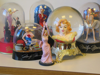
Does this count?

On Feb.13.2004 at 03:41 PM
Jason’s comment is:

Yummy! Yes, it counts.

On Feb.13.2004 at 04:06 PM
dave’s comment is:

Debbie those are great! I have some Marilyn Monroe, Hallmark Keepsake Ornaments that my mom was buying for a few years there.

I want to warn sensitive viewers that clicking the following link could damage any future respect you may have for me. Am I crossing the line here?

This is my most recent card for fun.

On Feb.13.2004 at 10:06 PM
Jason’s comment is:

You're irresistable, dave.

On Feb.13.2004 at 10:10 PM
Tan’s comment is:

You want kitsch? Well, it's hard to top a beef jerky site. And don't miss one of their sub-brands. Ah, the magic of interactive. How is this better than print again?

And the official term is "meat snacks". Nuff said.

As to vulgar -- a couple of years ago, I designed a call-for-entries brochure for a Seattle ad/design show that had a full-bleed (no pun intended) photo of Evander Holyfield's bitten ear on the cover. No words, just the bloody ear. Inside, the type read "Do Whatever It Takes to Win", next to a photo of Tyson in the act of biting it off. It got lots of responses, to say the least.

On Feb.14.2004 at 12:30 AM
Jason’s comment is:

Yum. Beef jerky! Speaking of jerky, I remember the ear like it was yesterday. I laughed and cried at the same time.

I guess "Do Whatever It Takes to Win" includes kitsch. But your poster, while vulgar, wouldn't really be kitschy would it?

On Feb.14.2004 at 12:53 AM
Tan’s comment is:

You're right Jason-- vulgar and intentional tastelessness is not necessarily kitschy.

I'll keep searching....

On Feb.14.2004 at 01:19 AM
Jason’s comment is:

No pressure, Tan. I'm still looking for this birthday party invitation I did with a Bowling Alley theme. I fear I may have deleted it to protect myself.

On Feb.14.2004 at 11:57 AM
Armin’s comment is:

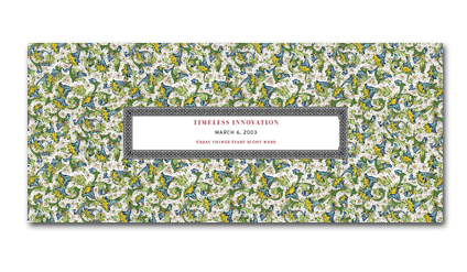
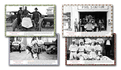
This is an invitation and some small posters we did for a Printer here in town. The theme was Chicago-firsts (did you know the first baton twirling contest took place here?). I bought some kitshcy wrapping paper and got some kitschy, vintagey photos and voila! Instant kitsch.

Intentional kitschiness doesn't count though, right?

On Feb.14.2004 at 03:59 PM
Jason’s comment is:

Sure it counts, as long as it was part of the communication objective or inherent in the subject matter.

On Feb.14.2004 at 04:47 PM
pk’s comment is:

kitsch has fueled most of my portfolio. i won't even point out a single example; it's my life. in fact, su and i have giant gold clarendon in our foyer reading "F-U-C-K O-F-F" with a black and white photo of my mom as the period, she's making this bizarre "wooo!" face. kind of a jokey take on those oversized fake-antique letters yuppie couples always have decorating their book cases.

On Feb.14.2004 at 10:57 PM
dave’s comment is:

yeah pk, i see it... it's like future kitsch. that's wild. i see that bubbleland signage all the time, it's near my house.

anthony ma hooked me on the kitsch. you still in contact with anthony?

On Feb.14.2004 at 11:58 PM
pk’s comment is:

absolutely. haven't seen him for a while; he and julie have been in hibernation for a bit since she's now wit' child. i wanna see what he's working on these days. his work's amazing.

On Feb.15.2004 at 03:38 PM
patricia’s comment is:

the budget limits of this publishing house sometimes lead me to explore low-cost ways of illustrating book covers. for this book (Different Rainbows), i scanned wedding figurines to convey the subject matter: gay relationships in latin america.

what do you think? socially conscious kitsch?

On Feb.15.2004 at 09:14 PM
Steven’s comment is:

Well, I think these meet the criteria of kitsch:

A poster I did for my friend's former band.

A recruitment poster I did while at Macromedia.

And two box designs (1) and (2) I did at Berkeley Systems, back in the day.

On Feb.15.2004 at 09:50 PM
Jason’s comment is:

Fabulous, Steven. I remember seeing both of those on the Best Buy shelves.

On Feb.16.2004 at 12:36 AM