Speak UpA Former Division of UnderConsideration
The Archives, August 2002 – April 2009
advertise @ underconsideration
---Click here for full archive list or browse below
  
Just Married

On several occasions, I have been approached to design wedding stuff by friends and family. Invitations, CDs, save the date cards, place cards. My first response is always, “Pick something out of an invitation catalog. Trust me, that is what you are looking for.” Sometimes that works. Is everyone here expected to design wedding invitations for friends and family?

I just got married last month and designed our invitations. Let me clarify. I designed, while my wife art directed. White, traditional, script, flourishes, centered, etc. Honestly, I couldn’t imagine them any other way. Everyone loved them. I do know designers however, that have designed their invitations to be conceptual, or with bright colors, or sans serif typefaces. Has anyone here designed any non-traditional wedding invitations?

C’mon, show and tell.

Maintained through our ADV @ UnderConsideration Program
ENTRY DETAILS
ARCHIVE ID 1661 FILED UNDER Show and Tell
PUBLISHED ON Nov.18.2003 BY David Weinberger
WITH COMMENTS
Comments
David W’s comment is:

Here they are.

On Nov.18.2003 at 08:35 AM
amanda’s comment is:

here is ours. since we are both! pig headed designers it made it even worse. We must have designed concepts for three months.

Husband illustrated cover, one color, nice & thick utopia, accordian fold, reply card cuts off the end with an area for guests to fill in song requests.

I have designed alot of invitations for alot of friends. I am starting to hate it because the brides are so controlling over every freaking detail (no offense to anyone here, i was kinda like that as well)

On Nov.18.2003 at 09:17 AM
Armin’s comment is:

Funny, I see my name and address on the invite but I didn't actually get invited... maybe it got lost in the mail ; )

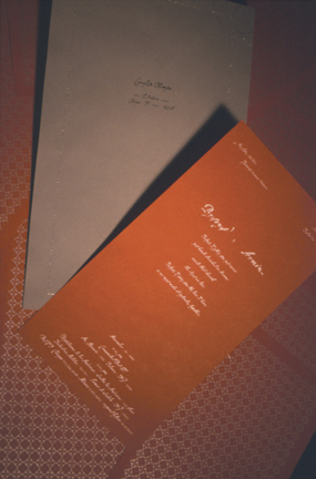
Our invitation was pretty cool, we think. We printed using metallic ink on French Paper's construction line. It's a bit oversized, the bigger (blue) envelope is 11 x 17 and is stitched (with silver thread) all around to close. This is kind of a dark picture. We also printed some cool thank you cards and we made a CD that came in a little pouch (pictures of that to come).

For the typographically curious, we used Stephen Farrell's lovely Volgare and Mrs. Eaves to compliment.

On Nov.18.2003 at 09:22 AM
Ginny ’s comment is:

Unfortunately, I don't have any pictures to show of the two wedding invitations I did. I like the first wedding invite I designed, eventhough the bride made me put a heart on the front.

The second wedding invite I did was a pain in the butt. The bride was very controlling and annoying. She wouldn't heed my advice and in the long run, although it looked pretty, it wasn't all that unique.

I have vowed to never design another wedding invite again, except my own.

On Nov.18.2003 at 09:43 AM
David W’s comment is:

Funny, I see my name and address on the invite but I didn't actually get invited

That is funny. You were there in spirit though, Armin. Tan had a great time. As did Debbie, Felix, Sam, Jon, Bradley and Marian. We'll send you pictures.

On Nov.18.2003 at 09:48 AM
Patrick’s comment is:

I did ours, with a bit of input from my wife, though she was pretty happy with most of my choices. We silkscreened the actual invite on brushed aluminum. I printed a custom vellum sheet with the invitees names that overlaid the invite; and the rsvp cards, etc all went underneath. The whole spiel was wrapped in purple fabric, closed with a sticker and put in a Crane's cotton envelope.

I have now been asked to do an invite for the wedding of a couple friends in May. The thing is they are doing a Star Wars theme - everyone will be in costume. Should be interesting.

On Nov.18.2003 at 09:55 AM
jonsel’s comment is:

a Star Wars theme

Wrap it in faux-Yoda skin!

On Nov.18.2003 at 10:09 AM
diego’s comment is:

I didn't design this, nor do i have a picture - but this guy I knew created a flip book of the male and female symbol (with the couples name under each symbol). As you flipped through it, the male symbol deconstructed to make a cupid's bow and arrow which shot and struck the female symbol. The female symbol responds by coming closer to the male symbol and then hearts appear and flutter up. It goes on for a while (like a 20 second animation) - and ends giving the date and time of the wedding. Really cool - he won a bunch of awards for it.

On Nov.18.2003 at 10:12 AM
Su’s comment is:

Want non-traditional? PK designed some invites a while back for a friend of his, using Not Caslon. There aren't any pictures on-line at the moment that I'm aware of. I'll see if I can get him to post 'em somewhere for a bit.

On Nov.18.2003 at 10:19 AM
Sam’s comment is:

I indeed had a great time and you missed it, Armin. I just wish someone had told me pants were mandatory.

On Nov.18.2003 at 10:54 AM
Brian Warren’s comment is:

David, your invitations look strikingly like ours did. We printed in a burgundy ink on classic columns, but that's about it. Our centered flourish wasn't LWD though. It was a non-descript flourish.

The fam was thinking of going with one of the catalog invitations, till i priced the printing of doing it ourselves, and they let me indulge a little.

I'd be very leary about doing someone else's invites though. We would definitely need to lay some ground rules.

On Nov.18.2003 at 11:07 AM
marian’s comment is:

Yeah David, that was a great wedding. I was wondering where Armin was--thought he was just being snooty. My apologies again about the cake.

To the best of my memory I have only ever done one wedding invitation--for a friend of my then-business partner. Was it all swirly an ornamental? No it was not. They wanted a travel-themed invitation and sent me about 20 photos to include AND made me put little feet-marks walking across the whole thing to the final destination (their wedding). It was absolutely hideous, and it was probably the third-worst project I ever worked on.

Never ever again. Ever.

On Nov.18.2003 at 11:22 AM
jesse’s comment is:

Here are the materials from my recent wedding:

The typeface is Weiss. Printed in two colors as a favor from a printer friend on excess Mohawk Navajo. The envelopes are French Paper Frostone Tundra, picked up from a paper store, also excess printer stock. I think we spent about ten bucks on the materials. I wanted the materials and colors to reflect our autumn wedding reception.

On Nov.18.2003 at 11:24 AM
pk’s comment is:

god, i wish i had my portfolio files here so i could post this.

i did a great one for friends as their wedding present (because i'ze po'). we did the whole package on sage paper (either voice or realm from gilbert, can't remember) in gloss varnish over metallic iridescents. typography: notcaslon. the bride's mother nearly had heart failure when she saw the first proofs, but the bride was unstoppable.

On Nov.18.2003 at 11:27 AM
mrTIM’s comment is:

I can't believe that this thread came up! I'm getting married in April and am in the process of designing the invitations.

I have a friend that owns an old school one color typeset press. A true antique from the late 1800's. So the invitations will be done on that machine.

I was thinking of doing something san-serif on a columned paper. And since the colors for the wedding are burgundy and silver it'll have some pizzaz.

Unfortunately since I'm using the press I'll be somewhat limited on font and paper choices, but it should turn out ok. I also will have my fiance giving her input, so I'm sure she'll want script titles, and center justified. *ug*

But it should make for a fun bonding experience for the two of us, and it'll be nice to typeset actual wood figures.

I'll have pictures as soon as their made.

On Nov.18.2003 at 11:43 AM
priya’s comment is:

i fantasize about doing this one day for my own wedding. these are exceptional.

i just sit and stare at martha stewart wedding magazines with adverts for lovely letterpress invites such as claudia calhoun (done by dicksons.)

On Nov.18.2003 at 11:50 AM
Sarah B’s comment is:

All beautiful!! I cannot wait to do mine - but if the boyfriend catches anything about the "M" word - it'll be my head!! :)

So instead, I have been drawing out plans for my dream house... I can do that one on my own - eventually!!

Oh, BTW, wedding invite font for me.... Emigre's Dalliance!! Knew it when I saw it!! :)

On Nov.18.2003 at 11:55 AM
Kenneth FitzGerald’s comment is:

Want non-traditional? PK designed some invites a while back for a friend of his, using Not Caslon.

I wish Not Caslon existed in 1992 for mine. I used Template Gothic. Mark Andresen (designer of Not Caslon) would love to see samples of pk's invite.

On Nov.18.2003 at 01:06 PM
Tan’s comment is:

> i just sit and stare at martha stewart wedding magazines with adverts for lovely letterpress invites such as claudia calhoun (done by dicksons.)

Priya -- I just happened to be at Dickson's when they were working on the Calhoun wedding invite system 9a couple of yrs ago). Dickson's prints everything for the set, from the huge binders to the place cards you use at the receptions.

I have to say that they are just amazing -- some of the most beautifully typeset printing that I've ever seen for anything. Letterpress, engraving, embossing, an a host of other custom printing techniques are tastefully combined to make up that amazing collection.

The design of the collection is also just stellar -- even by designer standards. They look like Stephen Doyle designed them...really. I have to say that I'd be hard pressed to do better myself. If I had to design my invitations today, I'd opt for the Calhoun stuff instead. It's really that nice.

And the best part is that they're a design series/collection that has a fixed cost -- letterpress dies have been made, paper and envelopes have been converted, etc. I guarantee that if you printed a similar set yourself at a comparable printer, it would easily be triple the cost or more.

You gotta hand it to Martha -- she knows how to resource design.

Seriously, if any of you are at that stage -- take a look at the set before you tackle your own invites. Save yourself the stress.

But back to the thread -- I have to dig my invites out, as it's been nearly 10 yrs now.

On Nov.18.2003 at 01:11 PM
Sam’s comment is:

I'd heard a long time ago that the Calhoun stuff was designed by Design MW. I think Doyle is more involved in the Martha Stewart Everyday line (the Kmart stuff). DesignMW are goddam superheroes.

On Nov.18.2003 at 01:29 PM
jesse’s comment is:

Seriously, if any of you are at that stage -- take a look at the set before you tackle your own invites. Save yourself the stress.

What Tan said. If I had to do it over I'd order something out of a catalog.

I think the level of stress involved was tantamount to some of the design-by-committee pieces I've worked on.

On Nov.18.2003 at 01:32 PM
Darrel’s comment is:

Seriously, if any of you are at that stage -- take a look at the set before you tackle your own invites. Save yourself the stress.

I'll take that a step further and suggest you elope. Save (and $$$) the stress of the entire wedding process. Send postcards from Vegas and call it good.

Granted, many people I know that did have weddings all say that same thing, so I suppose it's just one of those things that doesn't make sense until you go through the process yourself... ;o)

On Nov.18.2003 at 02:49 PM
Allison’s comment is:

What a coincidence! I got married a month ago too and designed my own invitations.

I have done invitations for others in the past and was actually looking forward to it.

When I have done invitations for other people I haven't really taken all that much direction from them. I ask if they have particular colors in mind or a motif or something about the wedding that they would like to emphasize in their invitation and I go from there. Usually it's a matter of giving them two or three ideas to choose from and then refining them a bit. What I get from them initially is typically so vague, I would have a hard time describing it as 'direction' at all.

There have been a couple of people who I directed towards on-line suppliers, mostly due to their budget constraints or extreme-lack-of -taste constraints.

'Yes, the invites will be more than a dollar a piece and no, I really don't think I want to recreate those Raphael Putti on the front.'

For ours we had ivy as a theme.. our church and reception location were smothered in it and it was in all of the centerpieces, etc. and I just picked two colors that I liked. A copper and a greyish teal. We coordinated everything, from the invites to the programs to personalized menus and it was great.

The hard part was having myself as a client. I am awful! But the end result was really satisfying and brought my personal touch into the wedding in a really noticeable and memorable way for our guests.

I guess I am the dissenting voice to say that I thought it was totally worth it and would do it again. Oops.

I don't have them posted online, or I would post them here.

On Nov.18.2003 at 04:40 PM
Jose Luis’s comment is:

Here are mine from a couple years back... not very weddinglike but the wife wanted something different and she would not give in...

On Nov.18.2003 at 10:58 PM
Jose’s comment is:

i kinda like what jose luis made. any more where that came from?

On Nov.19.2003 at 09:17 AM
Andrew Pollak’s comment is:

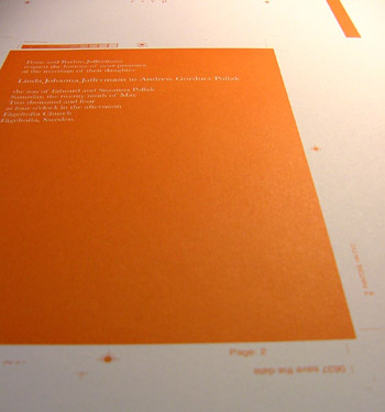
Just got my press proof.

On Nov.19.2003 at 10:28 AM
kev leonard’s comment is:

over the summer this year i got a job to design a wedding invitation. the bride and groom wanted something non-traditional and larger than life.

i got stuck on "larger than life" and created a poster.

they also needed a moving announcement, directions to the church (with a map) and a response card all to go out with the invitation.

i designed the poster/invite to perforate at the bottom and put all three devices at the bottom. that way when the recipient tore away the map, reply and moving announcement, they still had the invite as a keepsake and reminder of the event.

the poster was mailed in a tube along with a reply envelope.

it didn't hurt that the couple trusted me implicitly and had a pretty healthy budget, if this thread is still going tomorrow, i will send it to be posted. i would like some opinions on the design. the couple i did it for loved it.

On Nov.19.2003 at 10:50 AM
jonsel’s comment is:

Anyone do "Save The Date" announcements? I did a can of salmon for a friend once. That was, um, interesting. The cans they were using were tapered (like a yogurt cup), so I actually had to get special software to curve the design so they could cut them out and wrap them around the cans.

I did one invite for a friend and it was just too difficult. Never again. They thought they had found the most incredible paper, but couldn't find a supplier. Turns out it was just arches watercolor... I loved doing mine, even though I'm my own worst client. I have no pictures of my invite, so I'll post my Save The Date instead. It was so cheesy. I still love it.

On Nov.19.2003 at 12:37 PM
Armin’s comment is:

Jon, that's so chessy it's... um, it's... yeah, that's cheesy. They don't teach that kind of stuff at Portfolio Center, much less at Landor... life is the greatest school.

Bridezilla...

On Nov.19.2003 at 03:29 PM
Sam’s comment is:

SAVE YOURSELVES!

On Nov.19.2003 at 03:44 PM
jonsel’s comment is:

They don't teach that kind of stuff at Portfolio Center

Oh well. We found it amusing. The wind-up godzilla with the veil was actually a Valentine's Day gift to me from my wife.

Here's a poor quality scan of the invitation, within its vellum wrap and bellyband. The vines were printed bleed off the envelope flaps as well. All letterpress. Typeface is Serlio. Oh yeah, the blue had some silver mixed into it (but not enough to make it gaudy). It matched the bridesmaids dresses!

Hopefully this will restore a little of my credibility here? ;-)

On Nov.19.2003 at 04:06 PM
Armin’s comment is:

It did... especially with the added silver in the blue, that was a nice touch. Welcome back Jon.

On Nov.19.2003 at 04:25 PM
Sarah B’s comment is:

Jonsel - it is gorgeous. Is the vellum lined/columned?

On Nov.20.2003 at 11:35 AM
jonsel’s comment is:

Is the vellum lined/columned?

Yeah, it has a very small vertical pinstripe in the vellum itself (not printed).

On Nov.20.2003 at 11:52 AM
bmcgee’s comment is:

I picked the date 010101 just so I could design the invitation around it. A binary wedding date is a great excuse to go nuts with digital collage and pretty script fonts*. We mailed it out in static sheild bags (of course) with wrap around address labels.

The cover is printed on an envelope that serves to hold the RSVP and a map of our neghborhood. I'm still a little bummed that the printer couldn't back print the envelope... and wouldn't convert them for a decent price, but I guess it turned out well in the end. We got lots of compliments, etc.

* three cheers for Volgare!! Armin - Did you send Stephen a copy of your invitation?

On Nov.20.2003 at 02:24 PM
Cheshire’s comment is:

We're in the process of working out the design of our invitations. We haven't figured out what form they're going to take, but this is a draft of the image I'm working on:

The borders came from Briar Press's site, and I really like it, but I think I'm going to try doing my own border -- I just wanted to see what it would look like.

Once we figure out what all the pieces are and how they're going to go together, a friend will be printing the invitations on her letterpress, which I'm really excited about. We haven't even begun looking at papers yet. But at least now that we've secured locations, I can begin working on maps. That ought to be fun.

On Nov.20.2003 at 02:49 PM
Cheshire’s comment is:

I also want to say that the other pieces shown in this thread are extremely nice. Very inspirational.

On Nov.20.2003 at 02:50 PM
surts’s comment is:

I picked the date 010101 just so I could design the invitation around it.

that brings a tear to my eye, serious design dedication to say the least

On Nov.20.2003 at 03:02 PM
mrTIM’s comment is:

>010101

Awesome! Now if only 042404 was cooler...

On Nov.20.2003 at 08:49 PM
nancy mazzei’s comment is:

yikes! how do you post photo's? help!!

On Nov.21.2003 at 11:38 AM
nancy mazzei’s comment is:

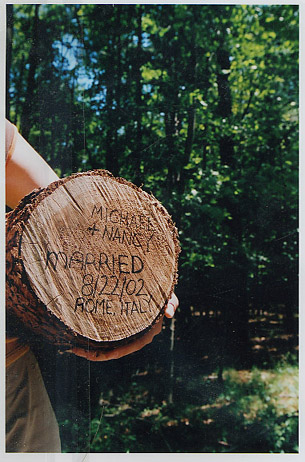
me and my honey ran away to Italy and got married, no family problems it's just what we both wanted. Anyway we sent these out on the way to the airport..it was cool because everyone thought we were just going on vacation.

On Nov.21.2003 at 01:11 PM
jesse’s comment is:

That's excellent, Nancy!

On Nov.21.2003 at 01:35 PM
jonsel’s comment is:

Nancy, just awesome. I'll bet you had quite a full answering machine when you returned!

On Nov.21.2003 at 09:48 PM
nancy mazzei’s comment is:

yeah it was cool. then we took that log and tossed it off a near by bridge...

On Nov.23.2003 at 04:01 PM
robSTANTON’s comment is:

plan to get hitched this summer. both designers. any tips from the trenches? or is it hopeless? thanx

On Nov.24.2003 at 01:25 AM
Colleen’s comment is:

both designers. any tips from the trenches?

rob-take nancy's route. You'll thank me for the advice later! or, start early and plan on many late nights of debate. I'll jump in late and show ours... sorry so big.


and my sister's...


On Nov.24.2003 at 05:30 PM
Gunnar Swanson’s comment is:

From the days before cheap color seps on the Mac. I gave the printer a board with B&W photos pasted in pace with crops and targets and three sheets of paper with crops and targets. They were labeled C, Y, M, and K and until I saw the Color Keys I didn't know if I was a crazy as he thought I was.

There was a book of wedding invites and birth announcements published a few years back. It was called Storks and Bonds.

On Dec.04.2003 at 02:38 PM
Diane’s comment is:

We are getting married in Poland in April and have figured out the design we want - B&W photo with vellum overlay - print on the vellum. The catch is finding a printer! I don't know much about card/paper stock - for the card etc... any suggestions? I love the unique work I see here! The cards are alive

On Jan.20.2004 at 05:17 PM
Bryan’s comment is:

I know this thread's been at ease for a while now but I just saw these online and I felt compelled to share:

Why am I not surprised that Trump's wedding invitations look like they were designed by a clerk at Staples?

On Jan.24.2005 at 09:46 AM
Gunnar Swanson’s comment is:

Why is the T in “two thousand and five” capitalized (and, as long as I’m kvetching, why the “and”?)

On Jan.24.2005 at 11:01 AM
szkat’s comment is:

i'm in love with dan mccarthy's work.

here's an invite he did.

On Jan.24.2005 at 12:16 PM
Priya’s comment is:

the trump invite was sort of designed by a clerk at Staples... This month's Vogue with the now MRS. TRUMP on the cover says that the invite was "designed" by Melania on Tiffany stationery.

I still don't know why Vogue put the word "designed" in quotations.

On Jan.25.2005 at 05:31 PM