Speak UpA Former Division of UnderConsideration
The Archives, August 2002 – April 2009
advertise @ underconsideration
---Click here for full archive list or browse below
  
The Designer’s Black Book

I notice that many Speak Up readers are designers who have “been there, done that” with respect to job interviews and many who hire for their respective firms. I am sure these designers have seen their share of the “Designer’s Black Book.”

I go for my first design-related formal interview next week. I must make a Book. I’ve never seen a completed example. I know the basic idea: that it’s a small collection of only your very best work. Perhaps arranged chronologically, by media, or by personal preference. Perhaps it’s shown in a case, on boards, or in a finished bound book. In all, I know that it’s what the book contains that counts more to the company than the jazzy binding I slap on it. But nonetheless I am compelled to make a simple, clean, sexy Book.

Does anyone have photos of theirs? Formats? How many pieces is entirely too much? 5? 10? 15? What’s overdone these days style-wise/layout-wise? What’s entirely inappropriate? Are brief descriptions of each piece (title, media, number of pages, print specs, date, brief explanation) appropriate? Is merely (carefully) mounting the pieces on boards with no explanation expected/preferred? Is it standard to show up with two books: the “book-that-you-only-show-and-never-give-out-to-keep” plus another “book-that-you-give-for-keeps”? Can supplying a portfolio URL substitute as a giveaway printed book? What was the best book you’ve ever seen?

Tell me about your Book.

Thanks to Priya Patel for the topic and entry. Good luck!

Maintained through our ADV @ UnderConsideration Program
ENTRY DETAILS
ARCHIVE ID 1618 FILED UNDER Show and Tell
PUBLISHED ON Oct.01.2003 BY Kiran Max Weber
WITH COMMENTS
Comments
jonsel’s comment is:

Mmm...good topic. As a designer who has been around a little but certainly not achieved "been there, done that" status, I'll give you my take.

First and foremost, show the pieces that best show your abilities and what you would like to do. Don't go to an interview for a corporate ID job with nothing but a web portfolio. Sounds obvious, I know. There's no golden rule for how many, but if you are just out of school, 10-15 is plenty. Most interviewers don't have a lot of time, so the more work you show, the longer the interview will go and they are less likely to pay better attention to the truly great pieces in your book.

Formatwise, I like to have something that's a little stylish but doesn't overwhelm the contents. Portfolio Center, where I graduated, used to be well known for its grad books. They were often massively elaborate trays of pull outs and bound books. My book was digital c-prints (I hate transparencies in portfolios, unless you are a photographer) matted and mounted on black boards. Not fancy, but the work is the important factor, and I had no trouble getting a job. Currently, my book consists of 2 silver wire-o books, french folded, one 8.5x11 of my print, packaging and identity work, and a smaller 5x5 book of just logos.

If you are leaving behind something, keep it short, with 4-5 of the best of the best. Include a title and VERY brief project description. Don't forget to put your name and contact info in the book. Books and resumes get separated. Don't get skipped over because nobody can find your number.

Oh, as for quality of print outs, I've seen HP deskjet prints to actual photographs to Canon laser prints. As long as it's good quality and doesn't make your beautifully drawn typography look like it's made of brown sugar, then you'll be fine.

And last but not least, know how to talk about each piece! Give a brief overview of the assignment and what your concept was to solve the problem. Be prepared to get further in detail if asked. I hated interviewing people who would describe a piece as "a business paper system" with no more detail. Why'd you use that typeface? "Because I like it," is not correct. The work may be nice, but Creative Directors want to know you understand why it is nice and what your thinking process was to get to that point. Most design can be taught, but intelligence is harder to get.

On Oct.01.2003 at 11:35 AM
jonsel’s comment is:

Oh, I should also say this: flaunt it if ya got it. In other words, if you have some extreme talent for calligraphy or origami, etc., feel free to find a way to get that into your book, either via your business card or a self-designed cover or whatever. If it makes you a more interesting person, and more likely to stand out, then it's a good thing.

On Oct.01.2003 at 11:44 AM
pk’s comment is:

my portfolio is, unfortunately, huge. it's impossible to give any more than a cursory amount of attention to each piece, so i emphasize my concepts and let them look at the work in-depth after i'm gone.

i make a leave-behind portfolio of a portfolio, usually containing about 25 pages...inkjet prints (i have an hp cp1700, which i can't recommend highly enough) at US letter size, packaged and heat-sealed in a 9x12 silver anti-static bag (the lovely bags that your RAM chips come in) containing a couple of business cards and postcards. it's a good tool; the folks i meet with generally need to show the work to others in the office. this way they can live with it for a while. i need that; my work's not immediately accessible.

i also enclose a few pages of pieces in progress. i show each one from pencil sketch (or cocktail napkin notes or whatever; i always take the actual artifact with me) to its current status. this puts them at ease when wondering how i work and how long i take to move a piece forward.

On Oct.01.2003 at 11:51 AM
jonsel’s comment is:

PK, do you have separate design and illustration portfolios?

On Oct.01.2003 at 12:13 PM
Darrel’s comment is:

I abandoned boards after my first job. One reason is that I haven't had to do much cold-calling since then. Another is that I just hate making boards and lugging them around.

I now simply create a 8.5 x 11 PDF portfolio with a page per project. When I need to meet, I just print out whichever sheets in the portfolio I feel are relevant to the interview and then bind them together with some fancy clips and a cover.

It's small, easy to carry/mail, and I can easily leave it with them if they wish. They can also unbind the presentation and pass them around in a group setting.

It's also easy to email when needed.

On Oct.01.2003 at 12:44 PM
graham’s comment is:

what work do you want to show? show that. it's as much (if not more) to do with you finding a place you want to be part of as them finding someone they want to employ.

if it's a real thing, show the thing. don't have a slide or print of a poster, have the poster. etc. whatever it is.

as little mounting and extra crap as possible-a loose bag of things-as-things is tactile and strong.

don't make your folder a clever (never clever ever) 'witty' or baroque thing in itself. it's all about the work in it. a bin bag should do if the work in it is strong enough.

On Oct.01.2003 at 01:19 PM
Bram’s comment is:

I've been in on a few interviews, so from my end, I'd really have to agree with Jon's comment about being able to talk about your work. My gimmick was to ask the interviewee to pick any one piece and tell us about it, their involvement from beginning to end, and their thoughts about how it went — usually got some good info on the person's work style, thought process, the environment they're coming from, etc., which can be more valuable than the work in making a decision.

And kind of that note, I think it's OK to include stuff that you may not have done all yourself, or that you were heavily directed on, and make that a part of the presentation. Chances are, you're being interviewed to work with and/or under an existing team/director, and it's helpful to know that you can take direction and be part of a group.

Ten to fifteen is probably a good target; I'd refine that based how long it takes to go through and present — if they're complicated and/or require explanation, maybe cut back. Format should be determined by the nature of the work — a standard book still works best in many instances; if things are dimensional and need a box or best shown by photos or whatever, go that way. Don't get hung up on the design of the book at the expense of what goes in it — just make it professional.

From my experience, what you have on your Web site works as a leave-behind/follow-up. A second sheet of the resume with a few thumbnails also works to help the interviewer remember your presentation.

Best of luck.

On Oct.01.2003 at 01:25 PM
pk’s comment is:

jonsel: not usually. i find that separating my disciplines weakens my work. i managed to grow this weird reputation as a can-do-it-all communications designer (the truth is that i'm actually just impatient), so i start the book with pieces in which i performed everything from strategy to implementation, whatever form that may take. i add pieces towards the back which spotlight individual capability.

i generally do this to show how the work changes voice (or suffers, if the client seems like they need a warning scenario) when i don't steer all aspects.

i also like to do this so i can sell collaborators' capabilities. the people i surround myself with say as much about me as my finished work. i always talk up thirst's talents, gilbert paper's excellent stocks, ogilvy's excellent creative strategy, and so on. just whatever comes up in conversation.

the only discipline i distinctly break out is typeface design.

On Oct.01.2003 at 01:38 PM
Patrick’s comment is:

I've always found including the actual piece (for print work) is much stronger than just a photo or two in a book. It's hard to get a feel for scale, flow, structure, from a printout. I always wanted the interviewer to see I could create whole projects that were strong, not just lay out a nice spread.

What I used to use (when I was looking for jobs) was an 11x14 clamshell box. For each piece, I'd mount a letter-sized sheet with one image and a paragraph explaining the project onto an 11x14 board. Then I'd put the piece itself in on top of it. Logos and websites would just get the board. The boards served to give the background when I left the book, and also helped organize to keep it from being just a junky box full of stuff. And yes, in presenting the work, always give at least a sentence or two of the strategy or thought behind each project. Then you can go back and talk in depth about ones that the interviewer tended to cue in to.

As for order, a general rule I've tended to follow is end with the strongest piece and start with the second strongest. And spread everything else out depending on who you're presenting to. I tend to stagger things: logo, then website, then print piece, etc. Tends to feel like a bigger variety that way.

On Oct.01.2003 at 02:18 PM
Rebecca C.’s comment is:

OK--here goes:

My portfolio is a matte black 3-ring 1/2" binder with non-glare heavy duty page holders. I include actual samples as often as possible. The back pages of multi-page pieces are slid into a slit cut in the page holders, to align correctly within the portfolio. I usually include only one page of logos, unless the job is for a logo (rare).

I have a file box of samples and digital output to exchange as necessary for each interview. Always always ALWAYS tailor your portfolio to the job/company/industry. Which leads me to: do your research. At the very least, look up the prospective employer on the 'net and the BBB. Have something intelligent to ask during the interview--don't just rely on witty answers to their questions.

If you must have a "flair" piece, let it be a leave-behind self promo or a business/contact card. If you are not currently employed, design & print your own business card with contact information to leave with prospective employers. It gives a nice upscale impression to be able to say "here's my card."

Last, always send a thank-you card, handwritten & signed, and addressed to the primary interviewer at their office. A little off topic, but very important, none the less.

On Oct.01.2003 at 02:25 PM
pk’s comment is:

related to that: set up a mailing list for yourself and email the living hell out of everyone.

once every week got me a lot of "please remove" responses, but every two weeks seems to not bug anyone. tell everyone what you're doing all the time. do this repeatedly at full volume. one meeting never keeps you in the client's mind, a sledgehammer with your name on it does.

On Oct.01.2003 at 02:50 PM
pk’s comment is:

email list: ALWAYS HIDE YOUR RECIPIENTS LIST.

i was up for a job with five gazillion other competitors. the client's secretary emailed all of us who didn't get the gig - but she left all our email addresses showing...a big privacy no-no. poor thing spent about two weeks getting flamed with cc's sent to everyone on the list.

On Oct.01.2003 at 02:52 PM
Darrel’s comment is:

related to that: set up a mailing list for yourself and email the living hell out of everyone.

I'd imagine that could backfire. I'm not a big fan of spam ;o)

On Oct.01.2003 at 04:03 PM
pk’s comment is:

I'd imagine that could backfire. I'm not a big fan of spam

me neither. i always ask in the meeting if they'd like to be kept up to date, and there's a disclaimer on the thing that they can be removed any time without hurting my feelings.

On Oct.01.2003 at 04:07 PM
Tan’s comment is:

here's my 2 cents.

1. size of case -- it should fit easily on a desk. That will increase its chance of being seen by an art director.

2. to repeat pk -- a nice case gives off a good impression, but the work inside should surpass the case it's in.

3. no more than 10, and only the best that you can do. People will remember the best, and worst piece you have in there.

4. Just label the work w/ client and some very brief specs. Most reviewers will know what they're seeing -- you don't want to insult their intelligence by over-explaining something. Besides, the work should speak for itself.

5. enclose a resume, and a card if you have one. The resume is more essential. And on your self identity system, don't be pretentious. Don't brand yourself as a design office when you're not. Don't make a clever logo for yourself, when good type will do. Be as direct, concise, and professional as you can on all of your materials.

6. I agree w/ Graham -- include the real piece if you can. I personally like looking through the pacing of a book, or the fold format of a poster. You never know what will catch the eye of an art director.

7. and lastly, don't waste your time on a CD or a lengthy website. Print promotion is still the most effective way -- even if you have to mail or Fedex something instead of emailing. Remember, an email promo that can be sent in one click also just as easily be trashed in one click. Leaving behind something tactile tells them that you care about the materials that you produce.

On Oct.01.2003 at 04:20 PM
Garrick Van Buren’s comment is:

I haven't done formal visual design work since my first job out of school, doing information architecure work these days. But I still bring the same book to each conversation about my work.

It's a basic black portfolio box fits my 16x20 boards. I probably take 10-12 boards, to talk about. Boards are good because they're big, easy to share, and don't distract from the conversation (like a computer based portfolio does).

From what I've seen, it doesn't matter if it's your best work, worst work, or someone else's work (bad idea). What matters is the story of the project and how you talk about it.

So, a couple tips there: 1) know why each piece is in your portfolio. Three things is good, that'll give you plenty of things to talk about, but not so many that it slows the presentation down. 2) Always speak positively of everything/everyone you bring up in conversation. Karma is wicked.

Organizationaly, I like to put my 2nd most appropriate piece first, followed by my 3rd, with some OK stuff in the middle, ending with my most appropriate. I like to end on a high note - cause I don't like to leave stuff behind. Kinda paranoid that way.

On Oct.01.2003 at 05:40 PM
Priya’s comment is:

wow. this is SO much help. i don't know if i can thank you guys enough.

my inclination is using my bookbinding skills to make a simple stab bound book, 8" high x 14" long. i figure it'll be nice to leave it and if not, still wont be hard to update as i just have to cut the string and add and take out pages as needed.

i'd like to avoid the 16x20 size if possible as i have to transport it by plane. is this a bad idea? or should i just suck it up and deal with the cumbersome size?

good idea, bad idea?

On Oct.01.2003 at 07:03 PM
Tan’s comment is:

The smaller, the better.

It's a common joke that you can tell the seniority of a designer by the size of their portfolio. Enormous-sized cases usually means fresh-out-of-school. The smaller, the more experienced. Never fails. Ask any art director you know. A senior designer's portfolio usually fits within a medium-sized Fedex box, with bubble-wrap.

And I can't overstate the importance of showing your ability to edit your own work. I really disagree with the previous comment -- that it's not important what your work looks like as long as you can talk about it. On the contrary, it's extremely important that you can execute your concepts and good ideas, rather than give excuses as to why something did or did not work. Put your money where your mouth is, as they say. Only show your absolute best work.

On Oct.01.2003 at 07:17 PM
jes�s’s comment is:

Here is my take on it.

Not too big, not too long. I've reviewed dozens of portfolios and after just a few pages you can tell if you will make the call or not.

Size matters. Always put yourself in the shoes of the person reviewing your portfolio; you don't want them to struggle with big, cumbersome pieces. Keep boards and big formats to a minimum, they increase the distance between the work and the person reviewing it. Also, the more attention they have to pay to the object (ie. loose sheets, uneven formats, complicated boxes,...) the less they will pay to the work.

All this with one big exception: you can go crazy with the container if the idea matches the work. A portfolio is no different from a book, a movie, a room, or any design piece for that matter. You have to be very careful when it comes to be "clever," not all books work with die-cut pages, not all movies work with split screen, etc. A good story will always work in a standard format.

Like most of you said before, I cannot stress strongly enough the importance of doing your homework. Research > persistence > customization > cover letter > preparation for the interview > goodies to leave behind > follow up.

Don't forget to have a simple personal website with samples of the work (and the ability to zoom on the details) and downloadable pdf files with contact and resume. Most people start researching the market way before their wanted ads may be posted.

Mailable samples of your work are good because they float around in unexpected ways. Little giveaways, like well designed bookmarks (for actual books ;-) or postcards, take a life of their own. We all have kept a well designed printed piece before, right?

I hope this doesn't sound too bossy or pretentious, but you have to think that the same interview that for a potential candidate is a big event, for an AD is just another part of the job and will like to tackle it as efficiently as possible.

As for my personal portfolio, last time I used two years ago, it was a small 5x8 inch book (one of those the photographers use) edited like a magazine. I would also have with me -to show only if the interview was going very well- a book that I published with friends back home and my sketchbook.

On Oct.01.2003 at 08:19 PM
Armin’s comment is:

One thing I have noticed when looking at portfolios (for some reason I end up looking at books from Portfolio Center grads every two months or so) is that I really enjoy when they are all done presenting and they leave me wanting to see more... I know they are done, and there is nothing left to see yet I have a little glimmer of hope that they might pull one last piece out of their portfolio. Not sure what that means, but most probably if I was hiring somebody I would lean towards somebody who left me with that feeling.

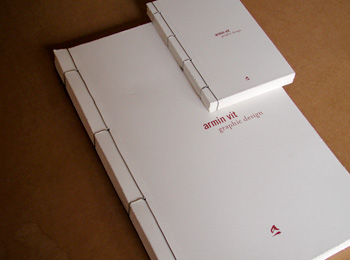
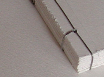
On my own personal portfolio... it's old, like three years old, but I still love it. It almost cost my wife her index finger, but we were able to sow it back together in time. It's around 13 x 19, double (glued back-to-back)130 lb watercolor paper, custom-bound (by my wife) with wire. It's almost two inches thick. I have around 15 projects in it. I also created the infamous minibooks in good Porftolio Center fashion, which are mini me's of the bigger portfolio. Like patric's, they are wrapped in an anti-static metallic bag. I'll take some shots of it this weekend... being that I live in darkness, I have no lighting to do so right now.

Also, I put all of it in an all-stainless steel briefcase... which totally froze to my hand when I was interviewing here in Chicago during January and February.

On Oct.01.2003 at 08:29 PM
Tan’s comment is:

> It almost cost my wife her index finger, but we were able to sow it back together in time.

holy crap! Were you being literal here, or were you exaggerating? Sounds awful.

On Oct.01.2003 at 08:49 PM
jonsel’s comment is:

It's a common joke that you can tell the seniority of a designer by the size of their portfolio.

So true. My student book was 11x14 because I knew I would be flying with it and refused to check it through. Another grad at the time had made a 30x40 book (!) and I ended up interviewing for some of the same positions. One interviewer kept thanking me for not wasting acres of black boards and keeping it small.

Good luck Priya. Take some pictures and let us see!

On Oct.01.2003 at 08:50 PM
Armin’s comment is:

> holy crap! Were you being literal here, or were you exaggerating? Sounds awful.

I may have exaggerated a bit for dramatic effect. I should have said that it almost cost her a good 1/4 of her index finger. We have a picture of it somewhere. It was really bad, sliced through the fingernail and everything. Funniest thing (and God love her), she made sure not to drop blood on the portfolio.

On Oct.01.2003 at 08:57 PM
Christopher Simmons’s comment is:

I've reviewed more portfolios than I can remember (both at work and at several AIGA portfolio review events) but I can remember a few. Usually I remember them for these characterstics:

Clear

Concise

Compelling

Character

Craft

Clear

If I can see the work and understand the context in which it should be considered (i.e. is this student work, if so what was the assignment? is this a poster or a post card?, Etc.) then it's a win. Most books fail right here.

Concise

Is this representative work, or every fucking thing you ever touched in your life? Quality over quantity. Breadth over depth (generally speaking).

Compelling

Why do I want to look at this? Is there anything interesting about this work that I can relate to. This generally has more to do with the subject of your work and little to do with the form.

Character

Why is this YOUR work and no one else's? What do YOU bring to the party? I typically look for articulate writing (say brief descriptions of each piece) as an indication of the designer's character. I also consider the format of the portfolio. Some schools teach portfolio classes which result in very slick tidy little books. That's great and all, but after you've seen two dozen books in identical format it feels like Costco started stocking designers.

Craft

Whatever you do (box, book, boards, video, whatever) do it well. A fancy book execute poorly is a poor book. A plain book executed flawlessly is exquisite.

Lastly, I always look for four things in the work itself:

1. Excellent type (that eliminates 90% right off the bat)

2. Awesome logos (my personal predjudice)

3. Vision (your design philosophy)

4. Something extra (that "new" idea that no one else has)

On Oct.01.2003 at 10:28 PM
ps’s comment is:

if you are looking for a job as a designer, i believe up to 12 pieces is good. as long as each piece is good. i'd rather see 3 good projects that you can talk about than 12 mediocres.

as far as getting clients as a designer. they should check out your work first. and the web makes that easy. if they want to see a portfolio in a meeting, i'd assume that would be a bad sign. the clients that respect our work usually don't ask to see work during a meeting but the meeting concentrates on their "issues". not the way your book looks.

On Oct.01.2003 at 11:02 PM
pk’s comment is:

Funniest thing (and God love her), she made sure not to drop blood on the portfolio.

i love this. everyone worth their salt has a story like this one, and it's usually from a sleep-deprived week in senior portfolio class. they always put priority on not bleeding on the work.

i'm missing the tip of my right pinkie for this very reason - we should do a thread: "show us your design-related maimings!" bet there's some good ones.

my take on portfolio sizing from my days of hiring for a larger company:

keep the size reasonable...i had to keep a lot of pieces filed. some got lost because i had no idea where they could be kept, and being in an open office plan...well, things walk away, especially when they're neat. people like to play.

also: if the portfolio was fragile, i'd usually ignore it (unless something really jumped out). if the work's too precious to be handled, then i'm not hiring them.

On Oct.01.2003 at 11:53 PM
Armin’s comment is:

> i'm missing the tip of my right pinkie for this very reason - we should do a thread: "show us your design-related maimings!" bet there's some good ones.

Friday. The topic had already been suggested! Good stories will surely come out. So hold on to those war stories.

On Oct.02.2003 at 08:33 AM
Darrel’s comment is:

Just label the work w/ client and some very brief specs. Most reviewers will know what they're seeing -- you don't want to insult their intelligence by over-explaining something. Besides, the work should speak for itself.

I have to side with Garrick on this one. The work, itself, can't possibly speak to the goals of the project, the specs, restrictions, measured successes, etc. So, I'd definitely try and put in a blurb about the project that describes the process and goals (as opposed to simply labeling the object...ie: use 'the client needed an affordable, practial way to distribute their capabilities to potential clients. This mailer succeeded in that... as opposed to 'this is a brochure for the client')

MN AIGA is revamping their interactive award show this year and are now (finally!) going to judge entries on the business process and solution more so than surface aesthetics. It's the story we should all be interested in...not the decoration so much.

It's a common joke that you can tell the seniority of a designer by the size of their portfolio. Enormous-sized cases usually means fresh-out-of-school.

Haha! I'm pretty sure that the portfolio manufacturers lobby art school professors to push the whole 16x20 board thing...

Oh...as far as 'fun' cases...the last firm I worked at, we used the 8.5x11 color laser printer + bound portfolios and then sealed them in heavy-duty plastic with one of those food-saver things. We usually threw in a few plastic toys and seemed to always impress.

On Oct.02.2003 at 09:54 AM
Armin’s comment is:

> Oh...as far as 'fun' cases...

My wife's company's portfolio is wrapped in a leopard pattern felty cloth... no kidding.

On Oct.02.2003 at 11:30 AM
Tom’s comment is:

As far as portfolios I remember, I once saw one of Modern Dog’s cases. The outside was brown fur with a red dog collar wrapped around it! The inside was just crammed full of great printed pieces that you just picked through like an old chest in your grandparents attic.

On Oct.02.2003 at 11:53 AM
ps’s comment is:

My wife's company's portfolio is wrapped in a leopard pattern felty cloth... no kidding.

your wife and my girlfriend should get together...

On Oct.02.2003 at 12:01 PM
Tan’s comment is:

> The work, itself, can't possibly speak to the goals of the project, the specs, restrictions, measured successes, etc.

Of course it can't. But in many ways, the outcome is the outcome, regardless of the circumstances or compromises. If a piece is 2-color, I assume there were budget limitations or the client was nonprofit -- no need to explain that to me. If there's an event package for a conference, it doesn't matter how big the conference was, or how much money the client had to spend -- I'm evaluating the success of the design and the execution, not the project management.

There's also a difference in approaches, depending on the seniority of the position you're applying for. If it's an entry or associate level design position -- most ADs will be looking for concept and design execution abilities. A senior design position will be different -- and project details like quantity, distribution, budgets, and other client-related criterias will matter more. And yes, written communication skills are a plus, but don't think for one moment that a slick case study will compensate for mediocre design. In fact, it makes things worse I think.

Judging a job portfolio is not that much different than having your work judged for a design competition. CA doesn't ask for a case study breakdown -- the piece either works or it doesn't. It's idealistic to think that the typical AD wil have time to evaluate things any differently.

Now, if your portfolio is good enough to get you to an interview, then of course be prepared to explain the work and follow-through. But I think it's a waste of your time and the AD's time to write up a one-sheet for every project you have in your portfolio.

Have enough confidence and conviction in your work to let it stand. And show some trust in the ability of the AD who's reviewing it that they're knowlegeable enough to evaluate and understand work of someone less-experienced. That shows more professionalism to me.

On Oct.02.2003 at 01:16 PM
Tan’s comment is:

> MN AIGA is revamping their interactive award show this year and are now (finally!) going to judge entries on the business process and solution more so than surface aesthetics. It's the story we should all be interested in...not the decoration so much.

It should be judged on the effectiveness of communication through design.

A design competition that compensates process with final results is a total copout. Do you think customers or clients give a shit how it was done? All they care about is how it works, and how effective the messaging was and how it influenced them to act.

On Oct.02.2003 at 01:29 PM
jonsel’s comment is:

how effective the messaging was and how it influenced them to act.

And how is this supposed to be judged? I'm not sure judging the actual process does much, but it would be very valuable to know more than just the typeface selection in a winning entry. Putting the greater emphasis on successful communication vs. the surface look is a strong credibility builder for design.

On Oct.02.2003 at 01:58 PM
David W’s comment is:

But in many ways, the outcome is the outcome, regardless of the circumstances or compromises.

Tan, you've said stuff like this before and I always disagree. If you only evaluate design by what it looks like, it's a beauty contest. A piece that is aesthetically perfect but inappropriate for the audience is a failure. If you don't know the audience, then you are not evaluating it correctly. That's just one example. I want to hear explanations also. Looking at a book separates good from bad but listening to the person separates great from good.

If there's an event package for a conference, it doesn't matter how big the conference was, or how much money the client had to spend

Really? I think both of those matter. Both would affect what you would design and why.

On Oct.02.2003 at 02:20 PM
Tan’s comment is:

we're really getting off topic here, but it's an interesting tangent.

what you've asked is the basic dilemma, isn't it Jon? What are the criterias of effective design? There is a definitely a business correlation, but is it a measurable, repeatable standard that can be used as a guage? And does that always correlate to effective design?

We did one job for the city transit system -- 2 small brochures on a 7-day deadline for completion. It was crazy, but extremely lucrative. In the end, the brochures looked great, was extremely profitable, made the client happy, and served their needs perfectly. But they're still just transit rack brochures. I would be delusional if I thought they belonged in a design awards annual.

Now we also do some work for a number of nonprofits. The jobs are a struggle from beginning to end. The clients are challenging, and the implementation of the design once it's done is spotty at best. So the business results are mixed, if measurable at all. But I'm quite proud of some of that design work, and hopeful that we will get design recognition for our efforts to elevate the project and client messaging.

I don't have a moral here, but just pointing out that "business" measurements of design is not as clear cut as it seems.

On Oct.02.2003 at 02:21 PM
Tan’s comment is:

> If you only evaluate design by what it looks like, it's a beauty contest. A piece that is aesthetically perfect but inappropriate for the audience is a failure.

I think you misunderstand me here David. I think audience messaging and client requirements are indeed important -- but the compromises that designers need to make to accommodate those requirements should be transparent. Too often, client limitations are touted as legit excuses for mediocre design work. My point is that good firms, and good designers, somehow manage to deal with shitty clients, and produce amazing, exquisite design. You never hear about their budgets, approval processes, focus study findings, or any of the business muck they might have endured. The important achievement is the quality of the end result.

To say that "the client only had $10 to do this, so that's why it's less than flawless looking" is a copout. At least it should be when judging design abilities, not project management abilities.

Look, you can keep arguing about business process if it makes you feel better about the quality of your design work. I simply choose not to.

On Oct.02.2003 at 02:31 PM
David W’s comment is:

But the fact is that when a logo or any piece of design is created and released, it must stand to be judged on its merits and the things it communicates. Sorry, but there are no circumstancial considerations that we need to know about the logo other than what we see. That's the harsh reality of design. Good intentions mean nothing in the end. Either it's good, or it isn't. - Tan

On Oct.02.2003 at 02:44 PM
jonsel’s comment is:

To bring this back on topic, and I think this point has been made, I'll just reiterate. I'm happy to see beautiful looking work in a portfolio. If it has been dropped off, and I'm reviewing it, having nice looking work is the fastest way to get me to meet someone. But once we meet, I better hear about how you came upon the solution and why it was right for the client. That satisfies my criteria for hiring: good design ability combined with intelligence and an understanding of business. Anything more can be taught.

On Oct.02.2003 at 03:12 PM
Darrel’s comment is:

If a piece is 2-color, I assume there were budget limitations or the client was nonprofit -- no need to explain that to me.

Well, maybe I didn't word that very well. You are right, the process (of manufacturing) is self-evident. What I'm suggesting is that you need to say why you did something. What was the business problem you were trying to solve and how did whatever you make solve that problem. Obviously, saying that 'the client needed a logo so we designed this logo' is wasted type. ;o)

but don't think for one moment that a slick case study will compensate for mediocre design

If it's mediocre design, then the case study is most likely mediocre as well.

CA doesn't ask for a case study breakdown -- the piece either works or it doesn't.

I find this a major, major problem with most graphic design shows, IMHO. It's just a bunch of pretty pictures. The nicest visual piece may have actually been a complete design failure because it met none of the needs of the client. There may be little-to-no correlation between the actual success of a design solution and what gets printed in the CA design annual.

It should be judged on the effectiveness of communication through design.

Of course. But how can you judge the effectiveness without a set of parameters to base your analysis off of?

A design competition that compensates process with final results is a total copout.

Not sure what you mean by that.

Do you think customers or clients give a shit how it was done?

They better give a shit. That's what they're buying: a process to achieve a design solution.

The process defines the goals and the measurements needed to take to determine success. All to often that process is ignored in design competitions and instead becomes a "who's prettier?" contest.

There is a definitely a business correlation, but is it a measurable, repeatable standard that can be used as a guage?

It only needs to be a measurable guage for that particular project.

And does that always correlate to effective design?

Umm...does what correlate? The guage? Well, on a per-project basis, yes, it should. Sometimes that guage/task/goal/measurement of success is *solely* aesthetics, but certainly not always, and probably not even a majority of the time.

But they're still just transit rack brochures. I would be delusional if I thought they belonged in a design awards annual.

Ah, well, then it sounds like we're just debating what we think a design awards annual should be.

IMHO, as for CA, we buy it and look at it for pretty pictures. CA knows that, that's how they make money. I say they leave well enough alone.

However, a local AIGA awards show, which is targeted at fellow designers, SHOULD have an emphasis on the process and business aspects of what we do. It sounds like your transit project was a very succesful design, even though you don't think it was flashy. I can get flash in CA, but sometimes I want meat.

I think audience messaging and client requirements are indeed important -- but the compromises that designers need to make to accommodate those requirements should be transparent.

They're not compromises...they are the parameters of the project. ;o)

On Oct.02.2003 at 03:36 PM
Tan’s comment is:

This is turning out to be the basis of a great discussion. Really, someone neutral should start it (Armin?).

...and touché, David. I hate it when my words are thrown back at me :-)

I'll say this. I don't think we're disagreeing that much here. I do believe in tangible business values of design. And I do acknowledge the parameters of clients and projects. I'm the one who touted business numbers in argument against the UPS rebrand, remember?

But where I disagree is whether or not it's necessary for young designers to include detailed write-ups on the back of their design pieces. I don't think it's necessary -- or helpful. In fact, for inexperienced designers, I think business parameters can give a false sense of security about their design work. And I agree w/ what you're saying Darrel, but the truth is -- our profession values work by CA superficial standards first, business substance second. It's idealistic to think otherwise.

How that's been morphed into a discussion of the validity of business measurements in design is one of the phenomenas of SpeakUp.

On Oct.02.2003 at 04:02 PM
jonsel’s comment is:

The nicest visual piece may have actually been a complete design failure because it met none of the needs of the client.

Ok, screw the thread. I really wish I could remember the actual specifics, but I recall an annual or a show that featured comments from the design firm and the client. In one particular piece, an annual report, I think, the design firm was very proud and happy, but the client stated outright that they would not be working with the designers again because they felt the design firm was merely looking for awards and not truly responding to the needs of their business.

That is the kind of design show I would love, where the winning pieces, even if they are chosen by a design-based jury, featured comments/interviews with the actual client company. It shows both sides of the story and could be quite educational for all firms.

On Oct.02.2003 at 04:06 PM
Armin’s comment is:

> This is turning out to be the basis of a great discussion. Really, someone neutral should start it (Armin?).

Hey, don't look at me, I just work here.

Seriously... Keep it going right here, otherwise it will be a forced discussion; I think we have had spin off discussions in the past and it's just not the same. The fire, as they say, does not burn as much. I'm feeling poetic today.

On Oct.02.2003 at 04:40 PM
Rick G’s comment is:

Late to the party as I usually am, but Jonsel, that is an amazing idea.

What the client wants or needs isn't always the best-looking solution, and I think a show with input from the client is a kick-ass idea. How well does the project stand up in the boardroom / supermarket / layout? There's the rub.

-R

On Oct.02.2003 at 04:41 PM
Tan’s comment is:

The show you're referring to Jon was the Mead annual report show from about 4 or 5 years ago.

The design firm spoken about was Leimer Cross here in Seattle. I remember the awards book. I thought it was interesting too.

Design isn't servitude. It's a mutual, service relationship between two businesses. And it depends on the perspective of the evaluators.

Take annual reports. I've attended past NIRI (national investor relations institute) annual report shows. Their criterias are very valid -- if taken from the perspective of an investor relations client. But it doesn't take into account the originality of design, or strength of concept messaging, or production quality. And they never talked about the process of working with the design firm, who is just another vendor to them. So...why argue about which side is more valid?

Unlike the cliché -- the client isn't always right. They might think they're right, or pay for you to agree that they're right -- but it doesn't mean that they are.

On Oct.02.2003 at 05:04 PM
graham’s comment is:

priya-never just leave your folder to be looked at. if you can't get in to see someone and speak about your work, try later and/or try the next place.

just show the work you're most happy with and forget everything else. you'll find somewhere you actually want to work at that way. clients can be wrong.

On Oct.02.2003 at 05:19 PM
jonsel’s comment is:

the Mead annual report show

Tan, thanks for finding that. I'm glad I didn't just make it up. As the old saying goes, there are 3 sides to every story. But having both sides, especially if from different perspectives, gives all the opportunity to figure out where the (partial?) truth lies.

the client isn't always right. They might think they're right, or pay for you to agree that they're right

Unfortunately, even if the client doesn't see it our way, they are the powerful in the relationship. They do pay us. So it behooves us to come to a meeting of the minds with our clients. In the end, we have every right not to work with them again and they have every right to work with another firm.

On Oct.02.2003 at 05:38 PM
graham’s comment is:

jonsel- "Unfortunately, even if the client doesn't see it our way, they are the powerful in the relationship. They do pay us. So it behooves us to come to a meeting of the minds with our clients. In the end, we have every right not to work with them again and they have every right to work with another firm."

blimey. yup. true enough. the sun might not rise in the morning. a bird in the hand is put off 'til tomorrow what you can do today. what if, like, our universe is like inside a piece of dust under some giant kind of guys thumbnail? why is the sky blue? clients can still be wrong.

On Oct.02.2003 at 05:54 PM
Chris Raymond’s comment is:

I agree totally with Graham: it's as much (if not more) to do with you finding a place you want to be part of as them finding someone they want to employ.

I would love to hear thoughts on the types of questions a designer should ask at an interview to get a good handle on what the place is really like to work at.

How can you find out how a firm really finds clients (anyone they can get vs. ones that value design), the nature of the client relationship (strategic partnership vs. service provider taking orders)... I guess what I am getting at is how to get behind the facade of some printed pieces on the walls to an accurate read on what it would really be like to work for this firm?

On Oct.03.2003 at 09:57 AM
Roballoo’s comment is:

Thank you for all of the great coments. I've lernaed a lot (like maybe my portfolio is perhaps a bit to big :)

I remember reading a book about portfolios from around ten years ago. One of the examples they showed, was illustrator Henrick Drescher's and stated that he had soaked it in a bathtub to give an extra added patina! It actually seemed to fit his work. If you've ever seen any of his lovingly bizarre illustrations and childrens books, you know what I mean.

On Oct.03.2003 at 09:27 PM
Big Steve’s comment is:

How about a couple of sample photos of page layouts, presentations boards, binding schemes, covers etc.? Might be helpful to young and old alike...

Great topic, I'm definitely archiving this for future use.

On Oct.03.2003 at 10:35 PM
kia’s comment is:

My design portfolio is leather-bound, 8.5 x11, about 15-20 pages with the actual printed pieces when they're small enough to go in the sleeve. It's separate from my photo portfolio, which is slightly bigger, and square. I like the sleeve format rather than a bound book because it lets me switch things in and out so I can tailor the work to the client. I've seen excellent portfolios consisting of nothing but postcard-sized cards, clamshell boxes, even spiral bound color copies. I think the key is just find something that works with your style.

However, 'cause I'm a student again, and I'm still working on my photo portfolio, I spent a lot of time last term going out and talking to people at ad agencies and design firms about what they think about different portfolio formats.. Mostly they were talking about photographer and illustrator portfolios, but I think a lot of the advice applies to design books too. Things pretty much everyone I talked to (mostly agency art buyers and art directors) agreed upon:

1. Don't make the outside more interesting than the inside. This doesn't mean it has to be black, but keep it understated and utilitarian. And never use a metal portfolio case. They scratch the hell out of desks.

2. Don't use boards, and don't use transparencies. It still works for some people, but they are a) heavy and b) hard to handle. Do you really want somebody to be viewing your work by holding it at arm's length up to the fluorescent fixtures or even the window when you spent all that money on 4x5 transparencies to show off the details of your design? I didn't think so.

3. Make it fit in a Fedex box. The secretary who has to mail it back will thank you. I actually met an art buyer who was recovering from a back injury from trying to lift a portfolio that was too big. You can bet that guy didn't get the job.

4. Experimental is great, but show that you can do practical things too. Don't show only practical things unless you want to do boring stock-photo-filled brochures for the rest of your life. I learned this the hard way.

5. If it's a school project, don't say it's a school project unless it's painfully obvious it's a school project. If it's painfully obvious it's a school project, you might think about taking it out.

6. There are lots of different ways to organize your book. I found the best way for me to do it was to lay everything out on the floor and find stuff that went together for a more organic "flow" of work. Everybody I talked to said it was important to begin and end the book with a "wow" piece. Also end with something as a leave-behind they could stick in their files for later like a promo piece, mini portfolio, or business card - preferably something with your web address (containing an online portfolio) so they can bookmark you and see more of your work.

7. If you have multiple bodies of work (say, illustration and design), make multiple books. You might even consider having one "work" book and one "personal" book to show off your more experimental or non-commercial stuff.

8. Write lots about the work, or write nothing. Either way, be prepared to talk about your work. Practice practice practice. Explain it to your friends. Be confident and positive about it, and show a real thought process behind what you did. This part has gotten me more jobs than the book, I think.

9. A few people absolutely *gushed* over the quality of Epson inkjet prints. I like 'em too. I've also seen some lovely Epson-printed portfolios designed like real books and bound.

10. Whatever you do, make it look nice and clean and well-put-together. Your portfolio should look like it belongs together, not just like a bunch of print-outs you shuffled together at the last minute.

On Oct.04.2003 at 12:34 AM
darrel’s comment is:

Per the last comment about school work, I agree, don't say it's school work. However, how do you actually label non-client work?

I'm probably not alone in having a few school projects or 'proposed' solutions that are worth putting in as they show a side of work that i like to do (mainly logos), but haven't necessarily been doing professionaly for a variety of reaons.

Do you say 'proposed' or 'not used' or do you say anything? (Which goes back to the argument about how much you describe things in the portfolio.)

On Oct.06.2003 at 03:08 PM
kevin’s comment is:

I'd say that your biggest asset is your common sense. But when in doubt, don't ask the interviewer if they liked your "Black Book", they may think that you're being oddly perverse.

great luck!

On Oct.06.2003 at 03:19 PM
jonsel’s comment is:

school work

If you are right out of school, it will be obvious, so don't hide from it. If you are several (2-3) years out, you should mostly clear out your school work from your book. After 4 years, you better have done something worth putting in the book by now! Ditch the schoolwork.

As for personal, or more experimental work, just label it as a personal project or have a separate book for it. I've had friends who've done this and won jobs based more on the personal work than on their job-based work. This is especially valuable if your current job isn't up to your creative standards.

Do you say 'proposed' or 'not used' or do you say anything?

I have a lot of "proposed" work in my book, simply because I worked on teams a lot in a large agency, so my work wasn't always selected. I'd label it "proposed" if you need to label it at all.

On Oct.06.2003 at 04:04 PM
Priya’s comment is:

holy crap. i leave to visit my parents for one measley weekend and miss a great discussion. i too am bookmarking this ish.

i second Big Steve and ask for photos of books. :)

On Oct.06.2003 at 04:55 PM
Tan’s comment is:

sorry, but my school portfolio slowly got taken apart years ago. The 'portfolio' these days are just actual samples of printed work, brochures, books, etc. It exists solely for clients.

But if you can all wait 2 weeks -- I'll take some photos of the student portfolio exhibition at the AIGA conference. There'll be about 200 students showing their goods there. I'll bring a digital camera and snap some of the best ones.

On Oct.06.2003 at 06:27 PM
Adam Waugh’s comment is:

I've got a question about showing one's book..

My 10-piece show portfolio is still-- in good part-- student work, and is all stuff from within the last six months. It's a good array of basic skills and all, but now that I'm out and am doing work for my own clients, and working with companies and agencies on projects, I'm finding that every project I do is leaps and bounds better than anything I've done in the past. So that means at any given time I'll have a project I love, and nine more that are to some extent-- less amazing.

Is there a point where a designer just gets good, and their product quality plateaus? Or are we always showing work and touting its merits, while biting our tongues about the piece's shortcomings?

We're taught to never talk bad about our own work, so of course we shouldn't talk about what we could have done better (right?), but how can one ever bring forth a body of work that's as good as the work we can do now?

On Oct.06.2003 at 06:44 PM
Mark’s comment is:

I think that we need to consider the appropriateness of the 'leave behind' portfolio. I agree that if you have it , flaunt it but flaunt the relative pieces that you think the company or client may want to see. Also variety of work not only shows your skill but your personality as well. My portfolio consists of commercial work, conceptual work as well as college work.

Based on my experience alot of the creatives I've met were as impressed with my past, present and future (experimental) work because the narrative of my portfolio shows my development as a whole. It makes me feel confident as well of who I am.

On Oct.17.2003 at 08:28 AM
Patrick’s comment is:

If you are right out of school, it will be obvious, so don't hide from it. If you are several (2-3) years out, you should mostly clear out your school work from your book. After 4 years, you better have done something worth putting in the book by now! Ditch the schoolwork.

An anecdote: I had one piece from school that stayed in my portfolio for about 4 years (It is still on my website, though it's long overdue to come down, I just haven't updated in a while). When I was looking for a mid-level design job, about two years out of school, I had an interview with Steve of Belk Mignogna (when they were still around). He commented specifically on it, saying he appreciated seeing a piece or two like that in there because it showed what I could do when give full creative control (I did all photography and most writing for it, in addition to the design). He said it was valuable to see, as most of the professional work in my book was rather conservative, a function of the clients and CD at my first job as a Junior Designer.

On Oct.17.2003 at 10:16 AM
bmcgee’s comment is:

This is a great discussion on portfolios, but what about your resume itself? I am in the process of looking for work... I have not had to do this in several years, so I'm a little rusty on the particulars.

I'm wondering; in today's job climate, should I generally stick to the "corporate rules" of resume structure, and let my book/site speak for my work? Or am I expected (as a designer) to do something creative with my new resume? e.g. I once sent out my resume in a tiny blueprint tube with mechanical drawings throughout... is this type of "gimmick" advisable today? If so, what kinds of things are you guys doing with your resumes?

On Oct.30.2003 at 02:17 PM
jonsel’s comment is:

is this type of "gimmick" advisable today?

Everything has its function, and the resume's is to quickly (and honestly!) convey your past work history. So within that function, what can you do to make it stand out? If you have a nice personal logo, use it here, like on letterhead. You can use interesting paper, even in a slightly different size (but not 30x40). I personally love monarch-sized resumes. Then, format it with some great typography in a nice grid(which will show those skills) and leave it at that.

Save the gimmicks and cool layouts for a separate leave-behind that the Creative Director can keep. The resume will most likely get filed (if there aren't openings at the time) by a Human Resources Mgr. or an Admin. person, so it has to be able to fit in a file and be recalled easily.

On Oct.30.2003 at 03:37 PM
Armin’s comment is:

I am more inclined to read a well, clean type-set resume than something with florid or cute illustrations. I want to read the facts and I want to read them quickly. Sometimes it's kind of cool if they come in some sort of fancy package, but in the end, it all comes down to clarity and professionalism. I have seen many grads from Portfolio Center with "cutesy" or "industrial" work in their portfolios but they never show their style in their resumes... which is a good thing.

On Oct.31.2003 at 12:27 PM
Jill’s comment is:

Recently I had to hire several designers (what amounts to almost half of the department) in quick succession: so the last few posts to this thread resonate strongly. I was surprised this time around at how little attention was given to the appearance of the many of the cover letters/resumes that were submitted. I agree that clarity and professionalism (and, for me, brevity) are paramount, though I am a sucker for the well-considered "gimmick".

Resume cosmetics aside, the strength of the portfolio is the primary gauge I use when extending offers to folks. I look for recent, relevant pieces, but don't mind if there are a few beloved artifacts from student days, for the reason Patrick mentioned. Other things I hope to glimpse during an interview are a sense of humor, a passion for typographic minutiae, and verbal agility. My background (entered book design from the editorial side of publishing, i.e. no formal design training) might explain why these things factor into my decisions more than, say, where one went to school. So there is a lot of luck in the process as well: how you connect with whomever is doing the hiring. Obvious point, perhaps, but a reminder to be yourself, and have confidence in what you are offering to prospective design groups. (This last part might be more appropriately posted to that other great thread currently under discussion.)

Armin, thanks for creating such an excellent forum.

On Oct.31.2003 at 11:07 PM
Armin’s comment is:

My pleasure!

On Nov.01.2003 at 11:20 AM
Bram’s comment is:

Some of the previous responses covered pretty much what I would've said, that your portfolio will be the real demonstration of your design ability.

I'll just add this — use your resume as an opportunity to show off your information design skills. You can put some personal flair in it, but keep in mind that its primary purpose is to get the facts across.

And don't neglect the content (and spelling, grammar, and punctuation) for either the resume or the cover letter . . .

On Nov.03.2003 at 10:52 AM
Priya’s comment is:

thanks to all that posted. after making a simple japanese stab bound book showing only the cream of my crop, i sucessfully aced the interview and got an offer. now i must find a place to live in new york!

thanks to all that contributed. i love you guys.

On Nov.03.2003 at 07:12 PM
Armin’s comment is:

Me, on October 1: I'll take some shots of it this weekend... So yeah, a week turned into a month and Priya already has her portfolio together. I wanted to share my book to (hopefully) inspire her� too late. Anyway, I finally took some pictures so I'm just going to put them up to reward my own effort of taking them.

Big portfolio and mini-me version

Detail of tip-of-finger-losing binding

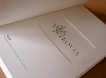
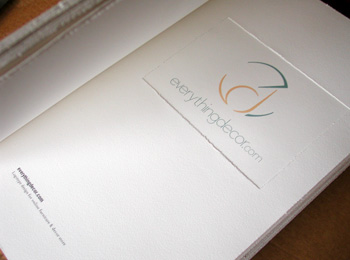
A couple of shots of the inside

Yeah, those logos are huge (almost 4 inches), I can't believe I ran them that big. Live and learn.

On Nov.06.2003 at 09:06 AM
Priya’s comment is:

better late than never, armin. that book is beautiful. how is the wire secured? my thread on my binding is that same stab stitch but it's knotted at the end.

textured deckle edged paper gives me delightful warm fuzzies.

On Nov.07.2003 at 02:19 AM
Armin’s comment is:

> how is the wire secured? my thread on my binding is that same stab stitch but it's knotted at the end.

Exactly the same, but it's not that easy to knot wire. Actually the two meeting loose ends of the wire are just twisted and placed on the spine so they don't show.

> textured deckle edged paper gives me delightful warm fuzzies.

I did that by hand, grabbed an old, worn xacto blade and roughed up every single page.

On Nov.07.2003 at 08:19 AM
patricia baca’s comment is:

Do you recommend showing originals of your work during an interview? besides the book?

What is the best way to write a cover letter? In first person or third

person? What information in it an interviewer is looking for?

thanks!

p.s. i am in process of looking/finding a job. there is no much posted

in the market. so i think the approach of

looking rather than just answer to ads should be different. what is the

roll of the cover letter in the "job hunt

On Jan.16.2004 at 02:27 PM
Armin’s comment is:

Patricia,

> Do you recommend showing originals of your work during an interview? besides the book?

Showing originals is highly recommended, specially if you are applying for a print position. It allows the employer to see your choice of paper, the way the piece feels and works, it lets them interact with it. Don't leave them behind though, take them with you.

> What is the best way to write a cover letter?In first person or third person? What information in it an interviewer is looking for?

Writing it in the third person is overly weird, specially if you sign it or is addressed by you. Use the cover letter to briefly introduce yourself, express what your intentions are (whether you are looking for a full-time job, freelance, etc.) They don't have to be very lengthy, it's just a cordiality that helps establish what you want. Don't give any redundant information that will already be in your resume.

That's my take, there are probably other folks here with more hiring power who can tell you what they look for in a cover letter.

Best of luck.

On Jan.16.2004 at 07:45 PM
Tan’s comment is:

Patricia --

Just adding to Armin's good advice.

Keep the cover letter to 1 short paragraph -- or just a little longer. Don't include anything personal, like where you're moving from, stuff like that -- keep it professional.

Address the cover letter to a real name, never "To whom it may concern". Include something that tells them it's not just a generic letter you sent out to 50 other firms, eventhough that may be the case. Refer to a client of theirs or a piece of theirs that you may have seen in a recent design mag -- let them know you actually know something about them.

And lastly, end the letter with a proactive action on your part, not theirs. Like "I'll call you within the next few days to see if we can set up a meeting to review my work." Never close the door by saying stuff like, "Please contact me if you have any questions or employment opportunities." Cause in most cases, they won't.

Keep the tone of your writing professional, but real. Put down the Thesaurus, and stick to words that sound more like how you really talk -- but grammatically correct. Be real.

And for God's sake, spell check all names and titles.

Good luck.

On Jan.17.2004 at 12:43 AM
Matt Council’s comment is:

I am relocating to Atlanta and have a few interviews scheduled. I gave them

this link http://www.coroflot.com/mcouncil and now I need to bring something

else to the interview. Or do I? Do I need to bring a CD with some custom

designs on them? What do you guys think I should do? I am all web so there

is no print work.

Also, if you know of anyone who is an Art Director or Manager in Atlanta? I

am relocating there in a few weeks and am looking for design work. Any help

would be greatly appreciated. Thanks a bunch.

On Jan.21.2004 at 05:02 PM
Armin’s comment is:

For web work it is kind of different. Art Directors or principals might expect you to leave some sort of digital leave-behind, although I'm not sure how that works these days in regards to web.

If you do leave a CD or DVD try putting it in one of these. Cool and different.

Perhaps you do a little printed piece to leave behind, as a way of showing your range — but only if you feel comfortable doing it, otherwise it will just have a bad effect.

On Jan.21.2004 at 05:15 PM
Matt Council’s comment is:

Thanks. I think I may use those boxes.

On Jan.21.2004 at 05:38 PM
Dan’s comment is:

As I gear up for interviews in the next few weeks, I want more than anything to not lug around my 18"x24" portfolio in the nasty Chicago weather again. I'm a newbie to the real world, though I've freelanced a bit here.

So I am designing a book, ala Mr. Vit (and a couple others I've seen around). The problem is, how big is too big for that? How small is too small? How can I bind it so the pages lie flat during discussion? Any ideas besides wire-O-bound or sticking it in a binder? What are some clever solutions you've seen for portfolios?

What if you have a logo, poster, and website for one company? Do you cram all that in there? Is that 1 or 3 pieces? Where do you draw the line?

Is a 11x17 foldable poster good for a leave-behind or is that too huge?

Is Kinko's my best/only bet at printing my stuff (I usually print my stuff at my former school, but I can't get back there any time soon).

If I have, say, a magazine I designed, should I put a couple spreads of it in my book and then show the interviewer the actual magazine (as I did back in August) or do I omit it from the book and bust it out in the end, hence no segue?

Hey Armin, how much did Coudal pay you for the Jewelboxing plug? Or do you feel bad for him since he got robbed in the Veer Lightboxing Challenge?

On Jan.22.2004 at 01:03 AM
Tan’s comment is:

I can't possibly answer all of your questions Dan -- but you can probably find lots of good advice from the 76 other posts above, many of which I bet will relate.

Lots of people seem to be very paranoid about number of pieces, size and format in their portfolio -- which are all legit concerns. The case itself needs to be practical, clean, and professional. But I just have one advice to keep things in perspective.

Beautifully presented work, no matter how nice, cannot compensate for lack of concept in the work itself. So gear your portfolio to show how smart the work is, not how intricate or neat the package that it's in. Art directors aren't usually that easily distracted by shiny things. And not to discount Armin's pretty portfolio book, but I've seen similar ones before. It's the work inside that I should notice and remember.

So if you've designed magazines, brochures, annual reports, or branding systems that require more than a spread and cover to grasp the concept -- then put it in there. There's no subsitute for flipping through a well-thought out brochure or AR comp. A pretty photo of the work is just that, a pretty photo.

And I rarely remember what a designer's portfolio case looked like -- just the work.

On Jan.22.2004 at 01:56 AM
Dan’s comment is:

Thanks, Tan. I read this thread back when it was fresh and I read it again today. I wanted to post because there's more people reading here than in October, and I'm maybe seeking some new advice. It also tends to trail off in whacked out directions. I sure did ask a lot of questions, probably I should rely on common sense to answer most of them.

I have my portfolio together, but it's freaking huge. I hate it. I can't believe I ever let anyone convince me to shell out $130 for it when I can make my own and it will look nicer, be cheaper, fit on a desk, and be portable. Walking around the city in nasty wind with a gigantic leather case is like toting around your iMac on the bus. Plus, it can be awkward reaching across the table to turn the page, and that damn plastic covering...there's enough static electricity to suspend an infant from a ceiling.

I like Armin's book because it's a good solution to how to show work. I don't think I'll have too much shimmer, just a well-structured book that lets the interviewer see my craft and thought, like in my resume and cover letter, but not my gidgets and gadgets.

On Jan.22.2004 at 02:33 AM
Armin’s comment is:

A good article by Ellen Shapiro regarding the current state of portfolios on Communication Arts, where our own, wise Mr. Le is quoted.

On Mar.26.2004 at 09:17 AM
JonSel’s comment is:

The PDF route is indeed a good one. I've been doing that for the past 2 years. It's been very successful at getting me from "who is this guy?" to "Please come in and meet our team." I have three different PDFs. One is packaging heavy, another identity-focused, and the third is a more general amalgam of work. Also, PDFs are easier to update with new work than my bound portfolio books.

The only time I've had problems with it are responding to craigslist ads, since those clients all seem to still only have 28k modems and incredibly small mailbox limits. Of course, I've learned there are many other reasons not to respond to craigslist ads...

On Mar.26.2004 at 10:50 AM
sf’s comment is:

Ok, I have been struggling with putting my porfolio together for a while (obviously I'm not in a huge hurry, but it needs to get done). I've been getting stuck on how to create a portfolio that is a good design in itself (hopefully equal to the work in it) and easy to handle. So, I read this entire thread and I'm not sure that I heard of any easy to manage, seamless, clean, attractive ways of presenting actual pieces in a portfolio.

If it's in a presentation case with those top loading polypropylene sheet protectors, you still have to mount the piece somehow so it's not swimming around in there. For boards, I've used photo corners, but it's very unwieldy to remove the piece to show the interior pages. A lovely bound book like Armen's...I don't know. Armen, how did you present multipage pieces in there? I only saw logos...

Anybody have any other ideas about this? I would really appreciate more input!

Thank you!

On Feb.13.2005 at 05:05 AM
Armin’s comment is:

Missed answering this one�

> how did you present multipage pieces in there? I only saw logos...

For multiple image pieces I took pictures or screenshots for web sites and placed three squares in the same page.

> So, I read this entire thread and I'm not sure that I heard of any easy to manage, seamless, clean, attractive ways of presenting actual pieces in a portfolio.

For actual pieces I would recommend a "special" container for them that goes inside your main, large portfolio case. It can be as simple as a bellyband that holds the pieces together to a nice, thinner and lighter box to a cool, smallish bag. Do not do the photo corner thing, it's utterly annoying if an interviewer has to deal with taking the pieces in and out and the corners will most likely fall. Actual pieces need to be handled, fondled and twisted (sometimes) so make sure they are easily grabable and accessible to you and the interviewee.

> If it's in a presentation case with those top loading polypropylene sheet protectors, you still have to mount the piece somehow so it's not swimming around in there.

That is a bad look, it feels like it wasn't thought through. Unless you find a way to really hold them in those sheets I would recommend the keeping the actual pieces separate.

On Feb.17.2005 at 02:47 PM