Speak UpA Former Division of UnderConsideration
The Archives, August 2002 – April 2009
advertise @ underconsideration
---Click here for full archive list or browse below
  
“Friday Five” — Speak Up style

In the tradition of fridayfive.org’s simple five questions at the end of the week and in a modest celebration of “Heart” Day, here are some simple-to-answer, themed questions to which all of you clever Speak Up folks may ponder and post:

1.) What’s the most clever print or Web advertisement that you’ve seen for Valentine’s Day this year?

2.) Which graphic designer/illustrator/or photographer would you say has the most consistently “romantic” style, and 3.) what about their work makes you characterize it so?

4.) What PMS color (Webbies can answer in RGB, if they want) most says “love” to you, and 5.) why?

Maintained through our ADV @ UnderConsideration Program
ENTRY DETAILS
ARCHIVE ID 1368 FILED UNDER Miscellaneous
PUBLISHED ON Feb.14.2003 BY joy olivia
WITH COMMENTS
Comments
joy olivia’s comment is:

Let me start things off (surprised?)...

1.) What's the most clever print or Web advertisement that you've seen for Valentine's Day this year?

First thing this morning I saw Google's festive spin on their logo, which I find amusing but nothing too saucy and, well, not really an advert either. When I checked my Yahoo! account this morning, I found the photo used in a boring banner ad for eDiets to be cute, but nothing tops Tiffany's understated and classy frontpage. (Am I showing my girlie-ness too much by listing that as my supreme pick?)

2.) Which graphic designer/illustrator/or photographer would you say has the most consistently "romantic" style, and 3.) what about their work makes you characterize it so?

My vote goes to Henri Toulouse-Lautrec's poster work because (to me) of his use of color and fluid yet playfully simplistic illustration style gives me that warm and fuzzy feeling... which in a way a romantic sentiment, no?

4.) What PMS color (Webbies can answer in RGB, if they want) most says "love" to you, and 5.) why?

PMS 8103, which is a truly divine violet metallic with pinky and blueish undertones. It's warm but it can also be a bit cool -- which is perfect since love isn't always good and it isn't always bad.

On Feb.14.2003 at 12:36 PM
Michael S’s comment is:

Response to #2 & #3

I hate generalizing a designer to just style b/c there's a lot more going on with her work, but if you were to place 4 Valentine em's and 2 Halloween em's together in a blender, you would get 6 Margo Chase Em's www.margochase.com I'm not suggesting that she or the studio work is holiday themed, but the typography is interesting...

On Feb.14.2003 at 12:54 PM
Armin’s comment is:

I can only easily answer 2 and 3. I'll have to put more thought, and time, into the other ones.

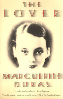
Most "romantic" designer: Louise Fili.

Why: c'mon, it's just beautifilly rendered type, colors that make you wanna cuddle up with your loved one and graphics that are reminiscent of everything that is good in life. This cover says it all:

On Feb.14.2003 at 01:44 PM
Darrel’s comment is:

Oh crap! Today is valentine's day...

On Feb.14.2003 at 02:21 PM