Speak UpA Former Division of UnderConsideration
The Archives, August 2002 – April 2009
advertise @ underconsideration
---Click here for full archive list or browse below
  
Show and Tell

Let’s try something different this morning. I don’t know if it will work or not, but it might be a nice sharing thing. Show us your favorite logo. It doesn’t have to be the best one, but your favorite one. A logo that you may have some sort of sentimental attachment to, or one that was just really hard to come up with but in the end it came out great. If you want to comment on other people’s logos you can do that too.

All logos will be in the comments window. Please use the code below to show us your logo, simply copy and paste it in the comments window, then replace the URL with an absolute path to your logo.

<img src="http://www.yoursite.com/image.gif">

Maintained through our ADV @ UnderConsideration Program
ENTRY DETAILS
ARCHIVE ID 1252 FILED UNDER Show and Tell
PUBLISHED ON Sep.30.2002 BY Armin
WITH COMMENTS
Comments
Armin’s comment is:

I did this logo to rebrand the firm I work at. It's probably not the most original logo ever, but it just has that combination of boldness and simplicity that really represents what we do.

On Sep.30.2002 at 08:56 AM
ale’s comment is:

I don't do logo for work, as a web developer, so the follwoing is my pretty naive attempt to logo on my own, for my own site.

Be Kind, please.

On Sep.30.2002 at 09:46 AM
arlo’s comment is:

I noticed the N logo at the top looks a lot like:


which I didn't do, but just figured I'd present it.

On Sep.30.2002 at 01:59 PM
Armin’s comment is:

And it also looks like this one, and I knew about this logo (done by pentagram) even before I started mine. I'm not a bragger, but I think my logo is better integrated than these two. And please if anybody doesn't think so, that's fine, say it, but let's not get into any discussions about it. It's just my opinion.

On Sep.30.2002 at 02:11 PM
ale’s comment is:

I like the norman logo, I don't think a 'n' letter in a circle could make two different logos look the same.

On Sep.30.2002 at 03:19 PM
joktu’s comment is:

I'm thinking �Saul Bass’ .

Were the letters for �norman’ hand-drawn?

AWCR, if not for the orange... For simplicity and good effect, would you consider dropping �solutions’?

Chris May, why not show us some of your exploratory for Palm Island.

On Sep.30.2002 at 06:40 PM
pk’s comment is:

favorite of my own:

the closet logo.

actually, i like the entire campaign. the logo's only a component. i think the writing is some of my better work.

favorites from others:

hasbro and playtex.

cheesy: yeah. i love hand-drawn advertising calligraphy, though.

there's a fantastic repository of logos in illustrator-compatible format here.

On Sep.30.2002 at 06:45 PM
Stephen Coles’s comment is:

Because I can’t decide on one, I’m going to be an unpardonable windowspace hog and post three logos. (The good Speak Up admins are welcome to remove any or all.)


Something I did for my school’s campus gathering place, a ’50s-era monolith that begged for a bit of fun-poking. My pal did the illustration using a bunch of original architectural drawings I swiped from the building’s admin offices. The font is Garage Gothic by Tobias Frere-Jones.


They make pre-fab blocks for construction. The font is Knockout by Hoefler.


A french skateboard corp that never got its wheels off the ground. Using the cat head for the ‘O’ came easy. Things that come easy are rare, so I’m fond of this project. The fonts are Sarcastic Girl Scout Bitch by Core and a roughed up Akzidenz Grotesk.

On Sep.30.2002 at 08:29 PM
herbert’s comment is:

That's only sentimental...

On Oct.01.2002 at 05:21 AM
ale’s comment is:

Talking about the sentimental side, what about this one:

Another one of my favourite is the "The Ladd Company" logo, remember the green tree appearing at the beginning of movies (is a movie distributor, actually). I remember the first time I saw it, it was for the 'Blade Runner' movie, it was great, especially related to that particular movie.

Someone could find it, I tried some searches but I didn' succeed.

On Oct.01.2002 at 06:51 AM
Armin’s comment is:

>Were the letters for �norman’ hand-drawn?

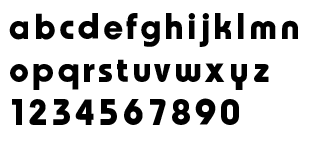
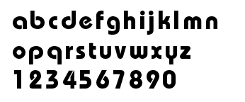
Not all of it, it's based off ITC Bauhaus extra bold, but the "a" looks horrible so I changed that one completely, then I made slight adjustments to the rest of "norman" and then I redid all the lowercase so we could use it in our brochure. Bauhaus has all those weird open letters, like the p,q,d,b,e,2 so I changed most of those.

On Oct.01.2002 at 07:08 AM
Armin’s comment is:

>Kiran

It would be nice to see it out of the box too, just AWCR in those big, bold orange letters.

>Stephen

Don't worry, the good admin people at Speak Up are really nice and will let you post all three logos. I really liked how you complemented them with the typeface information. I especially enjoyed the University logo.

>Sentimentalism

LEGO

On Oct.01.2002 at 09:18 AM
Stephen Coles’s comment is:

Armin - Nice idea on replacing the wacky Bauhaus glyphs. I'd love to see the rest of the modified face.

On Oct.01.2002 at 12:10 PM
Armin’s comment is:

Here you go Stephen:

And for comparison purposes, here is the original Bauhaus Demi:

On Oct.01.2002 at 12:58 PM
A Different Tom (A.K.A. Bossman)’s comment is:

This is one that I did for a comedy duo who kept using the word "edgy" when they talked about the stuff they did.

I'm not sure it's my favorite, but I'm convinced I could sell a ton of t-shirts with an S&M smiley face on them.

On Oct.01.2002 at 01:36 PM
Armin’s comment is:

Very much on target and very, very creepy. The eyes look like those eye-rolling cat wall clocks.

On Oct.01.2002 at 02:08 PM
Armin’s comment is:

(just thinking out loud)

Worst descriptions to come out of clients' mouths:

-Edgy

-Out of the box

-Make it Pop

-Traditional

-Free

On Oct.01.2002 at 02:10 PM
Armin’s comment is:

This one just got approved by the client. I like it because I was able to do some calligraphy, which I hated when they tried to teach me in college, but now I appreciate the effort made by the teacher.

On Oct.01.2002 at 02:25 PM
Darrel’s comment is:

Still my favorite:

For a company making livestock management software. Excuse the yellow. The only logo I could find online happened to be aliased against yellow.

On Oct.03.2002 at 04:51 PM
Armin’s comment is:

Darrel, that cow rocks man! I really like it.

On Oct.03.2002 at 04:55 PM
Hrant’s comment is:

> Herd-pro ... livestock management software.

"Previously only available for use by the US government!"

hhp

On Oct.03.2002 at 05:37 PM
Darrel’s comment is:

I feel dumb. I think I should understand your comment HRANT, but it went completely over my head. Sigh.

On Oct.04.2002 at 11:03 AM
Armin’s comment is:

Darrel,

Hrant is probably making some sort of social commentary about how the government treats it's citizens like cows waiting in line to be butchered : (

That's just my interpretation, sometimes it's easier to understand the meanings of your dreams than Hrant's comments : )

On Oct.04.2002 at 02:44 PM
Hrant’s comment is:

And not understanding what I wrote reinforces it...

The further west you go in our world today,

the more it smells like Coalinga.

hhp

On Oct.04.2002 at 09:32 PM
Darrel’s comment is:

The link to a non-existant page didn't help clarify your comment, hrant. ;o)

On Oct.07.2002 at 10:53 AM
Armin’s comment is:

maybe it's this?

On Oct.07.2002 at 03:15 PM
Armin’s comment is:

These people moved from alaska to coalinga:

On Oct.07.2002 at 03:18 PM
Darrel’s comment is:

What does Coalinga smell like?

On Oct.07.2002 at 03:44 PM
Hrant’s comment is:

Drive on the I-5 (Northbound, for the full effect), and try not to stare so long as to cause an accident: it seems like one billion cows are waiting... waiting... waiting... The smell? Like a Happy Meal left under the sun for a week or so. You know, it's like a Food Cycle...

hhp

On Oct.07.2002 at 04:29 PM
Darrel’s comment is:

Ah! OK. I get it now...well, at least the Coalinga connection (still not sure about the US Gov comment ;o). Yes, I know that smell well. We actually attended World Ag Expo out there a few years ago. It's an amazing area of the country in that valley.

On Oct.07.2002 at 04:44 PM