no.
by armin
Some of you have asked for suggestions on what to replace Quipsologies with. Here are my go-to sites that fueled much of the content throughout the years. Shown in no particular order.
10.19.2017


Chronicling the most curious, creative, and notable projects, stories, and events of the graphic design industry on a daily basis.
• Plamen
• Doug Bartow
• Josh Berta
• Niki Blaker
• James I Bowie
• Ricardo Cordoba
• Diane Zerr


• Quipsologies, is a division of UnderConsideration, chronicling the most curious, creative, and notable projects, stories, and events of the graphic design industry on a daily basis.
• Quipsologies uses TypeKit to render P22 Underground, Skolar Web by TypeTogether, and Coquette by Mark Simonson.
• Quipsologies is run with Six Apart’s MovableType 6.8.8
• All comments, ideas and thoughts on Quipsologies are property of their authors; reproduction without the author’s or Quipsologies’s permission is strictly prohibited
• Search through our archives (starting with Vol. 45 September 2010)
UnderConsideration is a graphic design enterprise that runs a network of blogs, publishes books, organizes live events, and designs for clients.
online
Brand New / Displaying opinions, and focusing solely, on corporate and brand identity work.
FPO (For Print Only) / Celebrating the reality that print is not dead by showcasing the most compelling printed projects.
Brand New Classroom / Providing a space for critique and opinions on student identity work.
Speak Up (2002 – 2009) / Discussing, and looking for, what is relevant in, and the relevance of, graphic design. Archives Only.
Word It (2003 – 2010) / Encouraging creative diversity in the community through monthly, one-word challenges. Archives Only.
publishing
Flaunt: Designing effective, compelling and memorable portfolios of creative work / 2010, self-published.
Graphic Design, Referenced: A Visual Guide to the Language, Applications, and History of Graphic Design / 2009, Rockport.
Women of Design: Influence and Inspiration from the Original Trailblazers to the New Groundbreakers / 2008, HOW Books.
The Word It Book: Speak Up Presents a Gallery of Interpreted Words / 2007, HOW Books.
live events
2010 Brand New Conference / A one-day event on the development of corporate and brand identity projects by some of today’s most active and influential practitioners from around the world.
graphic design
Department of Design / Designing corporate and brand identities and full development of printed and digital matter for clients.

Quip’d by a representative of UnderConsideration

Quip’d by a contributing Quipsologist

Submitted by our readers and Quip’d by UnderConsideration


Some of you have asked for suggestions on what to replace Quipsologies with. Here are my go-to sites that fueled much of the content throughout the years. Shown in no particular order.
10.19.2017

This is the last Quip.
Many thanks to Plamen, Doug Bartow, Josh Berta, Niki Blaker, James I Bowie, Ricardo Cordoba, and Diane Zerr for their continued contributions over the years as well as to everyone who has submitted content for publication.
10.17.2017
Can graphic design save your life? Design Week interviews Lucienne Roberts.
10.17.2017
Someone imagined what the Hamburger Helper mascot’s skeletal structure looks like. A bit scary if you ask me…
10.17.2017

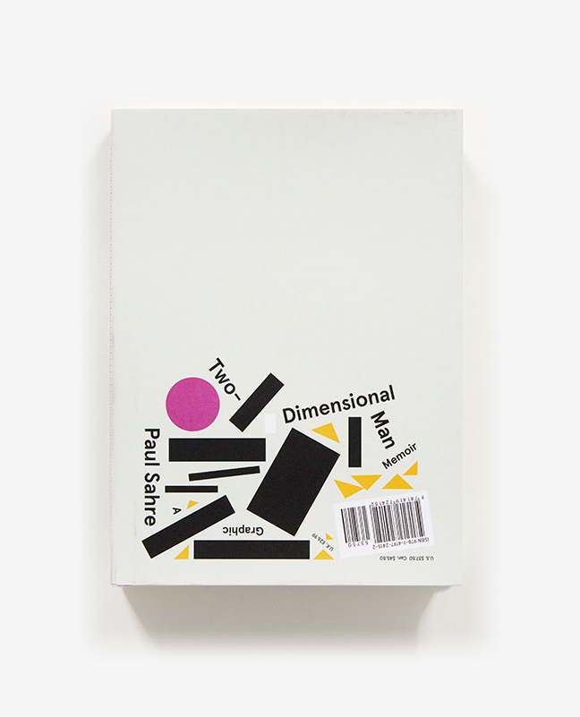
Designer Paul Sahre has published a new book, Two-Dimensional Man, which is part memoir and part monograph. Read the rave reviews at the link.
10.16.2017
“…when we champion individuality and self-expression, that’s when we see its true power.”
CoverGirl reinvents itself with “I Am What I Make Up”
10.16.2017
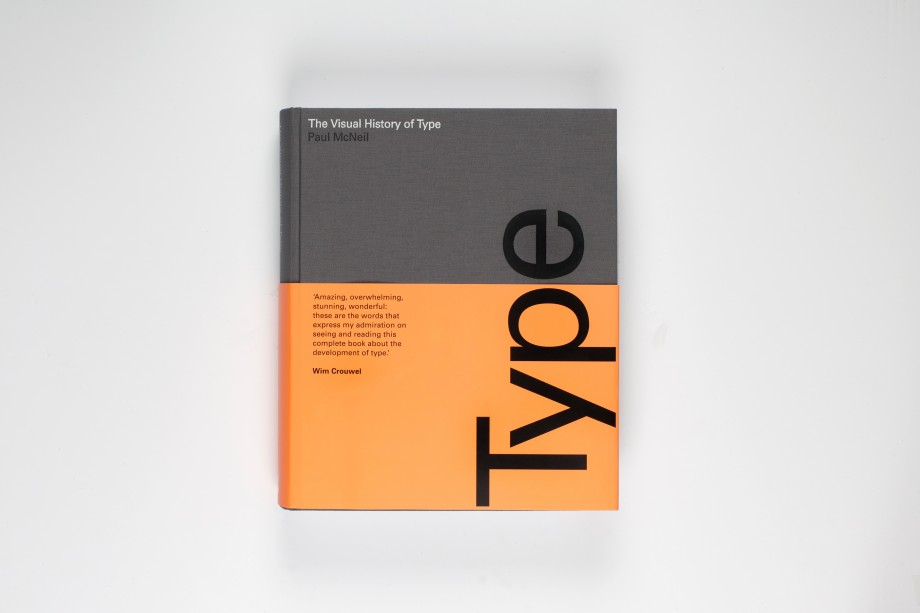
The Visual History of Type, a gorgeous new book by Paul McNeil. (One tiny critique: the title is a bit misleading, since it only includes examples of Western, Latin-based typefaces.) Read more about the book in this post by Emily Gosling.
10.16.2017
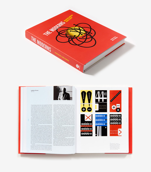
Great new book on the market, The Moderns: Midcentury American Graphic Design by Steven Heller and Greg D’Onofrio.
10.13.2017