The Speak Up poster contest started on a warm summer day on August 9th, 2004. Deadlines, rules, regulations and details were announced then [PDF]. Excitement followed. The rules were simple:
1. Select a quote from anywhere on Speak Up
2. Get permission from the original author
3. Design like there was no tomorrow
4. Make sure it can be silkscreened using only two colors
5. Submit
The ultimate goal of the contest was to print (silkscreened no less) four 19" x 25" winning posters. One would be selected by a democratic online voting, and the three other posters by a distinguished panel of judges:
Art Chantry. Raised in Tacoma, Art Chantry worked in Seattle for nearly 30 years. He has won hundreds of design and advertising awards, including a bronze lion at Cannes. His work has been collected and exhibited by some of the most prestigious museums and galleries in the world: the Louvre, The Smithsonian, The Library of Congress and the Rock and Roll Hall of Fame to name a few. His work has been published in countless books and magazines and in 2001 Chronicle Books published the monograph of his work, Some People Cant Surf, written by Julie Lasky. In the year 2000, Art relocated to St. Louis, Missouri, where he currently continues his efforts at world domination with the assistance of co-conspirator Jamie Sheehan. They live in a large Victorian brick house with a dog and a cat, both in designer black.
Ellen Lupton. Writer, curator, and graphic designer. She is director of the MFA program in graphic design at Maryland Institute College of Art (MICA) in Baltimore. She also is curator of contemporary design at Cooper-Hewitt National Design Museum in New York City, where she has organized numerous exhibitions, each accompanied by a major publication, including the National Design Triennial series (2000 and 2003), Skin: Surface, Substance + Design (2002), Graphic Design in the Mechanical Age (1999), Mixing Messages (1996), and Mechanical Brides: Women and Machines from Home to Office.
James Victore Self-taught, independent graphic designer. Victore’s work ranges from publishing, posters and advertising to animation. Clients include Moet & Chandon, Watson Guptill, The Shakespeare Project, The New York Times, MTV, Target, The Lower East Side Tenement Museum and the Portfolio Center. Awards include an Emmy for television animation, a Gold medal from the Broadcast Designers Association, the Grand Prix from the Brno (Czech Republic) Biennale, and Gold and Silver Medals from the New York Art Directors Club. Victores posters are in the permanent collections of the Palais du Louvre, Paris, the Library of Congress, Washington, DC and the Museum für Gestaltung, Zurich among others. His work has been featured in magazines around the world, and recently a book of his design work was published in China. He also teaches graphic design at the School of Visual Arts in New York City. He loves and works in Brooklyn, NY.
With the deadline extended to September 20 we expected a decent response, however we were not prepared for the 170+ submissions we received by midnight. Many of them were turned down because they did not meet the technical requirements and we ended up with 153 posters.
On September 27 the voting den opened. People could only vote once and only for their favorite poster, this spread the votes quite widely. With 544 votes tallied, the competition slimmed down to five posters for a vote-off. 320 votes later we had our first winner.

Once the viewer’s choice was selected our judges went to task on the posters. After long deliberation, the verdict came in:

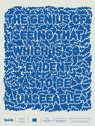
Judge’s comment: “I chose this poster from the scores of great work because I like its simple direct approach. It takes a really great quote (one that I rather identify with on a personal level) and does justice to it through utilizing typography AS illustration, rather than putting a caption to a ‘picture’. The obscure and eminently illegibly legible image says it all, this could actually stand as a sort of definition of graphic design. The intensely hand-rendered treatment appeals to my misanthropic and iconoclastic relationship with the current level of technology in design as well. It appears to completely sidestep the computer as a design tool. That’s a strategy that I think we all might examine in the future. This poster and its message is entirely antagonistic without having to resort to being clever. I only wish that the color was thought through a bit more. I think a nice flesh tone would have put it over the top given it a lot of ‘guts’. (heh. heh.)”

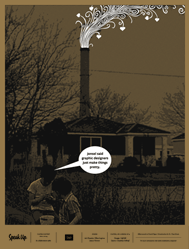
Judge’s comment: “This poster is both dark and optimistic. I like the fact that it depicts design as a social exchange. It is visually strong and direct, while also being oddly recessive and laid back. It asks us to consider the relevance and consequences of the statement at the center of the poster, rather than slamming us with a definitive message. Sometimes, text is more powerful when its small.”

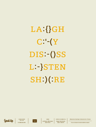
Judge’s comment: “On it’s own, I feel it is a very simple idea played out elegantly. I think it is a nice answer for a web-inspired competition.”
A bit more about the winners:
Spencer Fruhling is a recent graduate of Capilano College’s IDEA program in North Vancouver, BC. A God-fearing man, Spencer would never want to go to Hell in a bobsled, though a two-man luge is not “out of the question.” He currently resides in Richmond, BC as a freelance designer-slash-illustrator, with his gorgeous wife, Juliana.
www.spencerfruhling.com
Tristan Benedict-Hall is a current senior design major at the Maryland Institute College of Art in Baltimore, MD. Growing more and more concerned with the role of the graphic designer in today’s society, he has co-founded bimanous.net, a collective designed to communicate world-issues through various mediums.
www.magmaonthesurface.net
Jeff Gill spent 10 years as a pastor working with teenagers and trying to learn how to do graphic design. In 2000 he left his job and his home in Tucson, Arizona to be a full-time graphic designer in North Wales, UK. He has at least five clients, and he’s pretty sure you haven’t heard of any of them. Jeff is married to Christine, the greatest woman on Earth. They have two spectacularly attractive and talented children, two cats and an aging G4.
www.noveltymeats.co.uk
Bernie Roessler is a principal of Plumbheavy Design, a five-year-old design studio in Edmonton, Alberta, Canada. Bernie holds a Bachelor of Design degree from the University of Alberta, where he teaches as a sessional instructor.
www.plumbheavy.ca
And so the poster contest ended and production began with its necessary hiccups. Now, you can purchase one, two, three or all four posters on Speak Up and Veer.
