|
JUNE 12 |
OCTOBER 16 |
NOVEMBER 13 |


May 01, 2008![]()
Posters
While most designers strive for dramatic white space in their poster work, Sam and Martin strive to take advantage of every square inch the canvas affords.

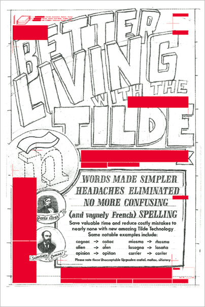
Poster for Punc’t, a series of posters commissioned by Neenah Paper and organized by David Schimmel in 2004. Each poster was a punctuation mark from the alphabet — Sam’s was the tilde.

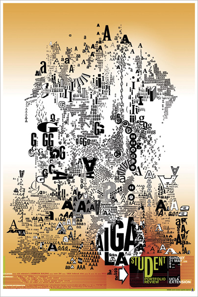
Poster for a 2006 Student Portfolio Review hosted by AIGA LA. The internet does not do this poster justice, specially when you consider that every single letterform was cut and pasted by hand.
![]()
Filed in Potts/Venezky • Link


