|
JUNE 12 |
OCTOBER 16 |
NOVEMBER 13 |


November 17, 2008![]()
Four Down, Zero to go
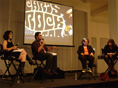
The fourth Opposites Attract is now in the books and the 2008 series is over. What will 2009 bring? Only destiny knows. [Thanks to Bryony’s dad for the photo]
![]()
Filed in Anderson/Raye • Link
November 12, 2008![]()
Blondes have more Fun
It just depends what’s your idea of fun.
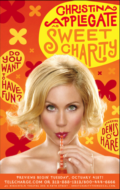
Poster for Sweet Charity musical by Gail.
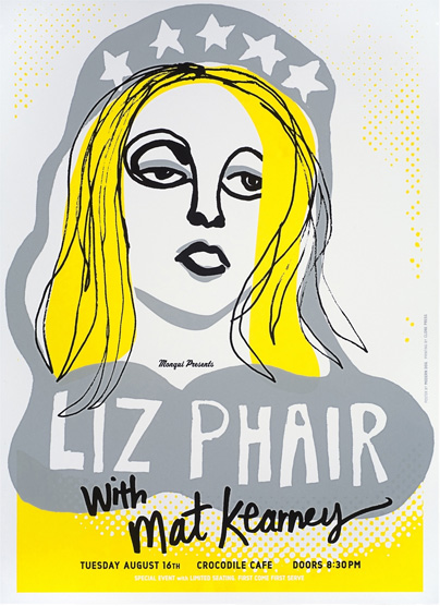
Poster for Liz Phair performance by Robynne.
![]()
Filed in Anderson/Raye • Link
November 11, 2008![]()
Women of Design, Available for Purchase
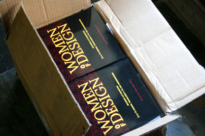
Just in the nick of time, we received our first shipment of Women of Design books and we will have them available for purchase at Thursday’s event.
November 10, 2008![]()
Oldies but Goodies
Nothing beats some good old-fashioned, vintage-inspired typography be it Americana or wood type.
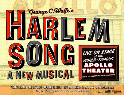
Poster for Harlem Song musical by Gail.
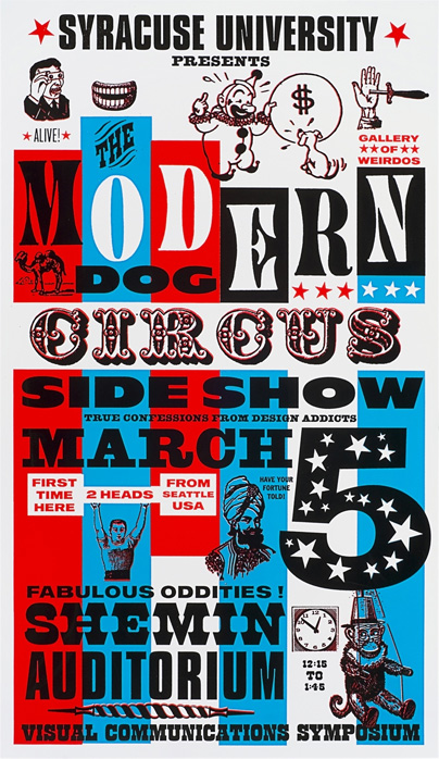
Poster for Modern Dog lecture at Syracuse University by Robynne.
![]()
Filed in Anderson/Raye • Link
November 07, 2008![]()
Stencilin’
If there is one motto to live by in the design industry it should be that when everything else fails, make a stencil. Not implying that everything else failed in these two posters, rather they point to how awesome stencil always looks.
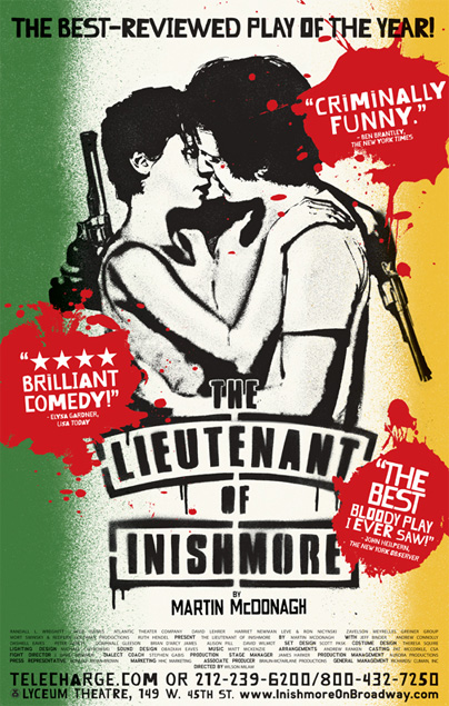
Poster for The Lieutenant of Inishmore play by Gail.
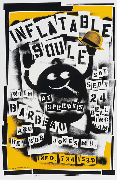
Poster for Infatable Soule performance by Robynne.
![]()
Filed in Anderson/Raye • Link
November 06, 2008![]()
Groovy Type
Not much explanation ncessary, really, just dig it.
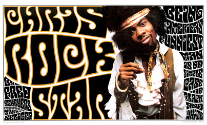
Spread for Rolling Stone by Gail.
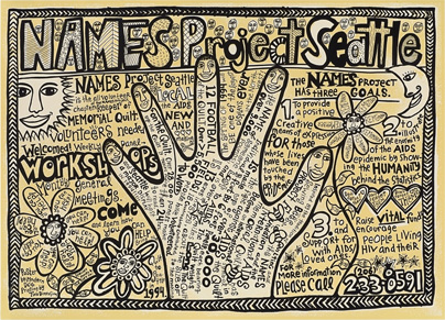
Poster for the Names Project by Robynne.
![]()
Filed in Anderson/Raye • Link
November 05, 2008![]()
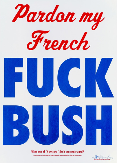
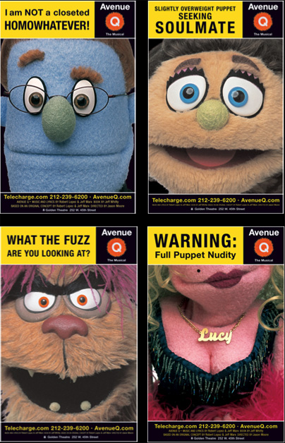
Lost in Translation: Fuzz vs. Fuck
Having fun with language — whether outright expletives or more subtle allusions — is part of Gail’s and Robynne’s talents that can be applied to both work and social conversation. Here we have two vastly different applications: On top is Robynne Raye’s contribution to the 2005 Hurricane Poster Project, which is self explanatory; and below it is Gail’s campaign for Avenue Q, the Sesame Street inspired Broadway musical not suitable for children. Aside from fun with words what these two posters have in common that the subject matter of both is, in the end, about puppets.
![]()
Filed in Anderson/Raye • Link

Next Page
(Total Number of Pages: 2)


