
Apologies for the late start this morning, major server issues. Photo by Flickr user justinlai.

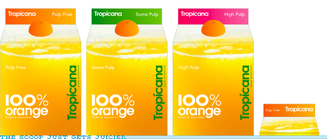
Just when you thought Pepsi week was over, comes the original scoop I had been talking about. Tropicana, another one of the Pepsi brands, has also gone under the knife… or the juicer. This is perhaps the least offensive work we’ve seen come out yet but it certainly pales in comparison to the previous line of packaging designed by Sterling Brands that hit the shelves no more than one or two years ago at the most. This new packaging feels, at best, like a discount store brand with what looks like, again, at best, rights-managed stock photography if not outright royalty free. And the typography is, once more, at best, a lame derivative of how the British have lately exploited geometric sans serifs like Futura and Avenir to great results — here’s just one example of many. And I really want to believe that the screw-cap will not be an orange-colored boobie as in the rendering above.
Continue reading this entry
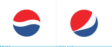
(Apologies for the delay on this one, I have been sitting on it since Wednesday, because there was, still is, a possibility for a bigger scoop. So if it happens I’ll just post it separately). This is possibly one of the biggest rebrandings that will take place over the next months/years as was announced this week that Pepsi will be revamping the design and identities of their key brands, in light of the decrease in sales with drops between 2% and 5% in different beverage categories. No visuals, other than the logo above, have been released so this is definitely a preemptive review of the work done by New York-based Arnell Group. There is plenty of quotables from the only two sources that have reported on the imminent change, so let’s get to those.
Continue reading this entry
To continue with our supermarket streak (three in a row, booyah!) at Brand New I would like to offer a, well, brand new entrant into the category. Fresh & Easy Neighborhood Market (yes, that’s the official full name) is a new chain of supermarkets opening in the West Coast of the United States, with 30 stores planned to open in the states of Arizona, California and Nevada by the end of 2007. The new venture is headed by UK-based Tesco, one of the world’s largest retailers (“the world’s third-largest retailer, behind Wal-Mart of the United States and Carrefour of France” according to Wikipedia). Launching the store and its associated 1,500-plus SKUs, Tesco worked with three agencies to complete the project, U.S.-based marketing / communications / anythingelse firm Deutsch Inc., U.K.-based and independently-owned branding agency Pemberton & Whitefoord (P&W), and U.K.-based and retail-specialized design and fabrication company Schorleaf. (The invoices from all three combined could probably buy you three or four of those islands near Dubai).
Continue reading this entry


