search results “The Best and Worst”
ReviewedNotedLinked
SpottedAnnouncedSponsored
2019 Year in Review
The Best and Worst Identities of 2019: In Case You Missed It
read more
Announced Jan. 6, 2020
2019 Year in Review
The Best and Worst Identities of 2019, Part 6: The Best Friday Likes
read more
Announced Dec. 31, 2019
2019 Year in Review
The Best and Worst Identities of 2019, Part 5: The Worst Noted
read more
Announced Dec. 30, 2019
2019 Year in Review
The Best and Worst Identities of 2019, Part 4: The Best Noted
read more
Announced Dec. 26, 2019
2019 Year in Review
The Best and Worst Identities of 2019, Part 3: The Worst Reviewed
read more
Announced Dec. 25, 2019
2019 Year in Review
The Best and Worst Identities of 2019, Part 2: The Best Reviewed
read more
Announced Dec. 24, 2019
New Logo and Identity for McKinsey by Wolff Olins
High Contrast
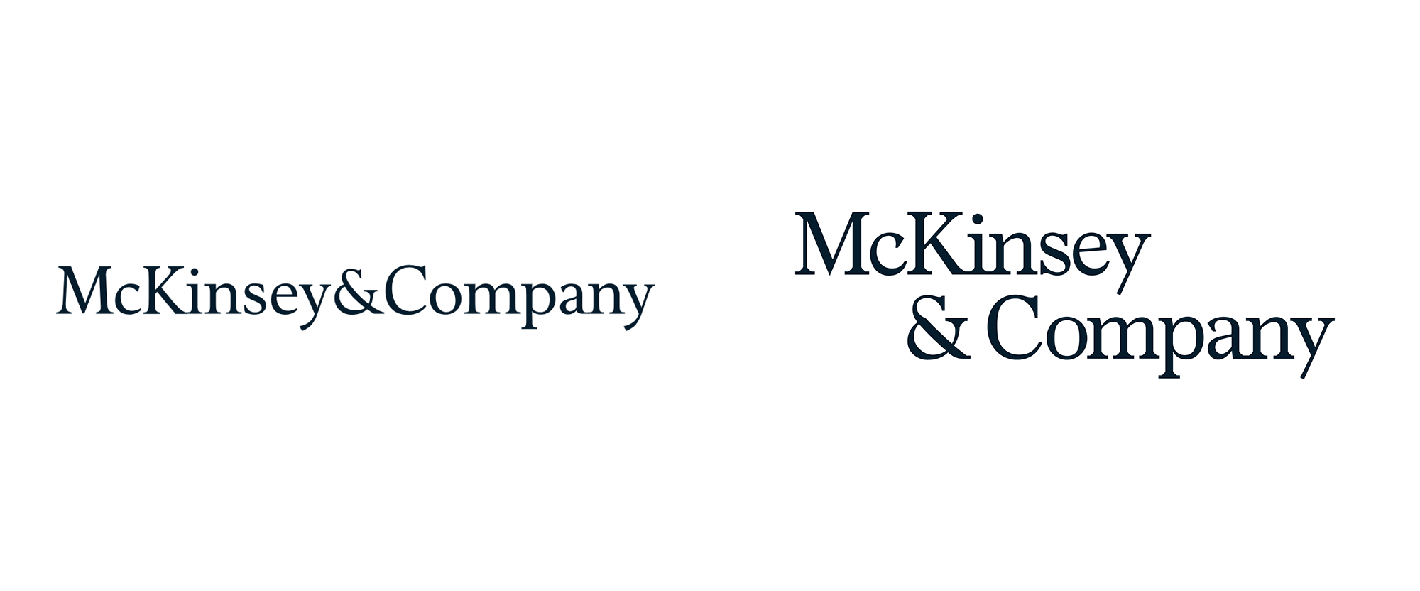
before
after
Reviewed Feb. 27, 2019
New Logo and Packaging for Molson Brands by BrandOpus
Turn Back the Clock
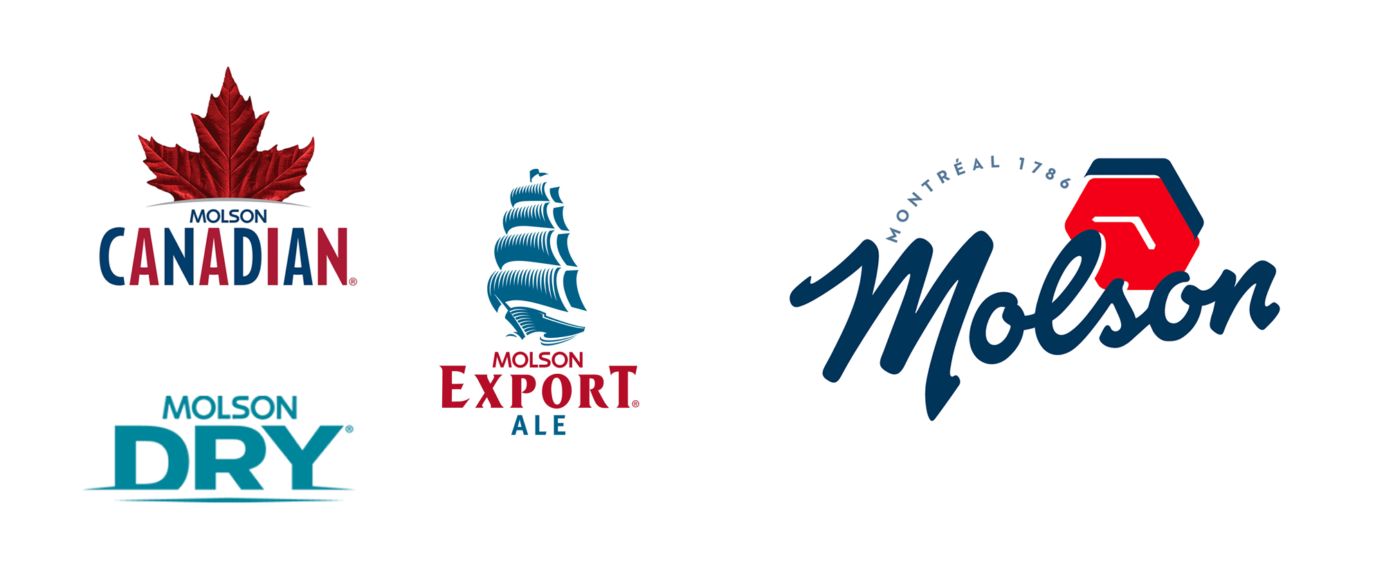
before
after
Reviewed Jan. 24, 2019
2018 Year in Review
The Best and Worst Identities of 2018: In Case You Missed It
read more
Announced Jan. 7, 2019
2018 Year in Review
The Best and Worst Identities of 2018, Part 5: The Worst Noted
read more
Announced Jan. 2, 2019
2018 Year in Review
The Best and Worst Identities of 2018, Part 4: The Best Noted
read more
Announced Dec. 31, 2018
2018 Year in Review
The Best and Worst Identities of 2018, Part 3: The Worst Reviewed
read more
Announced Dec. 28, 2018
2018 Year in Review
The Best and Worst Identities of 2018, Part 2: The Best Reviewed
read more
Announced Dec. 26, 2018
New Logo and Identity for Uber by Wolff Olins and In-house
Safety in Numbers

before
after
Reviewed Sep. 17, 2018
2017 Year in Review
The Best and Worst Identities of 2017: In Case You Missed It
read more
Announced Jan. 8, 2018
2017 Year in Review
The Best and Worst Identities of 2017, Part 5: The Worst Noted
read more
Announced Jan. 2, 2018
2017 Year in Review
The Best and Worst Identities of 2017, Part 4: The Best Noted
read more
Announced Dec. 28, 2017
2017 Year in Review
The Best and Worst Identities of 2017, Part 3: The Worst Reviewed
read more
Announced Dec. 27, 2017
2017 Year in Review
The Best and Worst Identities of 2017, Part 2: The Best Reviewed
read more
Announced Dec. 25, 2017
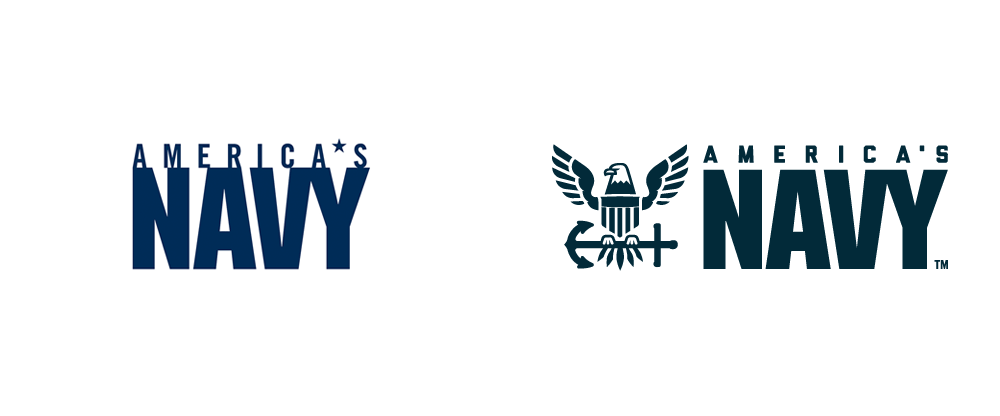
New Logo for U.S. Navy by Y&R
Lost at Sea
before
after
Reviewed Dec. 20, 2017
End of Year List
The Best and Worst Identities of 2016, Part 6: The Best Friday Likes
read more
Announced Dec. 30, 2016
End of Year List
The Best and Worst Identities of 2016, Part 5: The Worst Noted
read more
Announced Dec. 28, 2016
End of Year List
The Best and Worst Identities of 2016, Part 4: The Best Noted
read more
Announced Dec. 26, 2016
End of Year List
The Best and Worst Identities of 2016, Part 3: The Worst Reviewed
read more
Announced Dec. 23, 2016
End of Year List
The Best and Worst Identities of 2016, Part 2: The Best Reviewed
read more
Announced Dec. 21, 2016
End of Year List
The Best and Worst Identities of 2016, Part 1: The Most Notable Reviewed
read more
Announced Dec. 19, 2016
New Name, Logo, and On-air Look for Freeform done In-house
Family Values

before
after
Reviewed Jan. 13, 2016
End of Year List
The Best and Worst Identities of 2015, Part 6: The Best Friday Likes
read more
Announced Jan. 1, 2016
End of Year List
The Best and Worst Identities of 2015, Part 5: The Worst Noted
read more
Announced Dec. 30, 2015
End of Year List
The Best and Worst Identities of 2015, Part 4: The Best Noted
read more
Announced Dec. 28, 2015
End of Year List
The Best and Worst Identities of 2015, Part 3: The Worst Reviewed
read more
Announced Dec. 25, 2015
End of Year List
The Best and Worst Identities of 2015, Part 2: The Best Reviewed
read more
Announced Dec. 23, 2015
End of Year List
The Best and Worst Identities of 2015, Part 1: The Most Notable Reviewed
read more
Announced Dec. 21, 2015
New Logo for Verizon by Pentagram
Check, Please!
before
after
Reviewed Sep. 4, 2015
New Logo and Uniforms for Los Angeles Clippers
Clip and Roll
before
after
Reviewed Jun. 22, 2015
New Logo for IHOP by Studio Tilt
Turn that Frown Upside Down
before
after
Reviewed Jun. 2, 2015
Friday Likes 116
From for brands™, Robot Food, and Cast Iron Design
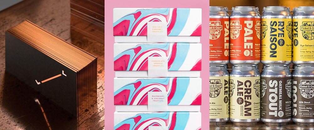
a
b
c
Reviewed Feb. 6, 2015
End of Year List
The Best and Worst Identities of 2014, Part 5: Most Liked Friday Likes
read more
Announced Dec. 31, 2014
End of Year List
The Best and Worst Identities of 2014, Part 4: The Worst Noted
read more
Announced Dec. 29, 2014
End of Year List
The Best and Worst Identities of 2014, Part 3: The Best Noted
read more
Announced Dec. 26, 2014
End of Year List
The Best and Worst Identities of 2014, Part 2: The Worst Reviewed
read more
Announced Dec. 24, 2014
End of Year List
The Best and Worst Identities of 2014, Part 1: The Best Reviewed
read more
Announced Dec. 22, 2014
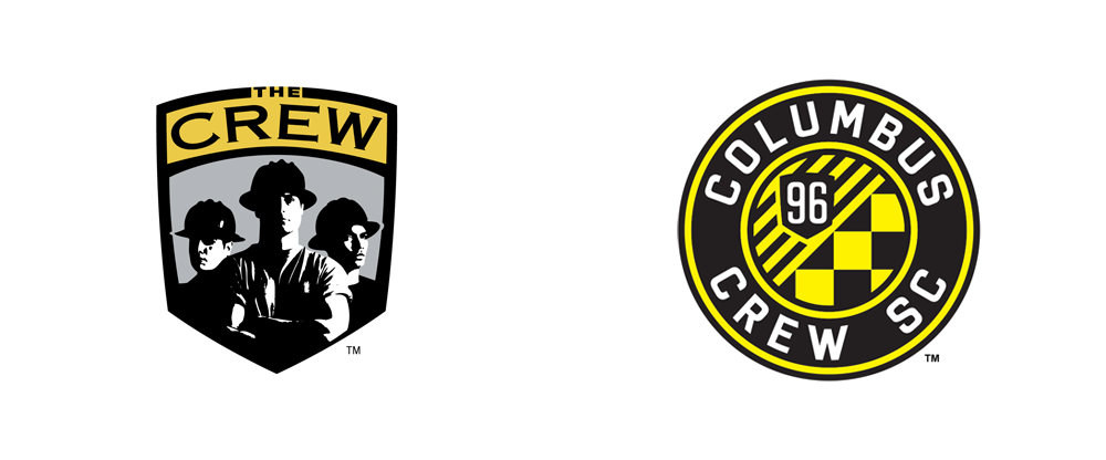
New Logo for Columbus Crew done In-house
No Hard Hats Required
before
after
Reviewed Oct. 13, 2014
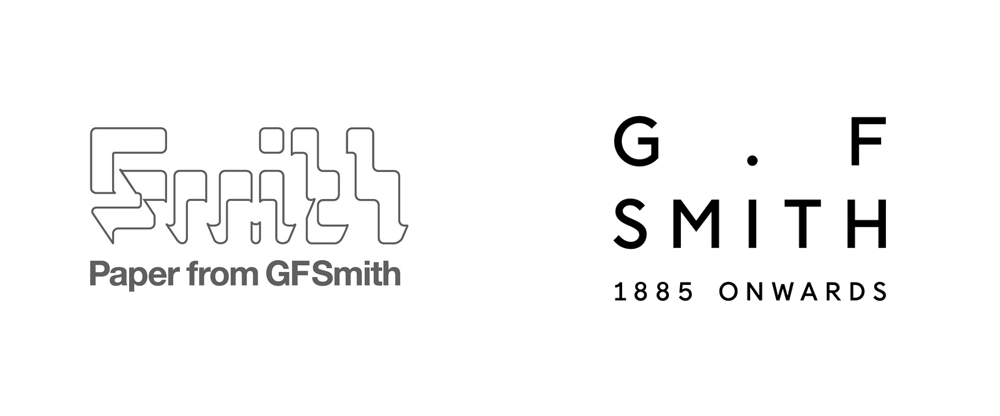
New Logo and Identity for G . F Smith by Made Thought
Paper. Period.
before
after
Reviewed Apr. 28, 2014
End of Year List
The Best and Worst Identities of 2013, Part 5: Most Liked Friday Likes
read more
Announced Jan. 3, 2014
End of Year List
The Best and Worst Identities of 2013, Part 4: The Worst Noted

read more
Announced Jan. 1, 2014
End of Year List
The Best and Worst Identities of 2013, Part 3: The Best Noted
read more
Announced Dec. 30, 2013
End of Year List
The Best and Worst Identities of 2013, Part 2: The Worst Reviewed
read more
Announced Dec. 26, 2013
End of Year List
The Best and Worst Identities of 2013, Part 1: The Best Reviewed
read more
Announced Dec. 23, 2013
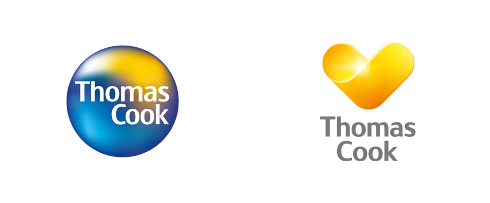
New Logo for Thomas Cook
Stone-cold Sunny Heart
before
after
Reviewed Oct. 7, 2013
New Logo for Bing by Microsoft
“b” be Crazy
before
after
Reviewed Sep. 18, 2013
New Logo for Yahoo Designed In-House
30 Days for This?

before
after
Reviewed Sep. 5, 2013
New Logo and On-air Look for RTL 4 by Fin Design
Trans-four-mer
before
after
Reviewed Aug. 27, 2013
Knock-Knock-Knocking on Hell’s Door
Reviewed Mar. 7, 2013
American Airlines, a Second Opinion
Reviewed Jan. 18, 2013
Follow-up: University of California
Reviewed Dec. 12, 2012
AIG’s Bizarro World Logo
Reviewed Oct. 3, 2012
A Swoosh is a Dish Best Not Served
Reviewed Jul. 12, 2012
With Windows Like These Who Needs Enemies? [UPDATED]
![With Windows Like These Who Needs Enemies? [UPDATED]](https://www.underconsideration.com/brandnew/archives/windows_8_logo_wrong.png)
Reviewed Feb. 17, 2012
jcpenney Nails the American Look
Reviewed Jan. 26, 2012
Sign Language for Swoosh
Reviewed Dec. 8, 2011
A Crusade Against Long Names
Reviewed Jul. 21, 2011
Meet Morph

Reviewed Apr. 6, 2011
Follow-up: My Little Pony
Reviewed Nov. 2, 2010
Most Boring Children’s Museum in the World

Reviewed Jul. 2, 2010
Follow-up: AOL, Round 2
Reviewed Jun. 2, 2010
European + Organic = Euro-Leaf

