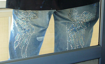
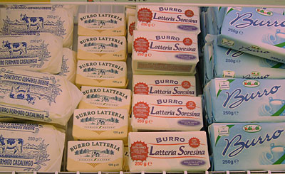
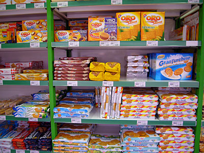
As made embarrassingly clear by that video excerpt of my bidet [Ed. Note: bidet discourse coming soon] discourse; for me, the fun of traveling is keeping a running record of cultural differences: the smell of milk, the cuts of jeans, the way men adorn themselves, mothers with children, etc.
From these constant comparisons, I’ve cribbed together an outlook and set of design values that I constantly pull from. Michael Vanderbyl famously stated that if you could design a logo, you could design a building; I’ll happily adapt that line of thinking and make the claim that one can develop a world view just by looking at a bathroom.
For the past twenty years in New York, there’s been an explosion in luxury apartment buildings. Over that time the word “luxury” has devolved to the point where all it means is that you get a doorman. Materials have become cheaper, rooms smaller, walls thinner and costs higher.
Even hotel rooms have diminished over time. I’ve stayed in budget hotels where the floor, made of a single layer of board laid over a metal-beam support, creaks with every step, and I’ve stayed in W Hotels that felt more like a nightclub than a comfortable place to stay: like the W in Montreal where they constantly have problems with (fabulous) pull rods which are too flimsy for the weight of the curtains in each window.
In many cases, if the developer or hotelier proudly touts the design of their project; it’s often the design of surfaces or lighting effects rather than the pervasive design of the whole experience. In one recent example on far west 23 Street in Manhattan, David Rockefeller created a highly theatrical lobby for the Tate co-op — where the actual apartments are so small, and the smoke detectors are placed so close to the kitchens, that anything more than boiling water results in the alarm going off. The bathroom sinks may have a Philippe Stark quality — wooden pedestal, white ceramic bowl, and a simple, curved faucet — but you can’t fit your head underneath to rinse your hair. And the parquet floors are the sort that buckle in four different directions after the most minor of floods.
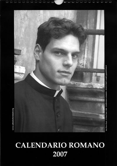
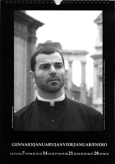
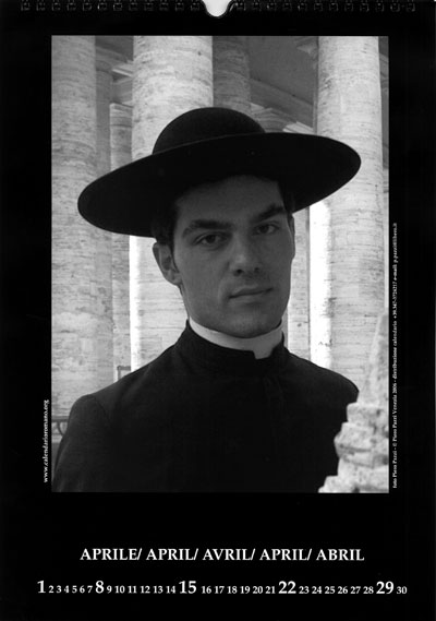
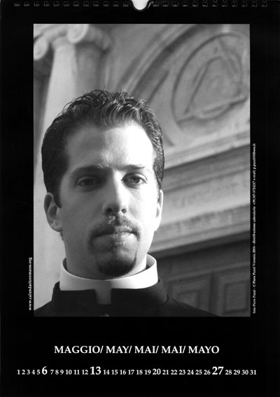
During our stay in Italy, standing in contrast to the cynicism of the American market, I’m struck by the frequent appearance of beautiful objects with the kinds of efficiencies not found in the US. This isn’t to say that the Italians have the answer to every problem: the bureaucratic minutia of having to document each and every hotel guest every single day or the frequent tax deadlines (calendars are sold to help business owners keep track of what’s due and when) are two pains typical of Italian paperwork. And this isn’t to say that everything that I’ve seen is a work of genius; but it is generally thoughtful.
For example, our first hotel in Rome had several thoughtful touches which offered comfort while keeping an eye on efficiency and reduced waste.

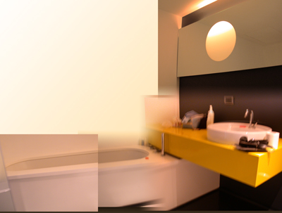
Here’s a collaged image of the bathtub with a small shower-like attachment — the silver wand at the head. Since european tubs and showers are often two separate things, the tub can be much narrower than your typical American tub. This allows it to fill faster and use less water, without making it any less sensual.
The cantilevered yellow counter dresses the room up with a Memphis vibe and gives you enough room to store your toiletries.

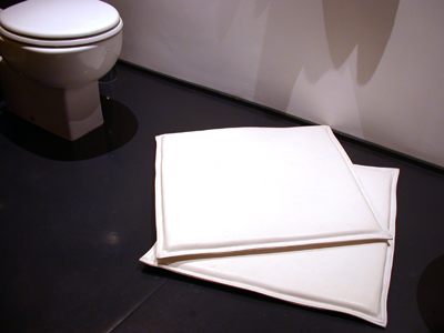
The bathroom floor is a black membrane over a thin padded surface and the two white squares are vinyl pads to be used instead of a bath-mat. Housekeeping needs to clean the bathroom floor anyway, and spray-cleaning the white pads, again, uses less water and energy than running bath-mats through the laundry.
To the left, the toilet is flushed by pushing a large button on the wall above. You can adjust your flush by pushing longer for solid matter and shorter for urine. The junction to the sewage stack must be wider than American toilets, because they never back up.

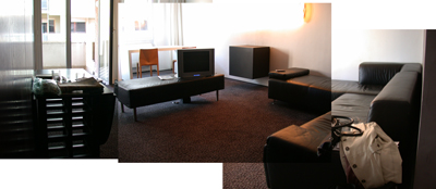
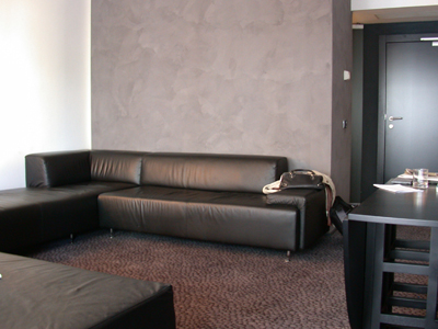
The main room itself is both chic and comfortable. Vacuuming is easy: the mini bar is up off the floor and the leather (actually soft vinyl) sectional sofa is cleaned with a damp cloth. While there is air conditioning, one can also open the large windows, with shutters, on opposite ends of the room for cross ventilation.

And thankfully, the room is free of generic artwork on the walls, and there’s less crap to dust.
I have a general theory that the roots of this combination of efficiency, simplicity and beauty lie in the shortages of postwar Europe; exemplified by Achille Castiglioni’s floor lamp made with a car headlight. Marian thinks it’s also because the traditions of european modernism are closer.
But whatever the reason, the attention to how people use the room and how employees maintain the hotel is a pleasure to think about. In many North American hotels, the cleaning crew is a daylong presence in the hallways — trudging from room to room — while in this particular hotel in Rome it wasn’t. Considering that the room was immaculate AND that this was accomplished in a country where siesta is a God-given right, it becomes more amazing.
