
![]()
![]()
CLIENT
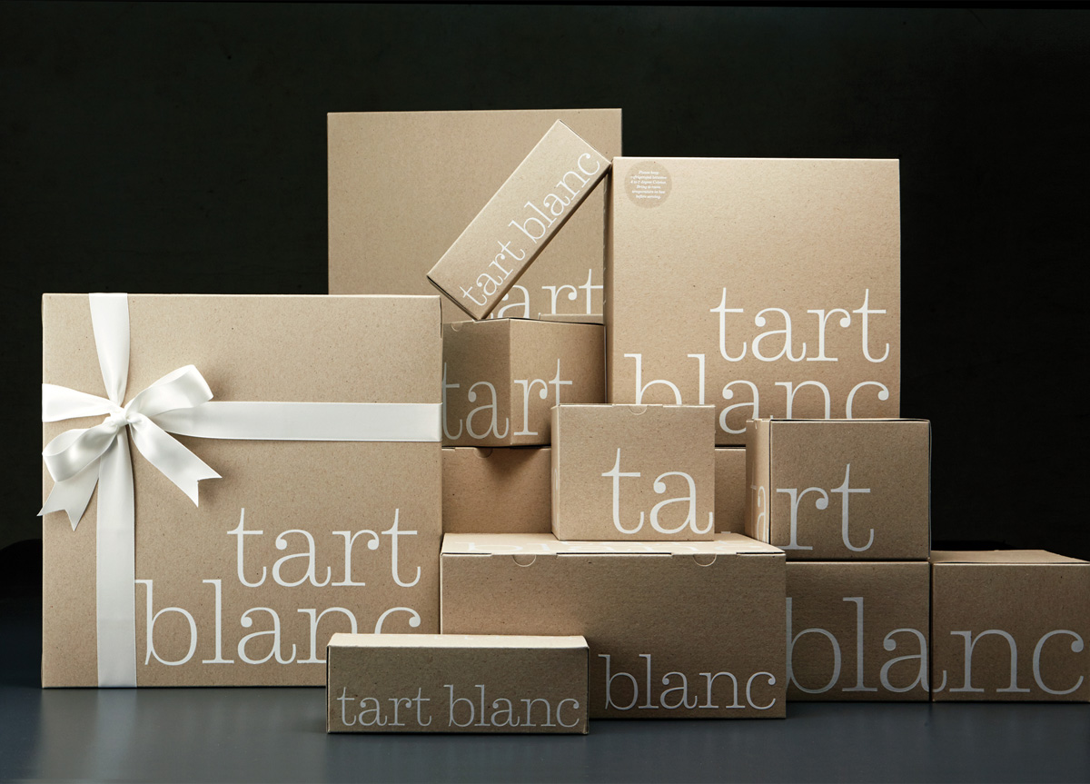
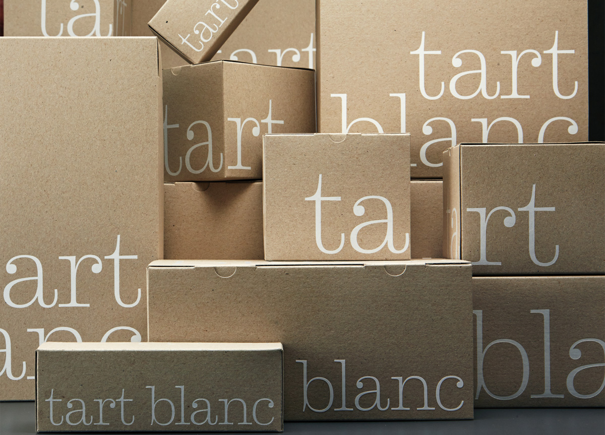
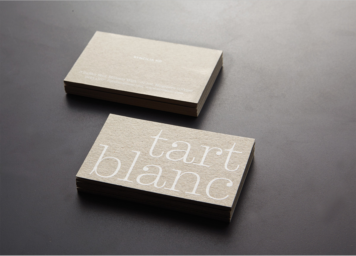
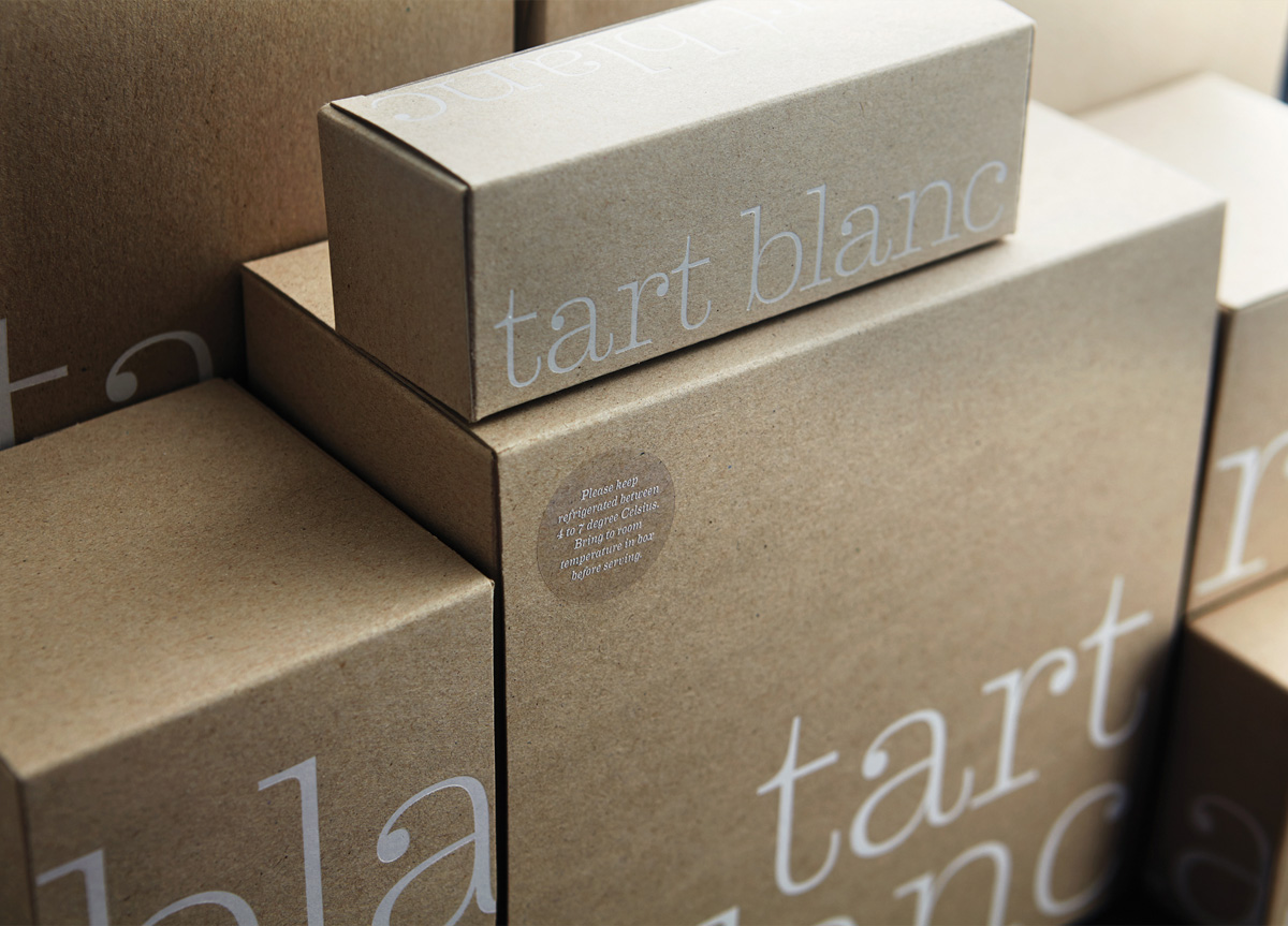
Tart Blanc is an artisanal bakery in Singapore specialising in beautiful tarts featuring inventive flavour and texture combinations. The owners, a pair of sisters, one of whom is the baker, tell us that they dream of multi-layered confections exploding with flavors and textures.
BRIEF
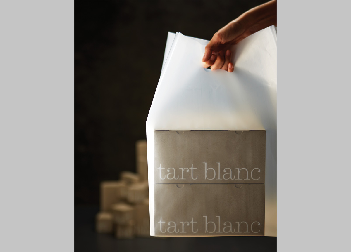
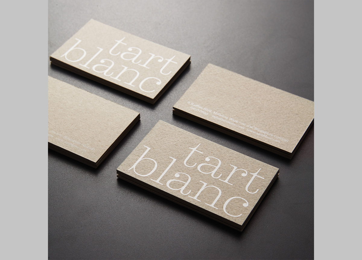
Instead of relying on overly ornamental scripts emblematic of the French, American, or European aesthetic—which would not have been authentic for them—the client wanted something clean and neutral. They are all about flavour combination, experimentation, and invention and wanted a blank slate to showcase their creations.
APPROACH
To underline the tartistry of the baked goods, we came up with the name tart blanc inspired by the phrase carte blanche, which means blank paper and expresses the idea that anything is possible. For the packaging and namecards, we chose an unusual and raw grey substrate as an alternative to the ubiquitous kraft to hint at the human-made, small batch nature of the bakery. It took us a very long time to convince the box maker to make the boxes in this material but we think that the results are worth every minute trying to get it right.


